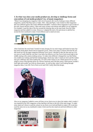
This document discusses how the author's media product both uses conventions from and challenges real music magazines. Some conventions that were used include taking the boxed lettering style of the masthead from Fader magazine and the sell lines on the front cover from XXL magazine. However, the author also challenged conventions by adding the barcode and price on the front cover to make it easier to see, pricing the magazine cheaper than competitors, including two photos on the contents page for more interest, and using a column layout for articles that is different from XXL. The goal was to both draw from real magazines but also make the design stand out in unique ways.


