
Recommended
More Related Content
What's hot
What's hot (19)
Viewers also liked
Viewers also liked (19)
Similar to Evaluation activity 1
Similar to Evaluation activity 1 (20)
More from Ceri Lewis
More from Ceri Lewis (16)
Recently uploaded
Recently uploaded (20)
Evaluation activity 1
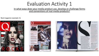
- 1. Evaluation Activity 1 In what ways does your media product use, develop or challenge forms and conventions of real media products? Real magazine example: Q
- 2. The title of the magazine: Written in a bold, white, large font with a red background so it stands out. The name Q symbolizes a record ready to play and is taken from the term ‘Cue’ but the name was changed so the magazine wouldn’t be mistaken for a snooker magazine. Graphology/page layouts: The layout for the cover page is eye catching and dynamic and will catch the audiences’ attention with the sizing of the masthead. For the contents page, the layout is simplistic yet bold and appeasing for the reader and clearly demonstrates the information that is conventionally expected on the contents page. The double page spread is written in a readable font and is laid out clearly and in an eye catching effective style that will encourage the reader to read the article. Evaluation Activity 1 In what ways does your media product use, develop or challenge forms and conventions of real media products? Referring to real magazine example:
- 3. Costumes, props and iconology used to reflect the genre: Cheryl Cole is featured in a bold and dynamic way using dark lipstick and wet hair to capture the audiences’ attention and the other artists are presented in an eye catching open style that will appeal to a range of audiences’. Camerawork and framing of images: A close up was used on the front cover and double page spread and a variety of shots including full body and medium shots were used for the contents page. Article, header ect font and style: The article on the double page spread is written in a clear font which means it is easy for the audience to read it. It is laid on in an interesting yet simplistic style which will catch the audiences’ attention. Evaluation Activity 1 In what ways does your media product use, develop or challenge forms and conventions of real media products? Referring to real magazine example:
- 4. Genre and how the magazine cover, contents and spread suggests it: Q Magazine includes a range of genres which is achieved in their magazine as a range of artists that will appeal to the audience are included. How are the artist(s) represented: Cheryl Cole is presented as a strong and dynamic artist using a bold colour scheme of red, white and black which will catch the audiences’ attention. Colour scheme: The colour schemes on the cover, contents page and double page spread all work together really well. The cover is eye catching and bold, the contents is simplistic yet effective and the double page spread is sharp and the article is easy to read. Evaluation Activity 1 In what ways does your media product use, develop or challenge forms and conventions of real media products? Referring to real magazine example:
- 5. Evaluation Activity 1 In what ways does your media product use, develop or challenge forms and conventions of real media products? Own magazine:
- 6. The title of the magazine: I feel that my masthead ‘DIVERGE’ fits the codes and conventions of a typical music magazines such as Clash and Vibe as they also have the same bold font that stands out on the magazine. The message behind my choice for this magazine is that Diverge means to separate from another route or go in a different direction which is generally displayed I alternative rock as this genre is very different to others. The positioning for my masthead is also very similar to the layout of Clash and Vibe which shows it conforms to conventions. I used the Telegrafico font which although it is a lot thinner than my examples of Clash and Vibe, but referring to my earlier magazine example, Q magazine is also in a thin font. I feel my magazine font still forms to the conventions as the style of the sharp outlines is shown in both Clash and Vibe magazine and the boldness of the font is similar to Q Magazine. Evaluation Activity 1 In what ways does your media product use, develop or challenge forms and conventions of real media products?
- 7. Graphology/page layouts: Evaluation Activity 1 In what ways does your media product use, develop or challenge forms and conventions of real media products? Real magazine layouts and graphology similar to my own magazine:
- 8. Evaluation Activity 1 In what ways does your media product use, develop or challenge forms and conventions of real media products? Graphology/page layouts: Real magazine layouts and graphology similar to my own magazine:
- 9. Graphology/page layouts: I used the Telegraffico font for my main cover, the Arual font for my contents page, The Next Font for my article ‘Fireside’ title on my double page spread and I used the Helvetica Neue Condensed Black for the rest of my text (including the headings, subheadings and article). I used the Helvetica Neue Condensed Black font for the majority of my magazine as I felt this was an eye catching font that was easy to read yet stood out on the page. Referring this to a real magazine, as shown in my examples on the previous slides, Q magazine does use a few different fonts which I feel works with the styling and layout for this magazine but it wouldn’t of worked with my own. I used three different fonts for my masthead, Contents heading and Fireside as I felt these fonts worked best with the page and it adds a sense of originality with each page as I keep the other text as the Helvetica Neue Condensed Black font. I felt mixing different fonts together didn’t work so this challenges the conventions of a real media product in comparison to Q magazine but I feel that overall it created a more effective product than it would’ve by mixing different fonts as I felt it didn’t work with my magazine style and layout. The layout for my magazine cover page is very similar to Q magazine and I used the style of moving the artist names more towards the main image rather than keeping them in line with the masthead. This follows the conventions of a real media product. I moved the barcode as this was recommended in my teacher feedback and I can see through research that this sizing would be appropriate as it is very similar to this Q magazine. This is using the conventions of a real media product. I used a range of sizes to make different text stand out in comparison to other text such as the headings on my contents page but I can see my text sizes are very similar to other music magazines so I feel that my magazine generally uses the forms and conventions of real media products but I feel I challenged the use of fonts as I believed my magazine in particular worked better using one font for the majority of my text. Evaluation Activity 1 In what ways does your media product use, develop or challenge forms and conventions of real media products?
- 10. Costumes, props and iconology used to reflect the genre: For my front cover, I decided to dress my model ‘Kayla Page’ in a denim jacket with a white top as this connotes a relaxed yet effective and edgy style that will appeal to my target audience. I used red lipstick as I felt this worked well with parts of my text written in red and this technique is often used in magazines which shows I am developing the conventions of real magazines as well as presenting the model’s iconology that will draw my target audience to my magazine. For my contents page, I dressed my male model in a leather jacket and a white top as this outfit symbolizes a calm yet intriguing character and this is an outfit that is generally worn by my target audience which is shown in my fashion research so readers will be drawn to see what this artist is about. I chose to keep the glasses on as although they symbolize the stereotype of not being classed as fashionable, the genre alternative rock is about being unique and yourself and I wanted to include this message in my magazine to subtly show my magazine is not conforming to general stereotypes which can be seen as challenging the conventions of real media products. My band ‘Fireside’ for my contents and double page spread are dressed in dark clothing of greys and blacks and they are all wearing the same lipstick which displays a subtle yet clear presentation that they look good as a band. This iconology will encourage my readers to see what the article is about as the idea of a new band that appear to look good together is a simple technique that will intrigue the audience to find out more. Evaluation Activity 1 In what ways does your media product use, develop or challenge forms and conventions of real media products? Front Cover Contents Page Double Page Spread
- 11. Camerawork and framing of images: My magazine follows the codes and conventions of typical music magazines as I mainly focused on close up/mid shots for my contents page, a mid shot for one of my contents images and long shots for the rest. My cover image is central on my front cover which ensures it will catch the audiences’ attention and the image works well with the layout of the text. I followed the Mert & Marcus photography approach (their work is shown in my photographer research and planning) focusing on appearance furthermore create an attractive product. This meant for my camera work I used two separate lights to ensure the lighting was good quality and I planned the styling in advance to ensure the images taken will be appealing for my target audience. I feel my magazine images fit the conventions of real media products as my intended purpose was to obtain images that will stand out to my target audience and work effectively on the page and I feel both of these objectives were achieved and these objectives are generally used in the production of real media products to ensure the magazine will be successful. Evaluation Activity 1 In what ways does your media product use, develop or challenge forms and conventions of real media products? FrontcoverContentspageDoublepagespread
- 12. Article, header ect font and style: My magazine article follows the style of Q Magazine having an image on one page and the article on the other but I decided to include another image in the text of the article as this will break up the text and means the article will be more inviting to the reader to give the illusion the article isn’t too long. The font for my article is bold and similar to Kerrang’s style which I felt is very defined and professional yet still is clearly readable to the audience. I used the Helvetica Neue Condensed Black font for the majority of my magazine (which I found on the existing fonts through Photoshop) but the Telegraffico font for my main cover, the Arual font for my contents page and The Next Font for my article ‘Fireside’ title on my double page spread. All of the rest of these fonts were taken from www.dafont.com. I felt they stood out were on my magazine and worked with the individual yet conventional structure of a real media product by including the font that I felt would stand out best to the audience to ensure maximizing publicity. But I have developed the design for the header having it very central and laid out as this is the simplistic yet effective and professional approach I wanted for my magazine which ensures my magazine will have character as the approach is slightly different in various aspects in comparison to other media products. Evaluation Activity 1 In what ways does your media product use, develop or challenge forms and conventions of real media products?
- 13. Genre and how the magazine cover, contents and spread suggests it: I feel my magazine conveys the genre of alternative rock through the styling of my artists. I took inspiration from my research and planning so all of my artists are wearing clothing displayed in the typical outfits associated with alternative rock My model on my cover page is also wearing red lipstick which is associated with independence and free will which is shown in alternative rock as it is a stereotypical music genre that connotes the idea that anyone can listen to what they want. Similarly to other magazines, my magazine clearly shows originality representing the genre of alternative rock and Q Magazine represent their genre by conveying different styles to show the magazine looks at more than one genre. Overall, this shows I am representing my genre in my magazine using the conventions of real media products. Evaluation Activity 1 In what ways does your media product use, develop or challenge forms and conventions of real media products?
- 14. How are the artist(s) represented: My artist on my front cover page is presented in a fun, individual and out going style as my target audience (scenesters from the leading Edge Tribe) focus on originality and being yourself which I believe is clearly captured in my image. I chose to have my cover page artist wearing red lipstick as dark red lipstick in the 1920s was worn by women to symbolize their independence. Also in the 1930s lipstick was seen as a symbol of adult sexuality and teenage girls saw lipstick as a symbol of womanhood but adults didn’t believe that teenage girls should be wearing it so therefore saw lipstick as a symbol of rebellion. This represents the genre of alternative rock as I feel the lipstick symbolizes independence and free will which is reflected in my target audience in the Leading Edge Tribe for the Scenesters group. I felt that this symbolism will attract my target audience and encourage them to buy my magazine. For my male artist, I dressed him in a black jacket with a white shirt taking the simplistic approach whilst having an outfits worn a lot in alternative rock. As well as having my artist fit my music genre, the simplicity of the outfits ensures his clothing won’t take away the attention from the actual artist. My band were dressed in dark clothing (typically worn in alternative rock) with no bright slogans or colours as I felt this approach means the attention won’t be taken away from the artist so they will be more recognizable to the reader in the future. Evaluation Activity 1 In what ways does your media product use, develop or challenge forms and conventions of real media products?
- 15. Colour scheme: My colour scheme for my magazine was black, white and red for the cover page and contents page but I mainly focused on black and white in my double page spread as I felt a bright colour would take the attention away from the article and images. I used red in the cover and contents page as it is a unisex colour that will stand out to both genders and it allows me to make certain text stand out. I didn’t include this feature to make text stand out in my double page spread as I generally focused on using sizing to catch the audiences’ attention having the pull quote, heading and subheading in a larger text size in comparison to my article. I felt that having an extra colour would be too overwhelming for the reader with the article also and may deviate them from wanting to read this double page spread. As shown in my examples, various other magazines such ad Q, NME, and Vibe use the colour scheme of red black and white and I felt the colors worked together really well to overall create an eye catching product. Furthermore, I continued the colour scheme into my contents page (similarly to Q) to make the page stand out more to the reader and this also shows me that my magazine is developing the conventions of a real media product as I have followed the style of Q magazine. I also used the red on my cover page model in the red lipstick to represent my artist as an original, outgoing and individual character who still stand out to my target audience. Evaluation Activity 1 In what ways does your media product use, develop or challenge forms and conventions of real media products?