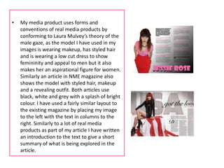
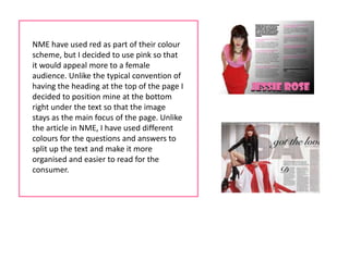
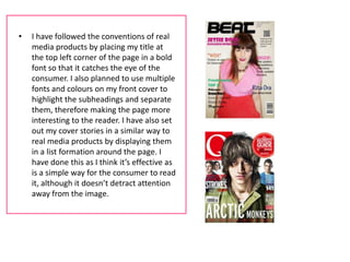
In what ways does my media
 product use, develop or challenge
forms and conventions of real media
             products?
•   My media product uses forms and
    conventions of real media products by
    conforming to Laura Mulvey’s theory of the
    male gaze, as the model I have used in my
    images is wearing makeup, has styled hair
    and is wearing a low cut dress to show
    femininity and appeal to men but it also
    makes her an aspirational figure for women.
    Similarly an article in NME magazine also
    shows the model with styled hair, makeup
    and a revealing outfit. Both articles use
    black, white and grey with a splash of bright
    colour. I have used a fairly similar layout to
    the existing magazine by placing my image
    to the left with the text in columns to the
    right. Similarly to a lot of real media
    products as part of my article I have written
    an introduction to the text to give a short
    summary of what is being explored in the
    article.
NME have used red as part of their colour
scheme, but I decided to use pink so that
it would appeal more to a female
audience. Unlike the typical convention of
having the heading at the top of the page I
decided to position mine at the bottom
right under the text so that the image
stays as the main focus of the page. Unlike
the article in NME, I have used different
colours for the questions and answers to
split up the text and make it more
organised and easier to read for the
consumer.
•   I have followed the conventions of real
    media products by placing my title at
    the top left corner of the page in a bold
    font so that it catches the eye of the
    consumer. I also planned to use multiple
    fonts and colours on my front cover to
    highlight the subheadings and separate
    them, therefore making the page more
    interesting to the reader. I have also set
    out my cover stories in a similar way to
    real media products by displaying them
    in a list formation around the page. I
    have done this as I think it’s effective as
    is a simple way for the consumer to read
    it, although it doesn’t detract attention
    away from the image.

Question 1 evaluation

  • 1.
    In what waysdoes my media product use, develop or challenge forms and conventions of real media products?
  • 3.
    My media product uses forms and conventions of real media products by conforming to Laura Mulvey’s theory of the male gaze, as the model I have used in my images is wearing makeup, has styled hair and is wearing a low cut dress to show femininity and appeal to men but it also makes her an aspirational figure for women. Similarly an article in NME magazine also shows the model with styled hair, makeup and a revealing outfit. Both articles use black, white and grey with a splash of bright colour. I have used a fairly similar layout to the existing magazine by placing my image to the left with the text in columns to the right. Similarly to a lot of real media products as part of my article I have written an introduction to the text to give a short summary of what is being explored in the article.
  • 4.
    NME have usedred as part of their colour scheme, but I decided to use pink so that it would appeal more to a female audience. Unlike the typical convention of having the heading at the top of the page I decided to position mine at the bottom right under the text so that the image stays as the main focus of the page. Unlike the article in NME, I have used different colours for the questions and answers to split up the text and make it more organised and easier to read for the consumer.
  • 5.
    I have followed the conventions of real media products by placing my title at the top left corner of the page in a bold font so that it catches the eye of the consumer. I also planned to use multiple fonts and colours on my front cover to highlight the subheadings and separate them, therefore making the page more interesting to the reader. I have also set out my cover stories in a similar way to real media products by displaying them in a list formation around the page. I have done this as I think it’s effective as is a simple way for the consumer to read it, although it doesn’t detract attention away from the image.