JamesLeeder
The font type usedinthis
magazine isthe serif fontstyle,
thisisbecause itis presentedasa
professionaluse of textand
appealstothe formal audience of
school students.The masthead
usesthe serif fontstyle asitis well
seenandcan appeal to both
genders.Thisfrontcoverhas
includedacolourfull andclear
designnotonlymakingiteasyto
readbut in orderto grab the
reader’sattentionwhichwill
entice the audience toreadon
throughthe magazine.
The layoutof the magazine has
beendesignedspecificallyinorder
to follow the route of the eye,this
isshownto us by the masthead
beinglocatedinbiglettersatthe
top of the page followedbythe
image takingplace onthe middle
of the page inorder to grab the
reader’sattention,followingthe
mainimage isthe cover line this
presentsanideawhatmay be
includedinthe magazine.
Image-The shottype usedinthisfrontcoverisknownas a mid-shotphoto,i have identifiedthisas
the picture showsbothchildrenclose enoughinordertosee facial expressionshoweverthe shot
type alsoallowsthe readertosee the surroundingareaand there clothing.Havingtheminthe
centre of the shotallowsforroomaround the edge inorderto put the mast headand the
subheadingswithoutcoveringany detailsof the picture.
Colourscheme-Alsoknownashouse stylethismakesthe magazine easilyidentifiable,thisspecific
colourscheme isinformal thisisbecause the magazine isaimedatthe youngeraudienceand
therefore doesnotneedtobe formal.The colourscheme usedonthisspecificmagazineisabright
eye catchingmulti-colouredfrontcoverwhichwill appealperfectlytothe audience.
Conventions-Thelayoutof the frontcoverisconventional,thismeansthatitissimilartoa lot of
othermagazines.i knowthisbecause itiseasyto see thatit followsthe traditional magazine layout
whichisthe Mast headtoppingthe page followedbythe mainimage whichiscentrednotcovered
by anythingbackedupbythe subheadings.
JamesLeeder
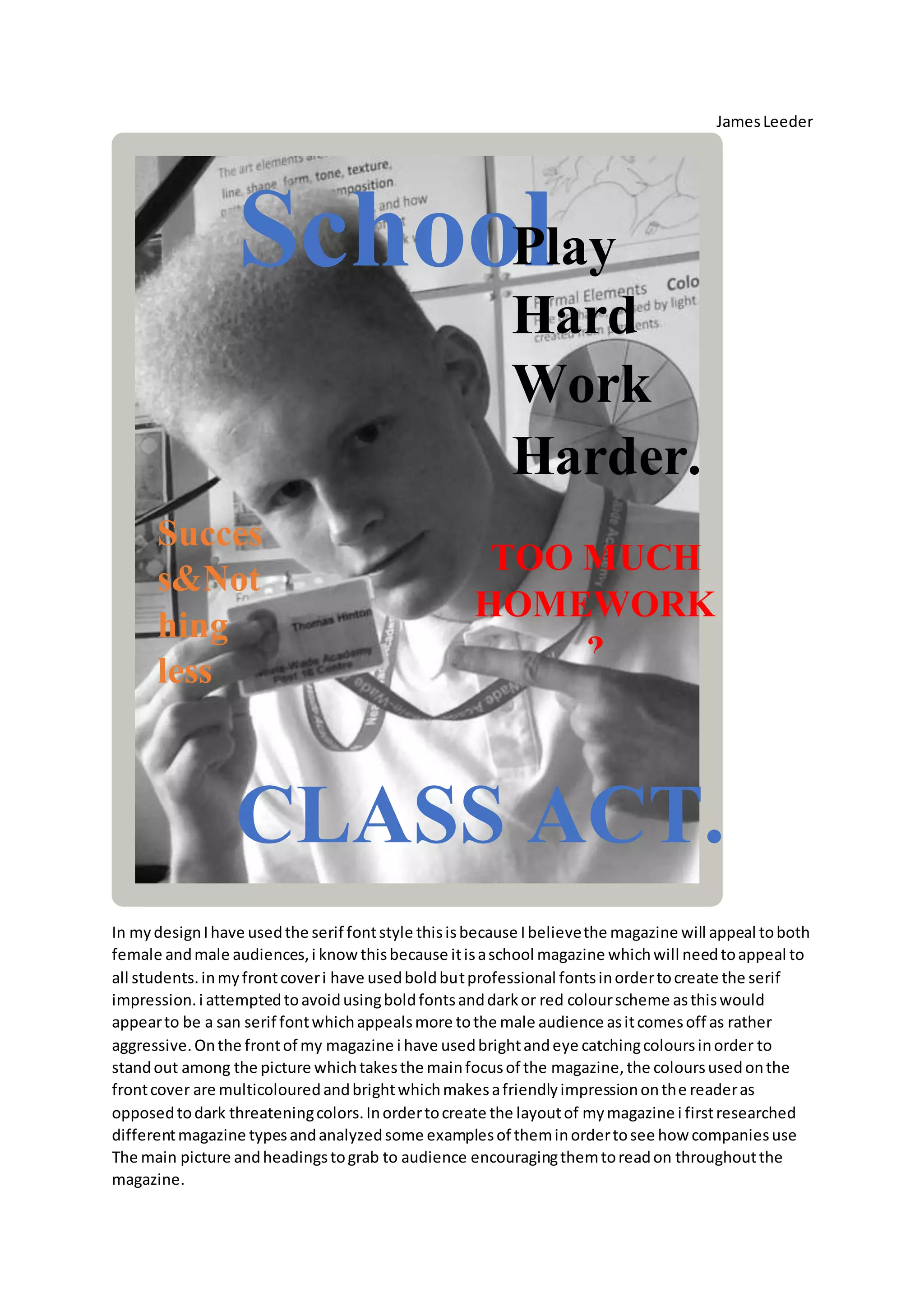
In mydesignIhave usedthe serif fontstyle thisisbecause Ibelievethe magazine will appeal toboth
female andmale audiences,i knowthisbecause itisaschool magazine whichwill needtoappeal to
all students.inmyfrontcoveri have usedboldbutprofessional fontsinordertocreate the serif
impression.i attemptedtoavoidusingboldfontsanddarkor red colourscheme asthiswould
appearto be a san serif fontwhichappealsmore tothe male audience asitcomesoff as rather
aggressive.Onthe frontof my magazine i have usedbrightandeye catchingcoloursinorder to
standout among the picture whichtakesthe mainfocusof the magazine,the coloursusedonthe
frontcover are multicolouredandbrightwhichmakesafriendlyimpressiononthe readeras
opposedtodark threateningcolors.Inordertocreate the layoutof mymagazine i firstresearched
differentmagazine typesandanalyzedsome examplesof theminordertosee how companiesuse
The main picture andheadingstograb to audience encouragingthemtoreadon throughoutthe
magazine.
CLASS ACT.
School
weekly.
TOO MUCH
HOMEWORK
?
Play
Hard
Work
Harder.
Succes
s&Not
hing
less
JamesLeeder
I came to the conclusioni will use the picture asthe centre of the magazine withthe headingatthe
top of the page followedbythe subheadingsandthe bannerwithtextatthe bottom.Thisdesign
followswhat'sknownasthe route of the eye,thisisthe wayyourbody naturallyreadssomething
whenlookingatthe magazine coveryoureyeswill naturallyfollow azpattern.I have designedmy
magazine inthiswayinorder to create a clear,orderedandunclutteredfrontcovermakingsure
everythingisinasuitable positionandnone of the image isbeingblocked.The shottype i have used
for myfront coverisknownas a mid-shot,thisisbecause the shotisfromthe body(shoulders)
upwards.Thisspecificshottype isusedinorderto helpthe audience focusmainlyonthe image and
put the mainconcentrationonthe style andfacial expressionsof saidpersoninthe image.Ihave
useda blackand white effectoverthe picture inordertocreate a greaterfocus onthe detail of the
picture andalso adda level/senseof classiness.Howeverthe fontcoloursusedonthe frontcover
are brightand vibrant,thisisbecause the targetaudience ismostlikelytobe kids/teensthatbeing
because it'sa school magazine. Thistargetaudience ismore likelytoappeal tobrighteye catching
colourswitheye catchingimagesincludedthenamore standardlacklustermagazine cover.Ibelieve
my designisconventional becausesimilarlayoutsare usedinmanymore popularmagazine brands.
The front coveri have analysedabove alsoincludesthingssuchaseye catchingfontcoloursandthe
serif fontstyle thisisbecause there magazinealsoappealstobothgendersandwill needtomake a
goodimpressiononthe age range of students.i believebothmymagazine andthe one i have
analysedinclude amix of informal andformal textsthisisdowntothe age range of the audience.
The real magazine coverispresentedinaslightlymore professionalwayasithas to setan example
to the school childrenasmine tendstoofferadvice frommaybe one studentstothe restof his/her
peers.

Mediatransitional.docx

  • 1.
    JamesLeeder The font typeusedinthis magazine isthe serif fontstyle, thisisbecause itis presentedasa professionaluse of textand appealstothe formal audience of school students.The masthead usesthe serif fontstyle asitis well seenandcan appeal to both genders.Thisfrontcoverhas includedacolourfull andclear designnotonlymakingiteasyto readbut in orderto grab the reader’sattentionwhichwill entice the audience toreadon throughthe magazine. The layoutof the magazine has beendesignedspecificallyinorder to follow the route of the eye,this isshownto us by the masthead beinglocatedinbiglettersatthe top of the page followedbythe image takingplace onthe middle of the page inorder to grab the reader’sattention,followingthe mainimage isthe cover line this presentsanideawhatmay be includedinthe magazine. Image-The shottype usedinthisfrontcoverisknownas a mid-shotphoto,i have identifiedthisas the picture showsbothchildrenclose enoughinordertosee facial expressionshoweverthe shot type alsoallowsthe readertosee the surroundingareaand there clothing.Havingtheminthe centre of the shotallowsforroomaround the edge inorderto put the mast headand the subheadingswithoutcoveringany detailsof the picture. Colourscheme-Alsoknownashouse stylethismakesthe magazine easilyidentifiable,thisspecific colourscheme isinformal thisisbecause the magazine isaimedatthe youngeraudienceand therefore doesnotneedtobe formal.The colourscheme usedonthisspecificmagazineisabright eye catchingmulti-colouredfrontcoverwhichwill appealperfectlytothe audience. Conventions-Thelayoutof the frontcoverisconventional,thismeansthatitissimilartoa lot of othermagazines.i knowthisbecause itiseasyto see thatit followsthe traditional magazine layout whichisthe Mast headtoppingthe page followedbythe mainimage whichiscentrednotcovered by anythingbackedupbythe subheadings.
  • 2.
    JamesLeeder In mydesignIhave usedtheserif fontstyle thisisbecause Ibelievethe magazine will appeal toboth female andmale audiences,i knowthisbecause itisaschool magazine whichwill needtoappeal to all students.inmyfrontcoveri have usedboldbutprofessional fontsinordertocreate the serif impression.i attemptedtoavoidusingboldfontsanddarkor red colourscheme asthiswould appearto be a san serif fontwhichappealsmore tothe male audience asitcomesoff as rather aggressive.Onthe frontof my magazine i have usedbrightandeye catchingcoloursinorder to standout among the picture whichtakesthe mainfocusof the magazine,the coloursusedonthe frontcover are multicolouredandbrightwhichmakesafriendlyimpressiononthe readeras opposedtodark threateningcolors.Inordertocreate the layoutof mymagazine i firstresearched differentmagazine typesandanalyzedsome examplesof theminordertosee how companiesuse The main picture andheadingstograb to audience encouragingthemtoreadon throughoutthe magazine. CLASS ACT. School weekly. TOO MUCH HOMEWORK ? Play Hard Work Harder. Succes s&Not hing less
  • 3.
    JamesLeeder I came tothe conclusioni will use the picture asthe centre of the magazine withthe headingatthe top of the page followedbythe subheadingsandthe bannerwithtextatthe bottom.Thisdesign followswhat'sknownasthe route of the eye,thisisthe wayyourbody naturallyreadssomething whenlookingatthe magazine coveryoureyeswill naturallyfollow azpattern.I have designedmy magazine inthiswayinorder to create a clear,orderedandunclutteredfrontcovermakingsure everythingisinasuitable positionandnone of the image isbeingblocked.The shottype i have used for myfront coverisknownas a mid-shot,thisisbecause the shotisfromthe body(shoulders) upwards.Thisspecificshottype isusedinorderto helpthe audience focusmainlyonthe image and put the mainconcentrationonthe style andfacial expressionsof saidpersoninthe image.Ihave useda blackand white effectoverthe picture inordertocreate a greaterfocus onthe detail of the picture andalso adda level/senseof classiness.Howeverthe fontcoloursusedonthe frontcover are brightand vibrant,thisisbecause the targetaudience ismostlikelytobe kids/teensthatbeing because it'sa school magazine. Thistargetaudience ismore likelytoappeal tobrighteye catching colourswitheye catchingimagesincludedthenamore standardlacklustermagazine cover.Ibelieve my designisconventional becausesimilarlayoutsare usedinmanymore popularmagazine brands. The front coveri have analysedabove alsoincludesthingssuchaseye catchingfontcoloursandthe serif fontstyle thisisbecause there magazinealsoappealstobothgendersandwill needtomake a goodimpressiononthe age range of students.i believebothmymagazine andthe one i have analysedinclude amix of informal andformal textsthisisdowntothe age range of the audience. The real magazine coverispresentedinaslightlymore professionalwayasithas to setan example to the school childrenasmine tendstoofferadvice frommaybe one studentstothe restof his/her peers.