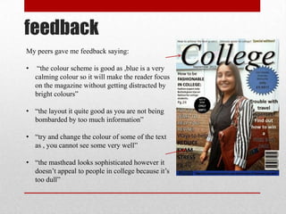
evaluation
To produce my magazine cover I first took my
picture using a camera and uploaded it onto my
computer.
I used power point because it was easier for me
to use than publisher as, it is more straight
forward. By using power point I could be more
creative with my fonts making my magazine
cover more appealing .
Layout
I used the photograph that I took as the
background of my magazine cover to make it a
dominant image. Also I placed text around the
model in the photograph.
I placed the pug on the right hand side slightly
covering the masthead to make it stand out and
gives a more 3D effect therefore making it look
more professional.
Choice of image
I took a photograph of a college student as It is relevant to the genre of the
magazine and, will let the you know who it is aimed at and what it will be
about. Also, I took a medium shot of the girl to reveal that she is holding a
bag which makes the magazine look smart therefore more professional.
Colour
I used a colour scheme of black ,white and blue. Because it went well with
my dominant image and made my magazine cover more appealing, thus
making it sell more.
Font
I used a sophisticated font for my masthead to make the magazine appear
smart which also links with the magazines genre. The rest of the text were
all the same font so that it didn’t look untidy.
Text
I made my masthead the largest font on my magazine cover so that it stood
out and the audience knows it’s the title of the magazine.
Some words are made larger than other words to emphasize them so that
the reader is drawn to them.
feedback
My peers gave me feedback saying:
• “the colour scheme is good as ,blue is a very
calming colour so it will make the reader focus
on the magazine without getting distracted by
bright colours”
• “the layout it quite good as you are not being
bombarded by too much information”
• “try and change the colour of some of the text
as , you cannot see some very well”
• “the masthead looks sophisticated however it
doesn’t appeal to people in college because it’s
too dull”

Evaluation

  • 1.
  • 2.
    To produce mymagazine cover I first took my picture using a camera and uploaded it onto my computer. I used power point because it was easier for me to use than publisher as, it is more straight forward. By using power point I could be more creative with my fonts making my magazine cover more appealing . Layout I used the photograph that I took as the background of my magazine cover to make it a dominant image. Also I placed text around the model in the photograph. I placed the pug on the right hand side slightly covering the masthead to make it stand out and gives a more 3D effect therefore making it look more professional.
  • 3.
    Choice of image Itook a photograph of a college student as It is relevant to the genre of the magazine and, will let the you know who it is aimed at and what it will be about. Also, I took a medium shot of the girl to reveal that she is holding a bag which makes the magazine look smart therefore more professional. Colour I used a colour scheme of black ,white and blue. Because it went well with my dominant image and made my magazine cover more appealing, thus making it sell more. Font I used a sophisticated font for my masthead to make the magazine appear smart which also links with the magazines genre. The rest of the text were all the same font so that it didn’t look untidy. Text I made my masthead the largest font on my magazine cover so that it stood out and the audience knows it’s the title of the magazine. Some words are made larger than other words to emphasize them so that the reader is drawn to them.
  • 4.
    feedback My peers gaveme feedback saying: • “the colour scheme is good as ,blue is a very calming colour so it will make the reader focus on the magazine without getting distracted by bright colours” • “the layout it quite good as you are not being bombarded by too much information” • “try and change the colour of some of the text as , you cannot see some very well” • “the masthead looks sophisticated however it doesn’t appeal to people in college because it’s too dull”