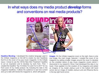
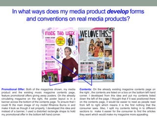
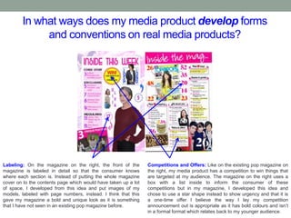
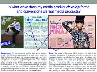
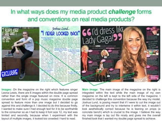
SlideShare a Scribd company logo
1 of 14
QUESTION ONE.
In what ways does your media product use, develop and
challenge forms and conventions on real media
products?
In what ways does my media product use forms and
conventions on real media products?
Body Language/Model: On my pop music magazine cover
photo, my model Olivia has a pose which shows her hand on
her hip as she looks at the camera. This is similar to Katy
Perry’s pose in InStyle and they both show confidence and
boldness which would appeal to my target audience of young
women who may be looking for this in their role models. Like on
the InStyle picture of Katy Perry, my model has pink hair which
fits in with femininity within my target audience which is
primarily female.
Headlines: On my pop music magazine cover, I did my
headlines with alternating colours of purple and black so that the
magazine seemed less boring and that the headline and
description of the article were both separate. This is similar to the
InStyle magazines headlines which alternate between light pink
and black for the same reason. I chose to use purple over pink
because it fit more with my colour scheme. Also, like on the
InStyle cover and on many pop magazines, the headlines on my
magazine fit around the model to make the magazine seem fuller.
In what ways does my media product use forms and
conventions on real media products?
Masthead: Both of the magazines shown, my own pop music
magazine and Top Of The Pops, feature similar mastheads.
They both have a pink font to fit in with the feminine ideas of
the target audience and they both have curvy fonts which fit in
with the idea of informality and youth. The font means that the
magazine does not come across as too formal but it also
appears to be finished and like it is a reputable magazine. It is
important to look reputable and distinguished as it reflects on
the content that is within the magazine.
Headline: Like on the Top Of The Pops magazine, my cover had
a circle shape on the right-hand side which has a headline in the
centre of it. It is a way of filling space on the magazine, adding
colour and adding another headline. It also makes the magazine
seem less formal and more abstract which relates to the age of
my target audience which is primarily young people. The pink and
purple of my circle shape relates back to the fact that my
audience will be mostly female as these colours are
stereotypically feminine.
In what ways does my media product use forms and
conventions on real media products?
Promotional Offer: Both of the magazines shown, my media
product and the existing music magazine contents page,
feature promotional offers giving away posters. Giveaways in a
magazine means they are more likely to be bought by a
potential consumer because they feel as though the magazine
is rewarding and gives them something from buying it. As my
target audience is younger females, the posters are a good way
to target them as this age group are more likely to want to get
posters than an older and more mature audience.
Background: Like on the existing pop magazine on the right, my
media product had a white rectangular shape backed my a
colourful background as the foundation of the contents page. The
magazine contents page on the left has a pink square backing
the white rectangle that all of the text is on while my background
follows a similar idea with an abstract purple and pink paint
splattered background. Once again, the colours chosen are to
relate back to the idea of femininity and target my intended
audience.
In what ways does my media product use forms and
conventions on real media products?
Title: In my media products contents page on the left, I chose
the title ‘Inside This Week’ to be at the top of the page. Beside
my magazine on the right, is an existing magazine that has
chosen ‘Inside The Mag…’ to title its own contents page. I
chose to use this title because it is common within pop music
magazines which means that I am sticking to and using the
conventions and forms of this genre. The colours, hot pink and
white, are used on both magazines to fit with the colour
schemes and make sure that the correct audience is targeted.
Layout: I chose to use boxed off sections to make it look more
finished and fit the conventions and typical layouts of this music
magazine genre. The layout is clear and ensures that the
magazine is easy to navigate as if it is too complex, people are
unlikely to buy it as they wont be able to find the articles they
bought the magazine for. Also, because the targeted audience
are teenagers to people in their early twenties, it allows them too
see upfront that there is a lot of content within the magazine so
that they don’t think the magazine will bore them.
In what ways does my media product use forms and
conventions on real media products?
Layout: The layout of the magazines have three obvious
similarities; the main image takes up the space on the left of the
double-page spread, the article is split in to three columns with
alternating colours and the title of the magazine is at the top of
the article. I chose the magazine on the right to base my
magazine on and develop from it as I think that the features
used create formality within the layout to make it look
professional while still targeting and relating an informal target
audience which is what I need to focus the most on doing.
Article Title: The title of my magazine on the left and the
magazine on the right are very similar. They are both split in to
two sections: the first being the name of the artist on the top and
the second being the tagline below it. The name of the artist is in
italics and a smaller, darker font than the main body of the title as
it makes it seem more creative and interesting. The tagline of the
title is done in a colour that fits the colour scheme, in both
magazines shown, which ensures that all of the colours on the
page complement each other – an important thing to consider
when creating a magazine.
In what ways does my media product use forms and
conventions on real media products?
Pose: Both of the models on the magazine are posed in
creative ways that don’t make them seem like they are boring
artists. My model Josh is in a very open position; with his body
facing forwards, his legs separated and one resting in a bent
position and his arms loosely crossed. The openness of the
pose means that the magazine is reflected in that way – it
positively affects the way the magazine is perceived which
means it will seem more appealing to a potential consumer. The
way Justin Bieber is posed in the magazine on the right reflects
the same values and attitudes.
Colour Scheme: Both of the magazines use bold colours within
their colour scheme that are stereotypically masculine; the
magazine on the right using red and the magazine on the left
using green and blue. The bold colours keep the young target
audience engaged and show that the magazine is not boring or
monotonous within its articles. By keeping to one colour scheme,
it means that the colours work well together and compliment each
other so the magazine does not seem to be too overpowering in
its presentation. A bold colour scheme also shows a lack of
formality which is an important need within my target audience.
In what ways does my media product develop forms
and conventions on real media products?
Headline Wording: I developed the creative language used in
the InStyle magazine on the left to create my own headlines
that fit on the cover of my pop music magazine. In the InStyle
issue, I chose to use the ‘2012s New Skin Treatment’ headline
to act as inspiration and to develop my work from. Then, I
created the headline ‘Top 10 Artists To Look For In 2017’ for my
front cover of my media product. By including the date in the
magazine headlines, it allows the audience to see how current
and up to date with trends the magazine is, which will appeal.
Images: On the InStyle magazine cover on the right, there is only
one image, the main image, featured. I created the cover of my
magazine by adding smaller images around the cover to develop
on the crowded nature of pop music magazine covers (which I
discovered in my research). Once I had developed this idea in my
head, I then applied it to the creation of my magazine and added
an imagine of my model Joshua Lund in the bottom left hand
corner and an image of models Joshua Lund and Rhianna Burns
in the top right hand corner.
In what ways does my media product develop forms
and conventions on real media products?
Promotional Offer: Both of the magazines shown, my media
product and the existing music magazine contents page,
feature promotional offers giving away posters. On the already
circulating magazine on the right, the poster layout is in a
banner across the bottom of the contents page. To ensure that I
could fit the main image of my model Rhianna Burns in and
make it look as though it sat properly, I developed this idea and
instead of a banner, I used a distorted rectangle shape to hold
my promotional offer in the bottom left hand corner.
Contents: On the already existing magazine contents page on
the right , the contents are listed on a box on the bottom left hand
corner. I developed from this idea and put my contents listed
down the left of the page. I thought that if it was positioned there
on the contents page, it would be easier to read as people read
from left to right which means it is the first nothing that the
consumer sees. Also, I split my contents listing in to different
sections to make it easier for the consumer to find the articles
they want which would make my magazine more appealing.
In what ways does my media product develop forms
and conventions on real media products?
Labeling: On the magazine on the right, the front of the
magazine is labeled in detail so that the consumer knows
where each section is. Instead of putting the whole magazine
cover on to the contents page which would have taken up a lot
of space, I developed from this idea and put images of my
models, labeled with page numbers, instead. I think that this
gave my magazine a bold and unique look as it is something
that I have not seen in an existing pop magazine before.
Competitions and Offers: Like on the existing pop magazine on
the right, my media product has a competition to win things that
are targeted at my audience. The magazine on the right uses a
box with a list inside to inform the consumer of these
competitions but in my magazine, I developed this idea and
chose to use a star shape instead to show urgency and that it is
a one-time offer I believe the way I lay my competition
announcement out is appropriate as it has bold colours and isn’t
in a formal format which relates back to my younger audience.
In what ways does my media product develop forms
and conventions on real media products?
Background: On the magazine on the right which features
singer Nicki Minaj, the background is a solid peach colour so
that the background does not overwhelm too much and so it
relates back to femininity and target audience. When creating
my background, I developed from this and related my the
colour choice to ideas of masculinity and it would portray Josh
as manly which is a key selling point when the target audience
is primarily female. The use of these colours target the age
groups increasing interest in boys and relationships. To make it
more unique I used a brush tool rather than block colour.
Pose: The image of the singer Nicki Minaj on the right of the
magazine comparison is large and almost in the centre of the
magazine, veering more to the right hand side. I developed from
this idea of a larger main image when creating my magazine and
put a full sized image of my model, Joshua Lund, on the left hand
side. The pose, bent arms and a serious facial expression
(looking in to the camera with a closed mouth and a stern look)
was also developed on from this magazine. Nicki has her arm
bent in the air and looking in to the camera yet Josh has his arms
bent, resting on his leg, which is how I developed from this idea.
In what ways does my media product challenge forms
and conventions on real media products?
Background: The background of the music magazine cover
that I created on the left challenges the idea of the conventions
of this genre. It does this as most backgrounds are solid block
colour, usually white, as to not distract the consumer from the
headlines. I challenged this idea as my background was
created with a light pink and purple watercolour brush tool
(downloaded from Brusheezy). I don’t believe that this distracts
the consumer from the headlines are they are pastel colours so
I think I was successful.
Masthead: Commonly on pop music magazine covers, if the
image overlaps the masthead, the masthead is usually brought to
the back as to prioritise the image. This means that the masthead
ends up laying being an image. I didn’t choose to do this on my
own magazine, on the left, as the part of the main image that was
covered, my model Olivia Richardson’s hair bun, was not a crucial
part of the image. I decided from this that I was not going to bring
the masthead to lie behind the image. This challenged traditional
layout conventions.
In what ways does my media product challenge forms
and conventions on real media products?
Main image: On the magazine on the right which is an existing
contents page from a Top Of The Pops issue, no main image is
featured which is challenged on my own media product on the
left. My pop music magazine contents page features six images
in total, 5 smaller images and 1 main image of my model
Rhianna Burns in the bottom right hand corner. I decided to
challenge this because I though one larger main image would
look better to my younger audience as it means that the
contents page is more image based that text based.
Content: On the already existing magazine contents page on the
right, there is a section for ‘Celebs and Gossip’ which I decided
not to include. I decided to go against including celebrity gossip
its own separate section in my contents page because it would
make it appear as more of a lifestyle magazine like OK! and
Woman magazine rather than like a pop music magazine.
Although I have listed gossip implying headlines like ‘Who wore it
best?’, I have not given them their own section on the3 contents
page which is how I challenged it.
In what ways does my media product challenge forms
and conventions on real media products?
Images: On the magazine on the right which features singer
Leona Lewis, there are 6 images within the double page spread
rather than the single image featured on mine. It is common
convention and form of a pop music magazine double page
spread to feature more than one image but I decided to go
against this and challenge it. I decided to do this because firstly,
I wanted to make sure I had enough text for it to be worthwhile
to the consumer so as I had to keep it font size 12, my text was
limited and secondly, because when I experiment with the
layout of multiple images, it looked too crowded / hard to read.
Main Image: The main image of the magazine on the right is
integrated within the text while the main image of my own
magazine on the left is kept to the left side of the magazine. I
decided to challenge this convention because the way my model,
Joshua Lund, is posing meant that if I were to cut the image out
of the background and try to intertwine it within text, it wouldn’t
look aesthetically correct because he is leaning on props (a
concrete bench) which is crucial to the image. I believe the way
my main image is lay out fits nicely and gives me the overall
finished look that I wanted my double page spread to achieve.

More Related Content

What's hot

AS Media Final Evaluation
AS Media  Final EvaluationAS Media  Final Evaluation
AS Media Final EvaluationNav Man
 
Media evaluation
Media evaluationMedia evaluation
Media evaluationOllySnowxx
 
Media Evaluation
Media EvaluationMedia Evaluation
Media Evaluationfitton92
 
Evaluation of Simply Pop Magazine
Evaluation of Simply Pop MagazineEvaluation of Simply Pop Magazine
Evaluation of Simply Pop Magazinejessicamaythorpe
 
Media studies magazine evaluation
Media studies   magazine evaluationMedia studies   magazine evaluation
Media studies magazine evaluationjessiemc
 
Kieron's Media evaluation
Kieron's Media evaluationKieron's Media evaluation
Kieron's Media evaluationKieronSava
 
Music mag evaluation
Music mag evaluationMusic mag evaluation
Music mag evaluationewalshatprior
 
Media evaluation
Media evaluationMedia evaluation
Media evaluationOllySnowxx
 
Media Evaluation 2
Media Evaluation 2Media Evaluation 2
Media Evaluation 2LaurenBC
 
AS Media Studies Music Magazine Evaluation
AS Media Studies Music Magazine EvaluationAS Media Studies Music Magazine Evaluation
AS Media Studies Music Magazine EvaluationSundasBostan
 
Evaluation - james pinnock
Evaluation -  james pinnockEvaluation -  james pinnock
Evaluation - james pinnockJPinnock
 
Question 1
Question 1Question 1
Question 1bet kei
 

What's hot (19)

AS Media Final Evaluation
AS Media  Final EvaluationAS Media  Final Evaluation
AS Media Final Evaluation
 
Media evaluation
Media evaluationMedia evaluation
Media evaluation
 
Unit 13 - L02
Unit 13 - L02 Unit 13 - L02
Unit 13 - L02
 
Evaluation powerpoint
Evaluation powerpointEvaluation powerpoint
Evaluation powerpoint
 
Media Evaluation
Media EvaluationMedia Evaluation
Media Evaluation
 
Evaluation of Simply Pop Magazine
Evaluation of Simply Pop MagazineEvaluation of Simply Pop Magazine
Evaluation of Simply Pop Magazine
 
Evaluation
EvaluationEvaluation
Evaluation
 
Media studies magazine evaluation
Media studies   magazine evaluationMedia studies   magazine evaluation
Media studies magazine evaluation
 
Kieron's Media evaluation
Kieron's Media evaluationKieron's Media evaluation
Kieron's Media evaluation
 
Powerpoint Evaluation
Powerpoint EvaluationPowerpoint Evaluation
Powerpoint Evaluation
 
Music mag evaluation
Music mag evaluationMusic mag evaluation
Music mag evaluation
 
Media evaluation
Media evaluationMedia evaluation
Media evaluation
 
Evaluation
EvaluationEvaluation
Evaluation
 
Media Studies Magazine Evaluation
Media Studies Magazine EvaluationMedia Studies Magazine Evaluation
Media Studies Magazine Evaluation
 
Media Evaluation 2
Media Evaluation 2Media Evaluation 2
Media Evaluation 2
 
AS Media Studies Music Magazine Evaluation
AS Media Studies Music Magazine EvaluationAS Media Studies Music Magazine Evaluation
AS Media Studies Music Magazine Evaluation
 
Evaluation - james pinnock
Evaluation -  james pinnockEvaluation -  james pinnock
Evaluation - james pinnock
 
Question 1
Question 1Question 1
Question 1
 
Media Evaluation Final
Media Evaluation FinalMedia Evaluation Final
Media Evaluation Final
 

Viewers also liked

19730119 sobre estar cuerdo en centros para no cuerdos. rosenhan
19730119 sobre estar cuerdo en centros para no cuerdos. rosenhan19730119 sobre estar cuerdo en centros para no cuerdos. rosenhan
19730119 sobre estar cuerdo en centros para no cuerdos. rosenhangaloagustinsanchez
 
טיפול בעזרת כלבים כבא
טיפול בעזרת כלבים כבאטיפול בעזרת כלבים כבא
טיפול בעזרת כלבים כבאkabadogs
 
Webinar un caso real de it service management atlassian
Webinar un caso real de it service management atlassianWebinar un caso real de it service management atlassian
Webinar un caso real de it service management atlassianatSistemas
 
Motivarnos presentación funcional
Motivarnos   presentación funcionalMotivarnos   presentación funcional
Motivarnos presentación funcionalGamifica
 
21. Утварэнне беларускай народнасці
21. Утварэнне беларускай народнасці21. Утварэнне беларускай народнасці
21. Утварэнне беларускай народнасціAnastasiyaF
 
Вътрешното спокойствие. Как да постигнем спокойствие
Вътрешното спокойствие. Как да постигнем спокойствиеВътрешното спокойствие. Как да постигнем спокойствие
Вътрешното спокойствие. Как да постигнем спокойствиеГеорги Календеров
 
Beware! DIRTY DATA CAN ADVERSELY IMPACT YOUR BOTTOM LINE
Beware! DIRTY DATA CAN ADVERSELY IMPACT YOUR BOTTOM LINEBeware! DIRTY DATA CAN ADVERSELY IMPACT YOUR BOTTOM LINE
Beware! DIRTY DATA CAN ADVERSELY IMPACT YOUR BOTTOM LINEtechnodatagroup
 

Viewers also liked (8)

19730119 sobre estar cuerdo en centros para no cuerdos. rosenhan
19730119 sobre estar cuerdo en centros para no cuerdos. rosenhan19730119 sobre estar cuerdo en centros para no cuerdos. rosenhan
19730119 sobre estar cuerdo en centros para no cuerdos. rosenhan
 
טיפול בעזרת כלבים כבא
טיפול בעזרת כלבים כבאטיפול בעזרת כלבים כבא
טיפול בעזרת כלבים כבא
 
ARQUEOPINTO
ARQUEOPINTOARQUEOPINTO
ARQUEOPINTO
 
Webinar un caso real de it service management atlassian
Webinar un caso real de it service management atlassianWebinar un caso real de it service management atlassian
Webinar un caso real de it service management atlassian
 
Motivarnos presentación funcional
Motivarnos   presentación funcionalMotivarnos   presentación funcional
Motivarnos presentación funcional
 
21. Утварэнне беларускай народнасці
21. Утварэнне беларускай народнасці21. Утварэнне беларускай народнасці
21. Утварэнне беларускай народнасці
 
Вътрешното спокойствие. Как да постигнем спокойствие
Вътрешното спокойствие. Как да постигнем спокойствиеВътрешното спокойствие. Как да постигнем спокойствие
Вътрешното спокойствие. Как да постигнем спокойствие
 
Beware! DIRTY DATA CAN ADVERSELY IMPACT YOUR BOTTOM LINE
Beware! DIRTY DATA CAN ADVERSELY IMPACT YOUR BOTTOM LINEBeware! DIRTY DATA CAN ADVERSELY IMPACT YOUR BOTTOM LINE
Beware! DIRTY DATA CAN ADVERSELY IMPACT YOUR BOTTOM LINE
 

Similar to Media Evaluation - Question One.

Media Evaluation
Media EvaluationMedia Evaluation
Media Evaluationgeorgiai
 
Media music magazine evalutaion
Media music magazine evalutaionMedia music magazine evalutaion
Media music magazine evalutaionjess_hopee
 
Media music magazine evalutaion question 1
Media music magazine evalutaion question 1Media music magazine evalutaion question 1
Media music magazine evalutaion question 1georgia_daltonx
 
Media music magazine evalutaion question 1
Media music magazine evalutaion question 1Media music magazine evalutaion question 1
Media music magazine evalutaion question 1jess_hopee
 
Media music magazine evalutaion question 1
Media music magazine evalutaion question 1Media music magazine evalutaion question 1
Media music magazine evalutaion question 1jess_hopee
 
New media evaluation
New media evaluationNew media evaluation
New media evaluationJAAN12345
 
New media evaluation
New media evaluationNew media evaluation
New media evaluationJas1231
 
New media evaluation
New media evaluationNew media evaluation
New media evaluationasmaa786
 
New media evaluation
New media evaluationNew media evaluation
New media evaluationasmaa786
 
New media evaluation
New media evaluationNew media evaluation
New media evaluationasmaa786
 
AS Media Studies Music Magazine Evaluation
AS Media Studies Music Magazine EvaluationAS Media Studies Music Magazine Evaluation
AS Media Studies Music Magazine EvaluationMattCairns98
 
Media work - Sarah Hindle.
Media work - Sarah Hindle.Media work - Sarah Hindle.
Media work - Sarah Hindle.sarahhindle
 
Evaluation write up
Evaluation write upEvaluation write up
Evaluation write uppopk44
 
Evaluation
EvaluationEvaluation
EvaluationRach234
 

Similar to Media Evaluation - Question One. (20)

Media Evaluation
Media EvaluationMedia Evaluation
Media Evaluation
 
Media music magazine evalutaion
Media music magazine evalutaionMedia music magazine evalutaion
Media music magazine evalutaion
 
Media music magazine evalutaion question 1
Media music magazine evalutaion question 1Media music magazine evalutaion question 1
Media music magazine evalutaion question 1
 
Media music magazine evalutaion question 1
Media music magazine evalutaion question 1Media music magazine evalutaion question 1
Media music magazine evalutaion question 1
 
Media music magazine evalutaion question 1
Media music magazine evalutaion question 1Media music magazine evalutaion question 1
Media music magazine evalutaion question 1
 
New media evaluation
New media evaluationNew media evaluation
New media evaluation
 
Evaluation
EvaluationEvaluation
Evaluation
 
New media evaluation
New media evaluationNew media evaluation
New media evaluation
 
New media evaluation
New media evaluationNew media evaluation
New media evaluation
 
New media evaluation
New media evaluationNew media evaluation
New media evaluation
 
New media evaluation
New media evaluationNew media evaluation
New media evaluation
 
AS Media Studies Music Magazine Evaluation
AS Media Studies Music Magazine EvaluationAS Media Studies Music Magazine Evaluation
AS Media Studies Music Magazine Evaluation
 
Media work - Sarah Hindle.
Media work - Sarah Hindle.Media work - Sarah Hindle.
Media work - Sarah Hindle.
 
Evaluation write up
Evaluation write upEvaluation write up
Evaluation write up
 
Evaluation
EvaluationEvaluation
Evaluation
 
As g321
As g321As g321
As g321
 
Q 1
Q 1Q 1
Q 1
 
Evaluation
EvaluationEvaluation
Evaluation
 
Evaluation
EvaluationEvaluation
Evaluation
 
AS Media Evaluation
AS Media EvaluationAS Media Evaluation
AS Media Evaluation
 

Recently uploaded

Atmosphere science 7 quarter 4 .........
Atmosphere science 7 quarter 4 .........Atmosphere science 7 quarter 4 .........
Atmosphere science 7 quarter 4 .........LeaCamillePacle
 
Employee wellbeing at the workplace.pptx
Employee wellbeing at the workplace.pptxEmployee wellbeing at the workplace.pptx
Employee wellbeing at the workplace.pptxNirmalaLoungPoorunde1
 
ECONOMIC CONTEXT - PAPER 1 Q3: NEWSPAPERS.pptx
ECONOMIC CONTEXT - PAPER 1 Q3: NEWSPAPERS.pptxECONOMIC CONTEXT - PAPER 1 Q3: NEWSPAPERS.pptx
ECONOMIC CONTEXT - PAPER 1 Q3: NEWSPAPERS.pptxiammrhaywood
 
What is Model Inheritance in Odoo 17 ERP
What is Model Inheritance in Odoo 17 ERPWhat is Model Inheritance in Odoo 17 ERP
What is Model Inheritance in Odoo 17 ERPCeline George
 
Procuring digital preservation CAN be quick and painless with our new dynamic...
Procuring digital preservation CAN be quick and painless with our new dynamic...Procuring digital preservation CAN be quick and painless with our new dynamic...
Procuring digital preservation CAN be quick and painless with our new dynamic...Jisc
 
ACC 2024 Chronicles. Cardiology. Exam.pdf
ACC 2024 Chronicles. Cardiology. Exam.pdfACC 2024 Chronicles. Cardiology. Exam.pdf
ACC 2024 Chronicles. Cardiology. Exam.pdfSpandanaRallapalli
 
Crayon Activity Handout For the Crayon A
Crayon Activity Handout For the Crayon ACrayon Activity Handout For the Crayon A
Crayon Activity Handout For the Crayon AUnboundStockton
 
Introduction to ArtificiaI Intelligence in Higher Education
Introduction to ArtificiaI Intelligence in Higher EducationIntroduction to ArtificiaI Intelligence in Higher Education
Introduction to ArtificiaI Intelligence in Higher Educationpboyjonauth
 
MULTIDISCIPLINRY NATURE OF THE ENVIRONMENTAL STUDIES.pptx
MULTIDISCIPLINRY NATURE OF THE ENVIRONMENTAL STUDIES.pptxMULTIDISCIPLINRY NATURE OF THE ENVIRONMENTAL STUDIES.pptx
MULTIDISCIPLINRY NATURE OF THE ENVIRONMENTAL STUDIES.pptxAnupkumar Sharma
 
Hierarchy of management that covers different levels of management
Hierarchy of management that covers different levels of managementHierarchy of management that covers different levels of management
Hierarchy of management that covers different levels of managementmkooblal
 
Field Attribute Index Feature in Odoo 17
Field Attribute Index Feature in Odoo 17Field Attribute Index Feature in Odoo 17
Field Attribute Index Feature in Odoo 17Celine George
 
Proudly South Africa powerpoint Thorisha.pptx
Proudly South Africa powerpoint Thorisha.pptxProudly South Africa powerpoint Thorisha.pptx
Proudly South Africa powerpoint Thorisha.pptxthorishapillay1
 
Quarter 4 Peace-education.pptx Catch Up Friday
Quarter 4 Peace-education.pptx Catch Up FridayQuarter 4 Peace-education.pptx Catch Up Friday
Quarter 4 Peace-education.pptx Catch Up FridayMakMakNepo
 
AmericanHighSchoolsprezentacijaoskolama.
AmericanHighSchoolsprezentacijaoskolama.AmericanHighSchoolsprezentacijaoskolama.
AmericanHighSchoolsprezentacijaoskolama.arsicmarija21
 
Gas measurement O2,Co2,& ph) 04/2024.pptx
Gas measurement O2,Co2,& ph) 04/2024.pptxGas measurement O2,Co2,& ph) 04/2024.pptx
Gas measurement O2,Co2,& ph) 04/2024.pptxDr.Ibrahim Hassaan
 
HỌC TỐT TIẾNG ANH 11 THEO CHƯƠNG TRÌNH GLOBAL SUCCESS ĐÁP ÁN CHI TIẾT - CẢ NĂ...
HỌC TỐT TIẾNG ANH 11 THEO CHƯƠNG TRÌNH GLOBAL SUCCESS ĐÁP ÁN CHI TIẾT - CẢ NĂ...HỌC TỐT TIẾNG ANH 11 THEO CHƯƠNG TRÌNH GLOBAL SUCCESS ĐÁP ÁN CHI TIẾT - CẢ NĂ...
HỌC TỐT TIẾNG ANH 11 THEO CHƯƠNG TRÌNH GLOBAL SUCCESS ĐÁP ÁN CHI TIẾT - CẢ NĂ...Nguyen Thanh Tu Collection
 
ENGLISH6-Q4-W3.pptxqurter our high choom
ENGLISH6-Q4-W3.pptxqurter our high choomENGLISH6-Q4-W3.pptxqurter our high choom
ENGLISH6-Q4-W3.pptxqurter our high choomnelietumpap1
 
How to Configure Email Server in Odoo 17
How to Configure Email Server in Odoo 17How to Configure Email Server in Odoo 17
How to Configure Email Server in Odoo 17Celine George
 

Recently uploaded (20)

Atmosphere science 7 quarter 4 .........
Atmosphere science 7 quarter 4 .........Atmosphere science 7 quarter 4 .........
Atmosphere science 7 quarter 4 .........
 
Raw materials used in Herbal Cosmetics.pptx
Raw materials used in Herbal Cosmetics.pptxRaw materials used in Herbal Cosmetics.pptx
Raw materials used in Herbal Cosmetics.pptx
 
Employee wellbeing at the workplace.pptx
Employee wellbeing at the workplace.pptxEmployee wellbeing at the workplace.pptx
Employee wellbeing at the workplace.pptx
 
Model Call Girl in Bikash Puri Delhi reach out to us at 🔝9953056974🔝
Model Call Girl in Bikash Puri  Delhi reach out to us at 🔝9953056974🔝Model Call Girl in Bikash Puri  Delhi reach out to us at 🔝9953056974🔝
Model Call Girl in Bikash Puri Delhi reach out to us at 🔝9953056974🔝
 
ECONOMIC CONTEXT - PAPER 1 Q3: NEWSPAPERS.pptx
ECONOMIC CONTEXT - PAPER 1 Q3: NEWSPAPERS.pptxECONOMIC CONTEXT - PAPER 1 Q3: NEWSPAPERS.pptx
ECONOMIC CONTEXT - PAPER 1 Q3: NEWSPAPERS.pptx
 
What is Model Inheritance in Odoo 17 ERP
What is Model Inheritance in Odoo 17 ERPWhat is Model Inheritance in Odoo 17 ERP
What is Model Inheritance in Odoo 17 ERP
 
Procuring digital preservation CAN be quick and painless with our new dynamic...
Procuring digital preservation CAN be quick and painless with our new dynamic...Procuring digital preservation CAN be quick and painless with our new dynamic...
Procuring digital preservation CAN be quick and painless with our new dynamic...
 
ACC 2024 Chronicles. Cardiology. Exam.pdf
ACC 2024 Chronicles. Cardiology. Exam.pdfACC 2024 Chronicles. Cardiology. Exam.pdf
ACC 2024 Chronicles. Cardiology. Exam.pdf
 
Crayon Activity Handout For the Crayon A
Crayon Activity Handout For the Crayon ACrayon Activity Handout For the Crayon A
Crayon Activity Handout For the Crayon A
 
Introduction to ArtificiaI Intelligence in Higher Education
Introduction to ArtificiaI Intelligence in Higher EducationIntroduction to ArtificiaI Intelligence in Higher Education
Introduction to ArtificiaI Intelligence in Higher Education
 
MULTIDISCIPLINRY NATURE OF THE ENVIRONMENTAL STUDIES.pptx
MULTIDISCIPLINRY NATURE OF THE ENVIRONMENTAL STUDIES.pptxMULTIDISCIPLINRY NATURE OF THE ENVIRONMENTAL STUDIES.pptx
MULTIDISCIPLINRY NATURE OF THE ENVIRONMENTAL STUDIES.pptx
 
Hierarchy of management that covers different levels of management
Hierarchy of management that covers different levels of managementHierarchy of management that covers different levels of management
Hierarchy of management that covers different levels of management
 
Field Attribute Index Feature in Odoo 17
Field Attribute Index Feature in Odoo 17Field Attribute Index Feature in Odoo 17
Field Attribute Index Feature in Odoo 17
 
Proudly South Africa powerpoint Thorisha.pptx
Proudly South Africa powerpoint Thorisha.pptxProudly South Africa powerpoint Thorisha.pptx
Proudly South Africa powerpoint Thorisha.pptx
 
Quarter 4 Peace-education.pptx Catch Up Friday
Quarter 4 Peace-education.pptx Catch Up FridayQuarter 4 Peace-education.pptx Catch Up Friday
Quarter 4 Peace-education.pptx Catch Up Friday
 
AmericanHighSchoolsprezentacijaoskolama.
AmericanHighSchoolsprezentacijaoskolama.AmericanHighSchoolsprezentacijaoskolama.
AmericanHighSchoolsprezentacijaoskolama.
 
Gas measurement O2,Co2,& ph) 04/2024.pptx
Gas measurement O2,Co2,& ph) 04/2024.pptxGas measurement O2,Co2,& ph) 04/2024.pptx
Gas measurement O2,Co2,& ph) 04/2024.pptx
 
HỌC TỐT TIẾNG ANH 11 THEO CHƯƠNG TRÌNH GLOBAL SUCCESS ĐÁP ÁN CHI TIẾT - CẢ NĂ...
HỌC TỐT TIẾNG ANH 11 THEO CHƯƠNG TRÌNH GLOBAL SUCCESS ĐÁP ÁN CHI TIẾT - CẢ NĂ...HỌC TỐT TIẾNG ANH 11 THEO CHƯƠNG TRÌNH GLOBAL SUCCESS ĐÁP ÁN CHI TIẾT - CẢ NĂ...
HỌC TỐT TIẾNG ANH 11 THEO CHƯƠNG TRÌNH GLOBAL SUCCESS ĐÁP ÁN CHI TIẾT - CẢ NĂ...
 
ENGLISH6-Q4-W3.pptxqurter our high choom
ENGLISH6-Q4-W3.pptxqurter our high choomENGLISH6-Q4-W3.pptxqurter our high choom
ENGLISH6-Q4-W3.pptxqurter our high choom
 
How to Configure Email Server in Odoo 17
How to Configure Email Server in Odoo 17How to Configure Email Server in Odoo 17
How to Configure Email Server in Odoo 17
 

Media Evaluation - Question One.

  • 1. QUESTION ONE. In what ways does your media product use, develop and challenge forms and conventions on real media products?
  • 2. In what ways does my media product use forms and conventions on real media products? Body Language/Model: On my pop music magazine cover photo, my model Olivia has a pose which shows her hand on her hip as she looks at the camera. This is similar to Katy Perry’s pose in InStyle and they both show confidence and boldness which would appeal to my target audience of young women who may be looking for this in their role models. Like on the InStyle picture of Katy Perry, my model has pink hair which fits in with femininity within my target audience which is primarily female. Headlines: On my pop music magazine cover, I did my headlines with alternating colours of purple and black so that the magazine seemed less boring and that the headline and description of the article were both separate. This is similar to the InStyle magazines headlines which alternate between light pink and black for the same reason. I chose to use purple over pink because it fit more with my colour scheme. Also, like on the InStyle cover and on many pop magazines, the headlines on my magazine fit around the model to make the magazine seem fuller.
  • 3. In what ways does my media product use forms and conventions on real media products? Masthead: Both of the magazines shown, my own pop music magazine and Top Of The Pops, feature similar mastheads. They both have a pink font to fit in with the feminine ideas of the target audience and they both have curvy fonts which fit in with the idea of informality and youth. The font means that the magazine does not come across as too formal but it also appears to be finished and like it is a reputable magazine. It is important to look reputable and distinguished as it reflects on the content that is within the magazine. Headline: Like on the Top Of The Pops magazine, my cover had a circle shape on the right-hand side which has a headline in the centre of it. It is a way of filling space on the magazine, adding colour and adding another headline. It also makes the magazine seem less formal and more abstract which relates to the age of my target audience which is primarily young people. The pink and purple of my circle shape relates back to the fact that my audience will be mostly female as these colours are stereotypically feminine.
  • 4. In what ways does my media product use forms and conventions on real media products? Promotional Offer: Both of the magazines shown, my media product and the existing music magazine contents page, feature promotional offers giving away posters. Giveaways in a magazine means they are more likely to be bought by a potential consumer because they feel as though the magazine is rewarding and gives them something from buying it. As my target audience is younger females, the posters are a good way to target them as this age group are more likely to want to get posters than an older and more mature audience. Background: Like on the existing pop magazine on the right, my media product had a white rectangular shape backed my a colourful background as the foundation of the contents page. The magazine contents page on the left has a pink square backing the white rectangle that all of the text is on while my background follows a similar idea with an abstract purple and pink paint splattered background. Once again, the colours chosen are to relate back to the idea of femininity and target my intended audience.
  • 5. In what ways does my media product use forms and conventions on real media products? Title: In my media products contents page on the left, I chose the title ‘Inside This Week’ to be at the top of the page. Beside my magazine on the right, is an existing magazine that has chosen ‘Inside The Mag…’ to title its own contents page. I chose to use this title because it is common within pop music magazines which means that I am sticking to and using the conventions and forms of this genre. The colours, hot pink and white, are used on both magazines to fit with the colour schemes and make sure that the correct audience is targeted. Layout: I chose to use boxed off sections to make it look more finished and fit the conventions and typical layouts of this music magazine genre. The layout is clear and ensures that the magazine is easy to navigate as if it is too complex, people are unlikely to buy it as they wont be able to find the articles they bought the magazine for. Also, because the targeted audience are teenagers to people in their early twenties, it allows them too see upfront that there is a lot of content within the magazine so that they don’t think the magazine will bore them.
  • 6. In what ways does my media product use forms and conventions on real media products? Layout: The layout of the magazines have three obvious similarities; the main image takes up the space on the left of the double-page spread, the article is split in to three columns with alternating colours and the title of the magazine is at the top of the article. I chose the magazine on the right to base my magazine on and develop from it as I think that the features used create formality within the layout to make it look professional while still targeting and relating an informal target audience which is what I need to focus the most on doing. Article Title: The title of my magazine on the left and the magazine on the right are very similar. They are both split in to two sections: the first being the name of the artist on the top and the second being the tagline below it. The name of the artist is in italics and a smaller, darker font than the main body of the title as it makes it seem more creative and interesting. The tagline of the title is done in a colour that fits the colour scheme, in both magazines shown, which ensures that all of the colours on the page complement each other – an important thing to consider when creating a magazine.
  • 7. In what ways does my media product use forms and conventions on real media products? Pose: Both of the models on the magazine are posed in creative ways that don’t make them seem like they are boring artists. My model Josh is in a very open position; with his body facing forwards, his legs separated and one resting in a bent position and his arms loosely crossed. The openness of the pose means that the magazine is reflected in that way – it positively affects the way the magazine is perceived which means it will seem more appealing to a potential consumer. The way Justin Bieber is posed in the magazine on the right reflects the same values and attitudes. Colour Scheme: Both of the magazines use bold colours within their colour scheme that are stereotypically masculine; the magazine on the right using red and the magazine on the left using green and blue. The bold colours keep the young target audience engaged and show that the magazine is not boring or monotonous within its articles. By keeping to one colour scheme, it means that the colours work well together and compliment each other so the magazine does not seem to be too overpowering in its presentation. A bold colour scheme also shows a lack of formality which is an important need within my target audience.
  • 8. In what ways does my media product develop forms and conventions on real media products? Headline Wording: I developed the creative language used in the InStyle magazine on the left to create my own headlines that fit on the cover of my pop music magazine. In the InStyle issue, I chose to use the ‘2012s New Skin Treatment’ headline to act as inspiration and to develop my work from. Then, I created the headline ‘Top 10 Artists To Look For In 2017’ for my front cover of my media product. By including the date in the magazine headlines, it allows the audience to see how current and up to date with trends the magazine is, which will appeal. Images: On the InStyle magazine cover on the right, there is only one image, the main image, featured. I created the cover of my magazine by adding smaller images around the cover to develop on the crowded nature of pop music magazine covers (which I discovered in my research). Once I had developed this idea in my head, I then applied it to the creation of my magazine and added an imagine of my model Joshua Lund in the bottom left hand corner and an image of models Joshua Lund and Rhianna Burns in the top right hand corner.
  • 9. In what ways does my media product develop forms and conventions on real media products? Promotional Offer: Both of the magazines shown, my media product and the existing music magazine contents page, feature promotional offers giving away posters. On the already circulating magazine on the right, the poster layout is in a banner across the bottom of the contents page. To ensure that I could fit the main image of my model Rhianna Burns in and make it look as though it sat properly, I developed this idea and instead of a banner, I used a distorted rectangle shape to hold my promotional offer in the bottom left hand corner. Contents: On the already existing magazine contents page on the right , the contents are listed on a box on the bottom left hand corner. I developed from this idea and put my contents listed down the left of the page. I thought that if it was positioned there on the contents page, it would be easier to read as people read from left to right which means it is the first nothing that the consumer sees. Also, I split my contents listing in to different sections to make it easier for the consumer to find the articles they want which would make my magazine more appealing.
  • 10. In what ways does my media product develop forms and conventions on real media products? Labeling: On the magazine on the right, the front of the magazine is labeled in detail so that the consumer knows where each section is. Instead of putting the whole magazine cover on to the contents page which would have taken up a lot of space, I developed from this idea and put images of my models, labeled with page numbers, instead. I think that this gave my magazine a bold and unique look as it is something that I have not seen in an existing pop magazine before. Competitions and Offers: Like on the existing pop magazine on the right, my media product has a competition to win things that are targeted at my audience. The magazine on the right uses a box with a list inside to inform the consumer of these competitions but in my magazine, I developed this idea and chose to use a star shape instead to show urgency and that it is a one-time offer I believe the way I lay my competition announcement out is appropriate as it has bold colours and isn’t in a formal format which relates back to my younger audience.
  • 11. In what ways does my media product develop forms and conventions on real media products? Background: On the magazine on the right which features singer Nicki Minaj, the background is a solid peach colour so that the background does not overwhelm too much and so it relates back to femininity and target audience. When creating my background, I developed from this and related my the colour choice to ideas of masculinity and it would portray Josh as manly which is a key selling point when the target audience is primarily female. The use of these colours target the age groups increasing interest in boys and relationships. To make it more unique I used a brush tool rather than block colour. Pose: The image of the singer Nicki Minaj on the right of the magazine comparison is large and almost in the centre of the magazine, veering more to the right hand side. I developed from this idea of a larger main image when creating my magazine and put a full sized image of my model, Joshua Lund, on the left hand side. The pose, bent arms and a serious facial expression (looking in to the camera with a closed mouth and a stern look) was also developed on from this magazine. Nicki has her arm bent in the air and looking in to the camera yet Josh has his arms bent, resting on his leg, which is how I developed from this idea.
  • 12. In what ways does my media product challenge forms and conventions on real media products? Background: The background of the music magazine cover that I created on the left challenges the idea of the conventions of this genre. It does this as most backgrounds are solid block colour, usually white, as to not distract the consumer from the headlines. I challenged this idea as my background was created with a light pink and purple watercolour brush tool (downloaded from Brusheezy). I don’t believe that this distracts the consumer from the headlines are they are pastel colours so I think I was successful. Masthead: Commonly on pop music magazine covers, if the image overlaps the masthead, the masthead is usually brought to the back as to prioritise the image. This means that the masthead ends up laying being an image. I didn’t choose to do this on my own magazine, on the left, as the part of the main image that was covered, my model Olivia Richardson’s hair bun, was not a crucial part of the image. I decided from this that I was not going to bring the masthead to lie behind the image. This challenged traditional layout conventions.
  • 13. In what ways does my media product challenge forms and conventions on real media products? Main image: On the magazine on the right which is an existing contents page from a Top Of The Pops issue, no main image is featured which is challenged on my own media product on the left. My pop music magazine contents page features six images in total, 5 smaller images and 1 main image of my model Rhianna Burns in the bottom right hand corner. I decided to challenge this because I though one larger main image would look better to my younger audience as it means that the contents page is more image based that text based. Content: On the already existing magazine contents page on the right, there is a section for ‘Celebs and Gossip’ which I decided not to include. I decided to go against including celebrity gossip its own separate section in my contents page because it would make it appear as more of a lifestyle magazine like OK! and Woman magazine rather than like a pop music magazine. Although I have listed gossip implying headlines like ‘Who wore it best?’, I have not given them their own section on the3 contents page which is how I challenged it.
  • 14. In what ways does my media product challenge forms and conventions on real media products? Images: On the magazine on the right which features singer Leona Lewis, there are 6 images within the double page spread rather than the single image featured on mine. It is common convention and form of a pop music magazine double page spread to feature more than one image but I decided to go against this and challenge it. I decided to do this because firstly, I wanted to make sure I had enough text for it to be worthwhile to the consumer so as I had to keep it font size 12, my text was limited and secondly, because when I experiment with the layout of multiple images, it looked too crowded / hard to read. Main Image: The main image of the magazine on the right is integrated within the text while the main image of my own magazine on the left is kept to the left side of the magazine. I decided to challenge this convention because the way my model, Joshua Lund, is posing meant that if I were to cut the image out of the background and try to intertwine it within text, it wouldn’t look aesthetically correct because he is leaning on props (a concrete bench) which is crucial to the image. I believe the way my main image is lay out fits nicely and gives me the overall finished look that I wanted my double page spread to achieve.