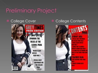
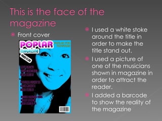
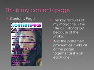
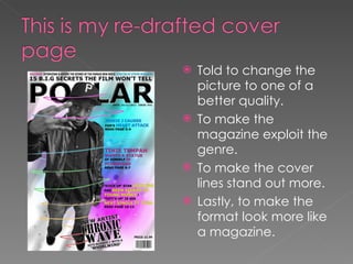
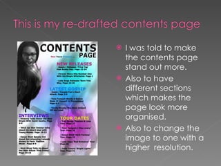
As a student myself I thought I will go for my target audience as I am more familiar with them. I knew that I had to make the design eye catching n order to entice the audience. I learnt that Adobe Photoshop was is better for photo editing while Adobe InDesign is best for structuring a project e.g. Text.
College Cover College Contents
Next time I would make the cover more appealing and the text more bold and eye catching. Feedback: ‘The title is not really eye catching it’s a magazine that you will pass in the shop barely noticing it. To enhance the design I would use Photoshop to edit the images to studio  quality and I will use InDesign to structure the text in a magazine format.
The genre of my music magazine is pop. I Chose the title ‘Poplar’ as it a play on words, merging two words together, Popular and Pop. Both words are associated with music and m genre.
Model 1 Model 2
Cover Design From looking at these cover designs I learnt that in order to make the front cover design successful I must have a high quality picture. The image itself must be eye catching. Also the colours portrayed throughout the design could associate with the colours within the image in order to make the page co-ordinated.  Cover Lines From looking at the cover lines I was aware the title of the magazine could be overlaid by the image this gives the audience the awareness that the magazine brand is very well known. Also that the cover lines often over lay the image in order to stand out as well as using bright colours for the text.
Target Audience: (you might like to take a photo of typical reader) Frequency: Weekly Distributed Cover price: £1.99 Publisher: BUA Unique Selling Point: Posters within the magazine.
Front cover I used a white stoke around the title in order to make the title stand out. I used a picture of one of the musicians shown in magazine in order to attract the reader. I added a barcode to show the reality of the magazine
 
Raw 1  Final 1 Here I used sharpen in order to make the design look much sharper as well as using a blue halftone to give the image a cartoon/abstract effect.
Raw 2 Final 2 Here I used diffuse glow in order to make the design look much clearer as well as brighter.
Raw 3 Final 3 Here I changed the opacity of the blend mode in order to make t blend in with the background.
Raw 4 Final 4 Here  used motion blur to give the impression the camera was in motion while I was taking the photo. This technique is often used for athletes.
 
Contents Page The key features of my magazine is the title as it stands out because of the stroke. Also the patterned gradient as it links all of the pages together as it is on each one.
The contents page links to the cover page because it has the same color scheme used. Also both pages have the patterned gradient which shows the link between both pages.  Lastly both pages have the image of the same person .
I have made the reader want to read on by putting the best story lines descending from the top. The link between images and words is that they the image relates to the word for e.g. the words are about the person in the image. The seriousness of the stories portrays the dominance.  I used a simple method of ordering the contents page by arranging them as if they where bullet points.
My contents page flags my double page spread as it is artistic it makes the audience look forward to looking at the double page. On the other hand if the audience see’s the contents page as plain and simple they would like to look towards the double page spread to see what is has to offer.
 
I Think this double page spread works because it is eye-catching which links with the headline ‘people think I’m an attention seeker..’ so the designers thought they will need to do a design which will catch the readers attention. That’s why they put whit text surrounded by black in order to make it stand out.
 
As well as the other pages my design had a patterned gradient in order to link with the other pages. I used on scheme of color which was black in order to show the elegance of the character within the image. Also using a white background to show the innocence of the character contradicting with the story line.
All three components are link together by the ongoing patterned gradient. They are also linked by the images as all images are of the same character. As well as being linked by the same text font being used which is ‘impact for the main body.
Told to change the picture to one of a better quality. To make the magazine exploit the genre. To make the cover lines stand out more. Lastly, to make the format look more like a magazine.
I was told to make the contents page stand out more. Also to have different sections which makes the page look more organised.  Also to change the image to one with a higher  resolution.
 
I was told to make the image stand out more so I chose to use a different one.  I was also told to make the double page spread stand out from others so I chose to change the background and text fonts used as well as colors.  Lastly, I used more than one image make others transparent to blend in with the background.
You can find my  blog  here: http://chronicwavemedia.blogspot.com/ And You can find my  evaluation  with responses to the 7 questions here: http://chronicwavemedia.blogspot.com/

As research planning_updated_2010-11

  • 1.
  • 2.
  • 3.
    As a studentmyself I thought I will go for my target audience as I am more familiar with them. I knew that I had to make the design eye catching n order to entice the audience. I learnt that Adobe Photoshop was is better for photo editing while Adobe InDesign is best for structuring a project e.g. Text.
  • 4.
  • 5.
    Next time Iwould make the cover more appealing and the text more bold and eye catching. Feedback: ‘The title is not really eye catching it’s a magazine that you will pass in the shop barely noticing it. To enhance the design I would use Photoshop to edit the images to studio quality and I will use InDesign to structure the text in a magazine format.
  • 6.
    The genre ofmy music magazine is pop. I Chose the title ‘Poplar’ as it a play on words, merging two words together, Popular and Pop. Both words are associated with music and m genre.
  • 7.
  • 8.
    Cover Design Fromlooking at these cover designs I learnt that in order to make the front cover design successful I must have a high quality picture. The image itself must be eye catching. Also the colours portrayed throughout the design could associate with the colours within the image in order to make the page co-ordinated. Cover Lines From looking at the cover lines I was aware the title of the magazine could be overlaid by the image this gives the audience the awareness that the magazine brand is very well known. Also that the cover lines often over lay the image in order to stand out as well as using bright colours for the text.
  • 9.
    Target Audience: (youmight like to take a photo of typical reader) Frequency: Weekly Distributed Cover price: £1.99 Publisher: BUA Unique Selling Point: Posters within the magazine.
  • 10.
    Front cover Iused a white stoke around the title in order to make the title stand out. I used a picture of one of the musicians shown in magazine in order to attract the reader. I added a barcode to show the reality of the magazine
  • 11.
  • 12.
    Raw 1 Final 1 Here I used sharpen in order to make the design look much sharper as well as using a blue halftone to give the image a cartoon/abstract effect.
  • 13.
    Raw 2 Final2 Here I used diffuse glow in order to make the design look much clearer as well as brighter.
  • 14.
    Raw 3 Final3 Here I changed the opacity of the blend mode in order to make t blend in with the background.
  • 15.
    Raw 4 Final4 Here used motion blur to give the impression the camera was in motion while I was taking the photo. This technique is often used for athletes.
  • 16.
  • 17.
    Contents Page Thekey features of my magazine is the title as it stands out because of the stroke. Also the patterned gradient as it links all of the pages together as it is on each one.
  • 18.
    The contents pagelinks to the cover page because it has the same color scheme used. Also both pages have the patterned gradient which shows the link between both pages. Lastly both pages have the image of the same person .
  • 19.
    I have madethe reader want to read on by putting the best story lines descending from the top. The link between images and words is that they the image relates to the word for e.g. the words are about the person in the image. The seriousness of the stories portrays the dominance. I used a simple method of ordering the contents page by arranging them as if they where bullet points.
  • 20.
    My contents pageflags my double page spread as it is artistic it makes the audience look forward to looking at the double page. On the other hand if the audience see’s the contents page as plain and simple they would like to look towards the double page spread to see what is has to offer.
  • 21.
  • 22.
    I Think thisdouble page spread works because it is eye-catching which links with the headline ‘people think I’m an attention seeker..’ so the designers thought they will need to do a design which will catch the readers attention. That’s why they put whit text surrounded by black in order to make it stand out.
  • 23.
  • 24.
    As well asthe other pages my design had a patterned gradient in order to link with the other pages. I used on scheme of color which was black in order to show the elegance of the character within the image. Also using a white background to show the innocence of the character contradicting with the story line.
  • 25.
    All three componentsare link together by the ongoing patterned gradient. They are also linked by the images as all images are of the same character. As well as being linked by the same text font being used which is ‘impact for the main body.
  • 26.
    Told to changethe picture to one of a better quality. To make the magazine exploit the genre. To make the cover lines stand out more. Lastly, to make the format look more like a magazine.
  • 27.
    I was toldto make the contents page stand out more. Also to have different sections which makes the page look more organised. Also to change the image to one with a higher resolution.
  • 28.
  • 29.
    I was toldto make the image stand out more so I chose to use a different one. I was also told to make the double page spread stand out from others so I chose to change the background and text fonts used as well as colors. Lastly, I used more than one image make others transparent to blend in with the background.
  • 30.
    You can findmy blog here: http://chronicwavemedia.blogspot.com/ And You can find my evaluation with responses to the 7 questions here: http://chronicwavemedia.blogspot.com/