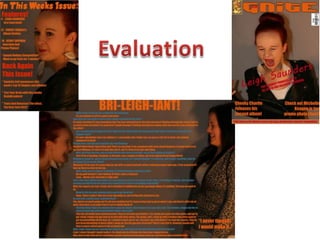
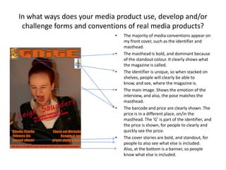
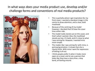
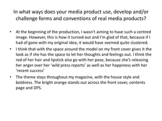
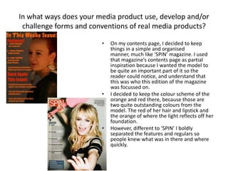
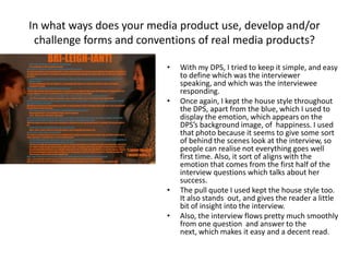
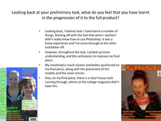
The document discusses the conventions used in the student's media product and how it compares to real magazines. The student aimed to have a bold masthead and central cover image like real magazines. However, they positioned the cover lines on the sides rather than bottom for simplicity. Throughout the magazine, they maintained a consistent orange and red color scheme and bold text for visibility. The layout of sections in the contents page and double page spread were also designed for clear reading like conventions in magazines but with some modifications for ease of use.