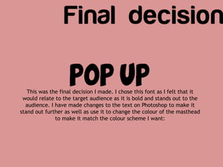
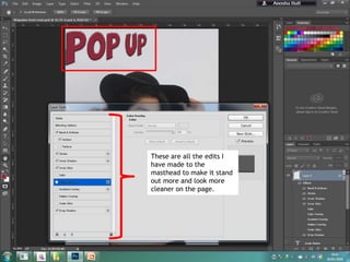
The document discusses font choices for a masthead. It decides on a sans serif, bold, capitalized font to stand out to the target audience, following conventions of magazines like Billboard and Top of the Pops. It then describes editing the font on Photoshop, resizing letters to emphasize "pop" and highlight the genre, and changing the color to match the model's lipstick for cohesion.