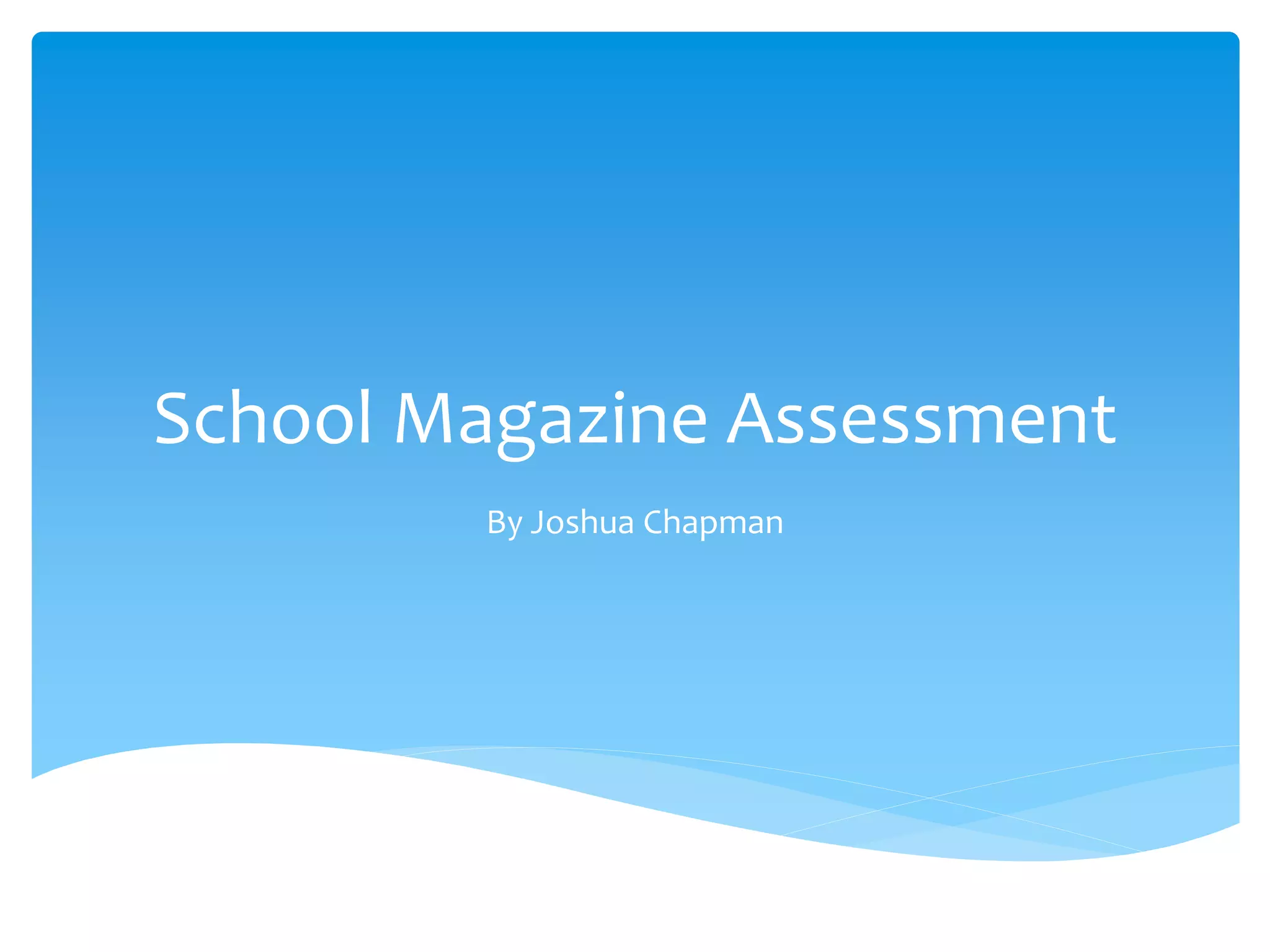
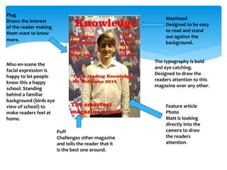
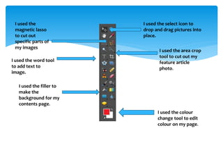
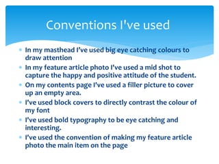
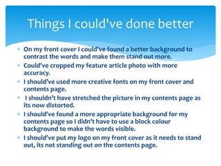
School Magazine Assessment 
By Joshua Chapman
Masthead 
Designed to be easy 
to read and stand 
out against the 
background. 
Plug 
Draws the interest 
of the reader making 
them want to know 
more. 
Feature article 
Photo 
Matt is looking 
directly into the 
camera to draw 
the readers 
attention. 
Puff 
Challenges other magazine 
and tells the reader that it 
is the best one around. 
The typography is bold 
and eye catching. 
Designed to draw the 
readers attention to this 
magazine over any other. 
Misc-en-scene the 
facial expression is 
happy to let people 
know this a happy 
school. Standing 
behind a familiar 
background (birds eye 
view of school) to 
make readers feel at 
home.
Style is serious but 
enjoyable. The 
magazine is filled 
with information 
but fun to read at 
the sane time. 
Filler to cover up 
empty space in the 
page. 
House style: Spelling 
and grammar should 
be correct as it for a 
formal audience. 
Audience: This is 
aimed at school 
students. Or, any 
adults who's 
interested on what's 
happening at school. 
Added my logo on to 
magazine so readers 
can easily identify it
I used the select icon to 
drop and drag pictures into 
place. 
I used the area crop 
tool to cut out my 
feature article 
photo. 
I used the colour 
change tool to edit 
colour on my page. 
I used the 
magnetic lasso 
to cut out 
specific parts of 
my images 
I used the word tool 
to add text to 
image. 
I used the filler to 
make the 
background for my 
contents page.
Conventions I've used 
 In my masthead I’ve used big eye catching colours to 
draw attention 
 In my feature article photo I've used a mid shot to 
capture the happy and positive attitude of the student. 
 On my contents page I've used a filler picture to cover 
up an empty area. 
 I've used block covers to directly contrast the colour of 
my font 
 I've used bold typography to be eye catching and 
interesting. 
 I've used the convention of making my feature article 
photo the main item on the page
Things I could've done better 
 On my front cover I could've found a better background to 
contrast the words and make them stand out more. 
 Could've cropped my feature article photo with more 
accuracy. 
 I should’ve used more creative fonts on my front cover and 
contents page. 
 I shouldn’t have stretched the picture in my contents page as 
its now distorted. 
 I should've found a more appropriate background for my 
contents page so I didn’t have to use a block colour 
background to make the words visible. 
 I should've put my logo on my front cover as it needs to stand 
out, its not standing out on the contents page.

School magazine assessment josh chapman

  • 1.
    School Magazine Assessment By Joshua Chapman
  • 2.
    Masthead Designed tobe easy to read and stand out against the background. Plug Draws the interest of the reader making them want to know more. Feature article Photo Matt is looking directly into the camera to draw the readers attention. Puff Challenges other magazine and tells the reader that it is the best one around. The typography is bold and eye catching. Designed to draw the readers attention to this magazine over any other. Misc-en-scene the facial expression is happy to let people know this a happy school. Standing behind a familiar background (birds eye view of school) to make readers feel at home.
  • 3.
    Style is seriousbut enjoyable. The magazine is filled with information but fun to read at the sane time. Filler to cover up empty space in the page. House style: Spelling and grammar should be correct as it for a formal audience. Audience: This is aimed at school students. Or, any adults who's interested on what's happening at school. Added my logo on to magazine so readers can easily identify it
  • 4.
    I used theselect icon to drop and drag pictures into place. I used the area crop tool to cut out my feature article photo. I used the colour change tool to edit colour on my page. I used the magnetic lasso to cut out specific parts of my images I used the word tool to add text to image. I used the filler to make the background for my contents page.
  • 5.
    Conventions I've used  In my masthead I’ve used big eye catching colours to draw attention  In my feature article photo I've used a mid shot to capture the happy and positive attitude of the student.  On my contents page I've used a filler picture to cover up an empty area.  I've used block covers to directly contrast the colour of my font  I've used bold typography to be eye catching and interesting.  I've used the convention of making my feature article photo the main item on the page
  • 6.
    Things I could'vedone better  On my front cover I could've found a better background to contrast the words and make them stand out more.  Could've cropped my feature article photo with more accuracy.  I should’ve used more creative fonts on my front cover and contents page.  I shouldn’t have stretched the picture in my contents page as its now distorted.  I should've found a more appropriate background for my contents page so I didn’t have to use a block colour background to make the words visible.  I should've put my logo on my front cover as it needs to stand out, its not standing out on the contents page.