Download to read offline

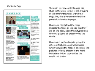


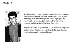


This document evaluates how the media product uses, develops, or challenges conventions of real magazines. It summarizes each section: The front cover sticks to conventions with a solo singer looking at the camera. The contents page highlights important articles and uses images and subheadings. The double page spread uses a large leading image and pull quote to grab attention. It also uses a popular Q&A interview format and columns to structure the text.


