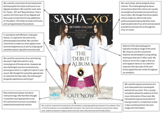
We usedthe typical conventionof a
real mediaadvertbyincludingthe
website forourartist.Thisisusually
includedtoallowthe audience tofind
more informationif theyneed.We
followedthe typical conventionsof
havingitsmall ina simple fontsothat
it doesnotdistractfrom the main
image andinformation.
Real mediatextsalwaysincludean
institutionlogo. We therefore thought
it wouldbe mostappropriate touse
thisconventiontoensure ourproduct
lookedprofessional andrealistic.
We useda black,white andgoldcolour
scheme.Thischallengedtypical dance
conventionswherethe coloursare usually
verybrightand providedcontrastwithour
musicvideo.We thoughtthatthese darker
coloursmade our advertlookmore
professionalandrepresentedthe more
sophisticatedsideof ourartistand we would
provide the elementof funthroughthe
mise-en-scene.
We usedthe conventionof real mediatexts
by keepingthe fontstyle continuousinour
digipakandadvert.We usedthe same style
for ‘Sasha– XO’and ‘BeyondColour’thatis
usedon the frontcoverof our digipakand
thenuseda similarfontforany addedtext
on the advert.Thishelpstocreate continuity
and synergybetweenthe products.
Advertsof the dance/popgenre
typicallyincludeanimage of the artist.
We chose to use thisconvention
howeverwe developeditusingediting
techniquesthataren’toftenused.We
chose to mirrorthe image sothat our
artistappearstwice on our advertto
representthe twosidesof herand
binaryoppositionwe create throughout
our products.
We usedthe conventionof ourartistbeing
dressedinhighheelswhichisvery
stereotypical of female artists.Howeverwe
alsochallengedcostume conventionsby
dressingourartistin a nightshirtwhichisvery
casual.We thoughtthiswouldbe appropriate
to representhertwosides,the ordinarygirl
alongside aglamorousandfungirl.
In accordance withMulvey’smale gaze
theory,itistypical for the artistto be
photoshoppedandedited.We usedthis
conventiontomake ourartist appearmore
tannedandglamorousas well asshapingand
smootheningherlegswhichwerebruised.
We used the conventionof minimal text andinformation, onlygiving anything necessaryto the audience. Thisis
so that the audience is not overloaded withinformation. We stuckto the conventions usingonlythe release
date, website, production company, album and artist name, featuredtracks andthe debut album.

Question 1 - Advert Conventions

  • 1.
    We usedthe typicalconventionof a real mediaadvertbyincludingthe website forourartist.Thisisusually includedtoallowthe audience tofind more informationif theyneed.We followedthe typical conventionsof havingitsmall ina simple fontsothat it doesnotdistractfrom the main image andinformation. Real mediatextsalwaysincludean institutionlogo. We therefore thought it wouldbe mostappropriate touse thisconventiontoensure ourproduct lookedprofessional andrealistic. We useda black,white andgoldcolour scheme.Thischallengedtypical dance conventionswherethe coloursare usually verybrightand providedcontrastwithour musicvideo.We thoughtthatthese darker coloursmade our advertlookmore professionalandrepresentedthe more sophisticatedsideof ourartistand we would provide the elementof funthroughthe mise-en-scene. We usedthe conventionof real mediatexts by keepingthe fontstyle continuousinour digipakandadvert.We usedthe same style for ‘Sasha– XO’and ‘BeyondColour’thatis usedon the frontcoverof our digipakand thenuseda similarfontforany addedtext on the advert.Thishelpstocreate continuity and synergybetweenthe products. Advertsof the dance/popgenre typicallyincludeanimage of the artist. We chose to use thisconvention howeverwe developeditusingediting techniquesthataren’toftenused.We chose to mirrorthe image sothat our artistappearstwice on our advertto representthe twosidesof herand binaryoppositionwe create throughout our products. We usedthe conventionof ourartistbeing dressedinhighheelswhichisvery stereotypical of female artists.Howeverwe alsochallengedcostume conventionsby dressingourartistin a nightshirtwhichisvery casual.We thoughtthiswouldbe appropriate to representhertwosides,the ordinarygirl alongside aglamorousandfungirl. In accordance withMulvey’smale gaze theory,itistypical for the artistto be photoshoppedandedited.We usedthis conventiontomake ourartist appearmore tannedandglamorousas well asshapingand smootheningherlegswhichwerebruised. We used the conventionof minimal text andinformation, onlygiving anything necessaryto the audience. Thisis so that the audience is not overloaded withinformation. We stuckto the conventions usingonlythe release date, website, production company, album and artist name, featuredtracks andthe debut album.