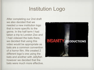
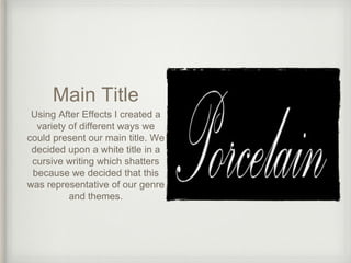
PRODUCTION DIARY 18
Naomi Pierce
WEEK 21
Titles
After our 2nd draft we decided that we needed to
add titles to our opening. To start I created a titles
timeline showing all of the titles we could include
in our opening, I used my analysis of the
Napoleon Dynamite titles to decide upon the
order to put them in.
Fonts
I decided that to ensure that our titles were fitting
to the genre and themes in our opening and film.
This made it easier when trying to design out
titles and adding them to the opening. I looked at
the importance of fonts in films and the different
types of fonts used in horror films to decide what
would be the most appropriate for our opening.
Institution Logo
After completing our 2nd draft
we also decided that we
needed a new institution logo
that is more specific to the
genre. In the half term I had
taken a trip to London Zoo and
I had videoed the bats there,
we decided that using this
video would be appropriate as
bats are a common convention
of a horror film. We created 2
different logo’s one using the
bats and another with Jellyfish
however we decided that the
bats were much more effective.
Main Title
Using After Effects I created a
variety of different ways we
could present our main title. We
decided upon a white title in a
cursive writing which shatters
because we decided that this
was representative of our genre
and themes.

Production Diary 18

  • 1.
  • 2.
    Titles After our 2nddraft we decided that we needed to add titles to our opening. To start I created a titles timeline showing all of the titles we could include in our opening, I used my analysis of the Napoleon Dynamite titles to decide upon the order to put them in.
  • 3.
    Fonts I decided thatto ensure that our titles were fitting to the genre and themes in our opening and film. This made it easier when trying to design out titles and adding them to the opening. I looked at the importance of fonts in films and the different types of fonts used in horror films to decide what would be the most appropriate for our opening.
  • 4.
    Institution Logo After completingour 2nd draft we also decided that we needed a new institution logo that is more specific to the genre. In the half term I had taken a trip to London Zoo and I had videoed the bats there, we decided that using this video would be appropriate as bats are a common convention of a horror film. We created 2 different logo’s one using the bats and another with Jellyfish however we decided that the bats were much more effective.
  • 5.
    Main Title Using AfterEffects I created a variety of different ways we could present our main title. We decided upon a white title in a cursive writing which shatters because we decided that this was representative of our genre and themes.