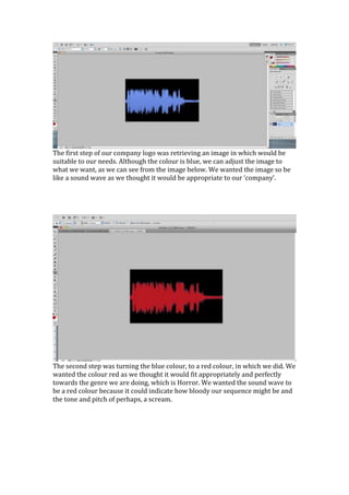
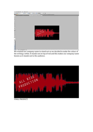
The company logo started as a blue sound wave image that was modified to be red to represent the horror genre, with a white text company name added to stand out against the red background, creating a final product conveying screaming, blood, and distinguished branding for their horror media company.