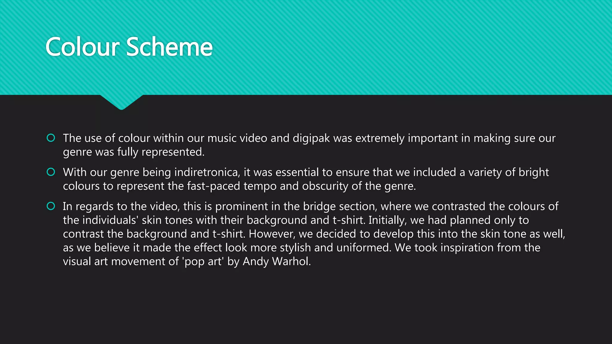
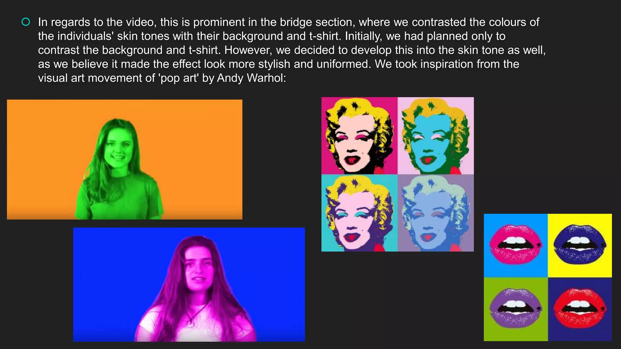
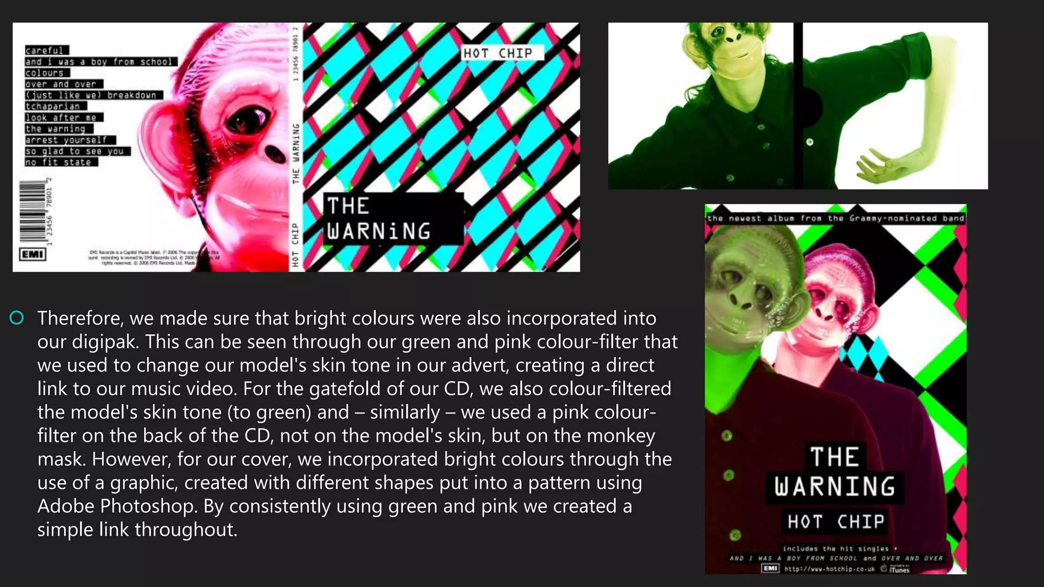
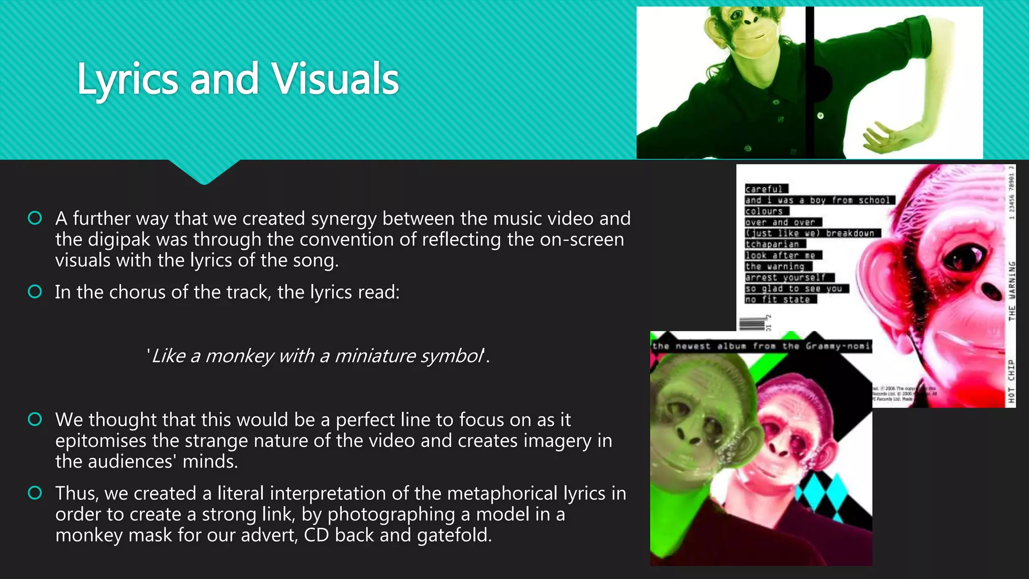
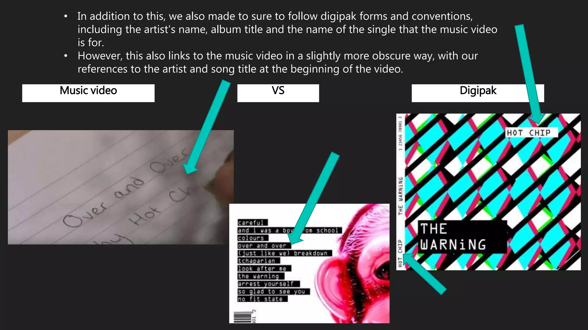
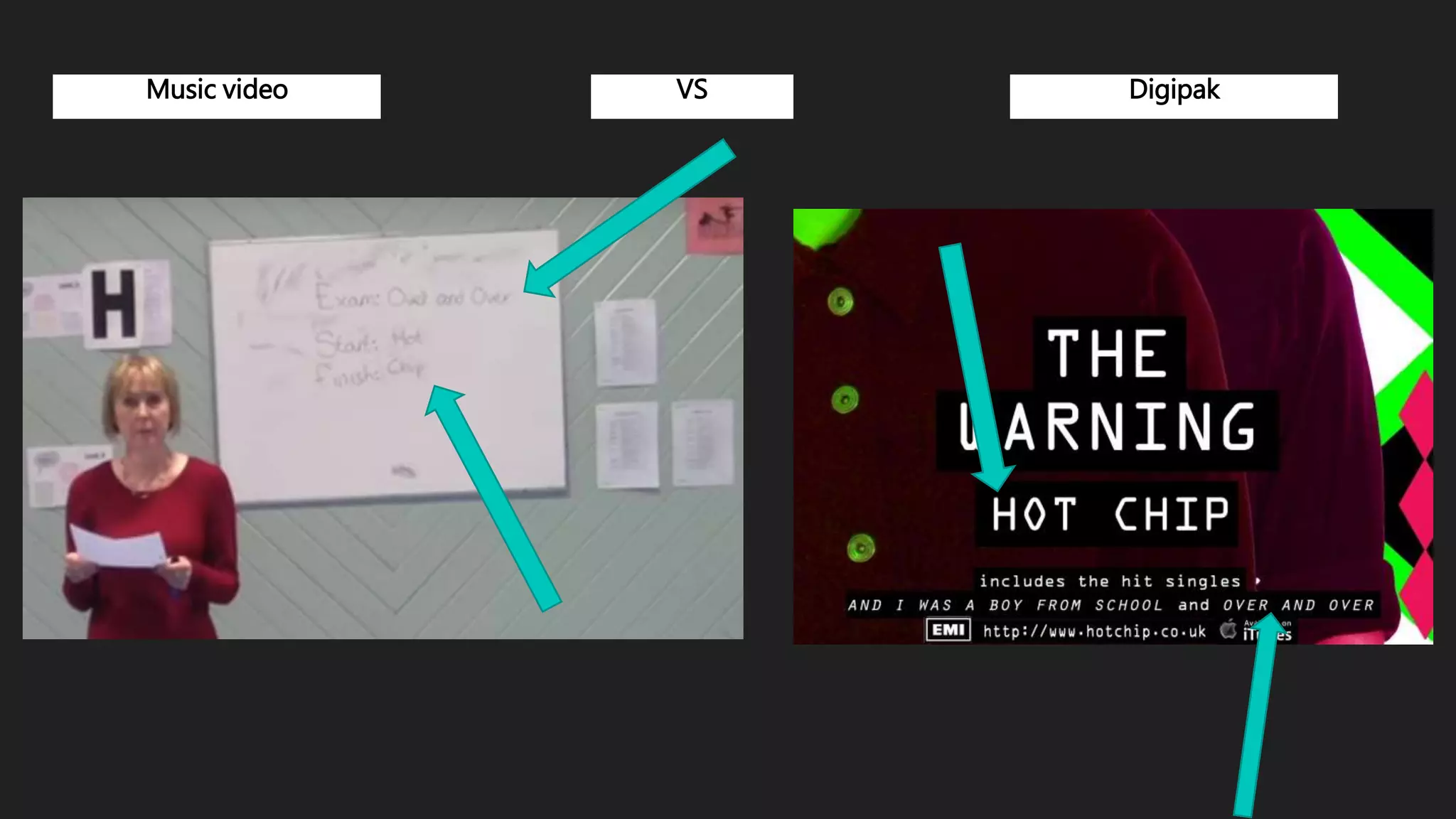
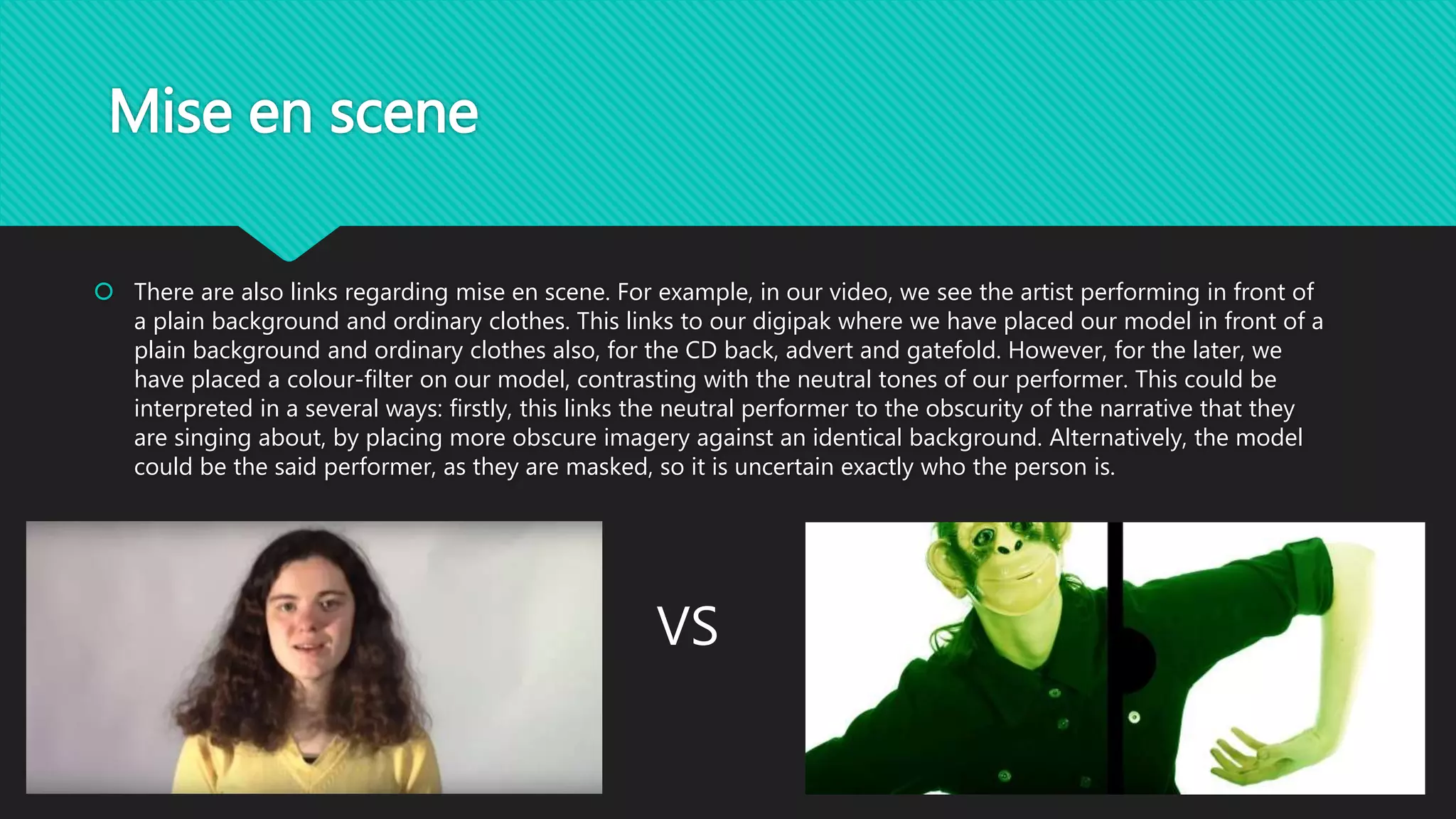
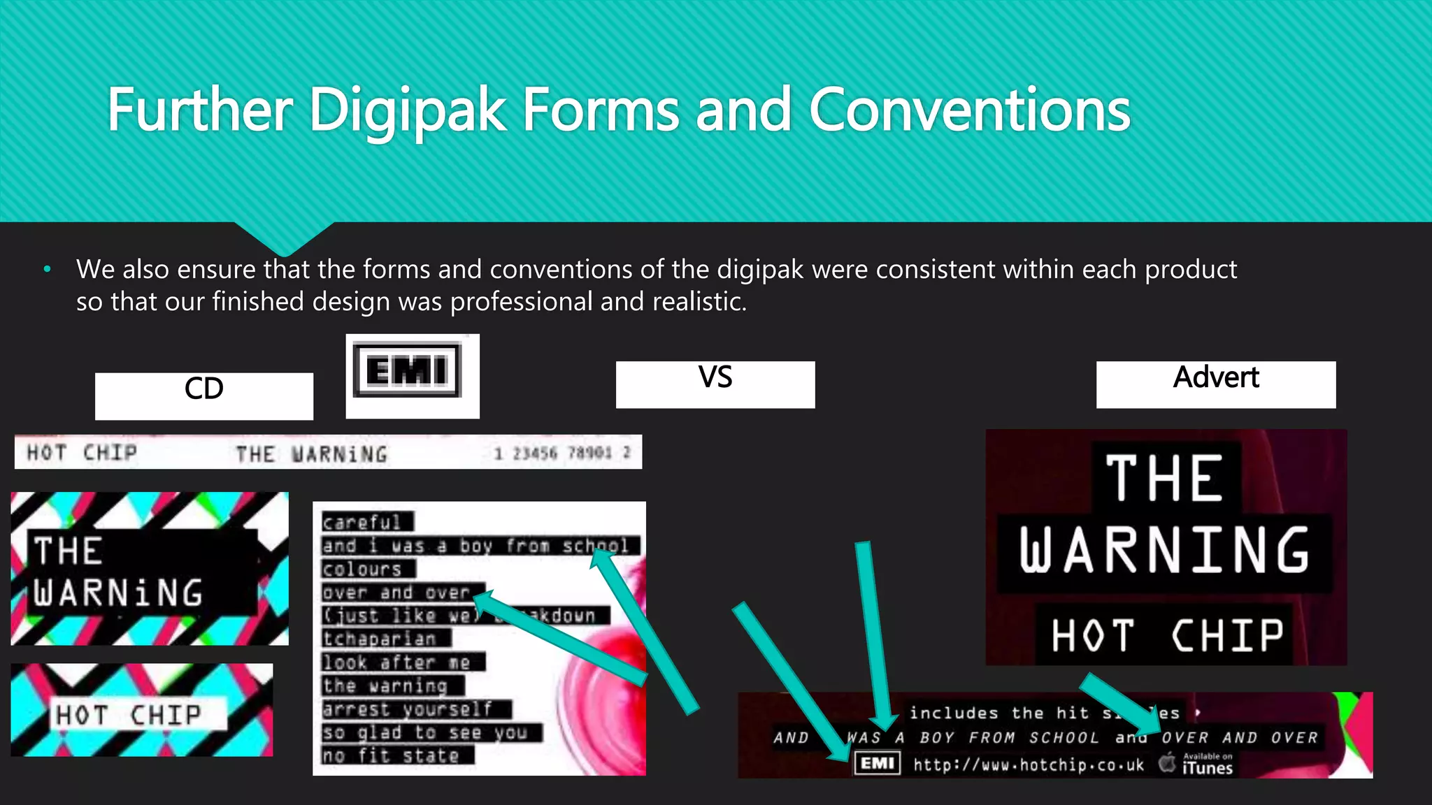
How effective is the
combination of your main
product and ancillary
texts?
An evaluation by Ciara Oakes and Amy Davies
Colour Scheme
 The use of colour within our music video and digipak was extremely important in making sure our
genre was fully represented.
 With our genre being indiretronica, it was essential to ensure that we included a variety of bright
colours to represent the fast-paced tempo and obscurity of the genre.
 In regards to the video, this is prominent in the bridge section, where we contrasted the colours of
the individuals' skin tones with their background and t-shirt. Initially, we had planned only to
contrast the background and t-shirt. However, we decided to develop this into the skin tone as well,
as we believe it made the effect look more stylish and uniformed. We took inspiration from the
visual art movement of 'pop art' by Andy Warhol.
 In regards to the video, this is prominent in the bridge section, where we contrasted the colours of
the individuals' skin tones with their background and t-shirt. Initially, we had planned only to
contrast the background and t-shirt. However, we decided to develop this into the skin tone as well,
as we believe it made the effect look more stylish and uniformed. We took inspiration from the
visual art movement of 'pop art' by Andy Warhol:
 Therefore, we made sure that bright colours were also incorporated into
our digipak. This can be seen through our green and pink colour-filter that
we used to change our model's skin tone in our advert, creating a direct
link to our music video. For the gatefold of our CD, we also colour-filtered
the model's skin tone (to green) and – similarly – we used a pink colour-
filter on the back of the CD, not on the model's skin, but on the monkey
mask. However, for our cover, we incorporated bright colours through the
use of a graphic, created with different shapes put into a pattern using
Adobe Photoshop. By consistently using green and pink we created a
simple link throughout.
Lyrics and Visuals
 A further way that we created synergy between the music video and
the digipak was through the convention of reflecting the on-screen
visuals with the lyrics of the song.
 In the chorus of the track, the lyrics read:
'Like a monkey with a miniature symbol'.
 We thought that this would be a perfect line to focus on as it
epitomises the strange nature of the video and creates imagery in
the audiences' minds.
 Thus, we created a literal interpretation of the metaphorical lyrics in
order to create a strong link, by photographing a model in a
monkey mask for our advert, CD back and gatefold.
• In addition to this, we also made to sure to follow digipak forms and conventions,
including the artist's name, album title and the name of the single that the music video
is for.
• However, this also links to the music video in a slightly more obscure way, with our
references to the artist and song title at the beginning of the video.
Music video VS Digipak
Mise en scene
 There are also links regarding mise en scene. For example, in our video, we see the artist performing in front of
a plain background and ordinary clothes. This links to our digipak where we have placed our model in front of a
plain background and ordinary clothes also, for the CD back, advert and gatefold. However, for the later, we
have placed a colour-filter on our model, contrasting with the neutral tones of our performer. This could be
interpreted in a several ways: firstly, this links the neutral performer to the obscurity of the narrative that they
are singing about, by placing more obscure imagery against an identical background. Alternatively, the model
could be the said performer, as they are masked, so it is uncertain exactly who the person is.
VS
• In addition, we have also made use of the close up in our digipak in order to link to our music video.
• Like our music video, we have included different angles in order to make our products more visually
engaging.
• In addition, there is also eye contact within the photographs and the these close up shots in the video,
as can be seen on the next slide.
Music video VS Digipak
Big close up
Music video VS Digipak
Medium close up
Further Digipak Forms and Conventions
• We also ensure that the forms and conventions of the digipak were consistent within each product
so that our finished design was professional and realistic.
CD VS Advert

2. How effective is the combination of your main product and ancillary texts?

  • 1.
    How effective isthe combination of your main product and ancillary texts? An evaluation by Ciara Oakes and Amy Davies
  • 2.
    Colour Scheme  Theuse of colour within our music video and digipak was extremely important in making sure our genre was fully represented.  With our genre being indiretronica, it was essential to ensure that we included a variety of bright colours to represent the fast-paced tempo and obscurity of the genre.  In regards to the video, this is prominent in the bridge section, where we contrasted the colours of the individuals' skin tones with their background and t-shirt. Initially, we had planned only to contrast the background and t-shirt. However, we decided to develop this into the skin tone as well, as we believe it made the effect look more stylish and uniformed. We took inspiration from the visual art movement of 'pop art' by Andy Warhol.
  • 3.
     In regardsto the video, this is prominent in the bridge section, where we contrasted the colours of the individuals' skin tones with their background and t-shirt. Initially, we had planned only to contrast the background and t-shirt. However, we decided to develop this into the skin tone as well, as we believe it made the effect look more stylish and uniformed. We took inspiration from the visual art movement of 'pop art' by Andy Warhol:
  • 4.
     Therefore, wemade sure that bright colours were also incorporated into our digipak. This can be seen through our green and pink colour-filter that we used to change our model's skin tone in our advert, creating a direct link to our music video. For the gatefold of our CD, we also colour-filtered the model's skin tone (to green) and – similarly – we used a pink colour- filter on the back of the CD, not on the model's skin, but on the monkey mask. However, for our cover, we incorporated bright colours through the use of a graphic, created with different shapes put into a pattern using Adobe Photoshop. By consistently using green and pink we created a simple link throughout.
  • 5.
    Lyrics and Visuals A further way that we created synergy between the music video and the digipak was through the convention of reflecting the on-screen visuals with the lyrics of the song.  In the chorus of the track, the lyrics read: 'Like a monkey with a miniature symbol'.  We thought that this would be a perfect line to focus on as it epitomises the strange nature of the video and creates imagery in the audiences' minds.  Thus, we created a literal interpretation of the metaphorical lyrics in order to create a strong link, by photographing a model in a monkey mask for our advert, CD back and gatefold.
  • 6.
    • In additionto this, we also made to sure to follow digipak forms and conventions, including the artist's name, album title and the name of the single that the music video is for. • However, this also links to the music video in a slightly more obscure way, with our references to the artist and song title at the beginning of the video. Music video VS Digipak
  • 7.
  • 8.
    Mise en scene There are also links regarding mise en scene. For example, in our video, we see the artist performing in front of a plain background and ordinary clothes. This links to our digipak where we have placed our model in front of a plain background and ordinary clothes also, for the CD back, advert and gatefold. However, for the later, we have placed a colour-filter on our model, contrasting with the neutral tones of our performer. This could be interpreted in a several ways: firstly, this links the neutral performer to the obscurity of the narrative that they are singing about, by placing more obscure imagery against an identical background. Alternatively, the model could be the said performer, as they are masked, so it is uncertain exactly who the person is. VS
  • 9.
    • In addition,we have also made use of the close up in our digipak in order to link to our music video. • Like our music video, we have included different angles in order to make our products more visually engaging. • In addition, there is also eye contact within the photographs and the these close up shots in the video, as can be seen on the next slide.
  • 10.
    Music video VSDigipak Big close up
  • 11.
    Music video VSDigipak Medium close up
  • 12.
    Further Digipak Formsand Conventions • We also ensure that the forms and conventions of the digipak were consistent within each product so that our finished design was professional and realistic. CD VS Advert