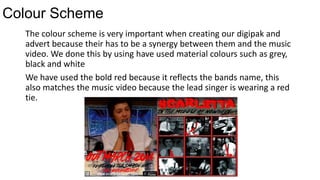
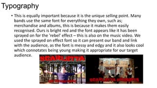
How effective is the
combination of your main
task and ancillary texts?
By Josh Smith
Synergy is extremely important when it comes to
linking products together because they all need to
feature a common thing and common conventions.
Colour Scheme
The colour scheme is very important when creating our digipak and
advert because their has to be a synergy between them and the music
video. We done this by using have used material colours such as grey,
black and white
We have used the bold red because it reflects the bands name, this
also matches the music video because the lead singer is wearing a red
tie.
Arctic Monkeys
Real media products also use synergy in their album advert and digipak.
For example Arctic Monkeys latest album “AM” uses their traditional
black and white colours because this is how they are recognised and
everyone instantly knows who it is.
Typography
• This is equally important because it is the unique selling point. Many
bands use the same font for everything they own, such as;
merchandise and albums, this is because it makes them easily
recognised. Ours is bright red and the font appears like it has been
sprayed on for the 'rebel’ effect – this is also on the music video. We
used the sprayed on effect font so it can present our band and link
with the audience, as the font is messy and edgy and it also looks cool
which connotates being young making it appropriate for our target
audience.
The Stone roses typography has been chosen to create synergy between the advert and the
album, both album and the advert share the splashed paint at the wall background and the
art attached to it such as the red, white and blue lines and also the lemons. The writing used
on the advert matches the famous colours the stone roses are known for an use the same 4
colours. These colours meet the pop-rock genre which connects brilliantly to their target
audience.
Brand identity
The brand identity is important as it makes the representations clear and
accurate. We wanted to make the band look passionate about their lyrics and
about their music, this is why we involved pictures from the music video into
our digital. We also included 'special addition photos’ that have never been seen
before of them being fun.
Research brand image photo
In our Music Video we wanted to show the representation of laid back people
who are down to earth, this I why they are dressed casual.
Theme
• We decided that we wanted our digipak and advert to relate with our Music
Video. This was the idea of young care-free musicians coming together to
celebrate their mutual passion towards music.
We did this by including a thank you message in the digipak to show how much
the support means to them. We also showed it in the advert through the
drummer having his drumsticks in his hand, this shows that music never leaves
them.
Conclusion
At first we found it difficult to create a successful synergy link between our
music video, digipak and advert. But after looking back at all our research
and everything we have learnt we were able to create successful media
products.
I believe our synergy was effective and all our media products connected
and looked really professional. However I wish the advert would have linked
more with the rest. For example I wish it had featured a brick wall as this
was a common aspect in both the music video and the digipak. On the
other hand our main focus was the portrait of the band and u believe they
were shown well.

Question 2

  • 1.
    How effective isthe combination of your main task and ancillary texts? By Josh Smith
  • 2.
    Synergy is extremelyimportant when it comes to linking products together because they all need to feature a common thing and common conventions.
  • 3.
    Colour Scheme The colourscheme is very important when creating our digipak and advert because their has to be a synergy between them and the music video. We done this by using have used material colours such as grey, black and white We have used the bold red because it reflects the bands name, this also matches the music video because the lead singer is wearing a red tie.
  • 4.
    Arctic Monkeys Real mediaproducts also use synergy in their album advert and digipak. For example Arctic Monkeys latest album “AM” uses their traditional black and white colours because this is how they are recognised and everyone instantly knows who it is.
  • 5.
    Typography • This isequally important because it is the unique selling point. Many bands use the same font for everything they own, such as; merchandise and albums, this is because it makes them easily recognised. Ours is bright red and the font appears like it has been sprayed on for the 'rebel’ effect – this is also on the music video. We used the sprayed on effect font so it can present our band and link with the audience, as the font is messy and edgy and it also looks cool which connotates being young making it appropriate for our target audience.
  • 6.
    The Stone rosestypography has been chosen to create synergy between the advert and the album, both album and the advert share the splashed paint at the wall background and the art attached to it such as the red, white and blue lines and also the lemons. The writing used on the advert matches the famous colours the stone roses are known for an use the same 4 colours. These colours meet the pop-rock genre which connects brilliantly to their target audience.
  • 7.
    Brand identity The brandidentity is important as it makes the representations clear and accurate. We wanted to make the band look passionate about their lyrics and about their music, this is why we involved pictures from the music video into our digital. We also included 'special addition photos’ that have never been seen before of them being fun. Research brand image photo In our Music Video we wanted to show the representation of laid back people who are down to earth, this I why they are dressed casual.
  • 8.
    Theme • We decidedthat we wanted our digipak and advert to relate with our Music Video. This was the idea of young care-free musicians coming together to celebrate their mutual passion towards music. We did this by including a thank you message in the digipak to show how much the support means to them. We also showed it in the advert through the drummer having his drumsticks in his hand, this shows that music never leaves them.
  • 9.
    Conclusion At first wefound it difficult to create a successful synergy link between our music video, digipak and advert. But after looking back at all our research and everything we have learnt we were able to create successful media products. I believe our synergy was effective and all our media products connected and looked really professional. However I wish the advert would have linked more with the rest. For example I wish it had featured a brick wall as this was a common aspect in both the music video and the digipak. On the other hand our main focus was the portrait of the band and u believe they were shown well.