This document provides a detailed summary and analysis of the conventions and design elements used across the covers and contents pages of several music magazines. Key points include:
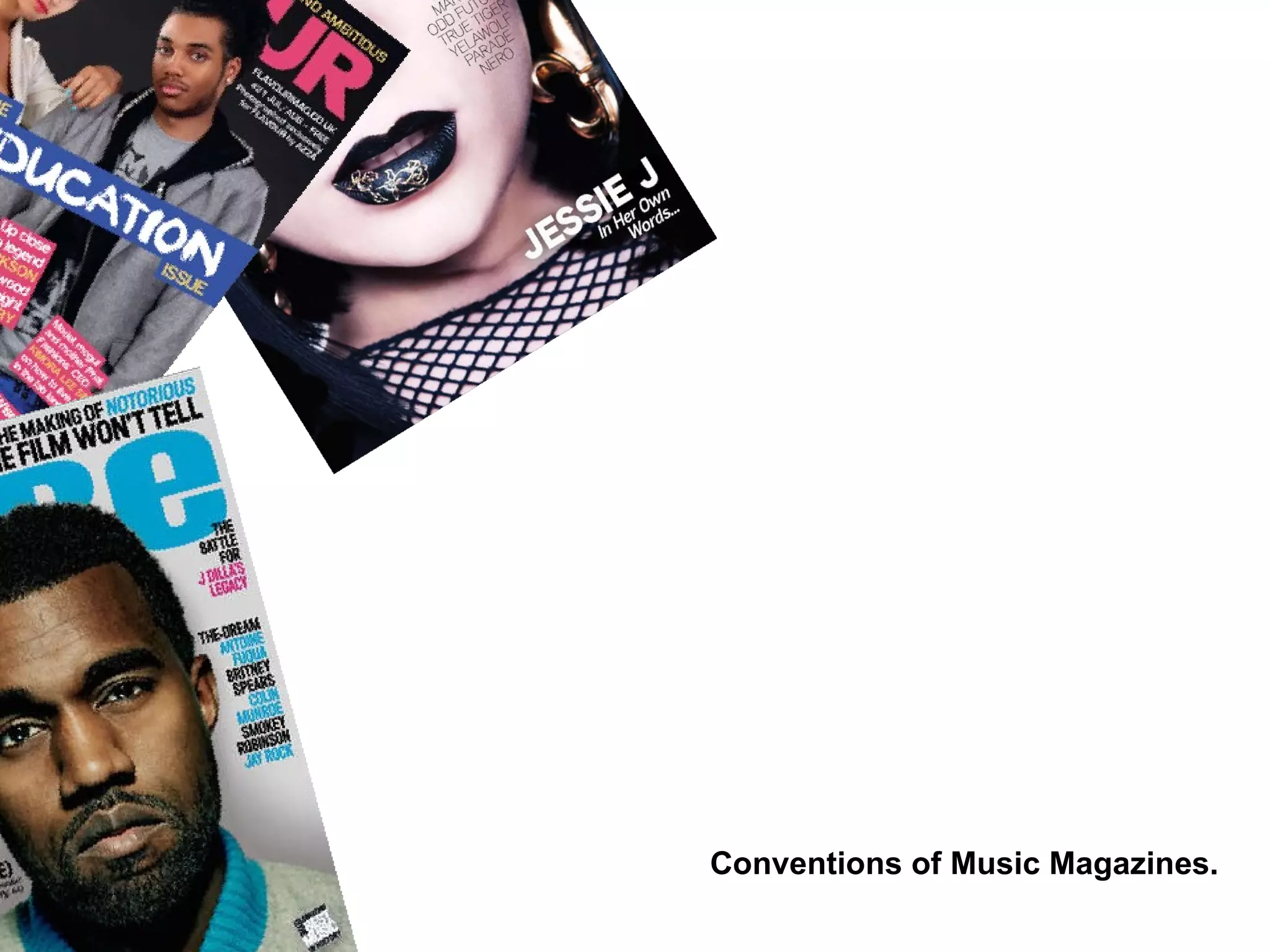
- Magazine covers typically feature close-up portraits of artists to capture their emotions and engage readers in their stories. Covers use symbolic imagery, color schemes, fonts and layouts to convey information about the featured artist and contents.
- Contents pages are designed for easy navigation, with page numbers, sections and artist photos organized clearly. They provide overviews of magazine contents and advertise additional online content.
- Analyses suggest target audiences based on representations of gender and styles of music featured. Magazines are aimed at both male and female readers and portray artists in non-sexual