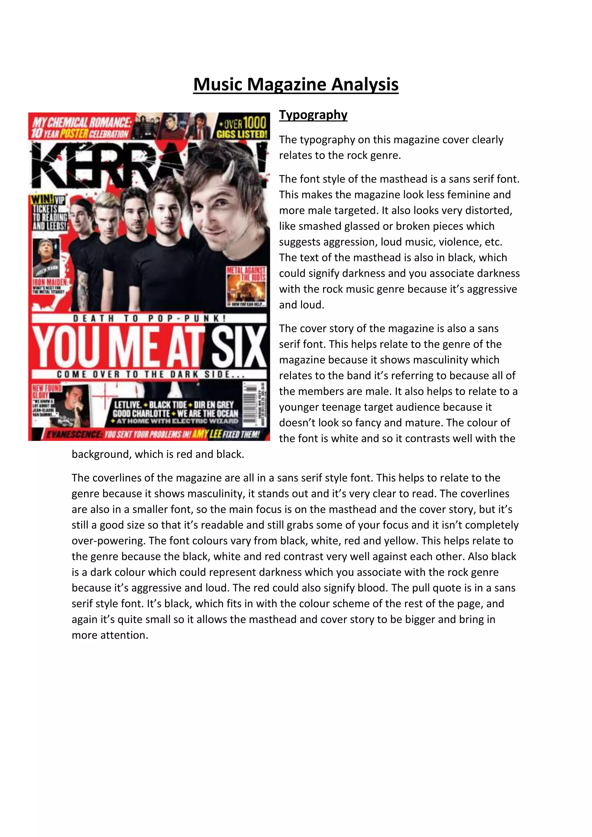
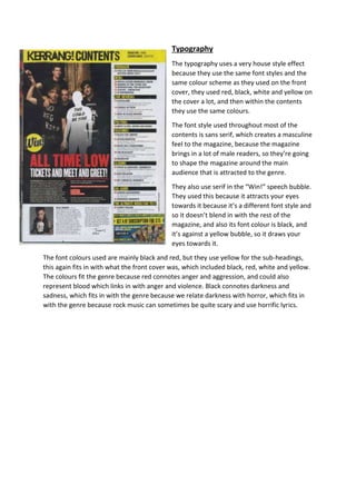
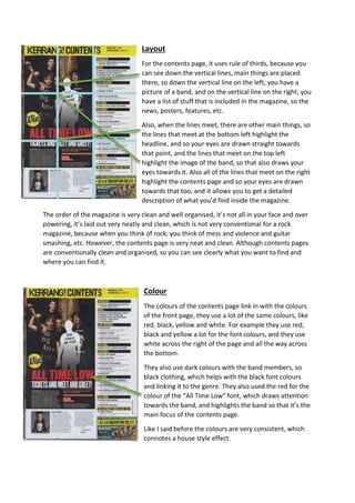
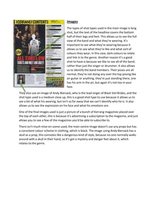
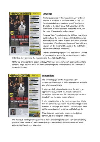
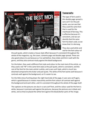
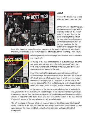
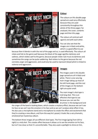
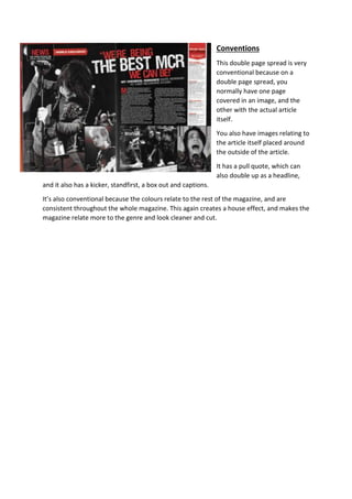
This document analyzes the typography, layout, color, images, language, and conventions used on the cover and contents pages of a music magazine. The summary is as follows:
1) The typography uses sans serif fonts throughout to appear masculine and relate to the rock genre. Dark colors like black, red, and white are used consistently to signify aggression.
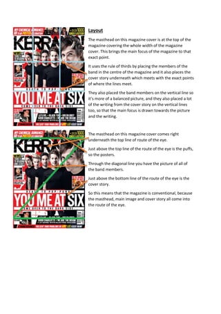
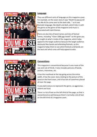
2) The layout employs techniques like the rule of thirds to draw attention to key elements. Images include shots of bands to relate to their style and the genre.
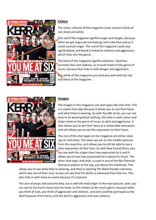
3) Color symbolism uses red to represent anger and blood, and black for darkness, linking to the rock genre's themes. The house style maintains consistency across pages.