The document evaluates how the author's music magazine prototype uses, develops, and challenges conventions of real music magazines.
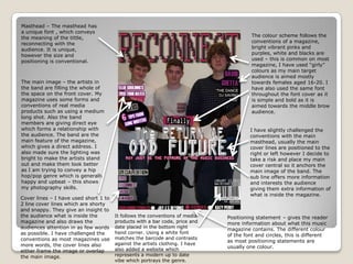
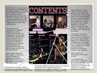
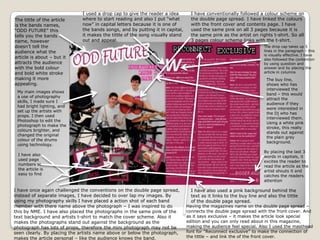
The masthead, cover images, and color scheme generally follow conventions but the masthead font and central cover lines introduce some challenges. Inside, the contents page connects to the cover visually while using an unconventional dark background color. Photographs and articles follow conventions through layout and sequencing but also introduce some innovative elements. Overall, the evaluation shows an attempt to balance familiar magazine conventions with new design risks.