FRONT COVER
In what ways does your media product
use, develop or challenge forms and
conventions of real media products?
Alex Townsley
As Media Studies
Most magazine front covers that fit into the genre of my magazine follow these
conventions: -
- Masthead
- Fonts
- Colour scheme
- Style of photography
- Writing style
- Coverlines
- Barcode/Price/Date
- Sub-Heading
Masthead
Mastheads
                                                                                                       Both mastheads have the
Both existing                                                                                          main image covering it to
magazines’ mastheads;                                                                                  keep the main story
the masthead pans                                                                                      dominant and stood out.
across the width of the
whole page.
                                                                                                        The font choice in both
                                                                                                        mastheads is bold,
                                                                                                        capitalised and quite
                                                                                                        distorted. This suits the
                                                                                                        target audience of
My Masthead                                                                                             these two existing front
                                                                                                        covers

In my masthead I chose to go with                                                                   Both existing front covers
the same, vibrant and capitalised                                                                   above have the masthead
style as the two existing front                                                                     panning across the width of
covers. I chose to do this for the                                                                  the page. I chose not to do this
same reasons I believe the existing                                                                 so that my main image and
products did it, to appeal to my                                                                    story would stand out more.
target audience better.                                                                             Also I did this to create more
Notice that I chose to put my key image over my masthead like the existing products do. I felt      space for my barcode, date,
that in the existing products it kept the key image (main story) the main part of the front cover   issue etc.
– which is why I chose to do this on my front cover.
Heading
Headings in existing front covers
Like the masthead, the font
of the title is big and bold                                  Sub heading to bring in
and matches the colour                                        reader more. Also written
scheme of the front cover                                     in big font which matches
itself.                                                       colour scheme well.


My heading on my front cover
                               Like the existing products I also chose to keep my main
                               story big bold like the masthead. I chose to do this to
                               keep the main story the biggest part of the magazine.
                               I also chose to use a sub heading like the existing
                               products do to draw in my target audience more
                               effectively and easily with a catchy line.
Colour Scheme
Colour schemes in existing front covers


Colour schemes in my front cover
               As you can see in the existing products both colour schemes are exactly the
               same. I chose to incorporate some of the ideas from there colour schemes
               because I felt it suited my genre well. This colour scheme allows my magazine to
               be quite rocky, like the genre, but also not be too boring.
Style of photography
Photography in existing front covers

                    Both taken in
                    studio
                            Both photos quite personal
                            due to eye contact
                    Both passive


               Both quite monochromatic


               Both posed


              Both front covers
              have the people in
              eye contact
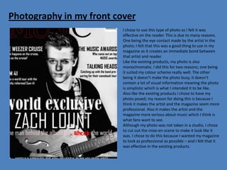
Photography in my front cover
                          I chose to use this type of photo as I felt it was
                          effective on the reader. This is due to many reasons.
                          One being the eye contact made by the artist in the
                          photo; I felt that this was a good thing to use in my
                          magazine as it creates an immediate bond between
                          that artist and reader.
                          Like the existing products, my photo is also
                          monochromatic. I did this for two reasons; one being
                          it suited my colour scheme really well. The other
                          being it doesn’t make the photo busy, it doesn’t
                          contain a lot of visual information meaning the photo
                          is simplistic which is what I intended it to be like.
                          Also like the existing products I chose to have my
                          photo posed; my reason for doing this is because I
                          think it makes the artist and the magazine seem more
                          professional. Also it makes the artist and the
                          magazine more serious about music which I think is
                          what fans want to see.
                          Although my photo was not taken in a studio, I chose
                          to cut out the mise-en-scene to make it look like it
                          was. I chose to do this because I wanted my magazine
                          to look as professional as possible – and I felt that it
                          was effective in the existing products.
Writing style
Writing style in existing products
            In both existing products the writing style is reasonably informal.
            In ‘KERRANG!’ (to the left) they chose to use a powerful choice of
            lexis. For example the use of exclamation marks is used a lot
            throughout the front cover – ‘FREE!’ and ‘PLUS!’ This lexical
            choice is supported by the fonts used. In ‘NME’ to the left they
            also go for this technique, although the words chosen aren’t
            quite as powerful and aren’t emphasised as much as those in
            ‘KERRANG!’. The use of quotations in ‘NME’ was effective as it
            draws the reader in.


Writing style in my magazine
               I chose to go for a similar technique to that of ‘KERRANG!’ and ‘NME’, as I felt it suits
               my target audience and the genre of my magazine. In ‘KERRANG!’ they choose to
               emphasise words like ‘free’ by using a different colour or exclamation; I chose to
               incorporate ideas from this by putting the word ‘shook’ in a completely different font
               to the rest of the front cover. I chose to do this as it is a powerful word which I think
               would catch the eye of my target audience. In ‘NME’ the use of quote is very effective
               as it draws the reader in, I chose to use this in my magazine for similar reasons ‘What
               happens on the Weezer cruise, stays on the Weezer cruise!’
Coverlines
Coverlines in existing products
                     The coverlines in the existing products are again, big and bold
                     like the masthead and heading. However they aren’t quite as
                     big and bold due to the fact the heading (main story) is much
                     more important and the editor will want the focus on that.
                     In the coverlines from ‘KERRANG!’ they include photos to go
                     with the story, they choose not to do this in ‘NME’.
                     The coverlines also follow the colour scheme in both existing
                     products.
                     The coverlines in ‘NME’ (far left) have a sub-heading also –
                     gives extra detail.


Coverlines in my magazine
                     I chose to incorporate some ideas from the existing products
                     seen above. Firstly; in both, ‘NME’ and ‘KERRANG!’ we saw that
                     the coverlines are bold and stand out. I chose to use this in my
                     magazine.
                     Also, in ‘NME’ I noted that they chose to use a sub-heading
                     with the coverlines. I chose to do this so I can give the audience
                     extra detail which could possibly attract them more to buying
                     the magazine.
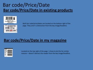
Bar code/Price/Date
Bar code/Price/Date in existing products


            Both bar code/price/dates are located on the bottom right of the
            page. They aren’t a distraction from the key image/headline.


Bar code/Price/Date in my magazine

          Located on the top right of the page. I chose to do this for similar
          reasons – doesn’t distract the reader from the key image/headline.
Sub-heading
Sub-headings in existing products
KERRANG!                      Both sub-headings have a short and catchy line which immediately draws the
                              reader in. In ‘KERRANG!’ the use of a rhetorical question is extremely effective as
                              it makes the reader want to search for the answer.
NME                           In ‘NME’, we can see that have chose to use a short quotation from the article
                              itself. Doing this allows the reader to gain some information but not enough to
                              not buy and read the article.


 Sub-headings in my magazine

 I again gained ideas from the existing products. By using a catchy line like they do in ‘NME’ and ‘KERRANG!’
 (above) I have immediately drawn in the audience in ‘the man behind the album that shook the world’.
 I also chose to emphasise the word ‘shook’ by changing it to a completely different font and a change of
 colour which fits in with the organized colour scheme – I chose to do this as ‘shook’ is a powerful word
 which will stand out to my target audience (writing style)

Evaluation

  • 1.
    FRONT COVER In whatways does your media product use, develop or challenge forms and conventions of real media products? Alex Townsley As Media Studies
  • 2.
    Most magazine frontcovers that fit into the genre of my magazine follow these conventions: - - Masthead - Fonts - Colour scheme - Style of photography - Writing style - Coverlines - Barcode/Price/Date - Sub-Heading
  • 3.
    Masthead Mastheads Both mastheads have the Both existing main image covering it to magazines’ mastheads; keep the main story the masthead pans dominant and stood out. across the width of the whole page. The font choice in both mastheads is bold, capitalised and quite distorted. This suits the target audience of My Masthead these two existing front covers In my masthead I chose to go with Both existing front covers the same, vibrant and capitalised above have the masthead style as the two existing front panning across the width of covers. I chose to do this for the the page. I chose not to do this same reasons I believe the existing so that my main image and products did it, to appeal to my story would stand out more. target audience better. Also I did this to create more Notice that I chose to put my key image over my masthead like the existing products do. I felt space for my barcode, date, that in the existing products it kept the key image (main story) the main part of the front cover issue etc. – which is why I chose to do this on my front cover.
  • 4.
    Heading Headings in existingfront covers Like the masthead, the font of the title is big and bold Sub heading to bring in and matches the colour reader more. Also written scheme of the front cover in big font which matches itself. colour scheme well. My heading on my front cover Like the existing products I also chose to keep my main story big bold like the masthead. I chose to do this to keep the main story the biggest part of the magazine. I also chose to use a sub heading like the existing products do to draw in my target audience more effectively and easily with a catchy line.
  • 5.
    Colour Scheme Colour schemesin existing front covers Colour schemes in my front cover As you can see in the existing products both colour schemes are exactly the same. I chose to incorporate some of the ideas from there colour schemes because I felt it suited my genre well. This colour scheme allows my magazine to be quite rocky, like the genre, but also not be too boring.
  • 6.
    Style of photography Photographyin existing front covers Both taken in studio Both photos quite personal due to eye contact Both passive Both quite monochromatic Both posed Both front covers have the people in eye contact
  • 7.
    Photography in myfront cover I chose to use this type of photo as I felt it was effective on the reader. This is due to many reasons. One being the eye contact made by the artist in the photo; I felt that this was a good thing to use in my magazine as it creates an immediate bond between that artist and reader. Like the existing products, my photo is also monochromatic. I did this for two reasons; one being it suited my colour scheme really well. The other being it doesn’t make the photo busy, it doesn’t contain a lot of visual information meaning the photo is simplistic which is what I intended it to be like. Also like the existing products I chose to have my photo posed; my reason for doing this is because I think it makes the artist and the magazine seem more professional. Also it makes the artist and the magazine more serious about music which I think is what fans want to see. Although my photo was not taken in a studio, I chose to cut out the mise-en-scene to make it look like it was. I chose to do this because I wanted my magazine to look as professional as possible – and I felt that it was effective in the existing products.
  • 8.
    Writing style Writing stylein existing products In both existing products the writing style is reasonably informal. In ‘KERRANG!’ (to the left) they chose to use a powerful choice of lexis. For example the use of exclamation marks is used a lot throughout the front cover – ‘FREE!’ and ‘PLUS!’ This lexical choice is supported by the fonts used. In ‘NME’ to the left they also go for this technique, although the words chosen aren’t quite as powerful and aren’t emphasised as much as those in ‘KERRANG!’. The use of quotations in ‘NME’ was effective as it draws the reader in. Writing style in my magazine I chose to go for a similar technique to that of ‘KERRANG!’ and ‘NME’, as I felt it suits my target audience and the genre of my magazine. In ‘KERRANG!’ they choose to emphasise words like ‘free’ by using a different colour or exclamation; I chose to incorporate ideas from this by putting the word ‘shook’ in a completely different font to the rest of the front cover. I chose to do this as it is a powerful word which I think would catch the eye of my target audience. In ‘NME’ the use of quote is very effective as it draws the reader in, I chose to use this in my magazine for similar reasons ‘What happens on the Weezer cruise, stays on the Weezer cruise!’
  • 9.
    Coverlines Coverlines in existingproducts The coverlines in the existing products are again, big and bold like the masthead and heading. However they aren’t quite as big and bold due to the fact the heading (main story) is much more important and the editor will want the focus on that. In the coverlines from ‘KERRANG!’ they include photos to go with the story, they choose not to do this in ‘NME’. The coverlines also follow the colour scheme in both existing products. The coverlines in ‘NME’ (far left) have a sub-heading also – gives extra detail. Coverlines in my magazine I chose to incorporate some ideas from the existing products seen above. Firstly; in both, ‘NME’ and ‘KERRANG!’ we saw that the coverlines are bold and stand out. I chose to use this in my magazine. Also, in ‘NME’ I noted that they chose to use a sub-heading with the coverlines. I chose to do this so I can give the audience extra detail which could possibly attract them more to buying the magazine.
  • 10.
    Bar code/Price/Date Bar code/Price/Datein existing products Both bar code/price/dates are located on the bottom right of the page. They aren’t a distraction from the key image/headline. Bar code/Price/Date in my magazine Located on the top right of the page. I chose to do this for similar reasons – doesn’t distract the reader from the key image/headline.
  • 11.
    Sub-heading Sub-headings in existingproducts KERRANG! Both sub-headings have a short and catchy line which immediately draws the reader in. In ‘KERRANG!’ the use of a rhetorical question is extremely effective as it makes the reader want to search for the answer. NME In ‘NME’, we can see that have chose to use a short quotation from the article itself. Doing this allows the reader to gain some information but not enough to not buy and read the article. Sub-headings in my magazine I again gained ideas from the existing products. By using a catchy line like they do in ‘NME’ and ‘KERRANG!’ (above) I have immediately drawn in the audience in ‘the man behind the album that shook the world’. I also chose to emphasise the word ‘shook’ by changing it to a completely different font and a change of colour which fits in with the organized colour scheme – I chose to do this as ‘shook’ is a powerful word which will stand out to my target audience (writing style)