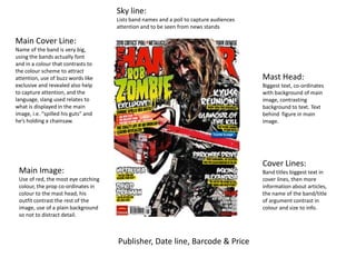
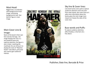
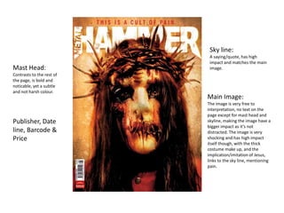
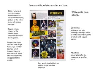
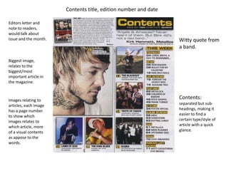
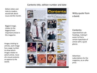
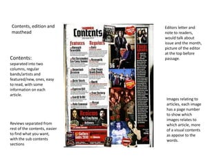
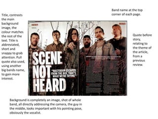
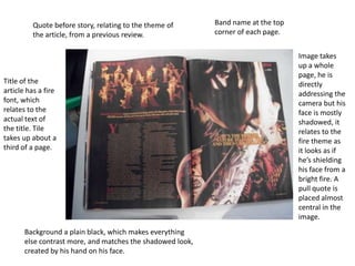
The document provides analysis of magazine cover design elements across 3 magazine covers. It summarizes the key elements magazines use to attract readers' attention on newsstands and entice them to purchase the issue. These include using bold colors, eye-catching images that relate to cover lines and headlines, strategic placement of text elements, and offering "puffs" or freebies to readers. Placement of cover lines and mastheads is also described to maximize visibility and coordination between visual and text elements.
This magazine front cover uses bright colors, multiple images, and tilted text to attract readers looking for gossip and drama. Six soap opera stars are featured across the page in three collaged images. Captions written in different colors and punctuation imply exciting revelations. The masthead stands out among other publications, while the "2 weeks revealed" button and 49p price imply value. Overall the chaotic colorful design aims to draw in readers looking for fresh drama on a budget.
This magazine cover uses bright colors, multiple images, and dramatic headlines and punctuation to attract readers. It implies value for money with its low price point and promises of multiple stories. The disorganized layout with overlapping images and text creates an "organized chaos" that draws in the eye. In contrast, the other magazine uses a simple color scheme, bold masthead, and sophisticated single starring image to appeal to an older, more loyal audience.
The document discusses key conventions used in magazine covers and TV posters. It analyzes several magazine covers and TV posters, noting conventions like central starring photos that make eye contact, backgrounds that provide context, minimal use of text, prominent branding, and colors and layouts that attract readers' attention without being distracting. Character costumes and poses are also used to convey narratives and target audiences. Overall, the document examines how magazine covers and posters employ visual elements, characters, and branding to effectively promote TV shows and magazines.
The document summarizes key elements of magazine design. It discusses elements like the masthead, target audience, cover lines, images, and body copy. These elements are used to attract readers and convey what content can be found inside. The document provides examples of both effective and ineffective magazine designs, noting strengths and weaknesses as well as ways magazines could be improved.
Classic fm magazine uses a color scheme of bright colors, whites, golds, and reds with black text to attract an older, mature audience. Four women dressed in white on the cover imply an angelic, classical feel. The coverline and image of an older man further hint at the older target demographic. Neutral blues and whites on another issue use images and serif fonts to represent the classical genre for sophisticated readers.
Magazine cover analysis_worksheet rolling stonekruane95
The document analyzes the design of a magazine cover. It summarizes various elements of the design including the masthead font, main image featuring a model, model credit, main cover line, placement of elements according to the Guttenburg design principle, colors used, typefaces, photography lighting, coverlines of different sizes featuring various artists, and the overall informal yet professional house style. The design aims to attract fans of indie and rock music genres through prominent coverage of the band Arctic Monkeys and a retro-themed image of a model associated with that genre.
Movie Magazine Cover & Poster analysis Naomi Collins
1) The document analyzes the cover of a movie magazine, noting key design elements like the masthead, images of main characters, taglines, and layout.
2) Color schemes, fonts, and positioning of elements are discussed in terms of appealing to the target audience and representing the theme and genre of the film.
3) Additional text provides context for the characters' costumes, poses, and expressions to engage readers and suggest what the film involves.
The magazine cover uses design techniques to attract its target audience of students. It features the band Niki and the Dove using direct address to appeal to readers. Bright colors like pink, purple, and yellow are used to grab attention, as is black text that stands out on pale backgrounds. Informal fonts and scattered cover lines featuring other bands aim to interest fans. Strategic placement of design elements follows principles to guide the eye to key information.
The student's media product uses and develops conventions of real pop magazines. Both use bright colors, sans serif fonts, and eye-catching images that appeal to target audiences. However, the student's magazine challenges conventions by using brighter colors that stand out more against a darker image. While layout, mastheads, and shot types are similarly conventional, the bolder color scheme makes the student's magazine distinct.
The media product uses and develops some conventions of real magazines while also challenging others. It uses conventional elements like a masthead, cover lines, and issue date, but challenges conventions with elements like a gradient background, non-text masthead incorporation, and large overlapping subtitles. Overall, it aims to target an indie audience with its mixture of conventional and unconventional design choices.
This document analyzes the design of a magazine cover. It discusses several design elements including the masthead, main image, model credit, main cover line, and coverlines. The analysis explains how these elements are used to attract the target audience of music fans. For example, the main cover line "Changed my life" in a bold font is intended to encourage readers. The variety of artists listed in the coverlines would appeal to different fans within the target genre of music. Overall, the cover uses photographic style and fonts associated with rock music to target its audience.
This document analyzes the design of a magazine cover. It discusses several design elements including the masthead, main image, model credit, main cover line, and various coverlines. It notes that the largest coverlines on the left side are more likely to be read. The direct address of the main image and retro theme are meant to appeal to the target audience of music fans. Color, typefaces, photography lighting and house style create an informal yet consistent look to attract readers.
The main image covers the entire left page to split up the double page spread and prevent boredom. It features the subject of the article to engage readers. The bold enlarged first letter indicates where the article begins. A heading above the image clearly states who the article is about. The double page uses a color scheme of black, blue and white that makes it look professional while maintaining interest. Captions are included to involve readers without requiring them to read the entire article. The page number is only on one side, which may make navigation difficult for some readers.
The document analyzes magazine covers and contents pages. Some key conventions highlighted include:
- Placing the magazine logo/masthead prominently at the top
- Using a large central image to draw attention, often of a famous person
- Employing bright colors, large fonts, and overlapping text to make elements stand out
- Including pull quotes, plugs, and other snippets to entice readers
- Numbering article pages clearly to help readers find specific pieces
- Relying primarily on images and text to communicate information to audiences
The contents page uses typical codes and conventions to highlight key stories and sections. The masthead clearly identifies the magazine brand at the top. Larger, bold text is used for the main story while smaller font lists other articles and their page numbers. Color contrasts draw the eye to important elements - the main story uses red text against a white background. A large central image represents the featured story. Standard section titles like "News" and "Radar" indicate where to find different types of content. Together, these visual cues help readers navigate the magazine and identify its most prominent stories at a glance.
The document analyzes the design elements of a college magazine cover, describing the masthead, tagline, images, cover lines, and main cover line and how they are used to attract readers' attention and convey key information. It examines design choices like font, color, sizing and positioning of elements to maximize visibility and highlight important content. The analysis breaks down the cover across multiple pages to understand how different sections work together to engage the target audience.
The document provides details about the development of a magazine cover for a film called "Friendly Betrayal". It describes:
1) The original template that was used as inspiration and how elements were adapted from it such as layout and positioning of key elements.
2) Examples from real magazines that were also used for inspiration regarding consistent branding elements like the masthead, cover lines, and barcode.
3) Details about the chosen image, colors, fonts, and other design decisions made and how they relate to the film's genre and story.
4) Feedback that was gathered from the target audience on the magazine cover design, teaser poster, and trailer to help evaluate and improve the campaign elements.
The document summarizes the design choices made for a student magazine. Key points include:
- A bold font was used for the title to resemble the style of NME magazine
- The price of £2.30 was based on survey results and aims to be affordable
- Images on the cover highlight things readers can relate to like a band member singing
- Various fonts, colors, images and layouts were chosen to draw attention and relate to the target audience
The document provides details about the layout and design of magazine covers. Key elements highlighted include:
1) Mastheads, dates, prices, and buzz words are prominently displayed in bold fonts and colors to attract readers' attention.
2) Main images feature artists in ways that communicate information about their style and importance within the issue.
3) Subheadings, quotes and preview images entice readers to learn more about articles inside.
4) Placement of text over or around images aims to emphasize artists and pull readers further into the magazine.
The NME targets young adult males interested in rock and hip-hop music. It has been published since 1952 and shifted its focus from music journalism to associated more with punk rock in the 1970s. Currently, the magazine aims to keep readers informed of new music through ads and articles, with a typical reader being a 23-year old male. Circulation is approximately 23,924 issues.
The magazine uses consistent branding elements like a red, white, and black color scheme throughout to maintain its house style and make the NME easily recognizable. Photos are used prominently on the cover and in articles to appeal to the target audience of younger music fans. Captions, pull quotes, and informal language help hook readers and provide a quick sense of the content in a way that matches the magazine's casual tone.
The NME targets young adult males interested in rock and hip-hop music. It has been published since 1952 and shifted its focus from music journalism to associated with genres like punk rock and hip-hop. The magazine aims to keep its audience informed of new music through ads and articles on up-and-coming artists. The typical reader is male around 23 years old, making up two-thirds of subscribers.
The document discusses the layout and design elements of magazine covers. Key elements include the logo, masthead, skyline, cover lines, barcode, price, and main image. The logo and masthead identify the magazine brand for readers. Cover lines are used to promote stories inside and attract audiences. Imagery and text are tailored to the target genre and audience. Pricing and barcode information is placed strategically to not interfere with the overall design.
The document discusses several music magazines as research for a new music magazine concept. It provides details on the target audiences, circulation numbers, and key aspects of Rock Sound, MOJO, Kerrang!, Vibe, and Billboard magazines. Rock Sound focuses on rock music and aims for a niche audience. MOJO targets classic rock fans with a predominantly male readership over age 21. Kerrang! attracts younger males ages 15-35 with its graphic design and coverage of various rock genres. Vibe centers on R&B, rap and hip hop with a young, urban audience. Billboard has worldwide circulation and covers the overall music industry.
The document provides an analysis of a college magazine cover design. In 3 sentences:
The masthead, tagline, main image of a person's face, and prominent cover lines and main cover line are analyzed for their strategic placement and design to attract readers' attention. Specific elements like the use of red, eye-catching colors, and topics relevant to students' interests are highlighted. The overall layout is described as using bold visuals and text to catch readers' eyes as they browse magazines on a newsstand.
The document describes a music magazine created by the author for a media assignment. It discusses how the magazine uses conventions of real music magazines, such as featuring an artist on the front cover and including advertisements. The author explains how some conventions were developed, like adding a barcode to allow online updates. Overall, the document demonstrates how the magazine borrows from and enhances standard magazine formats and styles.
The document discusses the layout of a double page spread (DPS) in a magazine. It analyzes a specific DPS from Kerrang! magazine featuring the band Linkin Park. The DPS follows standard conventions, including a large main image taking up half the pages that relates to the headline. The headline is written in big, bold, capital letters to grab attention. Smaller photos and body copy in columns make the page organized and easy to read. Overall, the DPS effectively engages the target audience through its use of images and design conventions.
The document compares the styles and layouts of two music magazines - NME and an R&B magazine. NME uses bold fonts, taboo language, and rock imagery to attract readers and comply with its genre. The R&B magazine focuses more on the editor's opinions through a formal letter style and photo in the primary visual area. While NME focuses on contents and artists, the R&B magazine emphasizes the editor's beliefs and ideas for the issue.
Michael Dell is the CEO of Dell who oversees the company's corporate and functional strategies. These include product development, supply chain/operations, IT, finance, and human resources strategies. Dell's corporate strategy focuses on responsiveness through reliable and quick delivery. The supply chain strategy must balance efficiency and responsiveness based on the demand uncertainty of different market segments. Current trends challenging supply chain management include increasing product variety, shorter life cycles, globalization, and the rise of closed-loop supply chains.
The document outlines the organizational structure and processes of a US staffing company. The CEO oversees various departments including vice president, account managers, recruiting leads, recruiters, and resource executives. The company provides staffing services and consulting for IT clients, finding jobs and training for consultants in the US. It details the staffing process which involves generating requirements, sourcing resumes, interviews, and paperwork for hiring. Recruiter and resource executive roles are also summarized.
The document provides details for planning a photo shoot with a musician model. Key details include:
- Contacting the model and scheduling a photo shoot for the weekend of February 25th.
- Scouting the location, the model's bedroom, on February 21st and taking test photos.
- Creating layout plans and choosing fonts between February 22nd-24th.
- Conducting the photo shoot with the model on February 25th.
- Writing an evaluation of the shoot and editing photos between February 26th-28th.
This document discusses symbiosis, which is a close and long-term biological interaction between two different biological organisms. Specifically, it mentions that symbiosis was defined by the mycologist Anton de Bary in 1879 and provides three examples of symbiosis: mutualism between plants and mycorrhizal fungi, commensalism between E. coli bacteria and humans, and parasitism between pathogenic bacteria and their hosts.
1. Router 1 had incorrectly configured Frame-relay mapping and its DTE interface had the clock-rate configured. The errors were fixed by correcting the Frame-relay map and removing the clock-rate from the DTE interface.
2. Router 2 had the clock-rate configured on its DTE interface, incorrect Frame-relay mapping, LMI configured as ANSI instead of Cisco, and no password on virtual lines. The errors were fixed by removing clock-rate, correcting Frame-relay map, changing LMI to Cisco, and adding a password to virtual lines.
3. The Frame-relay switch was missing the route from R2 DLCI 182 to R1 DLCI 181. This was fixed
Nestle is a Swiss company founded in 1866 that operates globally. It has over 2,000 brands and manufactures around 10,000 products. Nestle employs around 250,000 people worldwide and sells over a billion products daily across 130 countries. In India, Nestle focuses on infant nutrition, dairy, beverages, and other food products. The company's strategic focus is on strengthening its leadership in the nutrition market through initiatives like Nestle Nutrition. Nestle pursues growth through foreign direct investment and strategic partnerships. The company aims to balance sales between developed and developing markets through tailored strategies in each.
The document describes the process taken to design the cover of a magazine. The designer chose an image of a model that reflected his playful personality and style of intimate interviews. They added a masthead at the top in a large, eye-catching font. Below this they positioned the model's name in a slanted style to match his jawline and added a description in red to gain interest. Additional elements were added, such as a skyline with artist names, cover lines about an upcoming festival, and a barcode. The finished cover included details like an edition number and date.
Social Media for Pharma: Past, Present and FutureGigi Peterkin
The potential of using social media to increase awareness of healthcare issues, find health related information - and products - has become the ‘hot’ subject in pharmaceutical communications; an increasing proliferation of ‘patient-to-physician’ and ‘physician-to-physician’ websites means that healthcare information is more widely available than ever before. How can pharma be engaging in this conversation...and with whom?
Originally presented at the Social Media in Pharma workshop in London, this presentation takes a look back at where the industry has been, where many industry players are, and what's on the horizon for digital health.
Sandy Vilas started a new placement division called Corporate Coaches Inc. to generate sales from companies wanting to hire coaches trained by his company CoachInc.com. This increased both sales and profits. While starting a new business may seem extreme, Vilas was able to earn $100,000 in fees in the first year from this division. The article then provides 11 additional ways for business owners to increase sales, such as improving follow-up on sales leads, building customer loyalty, outsourcing non-essential tasks, and asking existing clients for referrals and additional business.
VasHouse is a leading provider of mobile network solutions and content. It offers global SMS services, mobile content and solutions, managed messaging services, and mobile marketing platforms. QR codes can encode large amounts of data in a small space and can be read from any direction. They are growing in popularity and could benefit prepaid cards by allowing users to redeem balances by scanning a QR code rather than manually entering a code, improving the user experience. Proper sizing and placement of the QR code on the card is important to ensure error-free reading. Instructions and other information would appear on the separate side of the card for users without smart phones.
The document discusses how Customer Experience Management (CEM) can enable operational transformation for service providers. It advocates establishing a Service Operation Center (SOC) using a customer-centric approach focused on processes, organization, metrics, and platforms. A SOC centralizes service monitoring, problem resolution, and reporting to improve customer satisfaction by reducing complaint times and improving resolution rates. The document provides examples of how SOC transformation has benefited Asian operators by dramatically improving key performance indicators like mean time to repair.
National Programme for Control of Blindness (NPCB) was launched in 1976 with the goal of reducing blindness prevalence from 1.4% to 0.3%. Main causes of blindness are cataract, refractive error, corneal blindness, glaucoma, and others. NPCB aims to reduce backlog of blindness, develop eye care facilities in every district, and improve human resources and service delivery. It functions at central, state, and district levels. Strategies include strengthening service delivery, developing human resources, promoting awareness, and building institutional capacity. The Vision 2020 initiative also aims to eliminate avoidable blindness by 2020 through a four-tiered structure of centers of excellence, training centers, service centers, and vision centers.
Confucius was an influential Chinese philosopher whose teachings about ethics, morality and good governance shaped Chinese thought for centuries. He lived from 551-479 BC during a time of political chaos. Confucius believed that social harmony could be achieved through self-cultivation, moral leadership and proper relationships between rulers and subjects. Though he sought political positions, he was never appointed to high office. Confucius spent his later years teaching and editing classical texts. His emphasis on virtue, propriety and humanism established the foundation for Confucian philosophy.
The document analyzes the design elements and conventions used on the cover of a magazine. Key elements include:
1) The masthead is large and bold to grab attention, positioned in the top third as is typical.
2) The main cover line and image dominate the page, with the line positioned above to maintain prominence over the image.
3) Additional lines like the date, skyline, and buzz words are used to inform readers of content and attract potential buyers.
The document provides a summary of a student's media magazine project. The student created a hip hop magazine called "The Beat" targeting a younger audience interested in rap and hip hop music. The summary describes the magazine's design conventions including the masthead, cover image, feature articles, and layout. It also discusses how the magazine represents its target audience and the technologies used in its construction. The student learned about magazine design, photography, and software like Photoshop and InDesign through completing the project.
Your media product represents a particular social group in the following ways:
- Target demographic: Based on your market research, your target audience is 16-year-old girls who enjoy indie/alternative/rock music. This represents a specific youth demographic interested in this genre of music.
- Musical interests: The content and stories featured focus on indie/rock bands and artists that would appeal to this social group. Including a competition for a festival known for indie acts further signals the musical tastes represented.
- Visual style: The bright color scheme, use of a young female on the cover, and casual/individualistic dress and style depicted visually convey the fashion and aesthetic preferences of this social group.
- Topics covered:
The document evaluates how the author's music magazine prototype uses, develops, and challenges conventions of real music magazines.
The masthead, cover images, and color scheme generally follow conventions but the masthead font and central cover lines introduce some challenges. Inside, the contents page connects to the cover visually while using an unconventional dark background color. Photographs and articles follow conventions through layout and sequencing but also introduce some innovative elements. Overall, the evaluation shows an attempt to balance familiar magazine conventions with new design risks.
This document provides an annotated summary of the conventions used in a magazine layout. It describes several typical magazine elements including the masthead, coverlines, pull quotes, contents page, double page spreads, standfirsts, headings, body copy, images, captions, kickers, and page numbers. The purpose is to highlight how the magazine follows standard conventions to identify its genre and engage its target rock music audience while putting its own style on elements like the masthead font.
This document provides a visual summary of the key elements found on the cover of a magazine, including the masthead, feature headline, drop quote, banner advert, cover lines, and explanatory text describing the purpose of each element in attracting readers and setting the tone. The main colors used are black and white with additional colors of yellow and red. An image is also included showing the layout of these elements on the magazine cover.
My media product is a music magazine that represents the metal and hardcore music scene. It uses conventions from other music magazines, such as a sidebar with features, but also challenges conventions by having the title in the center of the cover rather than the side. The target audience is males and females aged 15-20 who enjoy music events. It would be produced by a large publisher like Bauer Media Group and aims to attract its target audience through the relevant cover star and competitive monthly price of £2.40.
The document provides an evaluation of a music magazine product. Key details include:
- The magazine uses a bold masthead and prominent images of popular artists to draw attention.
- Interviews and articles about trending artists are included to attract readers interested in learning about new music.
- Consistent colors, fonts, and layouts are used throughout the magazine to provide continuity and familiarity for readers.
- Popular music genres and artists are featured to appeal to the target audience of teenagers and young adults. Consistent branding aims to clearly represent this social group.
The document discusses magazine cover design elements through analyzing several music magazine covers. It identifies common elements such as the masthead, central image, cover lines, date/price, and graphics. For each magazine cover analyzed, it describes how these elements are used and their purpose. This includes how the masthead is positioned, how the central image dominates the cover, and how graphics and fonts are used to draw attention to key information.
The font of the title block suggests movement and relates to an extreme sports brand to connote that genre. Red stands out from the pale background and connotes passion and excitement. The transparent block allows the main surfing image to take precedence. The magazine cover is dominated by natural colors like the sea to tie in with its surfing subject matter. Red contrasts to make the title and main article stand out. The target audiences are surfing fanatics attracted to the image, star, and article, and photography fans drawn to the dominance of the main image. The minimalist style appeals to a younger, style-conscious demographic.
Evaluation -1. In what ways does your media product use forms and conventions...CharleyO16
1. The document describes the forms and conventions used in a mock music magazine, including elements like the masthead, coverlines, contents page, articles, and body text.
2. Standard features are used, such as the masthead at the top, barcode, issue details, images, headlines, bylines, standfirsts, columns of text, and page numbers.
3. Design elements like the color scheme, font sizes, and positioning of images and text also follow conventions of real music magazines.
This document summarizes the layout and design elements of a magazine targeted towards young audiences. Key elements include an attractive masthead, highlighted artist names, and eye-catching cover lines in bold lettering and new colors to draw attention. Images of young, recognizable artists are used prominently to directly address the target demographic. Consistent color schemes and placement of popular sections like music and fashion further engage younger readers.
The document analyzes the front cover, contents, and double page spreads of the Smash Hits magazine from December 2005. It finds that the cover uses bright colors and colloquial language to appeal to its target teenage audience. The contents and articles also employ the magazine's house style colors and images of artists to look exclusive and attract readers. Overall, the document evaluates how various design elements of the magazine work to target its young female audience.
This document provides an analysis of how the media product uses conventions of real music magazines.
The analysis notes that the cover uses a bold masthead, relevant positioning statement, direct address, large central image, and informal tone to match the magazine's style. Barcodes, issue details, and the main cover lines follow conventions.
The contents page similarly follows conventions with colored backgrounds, capitalized cover lines, smaller ambiguous sublines, and images relating to the stories.
An article excerpt demonstrates conventions like a large interesting title, stand first, credits, drop caps, quotes, page numbers and website, direct address, mid shots, colored consistent scheme, and short paragraphs across columns.
The document provides details on the design of a magazine cover and contents page. Key elements emphasized include the logo linking to the name, price displayed to appeal to readers, and use of limited colors associated with males. Notable design features are the central image to focus on, headlines to emphasize important content, and advertisements to attract attention and encourage purchasing. The layout aims to clearly present each item and distinguish features for easy navigation through spacing and font treatments.
The magazine cover uses bold colors and contrast to attract its target audience. The masthead uses red text on a light background to stand out. The main image is of a man holding a gun to his chin, intended to shock viewers and make them want to learn more. Cover lines advertise artists and music in alternating red and white text. The design draws the eye to important information and creates intrigue to engage the target audience.
1) The document describes how the student's media product uses and challenges conventions of real music magazines.
2) Key conventions included are an off-center main image on the cover, unique masthead and font, and placement of information like the barcode and issue number.
3) The contents page includes similarities like the masthead and a band list, but also differences like less detailed section descriptions.
4) The double-page article spread features one main image and pull quotes, but differs from NME in placement of the masthead and number of images.
The document discusses the design of a magazine cover and contents page. Key points include:
- The magazine logo and price are prominently displayed to identify and appeal to the target audience.
- Dark colors like red and black are used throughout to appeal to the male target audience, with white text for contrast and readability.
- Important text features like the masthead and article titles use larger, bolder fonts to catch readers' attention.
- Images and advertisements are used as "lures" to entice readers to learn more about articles inside.
- Consistent colors and layout maintain continuity while distinguishing individual elements on each page.
The magazine represents its target audience of adult males aged 18-40 through its simplistic layout, sophisticated yet familiar language, and imagery relating to acoustic music. Rural areas are focused on as the intended distribution locations since the culture of acoustic music is more prominent there matching the preferences of the target readership. Appealing articles with varied sentence structure and larger blocks of text cater to the audience's preference to read over just viewing images.
Orpah Winfrey Dwayne Johnson: Titans of Influence and Inspirationgreendigital
Introduction
In the realm of entertainment, few names resonate as Orpah Winfrey Dwayne Johnson. Both figures have carved unique paths in the industry. achieving unparalleled success and becoming iconic symbols of perseverance, resilience, and inspiration. This article delves into the lives, careers. and enduring legacies of Orpah Winfrey Dwayne Johnson. exploring how their journeys intersect and what we can learn from their remarkable stories.
Follow us on: Pinterest
Early Life and Backgrounds
Orpah Winfrey: From Humble Beginnings to Media Mogul
Orpah Winfrey, often known as Oprah due to a misspelling on her birth certificate. was born on January 29, 1954, in Kosciusko, Mississippi. Raised in poverty by her grandmother, Winfrey's early life was marked by hardship and adversity. Despite these challenges. she demonstrated a keen intellect and an early talent for public speaking.
Winfrey's journey to success began with a scholarship to Tennessee State University. where she studied communication. Her first job in media was as a co-anchor for the local evening news in Nashville. This role paved the way for her eventual transition to talk show hosting. where she found her true calling.
Dwayne Johnson: From Wrestling Royalty to Hollywood Superstar
Dwayne Johnson, also known by his ring name "The Rock," was born on May 2, 1972, in Hayward, California. He comes from a family of professional wrestlers, with both his father, Rocky Johnson. and his grandfather, Peter Maivia, being notable figures in the wrestling world. Johnson's early life was spent moving between New Zealand and the United States. experiencing a variety of cultural influences.
Before entering the world of professional wrestling. Johnson had aspirations of becoming a professional football player. He played college football at the University of Miami. where he was part of a national championship team. But, injuries curtailed his football career, leading him to follow in his family's footsteps and enter the wrestling ring.
Career Milestones
Orpah Winfrey: The Queen of All Media
Winfrey's career breakthrough came in 1986 when she launched "The Oprah Winfrey Show." The show became a cultural phenomenon. drawing millions of viewers daily and earning many awards. Winfrey's empathetic and candid interviewing style resonated with audiences. helping her tackle diverse and often challenging topics.
Beyond her talk show, Winfrey expanded her empire to include the creation of Harpo Productions. a multimedia production company. She also launched "O, The Oprah Magazine" and OWN: Oprah Winfrey Network, further solidifying her status as a media mogul.
Dwayne Johnson: From The Ring to The Big Screen
Dwayne Johnson's wrestling career took off in the late 1990s. when he became one of the most charismatic and popular figures in WWE. His larger-than-life persona and catchphrases endeared him to fans. making him a household name. But, Johnson had ambitions beyond the wrestling ring.
In the early 20
Barbie Movie Review - The Astras.pdffffftheastras43
Barbie Movie Review has gotten brilliant surveys for its fun and creative story. Coordinated by Greta Gerwig, it stars Margot Robbie as Barbie and Ryan Gosling as Insight. Critics adore its perky humor, dynamic visuals, and intelligent take on the notorious doll's world. It's lauded for being engaging for both kids and grown-ups. The Astras profoundly prescribes observing the Barbie Review for a delightful and colorful cinematic involvement.https://theastras.com/hca-member-gradebooks/hca-gradebook-barbie/
The Unbelievable Tale of Dwayne Johnson Kidnapping: A Riveting Sagagreendigital
Introduction
The notion of Dwayne Johnson kidnapping seems straight out of a Hollywood thriller. Dwayne "The Rock" Johnson, known for his larger-than-life persona, immense popularity. and action-packed filmography, is the last person anyone would envision being a victim of kidnapping. Yet, the bizarre and riveting tale of such an incident, filled with twists and turns. has captured the imagination of many. In this article, we delve into the intricate details of this astonishing event. exploring every aspect, from the dramatic rescue operation to the aftermath and the lessons learned.
Follow us on: Pinterest
The Origins of the Dwayne Johnson Kidnapping Saga
Dwayne Johnson: A Brief Background
Before discussing the specifics of the kidnapping. it is crucial to understand who Dwayne Johnson is and why his kidnapping would be so significant. Born May 2, 1972, Dwayne Douglas Johnson is an American actor, producer, businessman. and former professional wrestler. Known by his ring name, "The Rock," he gained fame in the World Wrestling Federation (WWF, now WWE) before transitioning to a successful career in Hollywood.
Johnson's filmography includes blockbuster hits such as "The Fast and the Furious" series, "Jumanji," "Moana," and "San Andreas." His charismatic personality, impressive physique. and action-star status have made him a beloved figure worldwide. Thus, the news of his kidnapping would send shockwaves across the globe.
Setting the Scene: The Day of the Kidnapping
The incident of Dwayne Johnson's kidnapping began on an ordinary day. Johnson was filming his latest high-octane action film set to break box office records. The location was a remote yet scenic area. chosen for its rugged terrain and breathtaking vistas. perfect for the film's climactic scenes.
But, beneath the veneer of normalcy, a sinister plot was unfolding. Unbeknownst to Johnson and his team, a group of criminals had planned his abduction. hoping to leverage his celebrity status for a hefty ransom. The stage was set for an event that would soon dominate worldwide headlines and social media feeds.
The Abduction: Unfolding the Dwayne Johnson Kidnapping
The Moment of Capture
On the day of the kidnapping, everything seemed to be proceeding as usual on set. Johnson and his co-stars and crew were engrossed in shooting a particularly demanding scene. As the day wore on, the production team took a short break. providing the kidnappers with the perfect opportunity to strike.
The abduction was executed with military precision. A group of masked men, armed and organized, infiltrated the set. They created chaos, taking advantage of the confusion to isolate Johnson. Johnson was outnumbered and caught off guard despite his formidable strength and fighting skills. The kidnappers overpowered him, bundled him into a waiting vehicle. and sped away, leaving everyone on set in a state of shock and disbelief.
The Immediate Aftermath
The immediate aftermath of the Dwayne Johnson kidnappin
Leonardo DiCaprio House: A Journey Through His Extravagant Real Estate Portfoliogreendigital
Introduction
Leonardo DiCaprio, A name synonymous with Hollywood excellence. is not only known for his stellar acting career but also for his impressive real estate investments. The "Leonardo DiCaprio house" is a topic that piques the interest of many. as the Oscar-winning actor has amassed a diverse portfolio of luxurious properties. DiCaprio's homes reflect his varied tastes and commitment to sustainability. from retreats to historic mansions. This article will delve into the fascinating world of Leonardo DiCaprio's real estate. Exploring the details of his most notable residences. and the unique aspects that make them stand out.
Follow us on: Pinterest
Leonardo DiCaprio House: Malibu Beachfront Retreat
A Prime Location
His Malibu beachfront house is one of the most famous properties in Leonardo DiCaprio's real estate portfolio. Situated in the exclusive Carbon Beach. also known as "Billionaire's Beach," this property boasts stunning ocean views and private beach access. The "Leonardo DiCaprio house" in Malibu is a testament to the actor's love for the sea and his penchant for luxurious living.
Architectural Highlights
The Malibu house features a modern design with clean lines, large windows. and open spaces blending indoor and outdoor living. The expansive deck and patio areas provide ample space for entertaining guests or enjoying a quiet sunset. The house has state-of-the-art amenities. including a gourmet kitchen, a home theatre, and many guest suites.
Sustainable Features
Leonardo DiCaprio is a well-known environmental activist. whose Malibu house reflects his commitment to sustainability. The property incorporates solar panels, energy-efficient appliances, and sustainable building materials. The landscaping around the house is also designed to be water-efficient. featuring drought-resistant plants and intelligent irrigation systems.
Leonardo DiCaprio House: Hollywood Hills Hideaway
Privacy and Seclusion
Another remarkable property in Leonardo DiCaprio's collection is his Hollywood Hills house. This secluded retreat offers privacy and tranquility. making it an ideal escape from the hustle and bustle of Los Angeles. The "Leonardo DiCaprio house" in Hollywood Hills nestled among lush greenery. and offers panoramic views of the city and surrounding landscapes.
Design and Amenities
The Hollywood Hills house is a mid-century modern gem characterized by its sleek design and floor-to-ceiling windows. The open-concept living space is perfect for entertaining. while the cozy bedrooms provide a comfortable retreat. The property also features a swimming pool, and outdoor dining area. and a spacious deck that overlooks the cityscape.
Environmental Initiatives
The Hollywood Hills house incorporates several green features that are in line with DiCaprio's environmental values. The home has solar panels, energy-efficient lighting, and a rainwater harvesting system. Additionally, the landscaping designed to support local wildlife and promote
At Digidev, we are working to be the leader in interactive streaming platforms of choice by smart device users worldwide.
Our goal is to become the ultimate distribution service of entertainment content. The Digidev application will offer the next generation television highway for users to discover and engage in a variety of content. While also providing a fresh and
innovative approach towards advertainment with vast revenue opportunities. Designed and developed by Joe Q. Bretz
Unveiling Paul Haggis Shaping Cinema Through Diversity. .pdfkenid14983
Paul Haggis is undoubtedly a visionary filmmaker whose work has not only shaped cinema but has also pushed boundaries when it comes to diversity and representation within the industry. From his thought-provoking scripts to his engaging directorial style, Haggis has become a prominent figure in the world of film.
Top IPTV UK Providers of A Comprehensive Review.pdfXtreame HDTV
The television landscape in the UK has evolved significantly with the rise of Internet Protocol Television (IPTV). IPTV offers a modern alternative to traditional cable and satellite TV, allowing viewers to stream live TV, on-demand videos, and other multimedia content directly to their devices over the internet. This review provides an in-depth look at the top IPTV UK providers, their features, pricing, and what sets them apart.
Modern Radio Frequency Access Control Systems: The Key to Efficiency and SafetyAITIX LLC
Today's fast-paced environment worries companies of all sizes about efficiency and security. Businesses are constantly looking for new and better solutions to solve their problems, whether it's data security or facility access. RFID for access control technologies have revolutionized this.
Everything You Need to Know About IPTV Ireland.pdfXtreame HDTV
The way we consume television has evolved dramatically over the past decade. Internet Protocol Television (IPTV) has emerged as a popular alternative to traditional cable and satellite TV, offering a wide range of channels and on-demand content via the internet. In Ireland, IPTV is rapidly gaining traction, with Xtreame HDTV being one of the prominent providers in the market. This comprehensive guide will delve into everything you need to know about IPTV Ireland, focusing on Xtreame HDTV, its features, benefits, and how it is revolutionizing TV viewing for Irish audiences.
Christian Louboutin: Innovating with Red Solesget joys
Christian Louboutin is celebrated for his innovative approach to footwear design, marked by his trademark red soles. This in-depth look at his life and career explores the origins of his creativity, the milestones in his journey, and the impact of his work on the fashion industry. Learn how Louboutin's bold vision and dedication to excellence have made his brand synonymous with luxury and style.
The Evolution of the Leonardo DiCaprio Haircut: A Journey Through Style and C...greendigital
Leonardo DiCaprio, a name synonymous with Hollywood stardom and acting excellence. has captivated audiences for decades with his talent and charisma. But, the Leonardo DiCaprio haircut is one aspect of his public persona that has garnered attention. From his early days as a teenage heartthrob to his current status as a seasoned actor and environmental activist. DiCaprio's hairstyles have evolved. reflecting both his personal growth and the changing trends in fashion. This article delves into the many phases of the Leonardo DiCaprio haircut. exploring its significance and impact on pop culture.
3. Sky line:
Give a way of posters so it’s up with the mast head to capture
audiences attention and to be seen from news stands.
Main Image:
Use of red, an eye-catching
colour, and the first colour your Teasers:
eyes are drawn to makes it more Short phrases or words on the
bold, image has a lot of impact front cover to tempt the reader
through colour and pose, also to but the magazine
through the mask, the whole
thing draws attention.
Mast Head:
Biggest text, co-ordinates
Buzz words and with background of main
image, contrasting
Puffs: background to text. Text
To capture audience attention, behind figure in main
offers freebies, in the form of image.
posters, gig guide and
competitions.
Main Cover Line: Cover Lines:
Band title, is as big as mast Band titles biggest text in
head, which is unusual, but cover lines, also different
this magazines main cover colour, then more information
line was a special after the about articles, for the biggest
death of one of that band cover lines there is also an
members. The text doesn’t image of the band/ celeb
co-ordinate with a picture
like it usually does, it’s more
bold which makes it more
eye catching and the use of
a pull quote draws Date line, Barcode & Price
attention.
4. Sky line:
Big competition so it’s up with the mast head to capture
audiences attention and to be seen from news stands
Main Cover Line:
Band name is the biggest text.
Relates to the cover image, pull Mast Head:
quote and insight into celebrity Biggest text, co-ordinates with
that audiences want, her pose background of main image,
is also welcoming , letting the contrasting background to text.
audience in making them feel Text in front of main image.
like they’re getting to know her.
Text colour co-ordinates with
main image, contrasts, and
highlighted text colour and font Main Image:
co-ordinates with outfit. Use of yellow is very bold,
welcoming pose to entice
audience, and figure leaning to
the her left leaves a margin for
Cover Lines: cover lines, she’s looking directly
Band titles biggest text in at the audience, which draws
cover lines, then more attention.
information about articles,
for the biggest cover line
there is also an image of the
band.
Buzz words and Puffs:
To capture audience attention,
offers freebies, in the form of
Teasers: posters, gig guide and
Short phrases or words on the competitions.
front cover to tempt the reader to
but the magazine
Date line, Barcode & Price
5. Sky line:
Lists band names and a poll to capture audiences
attention and to be seen from news stands
Main Cover Line:
Name of the band is very big,
using the bands actually font
and in a colour that contrasts to
the colour scheme to attract
attention, use of buzz words like Mast Head:
exclusive and revealed also help Biggest text, co-ordinates
to capture attention, and the with background of main
language, slang used relates to image, contrasting
what is displayed in the main background to text. Text
image, i.e. “spilled his guts” and behind figure in main
he’s holding a chainsaw. image.
Cover Lines:
Main Image: Band titles biggest text in
Use of red, the most eye catching cover lines, then more
colour, the prop co-ordinates in information about articles,
colour to the mast head, his the name of the band/title
outfit contrast the rest of the of argument contrast in
image, use of a plain background colour and size to info.
so not to distract detail.
Publisher, Date line, Barcode & Price
6. Mast Head: Sky line & Cover lines:
Lists band names and a poll to capture
Biggest text, co-ordinates
audiences attention and to be seen
with background of main
from news stands, also cover lines as it
image, contrasting
adds more information about the
background to text. Text
bands, gives the main image more
behind figure in main
impact as it leaves the sides of the
image.
cover clear
Buzz words and Puffs:
Main Cover Line & To capture audience attention,
offers freebies, in the form of a
Image: free album.
Name of the band in their own
font and also the logo, the
image displays the man in a
very powerful pose and
captures attention, the figure is
also in black matching the
masthead, the use of locus's to
display the name of “Machine
Head’s” new album, pull quote
also used to gain audiences
interest.
Publisher, Date line, Barcode & Price
7. Sky line:
A saying/quote, has high
impact and matches the main
Mast Head: image.
Contrasts to the rest of
the page, is bold and
noticable, yet a subtle
and not harsh colour.
Main Image:
The image is very free to
interpretation, no text on the
page except for mast head and
Publisher, Date skyline, making the image have a
bigger impact as it’s not
line, Barcode & distracted. The image is very
Price shocking and has high impact
itself though, with the thick
costume make up, and the
implication/imitation of Jesus,
links to the sky line, mentioning
pain.
9. Contents title, edition number and date
Editors letter and
note to readers,
Witty quote from
would talk about a band.
issue and the month,
picture of the editor
to the left before
passage.
Biggest image,
Contents:
relates to the separated but sub-
biggest/most headings, making it easier
important article in to find a certain type/style
the magazine. of article with a quick
glance.
Images relating to
articles, each image
has a page number
to show which
images relates to
which article, more Advertises
of a visual contents subscriptions for the
as appose to the magazine, at an offer
words. price.
Buzz words, in a bold sticker
looking shape, catches
attention.
10. Contents title, edition number and date
Editors letter and
note to readers,
would talk about
issue and the month. Witty quote from
a band.
Biggest image,
relates to the
biggest/most
important article in
the magazine.
Images relating to
Contents:
articles, each image separated but sub-
has a page number headings, making it
to show which easier to find a
images relates to certain type/style of
which article, more article with a quick
of a visual contents glance.
as appose to the
words.
11. Contents title, edition number and date
Editors letter and
note to readers,
would talk about Witty quote from
issue and the month. a band.
Biggest image,
relates to the
biggest/most Contents:
important article in separated but sub-
the magazine. headings, making it
easier to find a
certain type/style of
article with a quick
Images relating to glance.
articles, each image
has a page number
to show which
images relates to
which article, more Advertises
of a visual contents subscriptions for the
as appose to the magazine, at an offer
words. price.
12. Contents, edition and Editors letter and
masthead note to readers,
would talk about
issue and the month,
picture of the editor
at the top before
Contents: passage.
separated into two
columns, regular
bands/artists and
featured/new, ones, easy
to read, with some
information on each
article.
Images relating to
articles, each image
has a page number
to show which
images relates to
Reviews separated from which article, more
rest of the contents, easier of a visual contents
to find what you want, as appose to the
with the sub contents words.
sections
14. Title in big font, taking up almost a half page, key
words of the title and description in pink, and buzz
word like absolutely in biggest text and with
exclamation mark.
Image takes
up majority of
a whole page,
open pose,
looking at the
audience, and
a black and
white theme,
simple and
honest, which
links to the
pull quote
used as a
title.
Background a grey tone, which compliments the Interview done in question
simple black and white colour scheme, and a border form, different background for
of what appears to be lights, resembles a typical question texts.
Hollywood dressing table mirror.
15. Image takes
up majority of
Title font all one size, no description, just a pull quote. a whole page
but is
positioned in
the middle of
the page;
hidden and
shadowed
pose, looking
down, almost
hiding, and a
red, white
and blue
theme,
resembling
the American
flag, with the
stars on his t-
shirt as well,
shows
nationality,
colours used
Background a plain black, which makes everything in the pull
else contrast more, and accentuates all the colour, quote used as
and the shadow on his face. a title.
16. Title in big font, taking up almost a half page, key
words of the title and description in pink. Different
Image takes
fonts used, the font for “wild” supposed to accentuate
up over a
the meaning of the word.
whole page,
open pose,
looking at the
audience; a
black theme,
simple and
dark, often
seen as a
“bad boy”
and in this
case girl
colour, along
with the
leather, which
links to the
title of bad
girl.
Background a plain black, which makes everything Interview done in question
else contrast more, but accentuates the dark make- form, different background for
up and all black outfit. question texts.
17. Band name at the top
Title, contrasts corner of each page.
the main
background
image, the
colour matches
the rest of the Quote before
text. Title is story,
abbreviated, relating to
short and the theme of
snappy to grab the article,
attention. Pull from a
quote also used, previous
using another review.
big bands name,
to gain more
interest.
Background is completely an image, shot of whole
band, all directly addressing the camera, the guy in
the middle, looks important with his pointing pose,
obviously the vocalist.
18. Quote before story, relating to the theme of Band name at the top
the article, from a previous review. corner of each page.
Image takes
up a whole
page, he is
Title of the directly
article has a fire addressing the
font, which camera but his
relates to the face is mostly
actual text of shadowed, it
the title. Tile relates to the
takes up about a fire theme as
third of a page. it looks as if
he’s shielding
his face from a
bright fire. A
pull quote is
placed almost
central in the
image.
Background a plain black, which makes everything
else contrast more, and matches the shadowed look,
created by his hand on his face.
20. Cover Ad + Contents Feedback + Ad Cover Line Story News + Ad
Introducing + Ad News + Ad News Live reviews Live Reviews
Live Reviews + Ad Main Cover Line Main Cover Line Main Cover Line Ad + Story
Cover Line Story Ad + Poster Posters Poster + Ad Cover Line Story
Ad + Cover Line Story Kerrang Ads New albums Albums +Ad
21. Ad + Gig Guide Gig Guide Gig Guide Ads Next week + “K Quiz”
Back Cover
Flat plan for an existing Kerrang magazine.
22. Evaluation
Through this analysis I have found that for a music magazine front cover the image has to be
powerful, whether it’s through clothes or through stance something has to gain your attention.
The metal ones are specifically using the models own style and styling the cover around them
often displaying their name in the own font and will be the second largest text on the page,
instead of a cover line, using a band name gains more attention, but other than these small
things the composure of the front cover follows conventions.
For the contents page I’ve seen that mixing a lot of images with the written contents is good,
having more of a visual contents captures attention and brings more life and interest to the
articles. Both magazines also feature a insert from the editor, showing the audience must like to
hear from the editor and besides it gives a more welcoming feeling to the magazine, makes you
feel that you can trust the contents more if you can grasp what kind of a person the editor is.
For the double page spreads colour schemes and main image is the main aspect, the image is
usually quite large, often taking up all of or most of a page- and in some cases two pages, and the
whole colour scheme of the article relates to the whole mise en scene of the image. Question for
is quite favoured as an interview strategy, I personally looked at a few magazines and they
sometimes do fan questions, and quiz the celebrity/band on that. The masthead or description
often contain a pull quote, maybe even some words linking to the mise en scene of the picture,
e.g. like “firey” and the picture includes flames, and often in the description the main words
relating to the article are highlighted in a different colour.