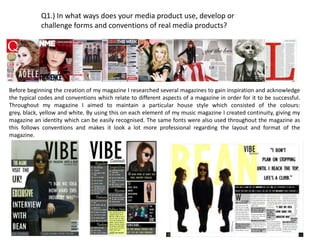
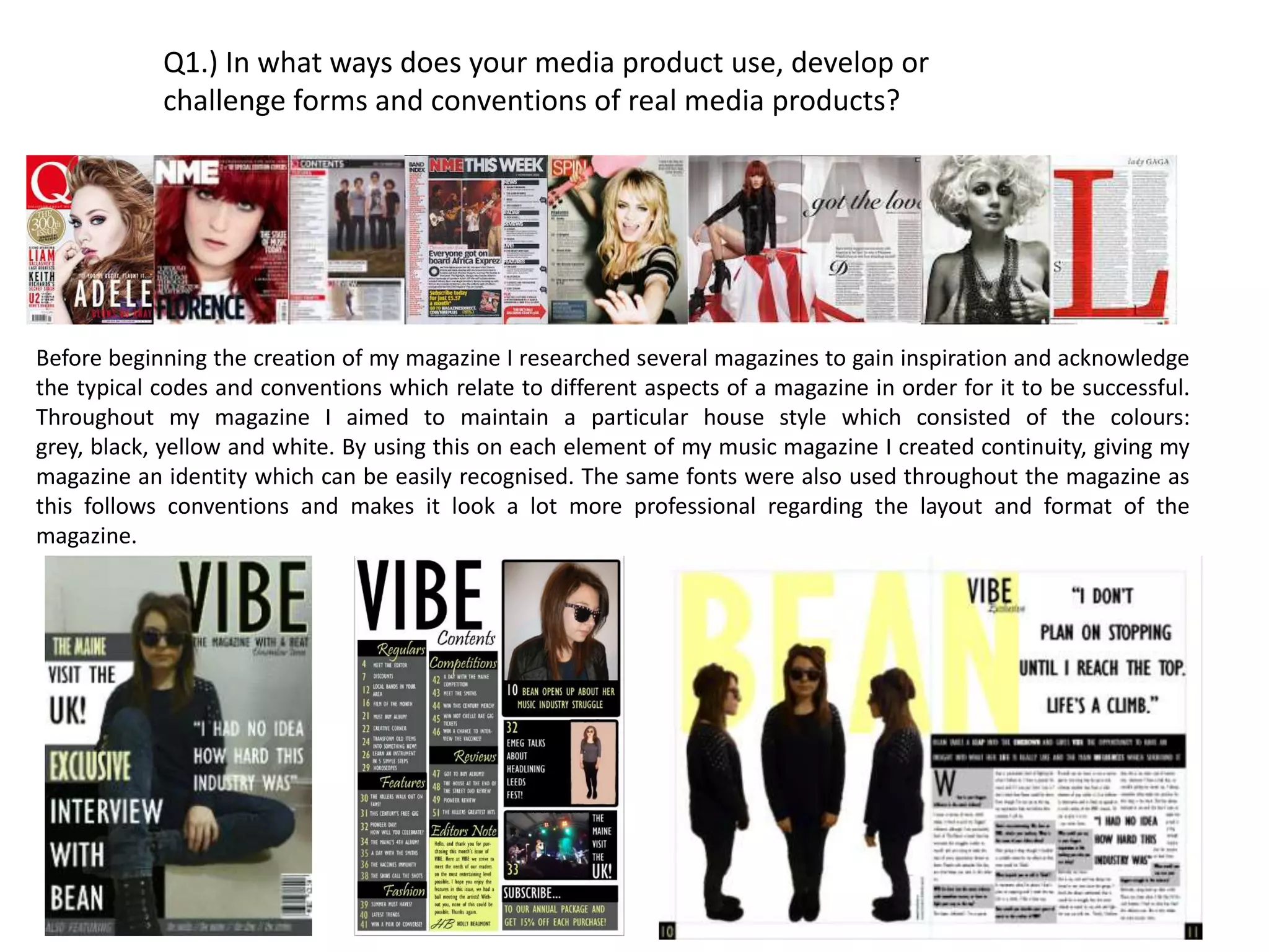
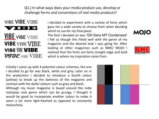
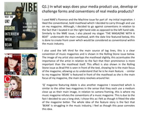
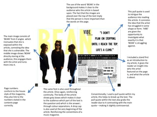
The document discusses how the media product both uses conventions of real music magazines as well as challenges some conventions. It follows conventions such as using consistent colors and fonts for continuity, including photos and captions, and blocking articles into categories on the contents page. However, it challenges conventions by placing the masthead on the right instead of left and using a long shot for the cover photo instead of a medium close-up. The document provides examples from researched magazines to support how it both conforms to and adapts real music magazine conventions for its target genre and ideas.
The document compares the key conventions used in the front covers and contents pages of the author's music magazine and Vibe magazine. Both magazines use similar conventions such as bold mastheads at the top, images of artists with props representing their style, pull quotes to summarize articles, and listings of articles in the contents. However, the author's magazine includes more information on the cover and arranges some elements differently for variety. The document analyzes the purpose behind various design elements used in both magazines.
This magazine cover uses Florence from Florence and the Machine as the central image. She is a popular musician, making her an engaging cover subject. Around her are landmarks from different cities, implying her music is spreading worldwide. The cover also promotes free music downloads from Florence to attract fans. Overall, the cover utilizes a popular artist and free music to generate interest in the magazine's music industry content.
The masthead is large and bold, as is typical. Only a few colors are used to keep the design clean. Cover lines advertise reviews and articles about bands and songs to appeal to the music-focused readership. Placement of elements like the barcode, price and date follow standard magazine layout conventions.
The document discusses how the creator of a music magazine researched other magazines to gain inspiration for conventions and codes. They aimed to maintain a consistent house style using the colors grey, black, maroon and white throughout the magazine to create continuity and identity. The same fonts were also used throughout to follow conventions and create a professional layout and format.
The document discusses the creation of a music magazine. It explains that the creator researched other magazines for inspiration on conventions and codes. Throughout the magazine, a house style was maintained using the colors grey, black, maroon and white to create continuity and identity. The same fonts were also used throughout for professional layout and format.
This document discusses how the author's media product uses and develops conventions of real rock magazines. It analyzes fonts, color schemes, photography, and writing styles used in magazines like Kerrang!, NME, and Rock Sound. The author replicates these conventions in their own magazine, "ACID," choosing a distressed title font, colors like red, black, white and yellow, high-contrast photography on the cover featuring a band, and informal writing with profanity and specialist terminology. Page numbers and a barcode are also included to follow magazine conventions.
The document discusses the design elements and conventions used in the media product, a magazine. It describes the page numbers, masthead, photography style, fonts, color scheme, pull quote, writing style, and how these elements represent the intended audience and attract readers. The goal is to emulate conventions of real magazines like Kerrang while appealing to fans of punk rock bands like My Chemical Romance. Photoshop skills were applied to arrange photos and text professionally. Overall, the document shows how conventions were adopted and adapted to target a specific demographic.
The document discusses the conventions used in magazine design, specifically for an indie music magazine. It examines the conventions used for elements like the masthead, images, fonts, and layout. Images typically feature bands in a casual style. Fonts are sans serif for readability. Layout follows typical magazine conventions like placing the largest image first to draw readers in before they read the article. The document provides examples from other magazines to illustrate these typical conventions.
The document summarizes how the media product challenges and conforms to conventions of real music magazines. It discusses several design elements:
1. The masthead conforms to conventions by being at the top but challenges conventions with its font and color gradient design.
2. The magazine name "Rewind" challenges conventions by having a musical reference while still sounding catchy.
3. The color scheme and images challenge conventions of rock magazines but the font size hierarchy conforms to draw attention to key information.
4. The contents page combines conventional elements like columns with an unconventional collage of images to highlight multiple artists.
5. The double-page spread uses a large gritty street scene image
My media product uses similar forms and conventions as real magazines like Kerrang! and NME by including elements like the issue date, price, and featured articles on the left side. The consistent fonts, colors, and styles throughout also mimic real magazines. The target audience is emos and rockers aged 13-19 through the use of darker colors, sarcastic language, and bands from that era. The writing and presentation aims to attract this audience by being bold, standing out from the dark background, and including relatable content. Through this process, I learned how to use Photoshop and gained experience using the magazine design software InDesign.
The document discusses conventions used in real media products and how the author's media product challenges or develops these conventions. Specifically:
- The magazine uses conventions like mastheads, skylines, sell lines, images, barcodes and dates found in other magazines.
- However, it challenges conventions by using unusual color schemes, separating letters in headings, and placing page numbers at the top rather than bottom.
- The target audience of 15-26 year olds is reached through a focus on R&B music news, trends and artists, as well as using social media to engage younger readers online.
This document discusses the design and conventions used in a mock magazine called "Feature" focused on the R&B music genre. Key elements included on the cover and throughout the magazine are the masthead, skyline, sell lines, main image, secondary image, hook, barcode, date, price, and main cover line. The target audience is males and females aged 15-26 interested in keeping up with the latest R&B artists, news, and style trends. Social media is integrated to engage younger readers who may prefer accessing the magazine online rather than in print. The color scheme used is black, white, and yellow to match the edgy nature of the R&B genre.
Annotation of two magazines front cover’sJessieGee14
This document summarizes and compares the front covers of two student magazines. One magazine appears to target female students with feminine colors and articles on topics of interest to women. The other magazine seems aimed at more motivated students not focused on parties, using pastel colors and featuring a young graduate to appeal to higher-achieving students interested in their career. Overall, the magazines appear to have very different styles and target audiences based on their front cover designs and imagery.
The document discusses the design conventions followed in creating a music magazine called "Spotlight". These include using a gritty yet readable font for titles, an easy to read font for body text, brief but informative articles, and a color scheme similar to other music magazines. Photographs follow conventions of using passive shots for covers and double page spreads and active shots for contents pages. Pull quotes, cover lines, and page numbers also adhere to typical magazine conventions. The intended audience is represented equally regardless of gender.
This document summarizes the key elements of magazine front covers including:
1) The main image which dominates the page and is positioned in front of the masthead to draw attention.
2) Cover lines and tag lines which list articles and the magazine's selling point to target different audiences.
3) The masthead which is typically positioned at the top third of the page in a large, attention-grabbing font.
4) Date, price and barcode which provide basic identifying information in a subtle manner.
The document provides an analysis of how the student's media magazine product uses conventions of real magazines to be successful. It examines the use of the rule of thirds in layout, the Gutenberg diagram to place key information, and how the front cover follows magazine conventions through positioning of images and title. The student also represents the niche audience of punk/grunge music fans aged 16-25 through the chosen model, clothing, and negative tagline. To attract this audience, the model is styled to look like the music genre through her leather jacket, t-shirt, and dismissive attitude.
This document discusses the layout and design elements of music magazine NME. It notes that NME typically uses a close-up headshot on the cover that takes up the whole page. The inside pages continue the red, white, and black color scheme and bold masthead. Sell lines entice readers with snippets of stories, while images on the contents page further engage readers. Double page spreads feature large central images that overlap pages and set the indie tone through costumes and locations. Pull quotes and drop caps are used to break up columns of text on feature articles. Consistency in house style and design elements builds brand identity and appeals to readers.
The document summarizes the key conventions and codes used in music magazines that the author incorporated into their own music magazine project. Some of the main conventions included mastheads, cover lines, quotes from artists, large cover images, contents pages with headings and listings of articles, double page interviews with photos and introductory comments, and consistent color schemes and fonts throughout. The author analyzed real music magazines to incorporate standard elements like mastheads, barcodes, and subscription boxes to make their magazine seem professional and realistic.
This document summarizes the front cover, contents page, and double page article layout of a music magazine called "Amp Volume".
[1] The front cover uses conventions like mastheads, strip lines, cover lines with images, barcodes, and advertisements to attract audiences.
[2] The contents page lists article headings in bright colors and includes a subscription box. Most magazines include cover images and editor summaries.
[3] Double page articles typically feature large central quotes and images that portray lifestyles and target audiences. Conventions like white text on black backgrounds are used.
The document summarizes the ways in which the media product uses, develops, and challenges conventions of real media. It discusses using a masthead similar to other magazines in terms of location, colors, and font. Images are used that represent the rock genre through posing, clothing, and facial expressions of models. Layout follows conventions such as masthead location, pull quotes, and issue dates. The written content aims to be interesting and understandable for the target audience. In summary, the document outlines how the media product adheres to and develops conventions through its visual design, images, layout, and writing.
- The document discusses the ways in which the media product (a music magazine called BASS) uses, develops, and challenges conventions of real music magazines.
- It represents the rap/hip-hop social group through the clothing, props, and settings used in the photos, targeting this demographic.
- The magazine would be well-suited for distribution by large publishers like Conde Nast or IPC Media, as they distribute a wide variety of music magazines and could help the magazine reach a broad audience.
- The target audience is identified as those ages 14-35, across both working and middle class readers, with a focus on rap/hip-hop fans of various ethnicities.
This document summarizes how the media product uses, develops, and challenges conventions of real music magazines. It analyzes the front cover, contents page, and double-page article spread. Conventions are followed, such as masthead placement and page numbers. Conventions are developed, like using filters on images. Conventions are challenged, like an unconventional masthead font. Overall it examines magazine design elements and how conventions are applied, modified, or subverted.
The document describes the process of selecting images and designing the layout for an indie music magazine. It discusses deliberating over which photos to use for the cover and features to establish the right aesthetic. Considerable effort was put into editing the cover image and ensuring variety among the small feature photos. Descriptions of the magazine masthead, selling points, interviews, festivals content, and features aim to appeal to an indie demographic.
The document discusses how the media product (a mock rock music magazine) uses, develops, and challenges conventions of real rock music magazines. It summarizes how various elements of the mock magazine, such as the masthead design, images, costumes, people featured, fonts, written content, genre portrayal, layout, and contents page conform and challenge conventions of real magazines like NME and Mojo. While some elements conform to conventions through similar color schemes, fonts, and article layouts, other elements like the album artwork images, limited artist variety, and masthead/title sizes challenge conventions of real magazines.
The document provides an analysis of 3 different music magazines: Kerrang, Status, and Vibe. For Kerrang, it notes the bold masthead font suits the rock audience and text overlapping the image screams out to readers. Status has a unique masthead and covers various artist genres. Vibe has few cover lines but the main one introduces new pop music, and its images project a tough image of the pop artists.
The document discusses how the author's magazine product represents and attracts its target audience. It uses similar conventions as other rock magazines through elements like masthead design, color schemes, and column structures. The magazine represents musicians and mainly male rock fans in their late teens to early twenties. It would be distributed by music festival publishers and at rock festivals to reach this audience. The author aims to attract readers through bold designs, live music images, and incentives like a free music download that appeal to their interests.
Sam Knappett's media magazine evaluationsamknappett
This document summarizes how the media product of a music magazine challenges and develops conventions of real music magazines.
The front cover challenges conventions by placing cover lines at the bottom instead of the side and using a large black and white feature photo with 7 people instead of the typical 1-5 people. The contents page challenges conventions by including more information and less photos than typical contents pages.
The double page spread challenges conventions by using a single background photo instead of multiple photos or white space, and not separating the text with pull quotes or a gap between pages. It also does not change the style from the front cover.
The magazine represents its target urban, rap/hip-hop audience through the clothing, poses,
The document discusses how the author's indie/rock music magazine cover uses and develops conventions from real magazines like NME, Q, and Rolling Stone.
The author based the aesthetics and layout of their cover on these magazines to make it recognizable as an indie/rock magazine. Colors, placement of images and text, and inclusion of music-related images like guitars follow conventions of these magazines.
The author also challenges some conventions by changing the central layout and placing the main image at the bottom of the cover rather than center. The target audience is younger at 13-18 to provide suitable content, and it aims for a middle (C2-E) class with informal, "laid back" styling.
The document describes the layout and design elements of an NME magazine cover and contents pages. Key points include:
- The cover uses a red, black and white color scheme consistent with NME's style, featuring tilted images and text at angles to look messy while remaining organized.
- Pull quotes from band members are included to draw in readers. Large central images are used along with smaller supporting images of other artists.
- The contents pages continue the color scheme and include photos matching interview quotes. Column layouts and page numbers provide organization.
- Advertisements and subscription information are also included consistently across pages in the color scheme.
The document summarizes the evaluation of a music magazine cover design and contents pages. It identifies ways the design challenges conventions of real magazines (e.g. not showing the artist's full face) and ways it conforms to conventions (e.g. using a 3-color scheme and placing the logo in the top left corner). The evaluation also examines how conventions are used or challenged for the contents page and a double-page article spread.
This analysis summarizes a double page magazine spread about Ed Sheeran. The main image depicts Ed Sheeran looking serious in front of London landmarks. His orange hair is emphasized through color filters to match the pull quote "I'm bringing ginger back!". The serious expression and backdrop reinforce a serious tone about his music, though the pull quote introduces humor. Minimal space around the article allows more focus on the large main image of Sheeran, while simple, colloquial language makes the content approachable to readers.
The document analyzes the front covers and contents pages of various music magazines. It describes the colour schemes, titles, and main images used on each cover and contents page. Common elements included bold colours like red to grab attention, well-known magazine titles in distinctive fonts, and photos of famous musicians. The covers aimed to highlight important artists and articles through the use of larger images and text sizes. Contents pages also used colour and images to identify key stories and sections within the issue.
The document discusses Maya Deren's analysis of Pablo Picasso's art and vision. Deren explains that Picasso was able to perceive elements in contexts differently by comparing disparate events and recognizing how parts function variably. She notes he aimed to disassemble wholes and manipulate elements to create new contexts and realities through his interventions. The document concludes that, as Deren's vision and Picasso's art show, people see things through the lens of their own experiences.
This document analyzes the conventions used in a double page spread (DPS) layout for a magazine. It examines various design elements like the main image, headlines, pull quotes, and text formatting. For each element, it provides an interpretation of what the used conventions may connote to readers. Overall, the document suggests the layout aims to engage audiences by appealing to their needs for information, entertainment, social interaction, and ways to find identity or satisfaction. It emphasizes the importance of considering how target readers may feel and react to different stylistic choices when designing magazine pages.
This document contains an evaluation of a student's media studies project creating a music magazine called "Virtuoso". The student discusses how their magazine uses and develops conventions from real music magazines like "Billboard". They also discuss representing social groups, their target audience, and how they addressed that audience. The student reflects on what they learned about using Adobe Photoshop to construct the magazine pages and planning the photography used.
Cell phones topped the list of things people said they could not live without according to a 2008 survey, with relationships such as family, best friends, bosses, and significant others also being highly valued. The survey found that cell phones serve as a phonebook and network for maintaining relationships with the top 4 contacts in a person's phone - family, best friend, boss, and significant other - accounting for 80% of calls and texts.
The student created a music magazine called AMPED that uses several conventions from real music magazines like NME, Metal Hammer, and Q. The front cover features a large central photo of the main artist like NME. Color schemes representing rock music include black, white, red, blue, and yellow. The masthead is prominently displayed unlike some magazines where it is blocked. While adhering to many conventions, the student also challenged some by adding a border to the front cover to focus attention and provide structure. Overall, the magazine draws from real media examples while making some adaptations.
The document summarizes how a music magazine cover and content pages were designed to follow conventions of real music magazines like NME and MOJO, while also innovating in some ways. Key points:
- The cover uses a large bold font for the masthead, pull quotes, and varied font sizes/colors like NME. However, it places the banner across the top rather than bottom.
- Content pages follow NME's layout with a band index, subtitles in boxes, and repeating the magazine title. But it uses one large central image rather than many small ones.
- Formal elements like "This Week" were included to appeal to older student readers, going against conventions.
- The
The document describes the process of creating a magazine cover, contents page, article layout, and questionnaire for a music magazine. Key details include using a female model on the cover to appeal to a broader audience than typical rock magazines. Color schemes, images, and fonts are chosen to represent the rock/alternative genre. Feedback from a questionnaire informed the content sections and artists featured. Overall the magazine aims to challenge conventions while appealing to its target 16-20 year old audience.
- The magazine follows conventions such as placing the masthead in the top left corner and cover lines near the main image to attract readers' attention.
- It challenges some conventions by moving the masthead to the right and having simpler cover stories and contents pages with relevant colors.
- While the magazine represents fans of drum and bass music, it also aims to attract other music fans through its use of dark colors contrasted with brighter tones.
- The magazine follows conventions such as placing the masthead in the top left corner and cover lines near the main image to attract readers' attention.
- It challenges some conventions by moving the masthead to the right and having simpler cover stories and contents pages with relevant colors.
- While the magazine represents fans of drum and bass music, it also aims to attract other music fans through its use of dark colors contrasted with brighter ones.
This document discusses the design choices made for a music magazine called "Alternative". It addresses the title, fonts, colors, layout, use of images, and written content. Photographs on the cover were manipulated using editing tools to darken the background and highlight the model. The overall style draws from existing magazines and aims to appeal to fans of alternative music through an informal tone and emphasis on the featured artist. While most elements follow conventions, the creator notes the contents page could have been designed more cohesively.
The document summarizes how the student's music magazine front cover and content pages use, develop, or challenge conventions of real music magazines. For the front cover, the student followed conventions like using a band banner and center image but challenged conventions with text placement. For content pages, the student used a layout inspired by NME but challenged conventions with formal elements and rearranging some sections. The goal was to appeal to an intended audience of older indie/rock music fans.
The magazine uses and develops conventions of real indie magazines through its minimalist design, simple color palette, and representation of the artists. The title, layout, and fonts follow conventions seen in magazines like Clash to create a recognizable product for its audience. Photographs feature the artists in relaxed, understated poses and clothing reflective of the indie genre. While some elements like placement of images and masthead differ from typical conventions, the overall design develops conventions to effectively represent and market the indie band to its target audience.
Evaluation of my own music magazine productionAshleigh Foy
The document provides an evaluation of the student's own music magazine production. It discusses various ways the magazine uses and develops conventions of real music magazines. This includes using a longer word for the masthead to fit the indie genre, positioning the cover model to turn pages, and including typical magazine elements like barcodes and prices. Formats like the contents page and double-page articles are analyzed against magazines like NME. The target audience is identified as women aged 16-23 interested in indie music and style. The student concludes that IPC Media, which distributes NME, would be a suitable institution to publish the magazine due to the similar audience demographics and conventions used.
Evaluation of my music magazine productionAshleigh Foy
This document provides an analysis of the student's music magazine project. It discusses several ways the magazine uses and develops conventions of real music magazines. It describes using "Eclectic" for the masthead to represent different indie music styles. Photos and layout follow conventions like large cover images and placing essential details in the bottom right. Color schemes and fonts were inspired by magazines like NME and Q. Inside pages imitate NME's layout with images, columns, and pull quotes. A double page spread uses a title at the top and 3 column layout like NME. The magazine aims to represent young female musicians and portray the main artist as having interests in photography, art, and fashion to inspire its target audience of women aged 16
Evaluation of my own music magazine productionAshleigh Foy
The document provides an evaluation of the author's own music magazine production. It summarizes the key ways the magazine uses and develops conventions of real music magazines. This includes using a longer masthead word, full page cover images, eye contact directing to the right, medium close-up shots, and color schemes inspired by other magazines. It also discusses representing a target audience of women aged 16-23 by featuring a female artist and portraying her style and interests. Finally, it suggests IPC Media as a potential distributor since they distribute a key inspiration magazine, NME, and have a large female audience.
Evaluation of my own music magazine productionAshleigh Foy
The document provides an evaluation of the author's own music magazine production. It summarizes the key ways the magazine uses and develops conventions of real music magazines. This includes using a longer masthead word, full page cover images, eye contact directing to the right, medium close up shots, and color schemes inspired by other magazines. It also discusses representing a target audience of women aged 16-23 by featuring a female artist and portraying her style and interests. Finally, it suggests IPC Media as a potential distributor since they distribute a magazine that inspired the design conventions, and they engage the target demographic.
Evaluation of my music magazine productionAshleigh Foy
The document provides an evaluation of the author's own music magazine production. It summarizes the key ways the magazine uses and develops conventions of real music magazines. This includes using a longer masthead word, full page cover images, eye contact directing to the right, medium close-up shots, and color schemes inspired by other magazines. It also discusses representing a target audience of women aged 16-23 by featuring a female artist and portraying her style and interests. Finally, it suggests IPC Media as a potential distributor since they distribute a key inspiration magazine, NME, and have a large female audience.
This document summarizes how the media product of an indie music magazine front cover, contents page, and double page spread uses and develops conventions of real music magazines while also challenging some conventions. The front cover takes inspiration from magazines like NME and Clash with its masthead design, prominent band image, and use of color. However, it challenges conventions by centering some text. The contents page follows conventions with its masthead, images, and section divisions, but challenges some by adding background to page numbers. The double page spread keeps the color scheme and uses images and highlighted text as is conventional, but challenges conventions through its use of contrasting colors.
The magazine challenges conventions by placing cover lines on the opposite side and using larger writing underneath in smaller text. The masthead is dominating and spread across the top like NME. The main image covers the masthead and conveys the magazine's genre.
The contents page uses a rhetorical question instead of just "contents" and pictures are framed like polaroids to look authentic. A band index like NME makes the magazine look information dense.
The double page spread repeats the band's title font and uses a large main image overlapping the title. The interview uses red and black text to break up information and introduce the band.
The magazine represents younger music fans ages 14-20 interested in indie/rock
The document summarizes the process of creating a magazine called "Amplify" focusing on indie/rock music. Key details include following conventions of similar magazines like NME, including features such as artist quotes and photos. While adopting many conventions, some choices break conventions such as not including a band index or magazine subscription advert. The target audience is identified as 16-25 year olds of both genders interested in music. Distribution through an experienced publisher like IPC or a specialist like Rhinegold is considered.
This document discusses how the student's media magazine product uses and develops conventions from real magazines like NME.
The title, images, people featured, fonts, and written content generally conform to conventions of indie magazines. The title, artists' photos and attitudes, and fonts used help suggest the magazine's music genre.
While some elements like the main model's pose on the cover challenge conventions slightly, other aspects like her style of dress and the layouts of the front cover, contents page, and spreads follow conventions. The contents page specifically aims to conform to NME's style but includes more photos, developing that convention.
The document summarizes the key aspects of an underground magazine created for a media studies assignment. It discusses conventions used and challenged in the magazine's design, such as cover lines, mastheads, images, and barcodes. Social groups represented include young people aged 14-20 interested in indie/rock music. A double page spread on a band called "The Pretty Suicides" uses different text colors and includes photos and a quote. The gender portrayed is strong, dominant teenage girls rather than stereotypical quiet ones. IPC Media is suggested as a suitable distributor since it produces magazines like NME that the underground magazine is similar to. The target audience is described as those who read magazines aimed at people interested in pop culture and
The document summarizes how the media product uses and challenges conventions of real music magazines. It analyzes each element of the front cover and contents page, describing how conventions are used or challenged for things like the masthead, sell line, images, columns, and page numbers. For example, the masthead challenges conventions by using a unique cut-out effect, while the sell line uses a common convention but differentiates it with italics. Overall, the document shows an understanding of magazine conventions and thoughtfully discusses how the media product both adheres to and innovates beyond typical conventions for music magazines.
The document summarizes how the media product uses, develops, and challenges conventions of real music magazines. It analyzed the front cover and contents page of NME magazine to identify codes and conventions. For its own indie/rock magazine called "Riff", it strived to follow conventions such as the masthead, coverlines, and sections on the contents page. However, it also challenged conventions by adding a second large photo on the cover and including a band index on the contents page. The document discusses each design decision and compares it to conventions from NME.
Theorists and how they relate to my material:holbeau
The document summarizes several media theories relating to representation, narrative, audience, and ideology. It discusses key concepts from theorists such as Levi Strauss, Laura Mulvey, John Berger, Tessa Perkins, Richard Dyer, and others. The document also relates each theory to the creator's own music video, explaining how concepts around binary opposites, male gaze, stereotypes, and more are relevant to the themes and story presented in the video.
The document discusses what the author learned from their preliminary magazine cover task to the final magazine product. They realized conventions like headers, selling lines, and prices are important to include to make the magazine look more professional. Unused conventions on the preliminary cover like headers and prices detracted from its quality. For the final product, the author aimed to conform to conventions like mastheads, dates, and barcodes. They also gained experience with design software and received feedback to improve the final magazine cover.
The document describes the process of creating a double page spread from first draft to final version. It involves image manipulation using selection and smudge tools to clean up jagged edges. The spread includes an artist name and title, a quote, introductory text, bylines, the article text, social media links, and feedback. The creator was advised to add page numbers for convention and decrease the prominence of social media plugs compared to the article text. Issues with wrapping text around an image leg will also be addressed when making future changes.
The document discusses changes made to a magazine's contents page based on feedback. It was advised to change the font to conform to the house style used throughout the magazine. The original color scheme made the font hard to read against the dark background. The font was changed to 'Mistral' for continuity with a double page spread, and the maroon tone was lightened to improve readability against the dark background.
This document outlines the production process for a magazine cover from initial photo shoots through revisions and feedback. It includes taking photos, selecting and editing images, adding design elements like mastheads and barcodes. The first draft received feedback suggesting alternating fonts for cover lines to appear more professional, adjusting the barcode size, and potentially filling blank space. Revisions were made to fonts, dates, and other elements before a final cover was completed.
Q4. How did you use media technologies in the research, planning, constructio...holbeau
This particular SlideShare highlights the key aspects of technology used throughout the process of the creation of my promotional package consisting of a promotional music video, digipak and promotional poster in combination with one another.
The document describes the steps taken to update a music poster based on feedback. It details how the artist copied a panel from their digipak to maintain continuity. It then explains how they blacked out the artist's face, changed the background color to maroon, added text stating the release date as "out now", and included more social media information to promote the artist. The updated poster incorporated this feedback to make the design more appealing and informative for audiences.
This document lists potential images for a front cover, contents page, and departmental profile sheet (DPS) but provides no details on the actual images or their purpose. It appears to be an incomplete draft listing where images could be included but without specifying the images themselves.
Images were taken of an unknown subject, with 4 total photos being captured to document an event or object. Brief imagery was recorded without providing context on the purpose, content, or nature of the pictures in a concise photographic documentation.
The document discusses problems with photographs taken for a magazine. It notes poor lighting, unwanted objects in shots, and large shadows around the model. This made editing difficult and brought down the overall quality and professionalism of the images. To address these issues, the photographer plans to reshoot the images with better lighting in the studio, clear backgrounds, and attention to framing shots without unnecessary inclusions.
The peer feedback provided suggestions to improve the magazine cover drafts:
1. Use a close-up portrait to show emotion and make eye contact with the audience. Include a visible price and use different font styles creatively.
2. Show more work leading up to the cover design. The pictures lack professionalism and the magazine looks empty without a color scheme. Make the masthead bigger and try a different font.
3. The blog research and draft ideas were good but the cover seems bland without more effects on the writing or an enlarged barcode and distinct price and date.
4. The blog research quality was high but the cover is lacking a date, title, price and headline to make it
The document discusses various techniques used in magazine contents pages to attract potential buyers. It notes that including a band index allows readers to see if there are artists they like featured. Subscriptions are promoted to save money while enjoying recurring issues. Images of upcoming content and arrows directing readers further entice people to purchase the magazine by implying more interesting articles are inside.
I have created a PowerPoint presentation highlighting areas where my music product could be promoted, including a promotional package showing different advertising options and their effectiveness. I believe professionally promoting my product in areas like YouTube, VEVO, iTunes, music magazines, and music stores will increase views, popularity, and sales by targeting audiences interested in pop rock music.
I created a SlideShare to show the first draft of each element of the ancillary text both within the digipak and as separate elements. The promotional poster is also included.
I took a variety of images from google of different digipak and analysed particular elements of each, stating how these would link to my product and influence its production.
This document discusses sources of inspiration for an album cover from various existing album covers. The writer intends to take elements from the covers of Tom Odell and Justin Timberlake. For Tom Odell's cover, the writer likes the simplicity and the road in the background to represent the character's journey. For Justin Timberlake's cover, a blindfold is noted as unusual but could represent love blinding the character. Elements like suits, blindfolds, and close-up shots may be incorporated to represent themes of formality, love, and empathy in the character's situation.
This is a SlidShare created to show the conventions of a typical Pop Rock digipak. Despite the fact that this pack is based on a band as opposed to an individual artist, I still chose to analyse it due to the fact that it makes me more aware of conventions within this genre and i am able to adapt a particular element to suit my situation if something was to appeal to me.
1. Q1.) In what ways does your media product use, develop or
challenge forms and conventions of real media products?
Before beginning the creation of my magazine I researched several magazines to gain inspiration and acknowledge
the typical codes and conventions which relate to different aspects of a magazine in order for it to be successful.
Throughout my magazine I aimed to maintain a particular house style which consisted of the colours:
grey, black, yellow and white. By using this on each element of my music magazine I created continuity, giving my
magazine an identity which can be easily recognised. The same fonts were also used throughout the magazine as
this follows conventions and makes it look a lot more professional regarding the layout and format of the
magazine.
2. Q1.) In what ways does your media product use, develop or
challenge forms and conventions of real media products?
I decided to experiment with a variety of fonts which
gave me a wide variety to choose from when deciding
which to use for my final piece.
The font I decided on was ‘Gill Sans MT Condensed’
I felt as though this fitted well with the genre of my
magazine and the desired look I was going for. After
looking at other magazines such as NME/ MOJO I
realised that the fonts are fairly straight edge and bold
which is where my inspiration came from.
Initially I came up with 4 potential colour schemes, the one
I decided to go for was black, white and grey. Later on in
the production I decided to introduce a fourth colour
(yellow) to break up the darkness of the magazine and
contrast with the duller colours such as grey and black.
Although my music magazine is based around the indie
rock/pop rock genre which can be grungy, I thought it
would be good to incorporate another colour to make it
seem a lot more light-hearted as opposed to constantly
melancholy.
3. Q1.) In what ways does your media product use, develop or
challenge forms and conventions of real media products?
I used NME’s Florence and the Machine issue for part of my initial inspiration. I
liked the conventional, bold masthead which I decided to carry through and use
on my magazine. Although, I decided to go against conventions in relation to
the fact that I located it on the right hand side as opposed to the left hand side.
Similarly to the NME issue, I also placed my slogan ‘THE MAGAZINE WITH A
BEAT’ underneath the main masthead, with the date line featured below, this
is done to create front cover which would be considered as conventional within
the music industry.
I also used the left third for the main source of tag lines, this is a clear
convention of music magazines and is shown in the Rolling Stone issue below.
The image of my artist also overlaps the masthead slightly, this accentuates the
importance of the artist in relation to the fact that their prominence is more
important than the masthead itself. This effect is also shown in the Rolling
Stone issue as Brad Pitt is seen in front of the text, showing he is the main focus
of the magazine; allowing us to understand that he is he main feature. - similar
to my magazine ‘BEAN’ is featured in front of the masthead as she is the main
focus of my magazine, the main story revolves around her.
‘Q’ magazine featuring Adele is also another magazine I researched which is
similar to the other two magazines in the sense that they each use a medium
close up as their main image, in relation to camera framing, this is where my
music magazine refutes the conventions of a music magazine. This is due to the
fact I decided to use a long shot, I chose this as I felt as though it fitted the vibe
of the magazine better. The whole idea of the feature story is the fact that
‘BEAN’ is struggling in the music industry, I feel as though this pose connotes
this idea.
4. Q1.) In what ways does your media product use, develop or
challenge forms and conventions of real media products?
After researching several music magazine contents page’s, my main inspiration came
from NME’s music magazine in relation to the fact that it is blocked into different
categories through the use of several subtitles, this makes it easier for the reader to
find a particular article they are interested in. I decided to include and editors note as,
although it is not included in NME, I thought it was a convention which would be good
to include. It makes the magazine appear a lot more personal to the editor and
creates a relationship between both the editor and audience.
I also included the masthead once again on the left hand side of the page to create
continuity throughout the magazine, this makes the magazine easily recognisable to
the readers and maintains the house style. This is a convention taken from various
magazines including the NME magazine below.
A ‘subscribe’ option is also included in my contents page which is another convention
of music magazines as seen on the NME contents. This helps lure in potential
customers to purchase the monthly magazines at a discount. This is helpful as my
magazine revolves around students, which will not have mass amounts of disposable
income.
I also conformed to the conventions of a music magazine in relation to the fact that
my magazine includes a variety of pictures relating to the articles on particular pages,
the captions located next to the image also give the reader an insight into the article
within it. This technique is also shown on the NME magazine of which most of my
inspiration came from. Although, it was adapted to suite my particular genre and
ideas behind the magazine better.
5. Q1.) In what ways does your media product use, develop
or challenge forms and conventions of real media
products?
Once again the main inspiration for my music magazine double page
spread came from the source of NME – their article of Florence and The
Machine.
In this article I particularly liked the background of the image made up
of the text ‘USA’, so I decided to recreate it into my own using the name
of my artist; ‘BEAN’. The reason for using 3 images of my artist from
different perspectives connotes the idea that she is fully exposed within
this interview – we see her from every angle.
I also followed conventions in relation to my double page spread
through the use of a standfirst to give a vague introduction to the artist,
and the article on the page.
I then used a drop can to once again reinforce conventions of the
double page spread regarding the article. The article was then
separated in blocks of white and grey to make it clear which part is the
question, and which is the answer. A credit line was also put in
regarding the model, and who the images and article belong to.
Page numbers were also included at the bottom of the page, sticking to
the colour scheme, to maintain continuity throughout my magazine.
The page numbers also related to the articles shown on the contents
page which reinforces the continuity throughout the magazine.
6. Masthead on the right hand side goes against
Q1.) In what ways does your media product use, develop conventions due to them usually being placed
on the left hand side as seen on NME and Q. I
or challenge forms and conventions of real media thought this would look better regarding the
products? positioning of the image. It makes it easier to
read and more noticeable for readers. The
image of my artist also overlaps the masthead
Conventions were also slightly, this accentuates the importance of
followed on my music the artist in relation to the fact that their
magazine regarding the sell prominence is more important than the
lines. They are placed on the masthead itself.
left third which is the most
common place for these to be
situated. The house style is
also introduced through the
blocks behind the text. The
black and white each contrast Magazine and date line are located below the
with one another which leaves masthead in a black font to create and
a good effect, I used grey and maintain the house style throughout the
yellow – slightly less harsh magazine. The font ‘Pristina’ is used on the
tones to make the magazine date line to show some sort of variation
seem a lot less grungy and between the two pieces of text. This font also
portray the light-hearted, fun features within the magazine although the
side of my music magazine. predominant font throughout is ‘Gill Sans MT
Condensed’.
I followed magazine conventions by using a pull
The main image is of the artist quote on the front cover which links to the main
which this months issue of my image, relating to the main article within. This is
music magazine revolves around – done to attract potential customers and give them
‘BEAN’. She is shown sat down an insight as to what the main feature for this
facing the audience which I feel months issue is. Which could then possibly lure
links with the pull quote on the them in to purchase the product.
front cover. The fact that she is
sitting connotes the idea that she
Similar to official music magazines, the name of my
is possibly feeling slightly down,
magazine and price of the issue is located on the
and the magazine has a duty to
Once again following conventions of a music barcode. This follows typical conventions of a music
investigate the reason behind this.
magazine, I included a footer on the bottom of the magazine.
cover to give the reader an insight as to what is
inside the magazine before actually purchasing it.
7. Q1.) In what ways does your media product use, develop
or challenge forms and conventions of real media
Conventionally, the image relating to
products? the main article is a lot larger in
comparison to the others featured on
I also included the masthead of the contents page. The image is
different, with the artist in a different
my magazine on the contents
stance and outfit to show variation. The
page to make it more main article is also featured on a page
recognisable to readers and relatively close to the front due to it
maintains the initial continuity of being higher of importance.
the music magazine.
To further reinforce continuity, I
ensured the use of the same 4 Smaller photos are also shown on the
colours, black, white, grey and contents page, showing the different
yellow, throughout. The features within the magazine. They are
placed further back in the magazine as
maintenance of this house style
they are less important in comparison
makes the magazine more to the main story on the front page.
recognisable, giving it more of
an iconic look.
A ‘subscribe’ option is also included in my
contents page which is another convention of
music magazines as seen on others, such as
NME. This helps lure in potential customers to
purchase the monthly magazines at a discount.
This is helpful as my magazine revolves around
students, which will not have mass amounts of
Sub headings are a convention of
disposable income.
magazines which help readers
find what they are looking for,
efficiently. My magazine also
includes 51 pages, which is an I included an editors note in my magazine. I don’t feel as
average amount for a music though this is 100% conventional due to the fact that
magazine. Further reinforcing not many music magazine of my genre include one. I
still decided to include it as I feel as though it helps
the use of conventions.
develop a good relationship between the editor and the
audience – it makes it more personal.
8. The use of the word ‘BEAN’ in the
background makes it clear to the
audience who the article is based
This pull quote is used
upon. The fact that the images are
to intrigue the
placed over the top of the text imply
audience into reading
that the person is more important than
the article. It connotes
the words on the page.
the idea that the artist
has struggled in some
shape or form. ‘VIBE’
are given the
opportunity to
The main image consists of investigate what
‘BEAN’ from 3 angles which exactly it is that
insinuates that she is ‘BEAN’ is struggling
exposed within the against.
article, connoting the idea
that she is vulnerable. The
middle image shows ‘BEAN’
directly staring at the I included a stand first
audience, this engages them as an introduction to
with the artist and lures my article, it gives the
them into it. reader an insight into
who the artist
featured on the page
is, and what the article
is about.
Page numbers The same font is also used throughout
conform to the house the article. Once again, reinforcing
style of the magazine, continuity. The body of the article Conventionally, I used a pull quote within my
they also link to the shows grey boxes which makes it clear article, this helps to break up the text. The
numbers stated in the to the audience which part of the text is pull quote within the text also grabs the
contents page the question and which is the answer; reader due to it contrasting with the main
correctly. through colour separations. A drop cap quote – making it slightly controversial.
is also used at the very beginning of the
article. Reinforcing the conventions of a
music magazine.