G321 Music Express Magazine
By Anwar Qureshi
In what ways does your media product use, develop or
challenge forms and conventions of real media products?
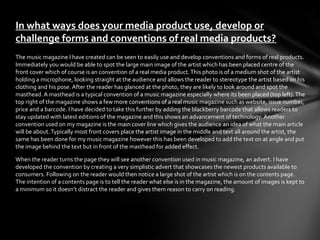
The music magazine I have created can be seen to easily use and develop conventions and forms of real products.
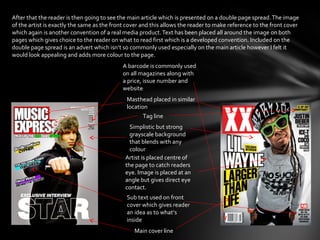
Immediately you would be able to spot the large main image of the artist which has been placed centre of the
front cover which of course is an convention of a real media product. This photo is of a medium shot of the artist
holding a microphone, looking straight at the audience and allows the reader to stereotype the artist based on his
clothing and his pose. After the reader has glanced at the photo, they are likely to look around and spot the
masthead. A masthead is a typical convention of a music magazine especially where its been placed (top left). The
top right of the magazine shows a few more conventions of a real music magazine such as website, issue number,
price and a barcode. I have decided to take this further by adding the blackberry barcode that allows readers to
stay updated with latest editions of the magazine and this shows an advancement of technology. Another
convention used on my magazine is the main cover line which gives the audience an idea of what the main article
will be about. Typically most front covers place the artist image in the middle and text all around the artist, the
same has been done for my music magazine however this has been developed to add the text on at angle and put
the image behind the text but in front of the masthead for added effect.

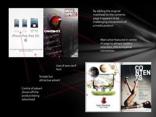
When the reader turns the page they will see another convention used in music magazine, an advert. I have
developed the convention by creating a very simplistic advert that showcases the newest products available to
consumers. Following on the reader would then notice a large shot of the artist which is on the contents page.
The intention of a contents page is to tell the reader what else is in the magazine, the amount of images is kept to
a minimum so it doesn’t distract the reader and gives them reason to carry on reading.
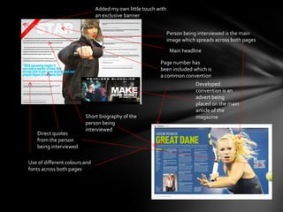
After that the reader is then going to see the main article which is presented on a double page spread. The image
of the artist is exactly the same as the front cover and this allows the reader to make reference to the front cover
which again is another convention of a real media product. Text has been placed all around the image on both
pages which gives choice to the reader on what to read first which is a developed convention. Included on the
double page spread is an advert which isn’t so commonly used especially on the main article however I felt it
would look appealing and adds more colour to the page.
                                            A barcode is commonly used
                                            on all magazines along with
                                            a price, issue number and
                                            website
                                              Masthead placed in similar
                                              location
                                                     Tag line
                                               Simplistic but strong
                                               grayscale background
                                               that blends with any
                                               colour
                                             Artist is placed centre of
                                             the page to catch readers
                                             eye. Image is placed at an
                                             angle but gives direct eye
                                             contact.
                                              Sub text used on front
                                              cover which gives reader
                                              an idea as to what’s
                                              inside
                                                 Main cover line
By adding the original
                                              masthead to the contents
                                              page it appears to be
                                              challenging conventions of
                                              a media product


                                                   Main artist featured in centre
                                                   of page to attract readers
                                                   attention, this is a typical
                                                   convention


                          Use of sans serif
                          font

             Simple but
             attractive advert

Centre of advert
shows off the
product being
advertised
Added my own little touch with
                               an exclusive banner


                                                                Person being interviewed is the main
                                                                image which spreads across both pages
                                                                 Main headline

                                                          Page number has
                                                          been included which is
                                                          a common convention
                                                                         Developed
                                                                         convention is an
                                                                         advert being
                                                                         placed on the main
                                                                         article of the
                         Short biography of the                          magazine
                         person being
                         interviewed
    Direct quotes
    from the person
    being interviewed

Use of different colours and
fonts across both pages
How does your music magazine represent a particular
social group?
Representation is the way which something is portrayed to an audience in a form of a stereotype. My magazine is
aimed to target social group C2-E with the age group being 16-25 year olds. Its likely that young black males would
be more interested to read this magazine as its fair to say the grime genre is strongly black dominated however
recently a few white artists have appeared so there’s a possibility of attracting a new crowd. The magazine I have
created looks to represent todays youth generation in particular those who are focused on rapping and having fun
with their lives. To gain full attention of the readers, images have been kept at large along with particular dress
codes and poses that the reader can relate to. Although this representation has a negative image in todays media,
it is what the youth of today regard as “cool”. The language used in most hip hop magazines is informal but this
has been developed to a more UK version where a lot of slang and more informal language has been used.

Certain phrases such as “freestyle” and “holla init” all link to the genre of grime. Immediately once the reader sees
the front cover photo of the artist, they will be attached to the rest of the magazine as they would be able to relate
to it with ease. Especially with todays generation of youth all wanting to pursue careers in music. Although the
main photo of the artist has no background, the use of prop draws attention and can give possible indication that
the photograph was taken in a studio. This also gives the reader a few seconds to think about the artist and
especially those aspiring to become artists would hope one day to be included in a magazine. The layout and
colour of the magazine has been kept simple but eye catchy along with informative as those interested in learning
about the artists life can do so.
What kind of media institutions might distribute your
media product and why?
The magazine I have created is likely to be published by Future. Future is a company that publishes magazines
that targets niche markets. The magazine would ideally need to be available in urban areas where the grime
genre is most popular. The areas that are quite fond of the grime genre are likely to be areas of low income and
high unemployment, this would mean it would be best for the magazine to be available online at a small
monthly subscription or be sold in normal corner shops. This gives the read choice over to own a paper copy or to
just simply log on to a website and download the magazine within minutes. Online magazines are not only easier
to view but also cost efficient for a distributer targeting niche markets. The magazine isn’t likely to sell in mass
amounts but revenue earned would be sufficient to keep the magazine available for consumers.

I also came across another well known publisher called Harris Publications. This of course is the publisher of the
XXL magazine which is the magazine similarly designed to the one I have created however Music Express has
been adapted to target a different sort of market. Harris Publications may be interested in targeting a UK
specific market even though they are based in America. Its possible they may look into investing into other
genres across the globe and grime may be of interest to them. The two magazines are similar in design and
content so it could be possible that some readers who have no idea what is grime is, still buy the magazine
because of brand loyalty to XXL magazines.
Who would be the audience for your media product?
My music magazine has been designed to target a young audience with the age ranging between 16-25. Grime
music is mostly dominated by male artists so its likely my magazine will be read by males however its possible
some females may be interested in looking at the magazine especially if the front cover photo appeals to them.
The magazine would be available in urban areas so people from the area are likely to be low class/working class
people. This makes them classed between C2-E in terms of social class. C2 represents people from low income,
followed up by D representing low skilled jobs and lastly E as unemployed. Peoples income from these areas are
likely to be low so the fee for the magazine is going to be set at a very competitive price which is affordable for
most living in these areas. Grime is more known to be underground, less mainstream music as compared to hip-
hop and rap which is mainstream. Grime is a genre that is starting to diversify into different races and
nationalities however its currently most popular amongst young black males. My front cover image shows that
the genre grime gives opportunity to anybody who has talent hence why it may seem odd to see an asian male
in a grime magazine especially as the main magazine image.

Many people who listen to grime often look up and idolise many artists as they wish to become successful. In
grime there are very few female grime artists so its possible by seeing a female featured in the magazine, it
may aspire the female reader to create music and would make the featured females possible idols for them.
Young males may be inspired and motivated to do well especially if they see unknown or local artists get
featured, it gives them something to look up too and give them reason to keep creating music.
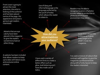
Front cover is going to             Use of slang and
attract the most                    informal language is the
attention, the artist is                                       Readers may be able to
                                    language preferred by      recognise locations of photos
looking at the audience             the youth of today
and has been placed                                            or even relate to similarities to
                                    which allows the reader    photo locations to the
centre of the page. His             to relate to.
appearance and pose is                                         environment they are in.
going to get readers
interested.


Adverts that are eye
catchy have been                          How did you
                                          How did you                    Cover lines attract the
placed in the magazine                                                   audience as it gives
to give the readers
                                        attract/address
                                         attract/address                 little insight as to
sometime to look at                     your audience?
                                         your audience?                  what’s inside the
other things.                                                            magazine.


A website has been included                                    I’ve used a mixture of colours that
that allows readers to keep     I have used a variety of       contrast well together to give the
up to date with latest issues   different fonts to create a    magazine a professional look
and exclusive online            better effect such as          along with a funky layout to keep
content.                        glow, bold lettering and I     the readers interested.
                                have also made use of
                                italics.
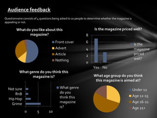
Audience feedback
Questionnaire consists of 4 questions being asked to 10 people to determine whether the magazine is
appealing or not.
What have you learnt about the technologies from the
process of constructing this product?
Throughout this project I have used and experimented with a large amount of different technologies which are
either software or hardware. In terms of creating the final products, the main hardware used have to be the
digital camera and the computer. For software it would have to be Adobe Lightroom and Adobe Photoshop. The
digital camera used was a canon 550d which is a camera I am very familiar with as I have been using it for over a
year. The camera has a lot of features, some which were not needed for this particular project but it is in fact a
great piece of equipment to use and fully delivered in taking great shots for my magazine. The camera actually
belong to my cousin so I was able to use the camera whenever whereas many of my peers had to book out
cameras from college which meant they had to wait until they were available.

To actually create my final product I of course I had to use the computer along with a range of software. A
computer allows you to gather all the data and put it together. Previously I had used a program called Adobe
Indesign however I had found this program to have very few features and just didn’t seem to work well in creating
an magazine effectively hence why I feel that wasn’t the best program to use when I had created my previous
project. This time I decided on sticking to a Photoshop which is program I have been using for many years and my
experience helped towards making my final products quickly and efficiently along with maintaining a professional
look that would appeal to my audience. Photoshop has a vast amount of features that were used and in very
easily to learn. The user friendly program meant that I was able to put together my product much quicker than
when I had used indesign in the past. To edit my photos I used Lightroom which is another program that is very
easily to use. Having used it before I knew how I wanted to edit my photos and how I was going to use them for
my magazine. When I first created my project, getting hold of the programs was difficult as I was limited to only
being able to work on my project in college however this time was much easier due to the fact I own a very
powerful editing/gaming computer at home that has a vast amount of programs that can be used.
Looking at your preliminary task, what do you feel you have
learnt in the progression from it to your full product?
Immediately the first thing I must have to say is that creating a professional magazine is not something that can be
done within a day. Hours of research must take place along with a larger amount of hours editing and creating the
magazine to make it perfect. Compare all my magazines and you can see how I’ve clearly improved upon with time
and more experience. My preliminary task was created within quite frankly must have just been a maximum of two
hours. My main product which was created previously took far longer however I was able to manage time more
effectively this time and managed to create a product not only appeals more but shows how my understanding of
conventions of magazines has improved. When creating a magazine, a numerous amount of conventions must be
implemented to your product otherwise the target audience simply will not be interested in reading it. Creating a
very simplistic but professional magazine is always likely to be successful along with the correct content readers
would like to read. The use of more appealing fonts, colour schemes and a better layout gives a better image of the
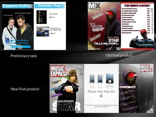
magazine. My preliminary task consisted of creating a magazine that wasn’t at all appealing, it was very dull and
lacked quality. My main product which was created before showed how I was able to pick up on these issues
however this was understanding was not fully shown as compared to the final product I have created now.

Of course not only has my editing skills improved, my noticing skills and research & planning skills have been
improved which can be used in many different projects for the future. I am able to successfully pick up and learn
different conventions of not just only magazines but other different types of media that can be used for A2.
Preliminary task    Old final product


New final product

2012 eval

  • 1.
    G321 Music ExpressMagazine By Anwar Qureshi
  • 2.
    In what waysdoes your media product use, develop or challenge forms and conventions of real media products? The music magazine I have created can be seen to easily use and develop conventions and forms of real products. Immediately you would be able to spot the large main image of the artist which has been placed centre of the front cover which of course is an convention of a real media product. This photo is of a medium shot of the artist holding a microphone, looking straight at the audience and allows the reader to stereotype the artist based on his clothing and his pose. After the reader has glanced at the photo, they are likely to look around and spot the masthead. A masthead is a typical convention of a music magazine especially where its been placed (top left). The top right of the magazine shows a few more conventions of a real music magazine such as website, issue number, price and a barcode. I have decided to take this further by adding the blackberry barcode that allows readers to stay updated with latest editions of the magazine and this shows an advancement of technology. Another convention used on my magazine is the main cover line which gives the audience an idea of what the main article will be about. Typically most front covers place the artist image in the middle and text all around the artist, the same has been done for my music magazine however this has been developed to add the text on at angle and put the image behind the text but in front of the masthead for added effect. When the reader turns the page they will see another convention used in music magazine, an advert. I have developed the convention by creating a very simplistic advert that showcases the newest products available to consumers. Following on the reader would then notice a large shot of the artist which is on the contents page. The intention of a contents page is to tell the reader what else is in the magazine, the amount of images is kept to a minimum so it doesn’t distract the reader and gives them reason to carry on reading.
  • 3.
    After that thereader is then going to see the main article which is presented on a double page spread. The image of the artist is exactly the same as the front cover and this allows the reader to make reference to the front cover which again is another convention of a real media product. Text has been placed all around the image on both pages which gives choice to the reader on what to read first which is a developed convention. Included on the double page spread is an advert which isn’t so commonly used especially on the main article however I felt it would look appealing and adds more colour to the page. A barcode is commonly used on all magazines along with a price, issue number and website Masthead placed in similar location Tag line Simplistic but strong grayscale background that blends with any colour Artist is placed centre of the page to catch readers eye. Image is placed at an angle but gives direct eye contact. Sub text used on front cover which gives reader an idea as to what’s inside Main cover line
  • 4.
    By adding theoriginal masthead to the contents page it appears to be challenging conventions of a media product Main artist featured in centre of page to attract readers attention, this is a typical convention Use of sans serif font Simple but attractive advert Centre of advert shows off the product being advertised
  • 5.
    Added my ownlittle touch with an exclusive banner Person being interviewed is the main image which spreads across both pages Main headline Page number has been included which is a common convention Developed convention is an advert being placed on the main article of the Short biography of the magazine person being interviewed Direct quotes from the person being interviewed Use of different colours and fonts across both pages
  • 6.
    How does yourmusic magazine represent a particular social group? Representation is the way which something is portrayed to an audience in a form of a stereotype. My magazine is aimed to target social group C2-E with the age group being 16-25 year olds. Its likely that young black males would be more interested to read this magazine as its fair to say the grime genre is strongly black dominated however recently a few white artists have appeared so there’s a possibility of attracting a new crowd. The magazine I have created looks to represent todays youth generation in particular those who are focused on rapping and having fun with their lives. To gain full attention of the readers, images have been kept at large along with particular dress codes and poses that the reader can relate to. Although this representation has a negative image in todays media, it is what the youth of today regard as “cool”. The language used in most hip hop magazines is informal but this has been developed to a more UK version where a lot of slang and more informal language has been used. Certain phrases such as “freestyle” and “holla init” all link to the genre of grime. Immediately once the reader sees the front cover photo of the artist, they will be attached to the rest of the magazine as they would be able to relate to it with ease. Especially with todays generation of youth all wanting to pursue careers in music. Although the main photo of the artist has no background, the use of prop draws attention and can give possible indication that the photograph was taken in a studio. This also gives the reader a few seconds to think about the artist and especially those aspiring to become artists would hope one day to be included in a magazine. The layout and colour of the magazine has been kept simple but eye catchy along with informative as those interested in learning about the artists life can do so.
  • 7.
    What kind ofmedia institutions might distribute your media product and why? The magazine I have created is likely to be published by Future. Future is a company that publishes magazines that targets niche markets. The magazine would ideally need to be available in urban areas where the grime genre is most popular. The areas that are quite fond of the grime genre are likely to be areas of low income and high unemployment, this would mean it would be best for the magazine to be available online at a small monthly subscription or be sold in normal corner shops. This gives the read choice over to own a paper copy or to just simply log on to a website and download the magazine within minutes. Online magazines are not only easier to view but also cost efficient for a distributer targeting niche markets. The magazine isn’t likely to sell in mass amounts but revenue earned would be sufficient to keep the magazine available for consumers. I also came across another well known publisher called Harris Publications. This of course is the publisher of the XXL magazine which is the magazine similarly designed to the one I have created however Music Express has been adapted to target a different sort of market. Harris Publications may be interested in targeting a UK specific market even though they are based in America. Its possible they may look into investing into other genres across the globe and grime may be of interest to them. The two magazines are similar in design and content so it could be possible that some readers who have no idea what is grime is, still buy the magazine because of brand loyalty to XXL magazines.
  • 8.
    Who would bethe audience for your media product? My music magazine has been designed to target a young audience with the age ranging between 16-25. Grime music is mostly dominated by male artists so its likely my magazine will be read by males however its possible some females may be interested in looking at the magazine especially if the front cover photo appeals to them. The magazine would be available in urban areas so people from the area are likely to be low class/working class people. This makes them classed between C2-E in terms of social class. C2 represents people from low income, followed up by D representing low skilled jobs and lastly E as unemployed. Peoples income from these areas are likely to be low so the fee for the magazine is going to be set at a very competitive price which is affordable for most living in these areas. Grime is more known to be underground, less mainstream music as compared to hip- hop and rap which is mainstream. Grime is a genre that is starting to diversify into different races and nationalities however its currently most popular amongst young black males. My front cover image shows that the genre grime gives opportunity to anybody who has talent hence why it may seem odd to see an asian male in a grime magazine especially as the main magazine image. Many people who listen to grime often look up and idolise many artists as they wish to become successful. In grime there are very few female grime artists so its possible by seeing a female featured in the magazine, it may aspire the female reader to create music and would make the featured females possible idols for them. Young males may be inspired and motivated to do well especially if they see unknown or local artists get featured, it gives them something to look up too and give them reason to keep creating music.
  • 9.
    Front cover isgoing to Use of slang and attract the most informal language is the attention, the artist is Readers may be able to language preferred by recognise locations of photos looking at the audience the youth of today and has been placed or even relate to similarities to which allows the reader photo locations to the centre of the page. His to relate to. appearance and pose is environment they are in. going to get readers interested. Adverts that are eye catchy have been How did you How did you Cover lines attract the placed in the magazine audience as it gives to give the readers attract/address attract/address little insight as to sometime to look at your audience? your audience? what’s inside the other things. magazine. A website has been included I’ve used a mixture of colours that that allows readers to keep I have used a variety of contrast well together to give the up to date with latest issues different fonts to create a magazine a professional look and exclusive online better effect such as along with a funky layout to keep content. glow, bold lettering and I the readers interested. have also made use of italics.
  • 10.
    Audience feedback Questionnaire consistsof 4 questions being asked to 10 people to determine whether the magazine is appealing or not.
  • 11.
    What have youlearnt about the technologies from the process of constructing this product? Throughout this project I have used and experimented with a large amount of different technologies which are either software or hardware. In terms of creating the final products, the main hardware used have to be the digital camera and the computer. For software it would have to be Adobe Lightroom and Adobe Photoshop. The digital camera used was a canon 550d which is a camera I am very familiar with as I have been using it for over a year. The camera has a lot of features, some which were not needed for this particular project but it is in fact a great piece of equipment to use and fully delivered in taking great shots for my magazine. The camera actually belong to my cousin so I was able to use the camera whenever whereas many of my peers had to book out cameras from college which meant they had to wait until they were available. To actually create my final product I of course I had to use the computer along with a range of software. A computer allows you to gather all the data and put it together. Previously I had used a program called Adobe Indesign however I had found this program to have very few features and just didn’t seem to work well in creating an magazine effectively hence why I feel that wasn’t the best program to use when I had created my previous project. This time I decided on sticking to a Photoshop which is program I have been using for many years and my experience helped towards making my final products quickly and efficiently along with maintaining a professional look that would appeal to my audience. Photoshop has a vast amount of features that were used and in very easily to learn. The user friendly program meant that I was able to put together my product much quicker than when I had used indesign in the past. To edit my photos I used Lightroom which is another program that is very easily to use. Having used it before I knew how I wanted to edit my photos and how I was going to use them for my magazine. When I first created my project, getting hold of the programs was difficult as I was limited to only being able to work on my project in college however this time was much easier due to the fact I own a very powerful editing/gaming computer at home that has a vast amount of programs that can be used.
  • 12.
    Looking at yourpreliminary task, what do you feel you have learnt in the progression from it to your full product? Immediately the first thing I must have to say is that creating a professional magazine is not something that can be done within a day. Hours of research must take place along with a larger amount of hours editing and creating the magazine to make it perfect. Compare all my magazines and you can see how I’ve clearly improved upon with time and more experience. My preliminary task was created within quite frankly must have just been a maximum of two hours. My main product which was created previously took far longer however I was able to manage time more effectively this time and managed to create a product not only appeals more but shows how my understanding of conventions of magazines has improved. When creating a magazine, a numerous amount of conventions must be implemented to your product otherwise the target audience simply will not be interested in reading it. Creating a very simplistic but professional magazine is always likely to be successful along with the correct content readers would like to read. The use of more appealing fonts, colour schemes and a better layout gives a better image of the magazine. My preliminary task consisted of creating a magazine that wasn’t at all appealing, it was very dull and lacked quality. My main product which was created before showed how I was able to pick up on these issues however this was understanding was not fully shown as compared to the final product I have created now. Of course not only has my editing skills improved, my noticing skills and research & planning skills have been improved which can be used in many different projects for the future. I am able to successfully pick up and learn different conventions of not just only magazines but other different types of media that can be used for A2.
  • 13.
    Preliminary task Old final product New final product