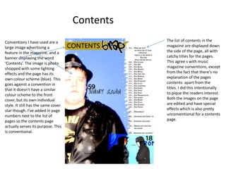
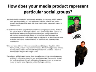
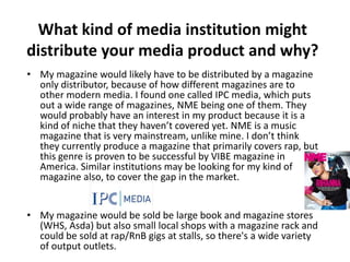
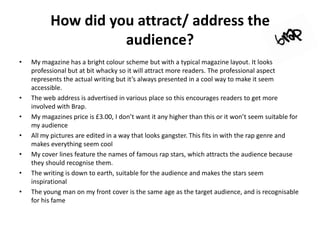
In what ways does your media product use, develop or challenge forms
                       and conventions of real media products?
On my front cover I have used
many conventions from other                                 I’ve gone against the
music magazines. The masthead is                            conventions by having a
at the very top and is in its own                           plain background. Most
font to make it stand out, it’s                             magazines have some
surrounded by incentives to buy                             scenery or special effects,
the magazine like 2 free demo                               but the way I’ve done it
CD’s, and I’ve listed the names of                          makes the cover star stand
some fictional rap artists which are                        out more, which is the main
also incentives in themselves.                              emphasis of the page. I’ve
                                                            kept the colour scheme
                                                            down to four colours too.
                                                            Apart from this I’ve stuck to
                                                            the conventions really,
                                                            especially with the colour
                                                            scheme that only features
                                                            four colours. I've done this to
                                                            try and continue the house-
                                                            style throughout the whole
                                                            page .
Contents
Conventions I have used are a                   The list of contents in the
large image advertising a                       magazine are displayed down
feature in the magazine, and a                  the side of the page, all with
banner displaying the word                      catchy titles for the pages.
‘Contents’. The image is photo                  This agree s with music
shopped with some lighting                      magazine conventions, except
effects and the page has its                    from the fact that there's no
own colour scheme (blue). This                  explanation of the pages
goes against a convention in                    contents apart from the
that it doesn't have a similar                  titles. I did this intentionally
colour scheme to the front                      to pique the readers interest.
cover, but its own individual                   Both the images on the page
style. It still has the same cover              are edited and have special
star though. I've added in page                 effects which is also pretty
numbers next to the list of                     unconventional for a contents
pages so the contents page                      page.
actually serves its purpose. This
is conventional.
I used this paint effect
  round the sides of the
  page to look cool and
                             Double page spread
                                                    This is called a category heading and gives the reader an idea of the
  fill in space.
                                                                                                   content on the page.
                                                                                                   This is conventional of
On this page I
                                                                                                   all magazines.
have a headline,
Edited image,
Caption,                                                                                              I edited this
Magazine logo,                                                                                        image by
page number                                                                                           adjusting colour
and a main and                                                                                        and contrast
secondary                                                                                             levels. I designed
                                                                                                      it so the people
article.                                                                                              look normally
                                                                                                      coloured (mostly)
These are all                                                                                         but the
conventions I                                                                                         background is
have took from                                                                                        trippy and could
other music                                                                                           be part of an
magazines, and                                                                                        album cover.
I haven't made
any exceptions
on this page.                     This section in red is a sidebar. It is a
                                  digression from the main article and
                                  provides additional information.
                                  This is common on most feature
                                  pages.
How does your media product represent
       particular social groups?
My Media product represents young people with a like for rap music, mostly males in
    their late teens or early 20’s. The audience is intended to be old and mature
    enough to understand the taboo side of rap music, so the magazine is mature in
    its appearance.

On the front cover there is a picture of a well-known young rapper (Jimmy). He fits all
     the specifications of the target audience and is what most of them aspire to be.
     He represents them by wearing popular clothing and posing as a hardman.
     Because he’s a famous rapper, seeing his face on the cover should get the
     customers buying. He is the biggest image on the page so he will attract the most
     attention and draw in the audience with his popularity and the aspects he’s
     representing.

When one looks at Jimmy in his expensive clothes and bold pose they think of him
    having wealth, success, being hip and audacious. The audience generally admires
    these qualities, and the man himself. The picture of him advertises a feature of
    him inside the mag and this will get it sold.

The audience will likely want to read about Jimmy because he’s an interesting person
     and there’s information about him and what he’s doing at the moment. Beneath
     the hardman attitude, Jimmy is subtly a sensitive guy, so he can serve as a role
     model for a wide range of people, not just the target audience.
What kind of media institution might
distribute your media product and why?
• My magazine would likely have to be distributed by a magazine
  only distributor, because of how different magazines are to
  other modern media. I found one called IPC media, which puts
  out a wide range of magazines, NME being one of them. They
  would probably have an interest in my product because it is a
  kind of niche that they haven’t covered yet. NME is a music
  magazine that is very mainstream, unlike mine. I don’t think
  they currently produce a magazine that primarily covers rap, but
  this genre is proven to be successful by VIBE magazine in
  America. Similar institutions may be looking for my kind of
  magazine also, to cover the gap in the market.


• My magazine would be sold be large book and magazine stores
  (WHS, Asda) but also small local shops with a magazine rack and
  could be sold at rap/RnB gigs at stalls, so there's a wide variety
  of output outlets.
Who would be the audience for your
              media product?
•   The audience for my media product would be young men
    and teenage males. There may also be a female part to the
    audience, but my magazine doesn’t appeal directly to them
    because there aren’t many female rappers and there is the
    sexualisation of women that comes hand in hand with rap
    music. It is a feature of the genre that comes naturally to
    my magazine. The people that buy my magazine would be
    from the middle – lower class of wealth. This is because the
    upper class isn’t typically into music and culture that is
    considered ‘street’. I have to bear in mind that the
    magazine must be a reasonable price for this reason.
•    I think the magazine will appeal to all races, as anyone
    could have an interest in rap music. VIBE (another rap mag)
    has a predominantly black audience, but this is because
    most of its sales are in America, where the rap scene is
    almost completely dominated by black gangsters. Here in
    the UK it is different, with a lot of white rappers finding
    success and breaking into the culture.
How did you attract/ address the
                    audience?
•   My magazine has a bright colour scheme but with a typical magazine layout. It looks
    professional but at bit whacky so it will attract more readers. The professional aspect
    represents the actual writing but it’s always presented in a cool way to make it seem
    accessible.
•   The web address is advertised in various place so this encourages readers to get more
    involved with Brap.
•   My magazines price is £3.00, I don’t want it any higher than this or it won’t seem suitable for
    my audience
•   All my pictures are edited in a way that looks gangster. This fits in with the rap genre and
    makes everything seem cool
•   My cover lines feature the names of famous rap stars, which attracts the audience because
    they should recognise them.
•   The writing is down to earth, suitable for the audience and makes the stars seem
    inspirational
•   The young man on my front cover is the same age as the target audience, and is recognisable
    for his fame
What have you learnt about technologies
    from the process of construction of this
                   product?
•    Before creating my magazine I had never used Photoshop before so it was all new to me.
     After learning a few basic tools in Photoshop I was able to start experimenting and finding
     out what worked. I had to look at other magazine layouts to get mine right and looking
     professional, I didn’t realise how much work actually went into it.
•    There are many different ways of doing things in Photoshop and as time went by a found
     what worked best for me, making my design work easier. I didn’t realise how advanced
     Photoshop was and only used the basic features at first. These included the move tool,
     rectangular marquee tool, custom shape tool, text, and the polygonal lasso tool to cut out
     people from images. I used a lot of layering to give the look I wanted. Picture editing
     techniques I used were cropping and brightness/contrast adjusting. When I had a finished
     product, I started learning some advanced features and making changes. One of these was
     the paintbrush tool (with custom brushes) I used to add gritty effects round my main feature
     page (2 page spread).
•    I found Photoshop to be a whole new level above what I usually use for design work, its great
     because you can do literally anything with an image and it brought my ideas to life.
Looking back on your preliminary task,
    what do you feel you have learnt in the
    progression from it to the full product?
•   Before the music magazine we were set a preliminary task which was to create pages from a
    college magazine, which consisted of the front cover and the contents. This was the first work
    I had done in Photoshop so I was just getting to grips with its basic features . This reflected in
    my college magazine , which consists mainly of images and text and doesn’t really follow the
    trends of magazine design. The front cover is ok but the contents page looks rushed and I
    struggled to make the text there work with the image I had chosen. I could have aced this
    with picture editing skill that I’ve learned now but I didn’t know back then. In comparison id
    say my music magazine is definitely more professional, inspired and nicer to look at.
•   In the progression from my preliminary task to now I have learned many more skills in
    Photoshop and also a lot more about magazine conventions and why they exist. I'm now
    pretty confident with Photoshop and will probably use it for other design work at college. I'm
    proud of how I started with zero knowledge of Photoshop and got the magazine to where its
    at now. I feel the music magazine is a success, as the result of the long work.

Magazine Project Evaluation

  • 1.
    In what waysdoes your media product use, develop or challenge forms and conventions of real media products? On my front cover I have used many conventions from other I’ve gone against the music magazines. The masthead is conventions by having a at the very top and is in its own plain background. Most font to make it stand out, it’s magazines have some surrounded by incentives to buy scenery or special effects, the magazine like 2 free demo but the way I’ve done it CD’s, and I’ve listed the names of makes the cover star stand some fictional rap artists which are out more, which is the main also incentives in themselves. emphasis of the page. I’ve kept the colour scheme down to four colours too. Apart from this I’ve stuck to the conventions really, especially with the colour scheme that only features four colours. I've done this to try and continue the house- style throughout the whole page .
  • 2.
    Contents Conventions I haveused are a The list of contents in the large image advertising a magazine are displayed down feature in the magazine, and a the side of the page, all with banner displaying the word catchy titles for the pages. ‘Contents’. The image is photo This agree s with music shopped with some lighting magazine conventions, except effects and the page has its from the fact that there's no own colour scheme (blue). This explanation of the pages goes against a convention in contents apart from the that it doesn't have a similar titles. I did this intentionally colour scheme to the front to pique the readers interest. cover, but its own individual Both the images on the page style. It still has the same cover are edited and have special star though. I've added in page effects which is also pretty numbers next to the list of unconventional for a contents pages so the contents page page. actually serves its purpose. This is conventional.
  • 3.
    I used thispaint effect round the sides of the page to look cool and Double page spread This is called a category heading and gives the reader an idea of the fill in space. content on the page. This is conventional of On this page I all magazines. have a headline, Edited image, Caption, I edited this Magazine logo, image by page number adjusting colour and a main and and contrast secondary levels. I designed it so the people article. look normally coloured (mostly) These are all but the conventions I background is have took from trippy and could other music be part of an magazines, and album cover. I haven't made any exceptions on this page. This section in red is a sidebar. It is a digression from the main article and provides additional information. This is common on most feature pages.
  • 4.
    How does yourmedia product represent particular social groups? My Media product represents young people with a like for rap music, mostly males in their late teens or early 20’s. The audience is intended to be old and mature enough to understand the taboo side of rap music, so the magazine is mature in its appearance. On the front cover there is a picture of a well-known young rapper (Jimmy). He fits all the specifications of the target audience and is what most of them aspire to be. He represents them by wearing popular clothing and posing as a hardman. Because he’s a famous rapper, seeing his face on the cover should get the customers buying. He is the biggest image on the page so he will attract the most attention and draw in the audience with his popularity and the aspects he’s representing. When one looks at Jimmy in his expensive clothes and bold pose they think of him having wealth, success, being hip and audacious. The audience generally admires these qualities, and the man himself. The picture of him advertises a feature of him inside the mag and this will get it sold. The audience will likely want to read about Jimmy because he’s an interesting person and there’s information about him and what he’s doing at the moment. Beneath the hardman attitude, Jimmy is subtly a sensitive guy, so he can serve as a role model for a wide range of people, not just the target audience.
  • 5.
    What kind ofmedia institution might distribute your media product and why? • My magazine would likely have to be distributed by a magazine only distributor, because of how different magazines are to other modern media. I found one called IPC media, which puts out a wide range of magazines, NME being one of them. They would probably have an interest in my product because it is a kind of niche that they haven’t covered yet. NME is a music magazine that is very mainstream, unlike mine. I don’t think they currently produce a magazine that primarily covers rap, but this genre is proven to be successful by VIBE magazine in America. Similar institutions may be looking for my kind of magazine also, to cover the gap in the market. • My magazine would be sold be large book and magazine stores (WHS, Asda) but also small local shops with a magazine rack and could be sold at rap/RnB gigs at stalls, so there's a wide variety of output outlets.
  • 6.
    Who would bethe audience for your media product? • The audience for my media product would be young men and teenage males. There may also be a female part to the audience, but my magazine doesn’t appeal directly to them because there aren’t many female rappers and there is the sexualisation of women that comes hand in hand with rap music. It is a feature of the genre that comes naturally to my magazine. The people that buy my magazine would be from the middle – lower class of wealth. This is because the upper class isn’t typically into music and culture that is considered ‘street’. I have to bear in mind that the magazine must be a reasonable price for this reason. • I think the magazine will appeal to all races, as anyone could have an interest in rap music. VIBE (another rap mag) has a predominantly black audience, but this is because most of its sales are in America, where the rap scene is almost completely dominated by black gangsters. Here in the UK it is different, with a lot of white rappers finding success and breaking into the culture.
  • 7.
    How did youattract/ address the audience? • My magazine has a bright colour scheme but with a typical magazine layout. It looks professional but at bit whacky so it will attract more readers. The professional aspect represents the actual writing but it’s always presented in a cool way to make it seem accessible. • The web address is advertised in various place so this encourages readers to get more involved with Brap. • My magazines price is £3.00, I don’t want it any higher than this or it won’t seem suitable for my audience • All my pictures are edited in a way that looks gangster. This fits in with the rap genre and makes everything seem cool • My cover lines feature the names of famous rap stars, which attracts the audience because they should recognise them. • The writing is down to earth, suitable for the audience and makes the stars seem inspirational • The young man on my front cover is the same age as the target audience, and is recognisable for his fame
  • 8.
    What have youlearnt about technologies from the process of construction of this product? • Before creating my magazine I had never used Photoshop before so it was all new to me. After learning a few basic tools in Photoshop I was able to start experimenting and finding out what worked. I had to look at other magazine layouts to get mine right and looking professional, I didn’t realise how much work actually went into it. • There are many different ways of doing things in Photoshop and as time went by a found what worked best for me, making my design work easier. I didn’t realise how advanced Photoshop was and only used the basic features at first. These included the move tool, rectangular marquee tool, custom shape tool, text, and the polygonal lasso tool to cut out people from images. I used a lot of layering to give the look I wanted. Picture editing techniques I used were cropping and brightness/contrast adjusting. When I had a finished product, I started learning some advanced features and making changes. One of these was the paintbrush tool (with custom brushes) I used to add gritty effects round my main feature page (2 page spread). • I found Photoshop to be a whole new level above what I usually use for design work, its great because you can do literally anything with an image and it brought my ideas to life.
  • 9.
    Looking back onyour preliminary task, what do you feel you have learnt in the progression from it to the full product? • Before the music magazine we were set a preliminary task which was to create pages from a college magazine, which consisted of the front cover and the contents. This was the first work I had done in Photoshop so I was just getting to grips with its basic features . This reflected in my college magazine , which consists mainly of images and text and doesn’t really follow the trends of magazine design. The front cover is ok but the contents page looks rushed and I struggled to make the text there work with the image I had chosen. I could have aced this with picture editing skill that I’ve learned now but I didn’t know back then. In comparison id say my music magazine is definitely more professional, inspired and nicer to look at. • In the progression from my preliminary task to now I have learned many more skills in Photoshop and also a lot more about magazine conventions and why they exist. I'm now pretty confident with Photoshop and will probably use it for other design work at college. I'm proud of how I started with zero knowledge of Photoshop and got the magazine to where its at now. I feel the music magazine is a success, as the result of the long work.