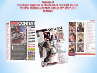
3. BANNER AT
NME MASTHEAD SAME TOP coloured black
COLOUR CODE AS FRONT to make the two title
Portrays consistency as it is same words stand out to
colour as front cover. Meaning same grab target audience’s
connotations. Suggesting to target attention
audience magazine is consistently
passionate(just like them) about DATE shows how recent
music. articles in the magazine are.
Main image is of
famous artist with her tour SUB HEADING
bus. This will interest the
reader as they love live BLOCKED OUT INTO
shows and the famous
artist standing by her tour
BLACK SUB
bus will suggest she will be SECTIONS makes these
performing live. stand out grabbing the target
audience’s attention.
Bands are listed in
red with page number BRIEF HEADING
in black this is so the +SUMMARY OF CONTENT
readers of the magazine can
easily find where in the WITH PAGE NUMBER IN
magazine news about their
favourite bands are.
RED easily lets reader see what main
articles are about and where they are.
Image is edited so it
looks like a PREVIOUS/FUTUR
photograph. This is E EDITIONS OF
appropriate NME ARE SHOWN
because It makes the WITH DETAILS OF
magazine look more like it
resembles the desire for the WEBSITE/PHONE
live experience of music just
like the target audience of
NUMBER ETC to
the magazine do,
Editor's introduction to keep readers interested in
the magazine by showing
contents of magazine
welcomes reader and shows all staff in magazine has multiple ways
magazine are actively interested in the of keeping passionate music
music which appeals to target fans up to date
audience.
4. At the top of the page to clearly show
what this part of the magazine is
about and how recent it is. It is here
to stand out and look interesting to
catch the attention of the target
audience
In this position so it is
easy to see for target
audience to see what
page to turn to what they
want as they turn the
page . Keeping it fresh in
their mind. It is also
made to stand out so it
grabs attention of reader
through using colours
black and red and capital
letters.
The editor’s introduction is also in quite
formal font which shows how serious the
editor takes the music. Just like the
target audience It is right underneath the
main image so it is more likely the target
audience will read it and see these
characteristics
Coloured
differently to
stand out in the
In this form to clearly show corner of the
the variety of bands the page to catch the
magazine has which will attention corner
intrigue target audience as of the reader’s
they are quite young and will eye
have multiple favourite
bands.
5. V stands for VIBE but
is in different form to
masthead on cover
showing the target
audience the magazine
varies. Meaning it has
something within its The word
articles for every
aspect of music the “contents” is
target audience is written fits with the target
audience. It is written in a
interested in. bold black stylish way
instead of just being spread
across the page. This will
interest the target audience
as they see themselves as
being stylish and bold and
their music having the same
characteristics (rap).
Main Image uses
image of famous artist which
reflects interests of target
audience. Kanye looks quite
trendy here and he is a rap
Sub headings
star. Also his heart being the
only thing in colour and
of “Features”
outside his chest being held
by what seems like a female
and “Fashion”
hand, suggests he is very
recognisably
are bold and
Passionate in his life.
Supposedly about music. He
black to stand out and
is also African-American catch the attention of
which will interest many target audience. So as to
readers as the majority are show they have articles
African-American
in the magazine that will
be relevant to this group
and of interest to them
Page number in black stands out
and makes it easier for target audience to
find pages in the magazine they would like to
read.
6. V is in the Contents has been
split into three and is in
background and is
the right hand corner
quite large which is very different to
stretching high other magazines. This
above the head of shows VIBE is different
kanye West which to other magazines and
suggests that what it offers its target
VIBE magazine audience no other
has covered all magazine can offer them
bases the target the same.
audience need
covering and
more.
This writing is
in this position so it is
easy to see for target
Main Image of audience to see what
page to turn to what
famous artist Kanye
they want as they turn
West is very big and
the page . Keeping it
takes up most of the
fresh in their mind.
space in the frame.
Suggesting to the
target audience that
with VIBE magazine
are mostly about
music just like they
are.
The overall layout of the contents
page in vibe is very simple and stylish
compared to other magazines, such as the above
NME. It is not too congested which suggest only
content really relevant to the target audience will be
in the magazine. This will appeal to the target
audience as they are stylish and want stylish things.
The simplicity here makes the page look very stylish.