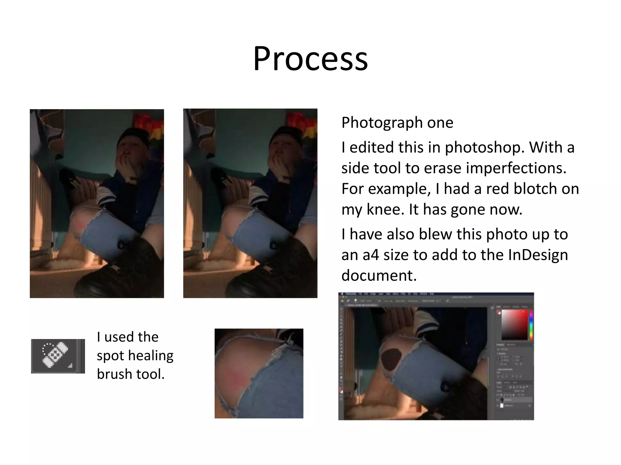
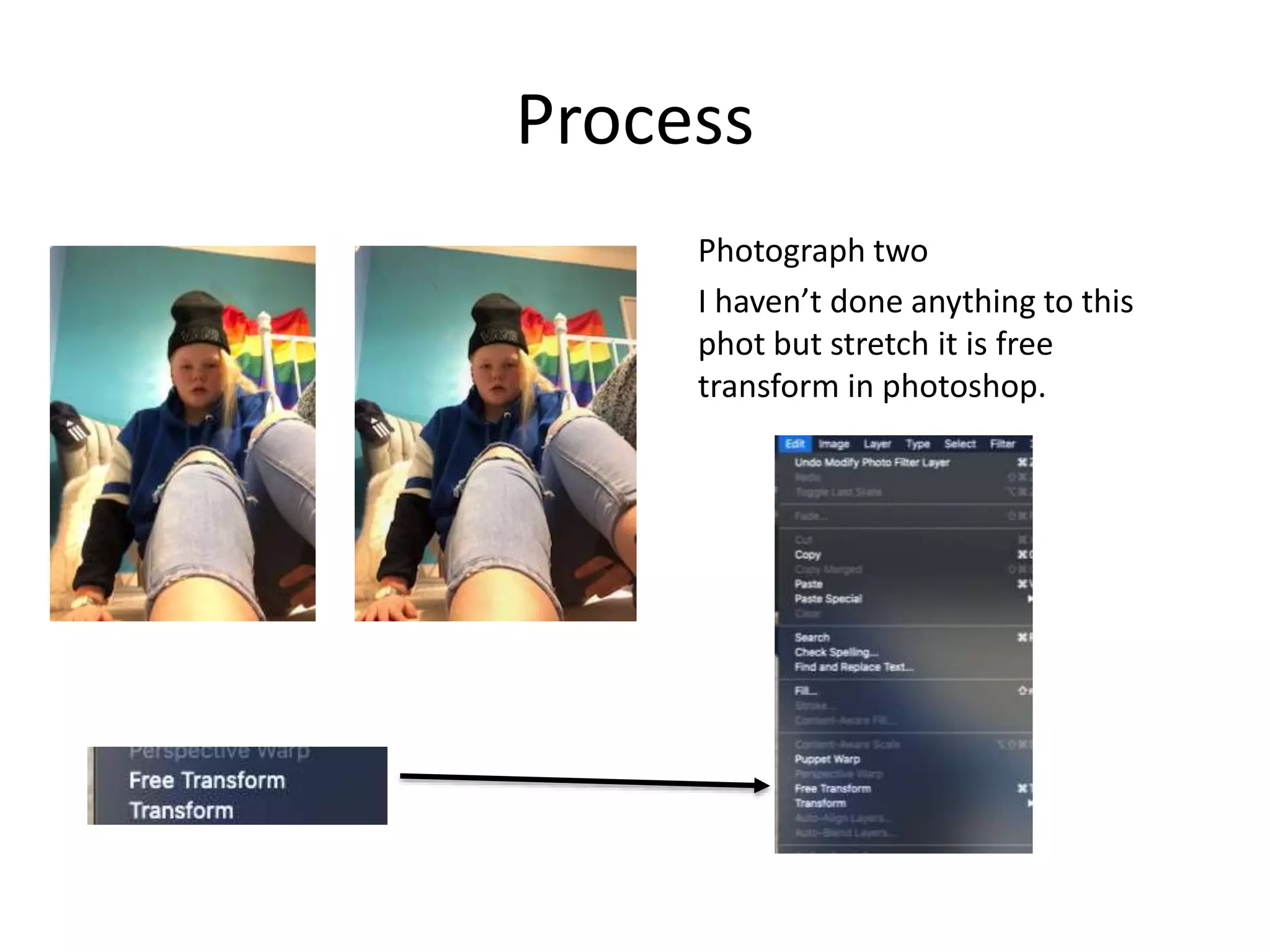
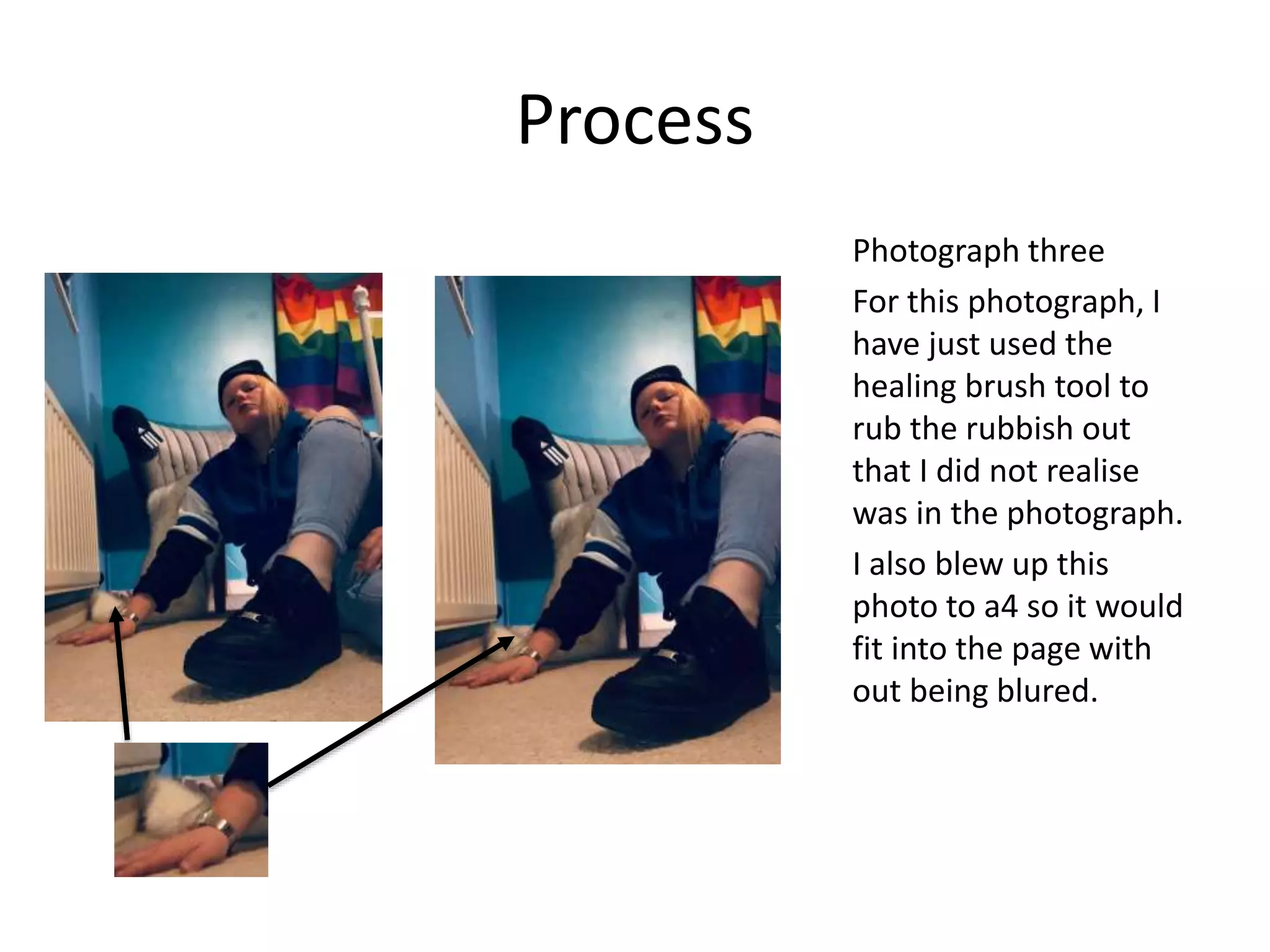
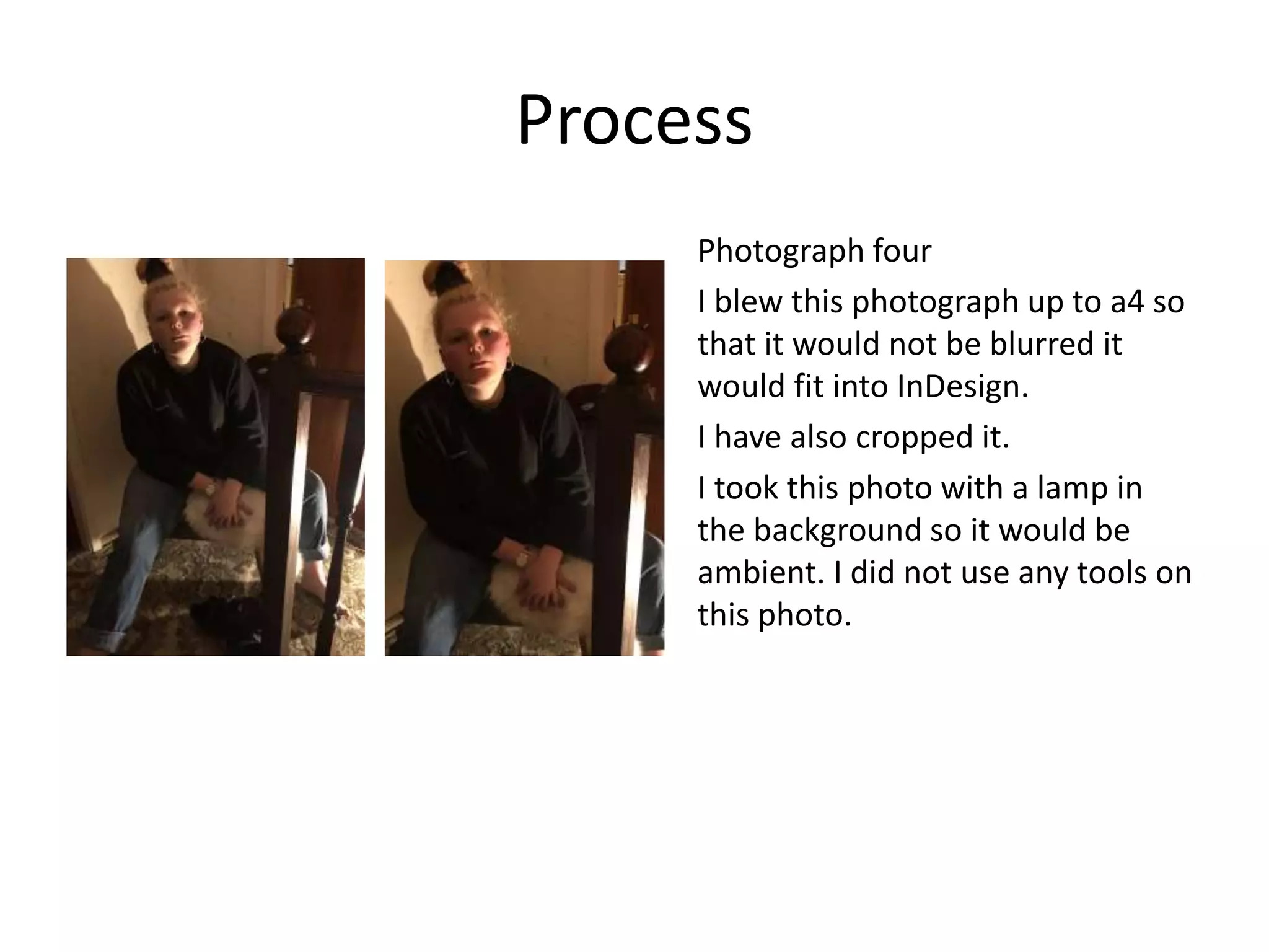
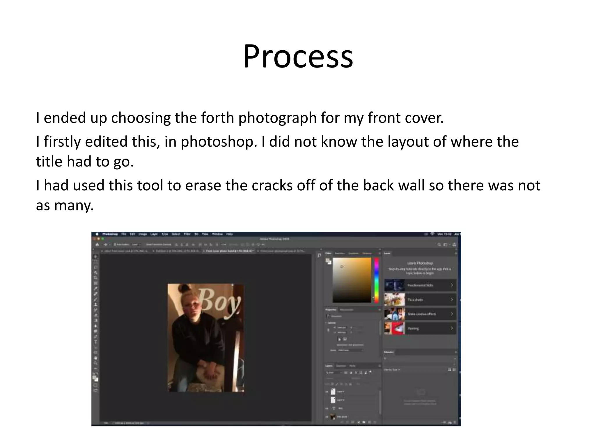
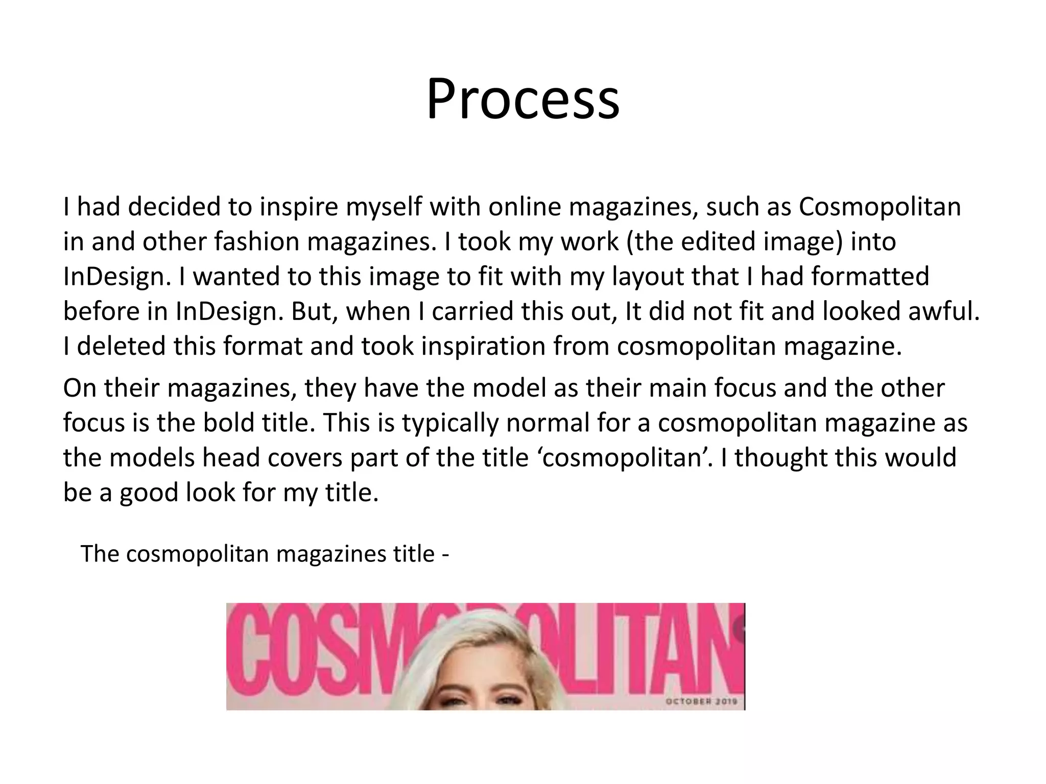
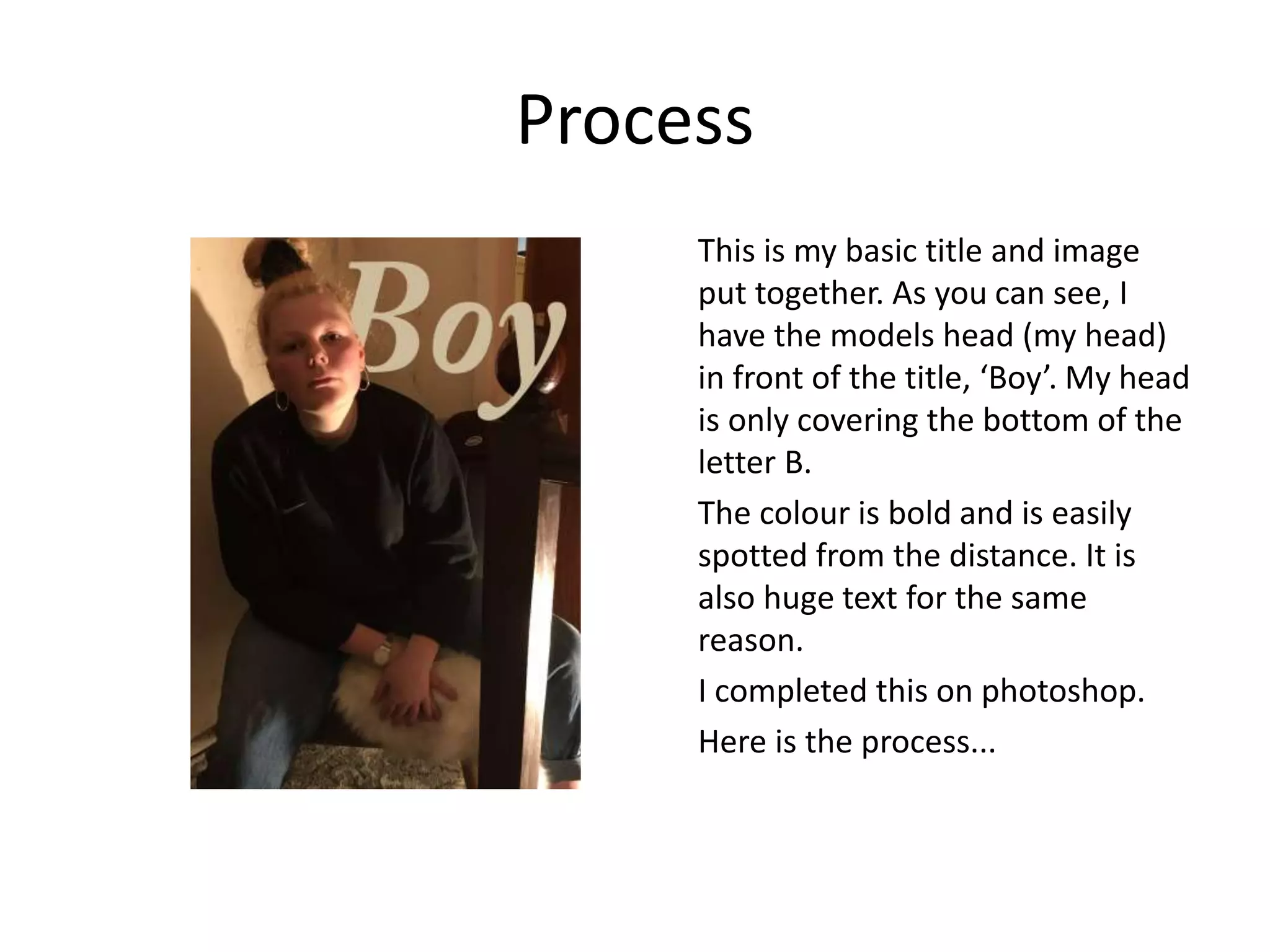
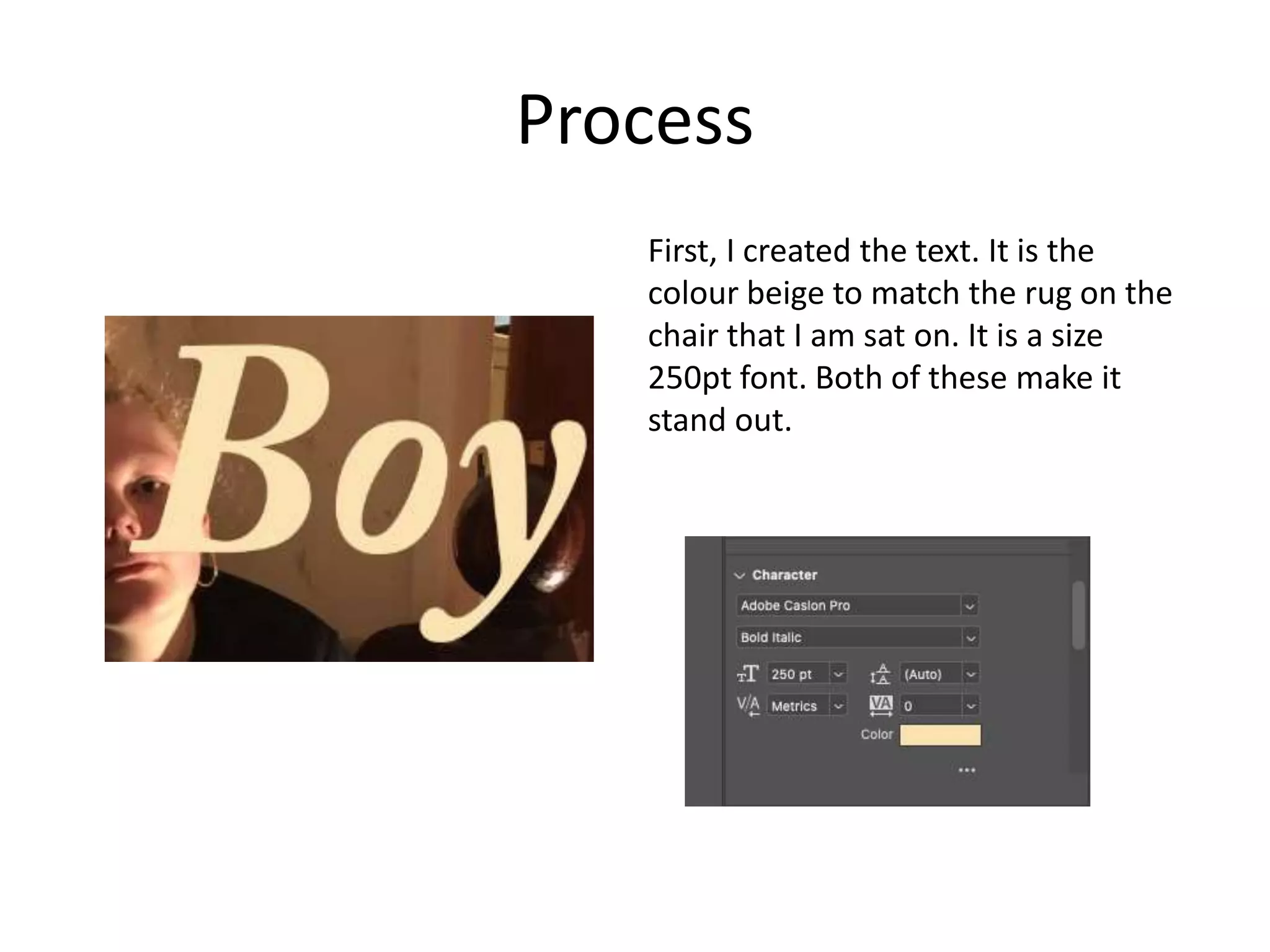
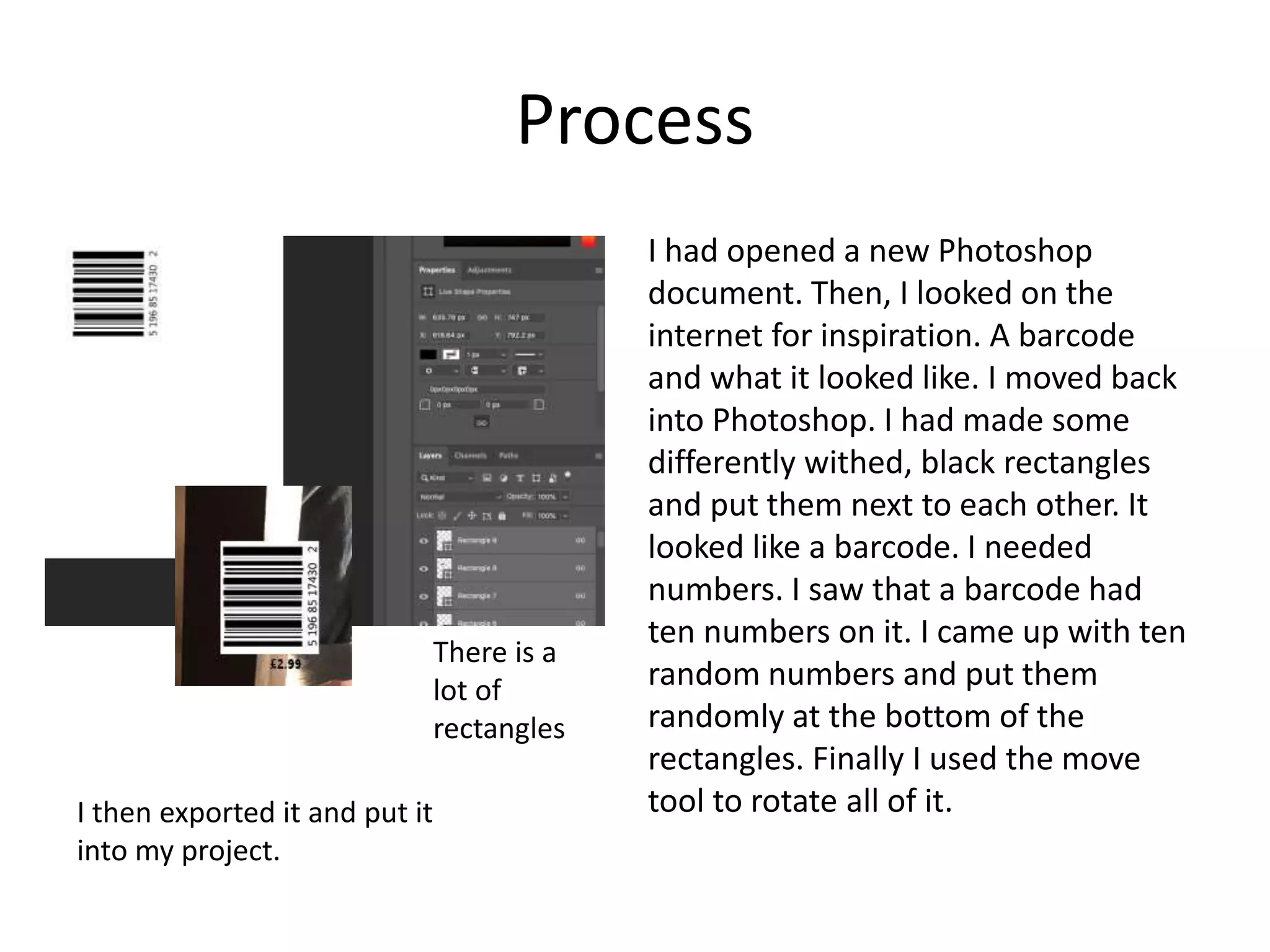
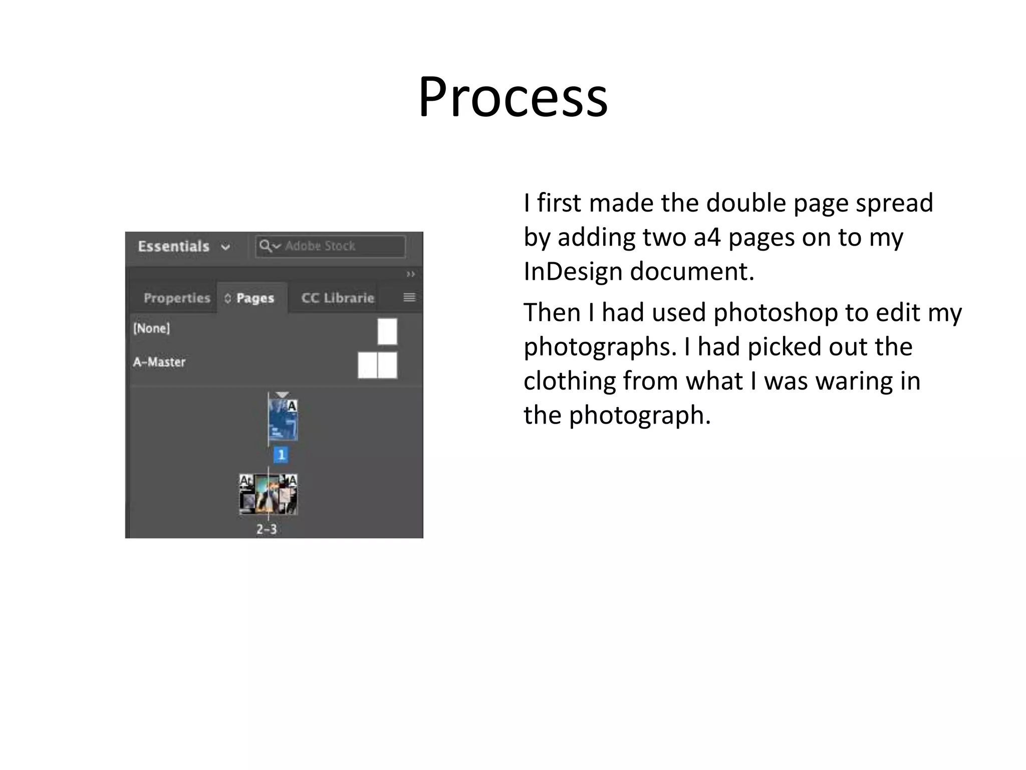
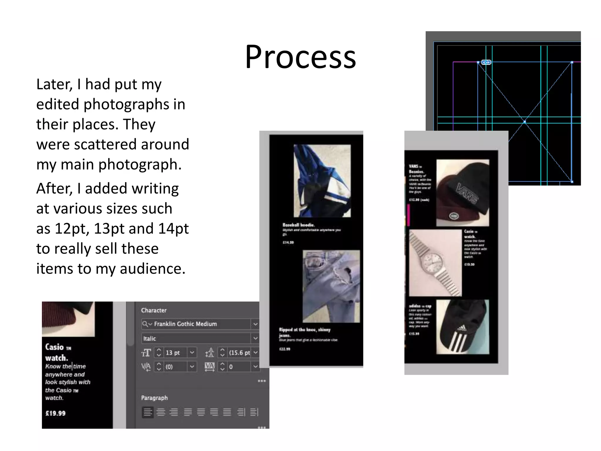
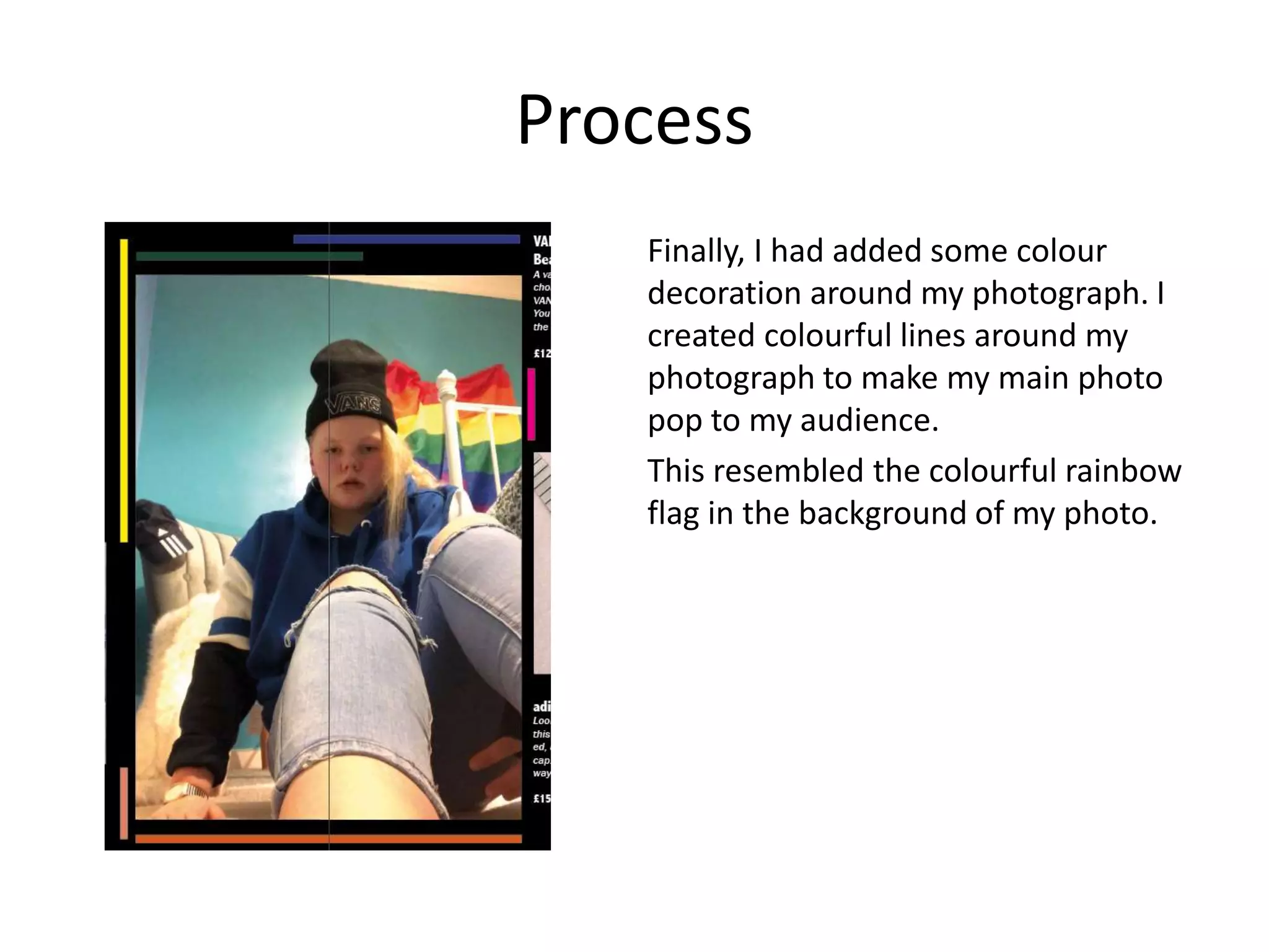
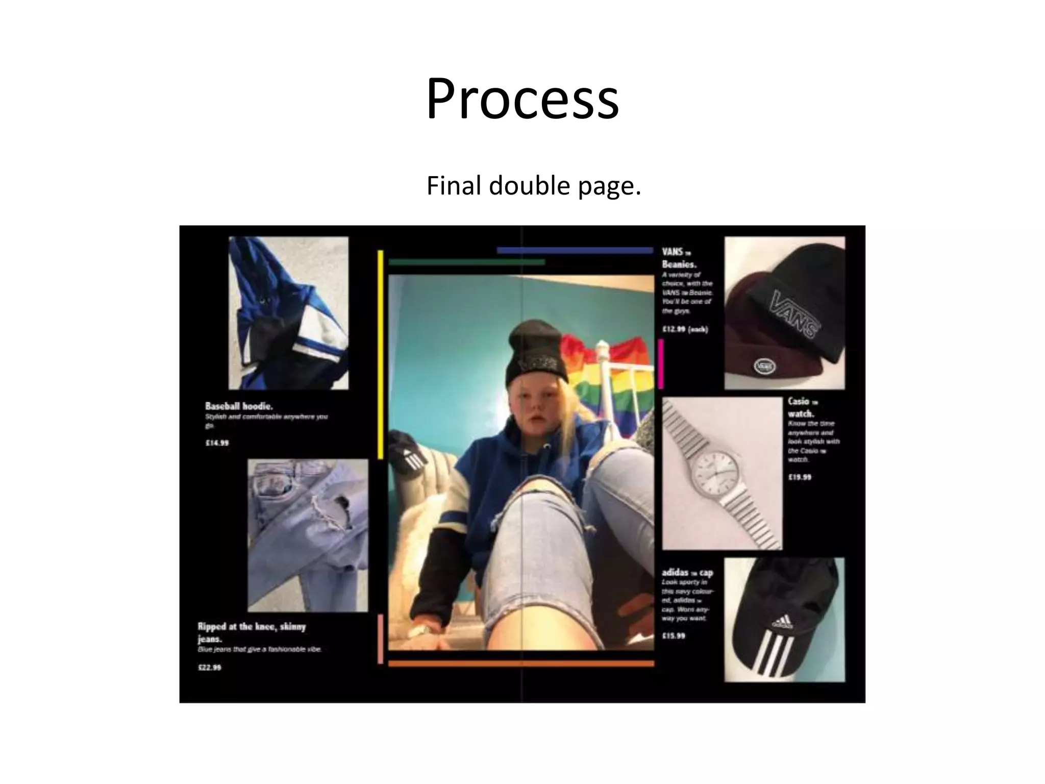
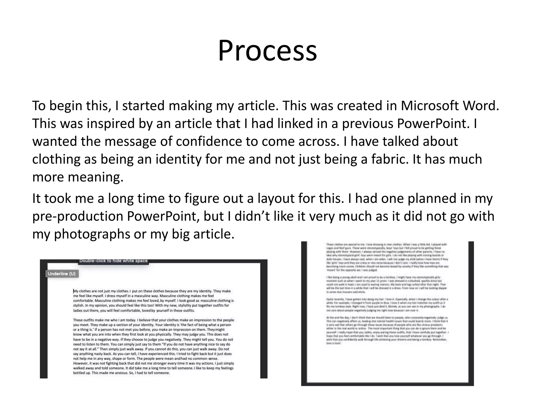
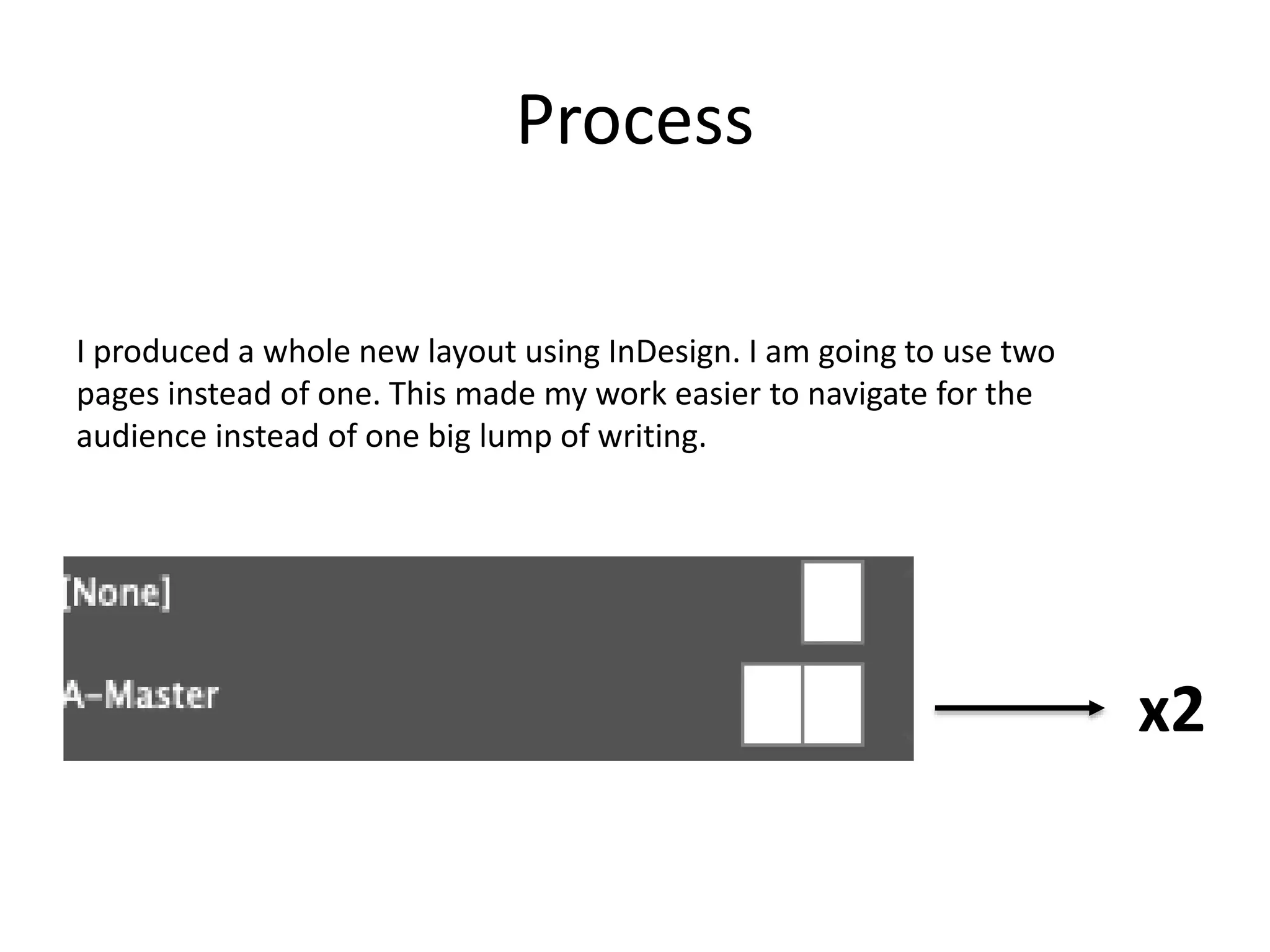
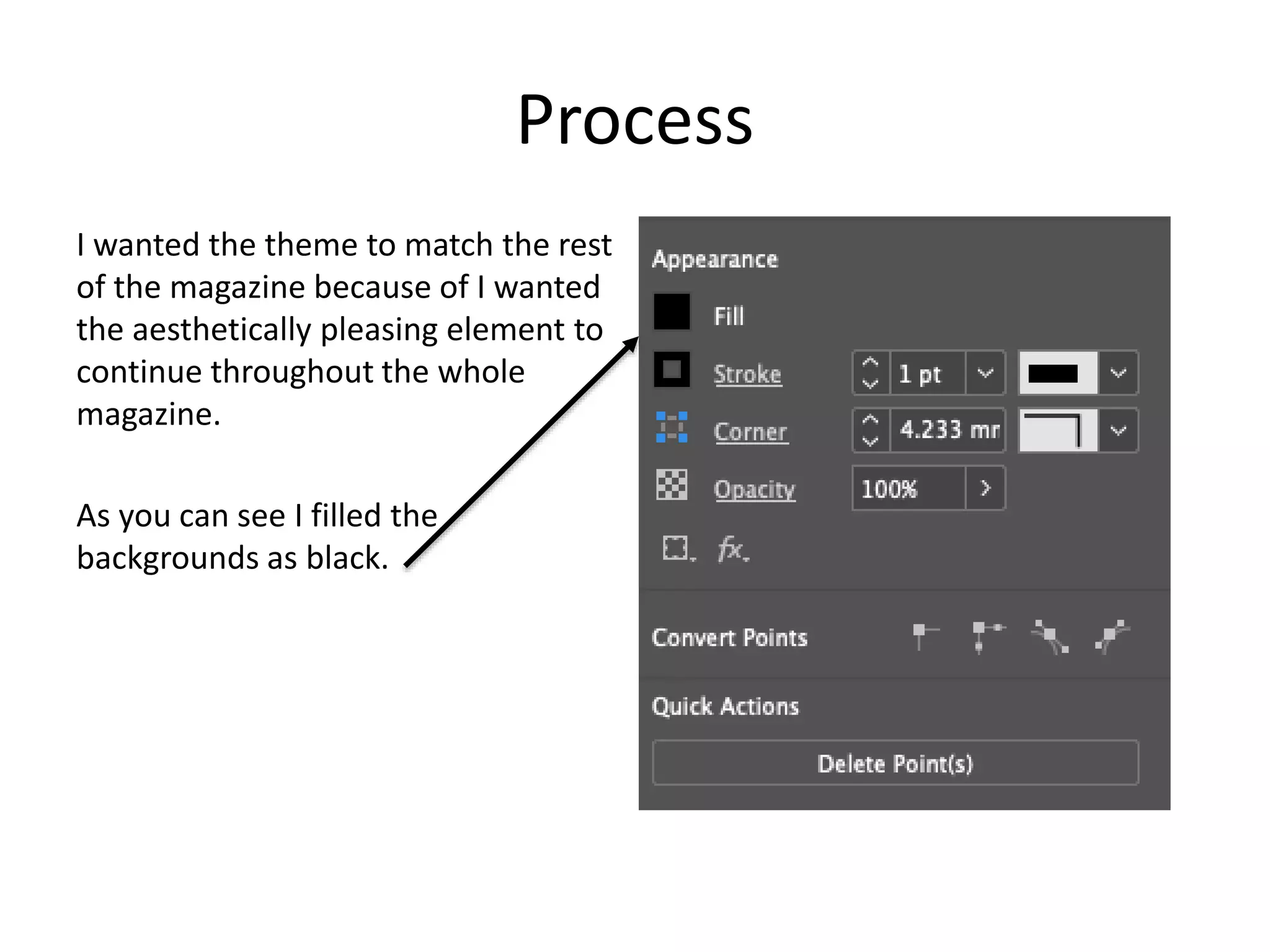
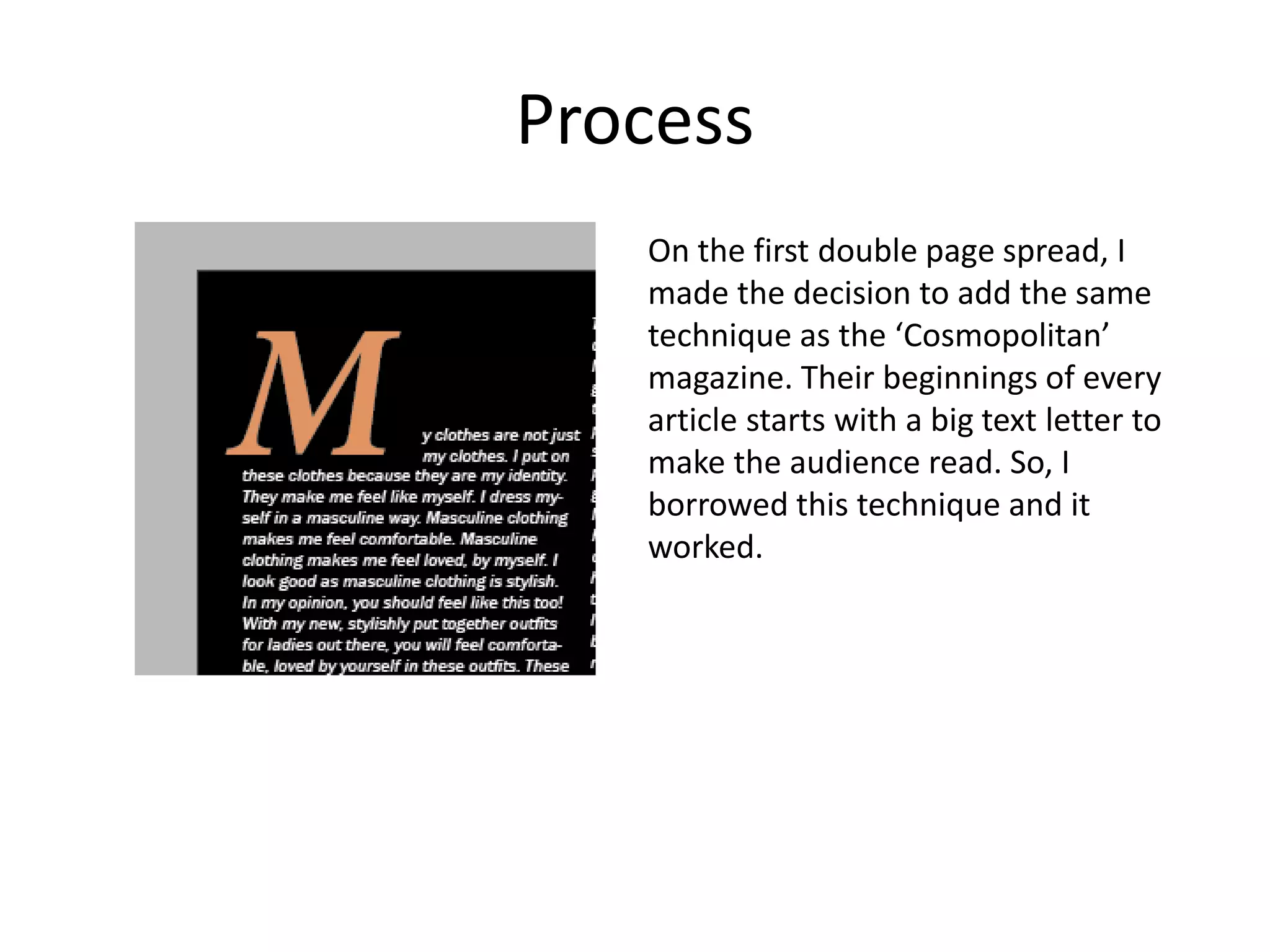
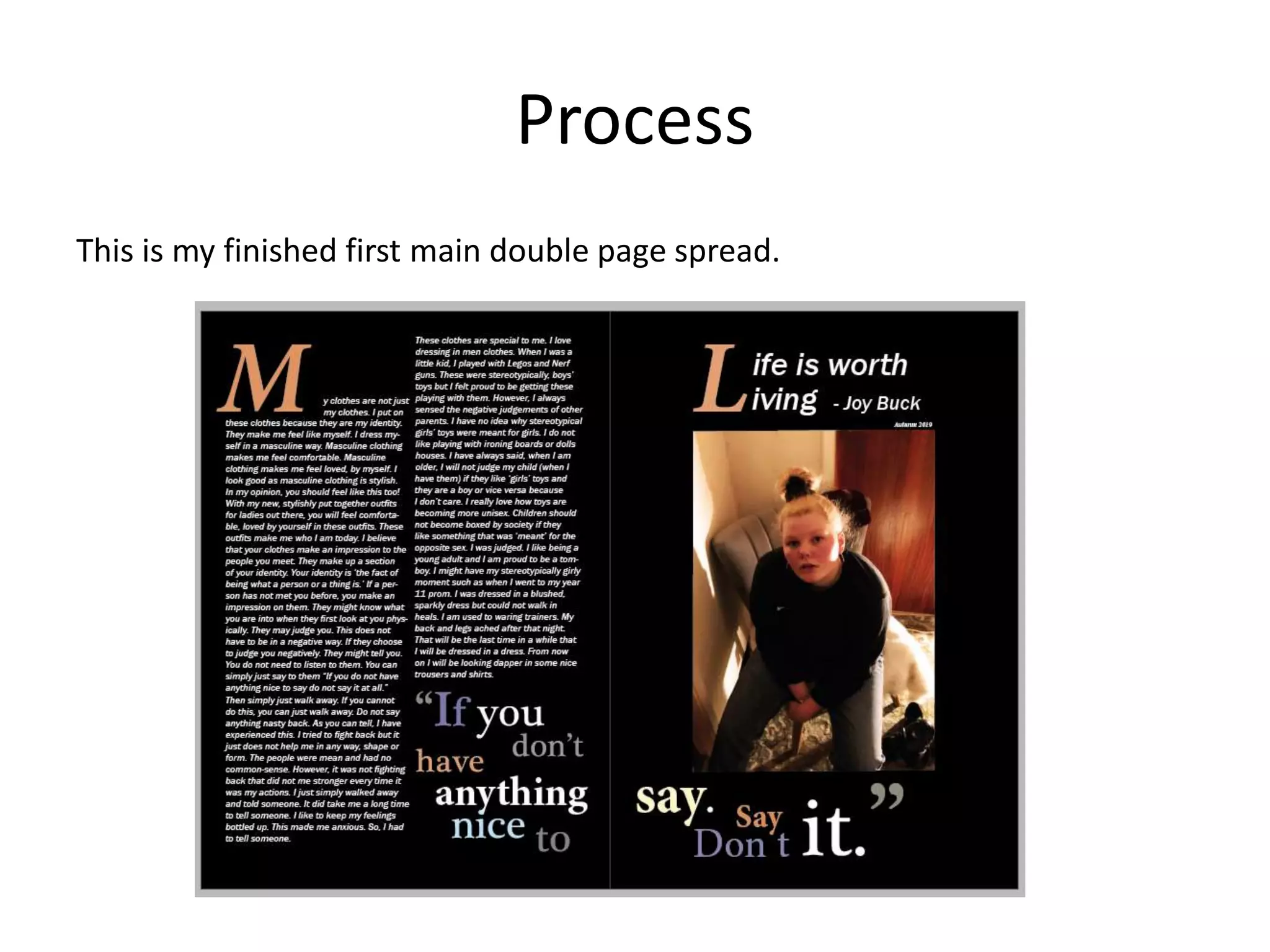
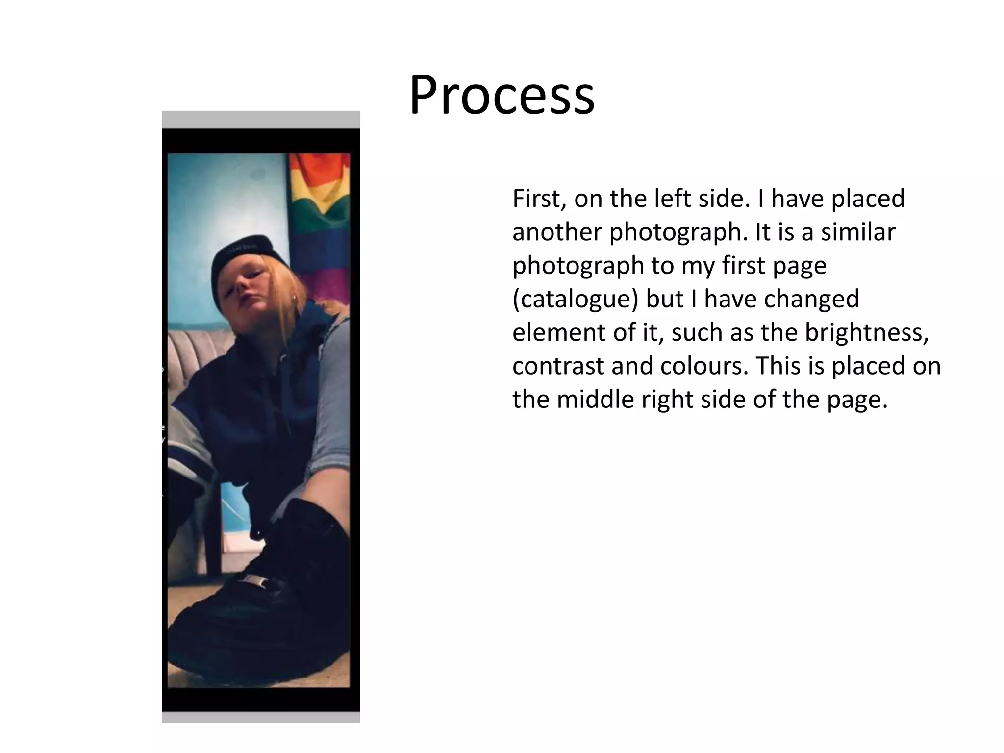
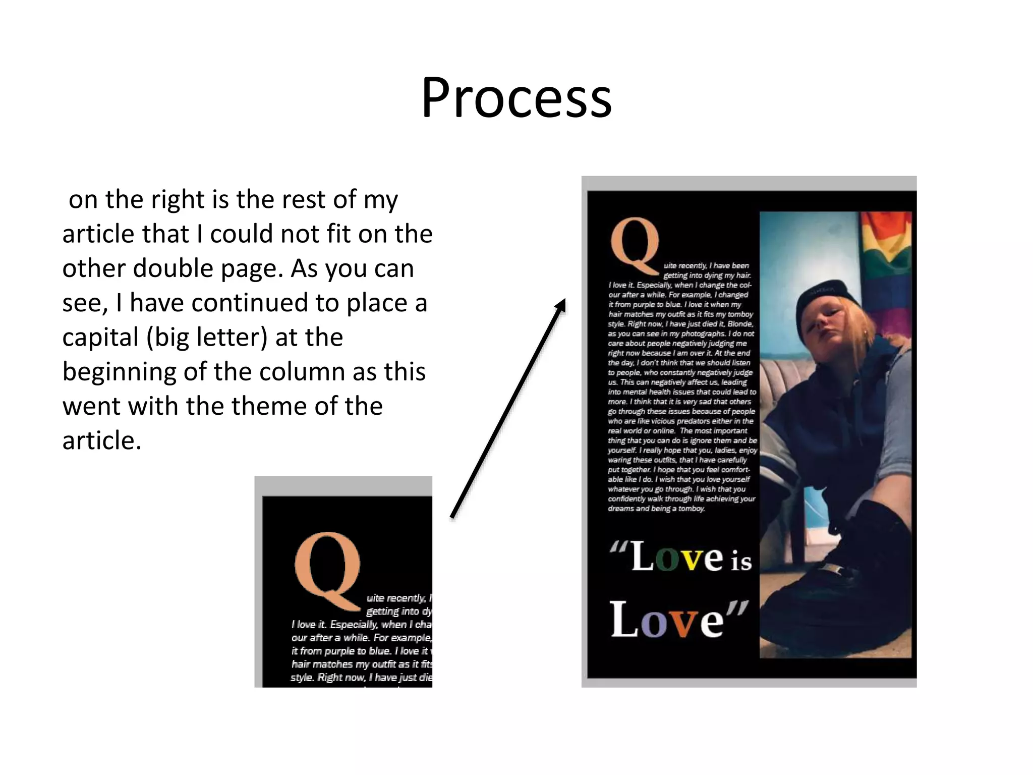
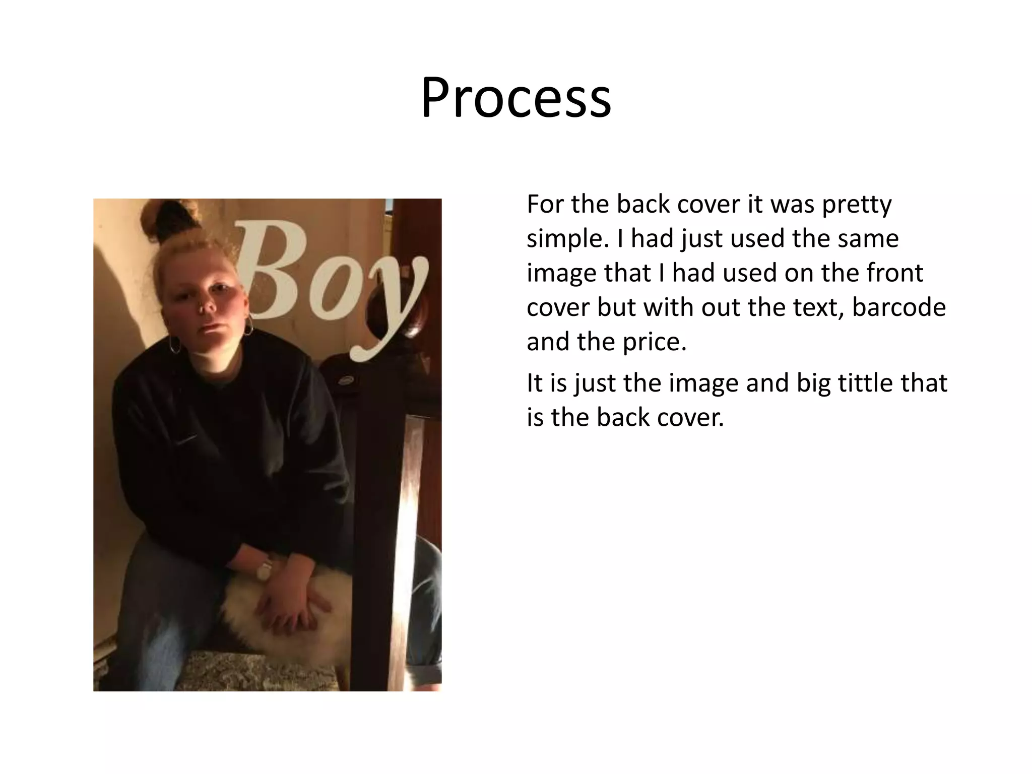
2. Process
In this Production, I will be completing more than the required front cover
and one double page spread. I will be completing 3-4 double page spreads,
front cover and back cover.
I will be using adobe photoshop to edit my photographs and then put them
into InDesign, where I will be making my magazine.
Photoshop will get me to learn more advanced skills within this project, such
as different tools that I can use to edit photographs and make them look like
they fit in a professional magazine. InDesign will allow me to create a
professional layout for my magazine.
4. Process
Firstly, I needed to create a front cover. When I started to create this, I had
not taken any photographs yet. So, I started to create a layout for my
magazine. I carried this out in Adobe InDesign. It looks nothing like the end
result.
When I took images for this project. I was happy with the result of them.
Consequently, I could not choose a photograph for my front cover. I had to
choose one. So, I decided to edit all four in Photoshop. These images looked
different once edited. Therefore, I decided to choose the darkest one. I
choose this because I thought white coloured text would stand out and make
my audience notice it in comparison to other magazines (If this was in a real
store).
5. Process
Photograph one
I edited this in photoshop. With a
side tool to erase imperfections.
For example, I had a red blotch on
my knee. It has gone now.
I have also blew this photo up to
an a4 size to add to the InDesign
document.
I used the
spot healing
brush tool.
7. Process
Photograph three
For this photograph, I
have just used the
healing brush tool to
rub the rubbish out
that I did not realise
was in the photograph.
I also blew up this
photo to a4 so it would
fit into the page with
out being blured.
8. Process
Photograph four
I blew this photograph up to a4 so
that it would not be blurred it
would fit into InDesign.
I have also cropped it.
I took this photo with a lamp in
the background so it would be
ambient. I did not use any tools on
this photo.
9. Process
I ended up choosing the forth photograph for my front cover.
I firstly edited this, in photoshop. I did not know the layout of where the
title had to go.
I had used this tool to erase the cracks off of the back wall so there was not
as many.
10. Process
I had decided to inspire myself with online magazines, such as Cosmopolitan
in and other fashion magazines. I took my work (the edited image) into
InDesign. I wanted to this image to fit with my layout that I had formatted
before in InDesign. But, when I carried this out, It did not fit and looked awful.
I deleted this format and took inspiration from cosmopolitan magazine.
On their magazines, they have the model as their main focus and the other
focus is the bold title. This is typically normal for a cosmopolitan magazine as
the models head covers part of the title ‘cosmopolitan’. I thought this would
be a good look for my title.
The cosmopolitan magazines title -
11. Process
This is my basic title and image
put together. As you can see, I
have the models head (my head)
in front of the title, ‘Boy’. My head
is only covering the bottom of the
letter B.
The colour is bold and is easily
spotted from the distance. It is
also huge text for the same
reason.
I completed this on photoshop.
Here is the process...
12. Process
First, I created the text. It is the
colour beige to match the rug on the
chair that I am sat on. It is a size
250pt font. Both of these make it
stand out.
13. Process
I have used this tool to cut out my head. It is called the lasso tool.
Then I have copied and pasted it. I now have another layer.
Lasso tool.
14. Process
I cleverly, moved the text layer
between the two cut out heads.
It is almost like a sandwich.
When I had completed this. I had put
it into InDesign.
15. Process
After this, I used InDesign to create a
better layout.
I used white font so it would stand
out in contrast to the darker
background. This was about a size
48pt text.
At first I thought this was it. It was
done. But, I had gotten advice from a
friend and they explained that It
needed more text boxes. So, I took
their advice...
16. Process
Here is my finished result.
However, I added to the
barcode and price. Here’s
how...
17. Process
I had opened a new Photoshop
document. Then, I looked on the
internet for inspiration. A barcode
and what it looked like. I moved back
into Photoshop. I had made some
differently withed, black rectangles
and put them next to each other. It
looked like a barcode. I needed
numbers. I saw that a barcode had
ten numbers on it. I came up with ten
random numbers and put them
randomly at the bottom of the
rectangles. Finally I used the move
tool to rotate all of it.I then exported it and put it
into my project.
There is a
lot of
rectangles
19. Process
For this project, I had decided to inspire myself with a magazine that is alike
mine. It is just a magazine catalogue about tomboy style. I wanted to involve
some clothing that I had worn in my photographs.
I had taken some photographs of the clothing that I had worn in the
photographs. This could have given the audience something else to look at
rather than the article alone. The photographs needed editing in photoshop.
And then put on to my InDesign document...
20. Process
I first made the double page spread
by adding two a4 pages on to my
InDesign document.
Then I had used photoshop to edit my
photographs. I had picked out the
clothing from what I was waring in
the photograph.
21. Process
Editing in Photoshop involved adding
in adjustments, such as Brightness,
contrast and filters. I used these tools
on most of the photos as they were
quite dark.
Brightness and contrast.
Colour filters
Hue and
saturation
22. Process
On this photograph, I had to cut
around the Jeans because the
carpet was not working as a
background as the other
photographs did.
I used the spot healing brush tool
and the object selection tool to
complete it.
After this I had linked the two
images and added adjustments
because the image looked dark so I
added brightness and contrast to
the image.
Object selection
tool to cut
around the
jeans
Spot healing tool
to rub the necklace
out of the phot as I
want the
background
23. Process
After that, I went back
into photoshop and
decided to make the
colours match the rest of
my magazine (the front
cover). So, I decided to
make the background
black and the writing
white ( when I had
written it). I knew this
would make the audience
happy as it would be an
aesthetically pleasing
quality.
24. Process
Then, I added the whole
photograph of myself. I had
previously edited this as I
thought this would be a good
front cover, but I had changed
my mind. I placed this in the
middle of my double page
spread.
25. Process
Later, I had put my
edited photographs in
their places. They
were scattered around
my main photograph.
After, I added writing
at various sizes such
as 12pt, 13pt and 14pt
to really sell these
items to my audience.
26. Process
Finally, I had added some colour
decoration around my photograph. I
created colourful lines around my
photograph to make my main photo
pop to my audience.
This resembled the colourful rainbow
flag in the background of my photo.
29. Process
To begin this, I started making my article. This was created in Microsoft Word.
This was inspired by an article that I had linked in a previous PowerPoint. I
wanted the message of confidence to come across. I have talked about
clothing as being an identity for me and not just being a fabric. It has much
more meaning.
It took me a long time to figure out a layout for this. I had one planned in my
pre-production PowerPoint, but I didn’t like it very much as it did not go with
my photographs or my big article.
30. Process
I produced a whole new layout using InDesign. I am going to use two
pages instead of one. This made my work easier to navigate for the
audience instead of one big lump of writing.
x2
31. Process
I wanted the theme to match the rest
of the magazine because of I wanted
the aesthetically pleasing element to
continue throughout the whole
magazine.
As you can see I filled the
backgrounds as black.
32. Process
On the first double page spread, I
made the decision to add the same
technique as the ‘Cosmopolitan’
magazine. Their beginnings of every
article starts with a big text letter to
make the audience read. So, I
borrowed this technique and it
worked.
33. Process
I have also used columns to split my
article up (3/4 of my article on the
first page spread)
34. Process
On the other side of the page is my
photograph. I had also edited this
before in Photoshop.
35. Process
I have added a quote from my article
to make the page more interesting. I
have made the decision to add the
colours to the text being the same as
the colours in the photograph.
The text is also various sizes as this
make it more fun for the audience to
look at.
I have put the key words in bold such
as ‘anything’ and ‘say’. This makes the
message come across to the
audience.
36. Process
I have also added a title that uses the same technique as the other side of the
page. The big letter and it is the same colour. This goes with the aesthetic of
the page.
38. Process
Now I am going to talk about my second double page spread. I have decided
to create a different layout than my other main double page spread. It is still
the same theme as the rest of my magazine, black.
39. Process
First, on the left side. I have placed
another photograph. It is a similar
photograph to my first page
(catalogue) but I have changed
element of it, such as the brightness,
contrast and colours. This is placed on
the middle right side of the page.
40. Process
on the right is the rest of my
article that I could not fit on the
other double page. As you can
see, I have continued to place a
capital (big letter) at the
beginning of the column as this
went with the theme of the
article.
41. Process
I have also placed a quote at the
bottom of the article. I have placed
this quote in big letters, in various
sizes such as size 95pt and 75pt fonts.
This font is in bold and is similar to
what I wanted use when I had
planned this magazine. I have also
used the colour swatch from the flag
in the background of the picture.
I think the bold writing gives the
message across to the audience.
43. Process
On the right side of the double page
spread, I have placed some more
products. I have edited this with
adjustments in photoshop. These
included brightness, contrast and
filters. I had just edited them like the
last batch of products. I have also
placed the text in the same way as
the last batch of products. I have just
placed them differently. There are
more than last time and this page
does not include a full body picture of
me in the clothing.
Here is the full page.
46. Process
For the back cover it was pretty
simple. I had just used the same
image that I had used on the front
cover but with out the text, barcode
and the price.
It is just the image and big tittle that
is the back cover.
Editor's Notes
Discuss the tools and processes used in your production. Log your thoughts and feelings about your work.