The document describes the development of the author's production skills over the course of creating a magazine project. In the preliminary tasks, the author knew little about magazine conventions but learned through trial and error. Comparing early tasks to the final product showed great improvement in editing skills and understanding how to properly apply codes and conventions. This journey helped make the magazine more professional and developed the author's production abilities throughout.
I brief description of what you might expect in Breckenridge Colorado. A short presentation with several photos, including pictures i took myself while in Breckenridge. I hope you enjoy.
This presentation consists of 10 tips to help someone make a successful slide presentation. Garr Reynolds explained 10 distinct steps in an article, and I have summarized his steps in this presentation.
Enhance your social media strategy with the best digital marketing agency in Kolkata. This PPT covers 7 essential tips for effective social media marketing, offering practical advice and actionable insights to help you boost engagement, reach your target audience, and grow your online presence.
Improving Workplace Safety Performance in Malaysian SMEs: The Role of Safety ...AJHSSR Journal
ABSTRACT: In the Malaysian context, small and medium enterprises (SMEs) experience a significant
burden of workplace accidents. A consensus among scholars attributes a substantial portion of these incidents to
human factors, particularly unsafe behaviors. This study, conducted in Malaysia's northern region, specifically
targeted Safety and Health/Human Resource professionals within the manufacturing sector of SMEs. We
gathered a robust dataset comprising 107 responses through a meticulously designed self-administered
questionnaire. Employing advanced partial least squares-structural equation modeling (PLS-SEM) techniques
with SmartPLS 3.2.9, we rigorously analyzed the data to scrutinize the intricate relationship between safety
behavior and safety performance. The research findings unequivocally underscore the palpable and
consequential impact of safety behavior variables, namely safety compliance and safety participation, on
improving safety performance indicators such as accidents, injuries, and property damages. These results
strongly validate research hypotheses. Consequently, this study highlights the pivotal significance of cultivating
safety behavior among employees, particularly in resource-constrained SME settings, as an essential step toward
enhancing workplace safety performance.
KEYWORDS :Safety compliance, safety participation, safety performance, SME
Multilingual SEO Services | Multilingual Keyword Research | Filosemadisonsmith478075
Multilingual SEO services are essential for businesses aiming to expand their global presence. They involve optimizing a website for search engines in multiple languages, enhancing visibility, and reaching diverse audiences. Filose offers comprehensive multilingual SEO services designed to help businesses optimize their websites for search engines in various languages, enhancing their global reach and market presence. These services ensure that your content is not only translated but also culturally and contextually adapted to resonate with local audiences.
Visit us at -https://www.filose.com/
Grow Your Reddit Community Fast.........SocioCosmos
Sociocosmos helps you gain Reddit followers quickly and easily. Build your community and expand your influence.
https://www.sociocosmos.com/product-category/reddit/
“To be integrated is to feel secure, to feel connected.” The views and experi...AJHSSR Journal
ABSTRACT: Although a significant amount of literature exists on Morocco's migration policies and their
successes and failures since their implementation in 2014, there is limited research on the integration of subSaharan African children into schools. This paperis part of a Ph.D. research project that aims to fill this gap. It
reports the main findings of a study conducted with migrant children enrolled in two public schools in Rabat,
Morocco, exploring how integration is defined by the children themselves and identifying the obstacles that they
have encountered thus far. The following paper uses an inductive approach and primarily focuses on the
relationships of children with their teachers and peers as a key aspect of integration for students with a migration
background. The study has led to several crucial findings. It emphasizes the significance of speaking Colloquial
Moroccan Arabic (Darija) and being part of a community for effective integration. Moreover, it reveals that the
use of Modern Standard Arabic as the language of instruction in schools is a source of frustration for students,
indicating the need for language policy reform. The study underlines the importanceof considering the
children‟s agency when being integrated into mainstream public schools.
.
KEYWORDS: migration, education, integration, sub-Saharan African children, public school
Buy Pinterest Followers, Reactions & Repins Go Viral on Pinterest with Socio...SocioCosmos
Get more Pinterest followers, reactions, and repins with Sociocosmos, the leading platform to buy all kinds of Pinterest presence. Boost your profile and reach a wider audience.
https://www.sociocosmos.com/product-category/pinterest/
Your Path to YouTube Stardom Starts HereSocioCosmos
Skyrocket your YouTube presence with Sociocosmos' proven methods. Gain real engagement and build a loyal audience. Join us now.
https://www.sociocosmos.com/product-category/youtube/
Surat Digital Marketing School is created to offer a complete course that is specifically designed as per the current industry trends. Years of experience has helped us identify and understand the graduate-employee skills gap in the industry. At our school, we keep up with the pace of the industry and impart a holistic education that encompasses all the latest concepts of the Digital world so that our graduates can effortlessly integrate into the assigned roles.
This is the place where you become a Digital Marketing Expert.
Unlock TikTok Success with Sociocosmos..SocioCosmos
Discover how Sociocosmos can boost your TikTok presence with real followers and engagement. Achieve your social media goals today!
https://www.sociocosmos.com/product-category/tiktok/
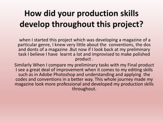
1. How did your production skills
develop throughout this project?
when I started this project which was developing a magazine of a
particular genre, I knew very little about the conventions, the dos
and donts of a magazine .But now if I look back at my preliminary
task I believe I have learnt a lot and improvised to make polished
product .
Similarly When I compare my preliminary tasks with my Final product
I see a great deal of improvement when it comes to my editing skills
such as in Adobe Photoshop and understanding and applying the
codes and conventions in a better way. This whole journey made my
magazine look more professional and developed my production skills
throughout.
2. In my first cover I have simply
joined a background image
with my cover star, the image
looks pasted on the
background and looks very
unnatural.
I have used an excess of
different fonts which is not very
conventional.
There is no particular color
scheme, so my work looks
messy.
I haven’t added any pugs.
No margins are left on either
Preliminary 1
My second cover is better than
the first as I have chosen a color
scheme and added a pug.
But still the use of many fonts is
giving an untidy look.
The biggest blunder I made in
this cover is that I was unable to
crop the main image properly
which makes it look very
unprofessional.
I have also added the social
media contact on the cover which
is conventionally added at the
back.
Preliminary 2 Final task
In my final project I have worked
More carefully while choosing my
Color scheme and fonts.
I made sure that my cover star
Is in the center and covers
maximum
space . I have left margins on
both
Side, as per convention.
I have successfully cropped the
main
Image and refined its edges, so it
Can blend with the gradient.
3. As I wasn’t having a professional makeup artist
for my model, you can see how the base is not
blended and is visible on my models face.
But as my editing skills have developed till
reaching the end product I was able to fix this by
changing the brightness and contrast of the
picture.
If you closely you’ll realize that I have also
changed the hair color of my model by adding a
tint of brown and now it looks more rich in
color. I was able to do this by using selective
color option on adobe Photoshop.
I also changed the lip
color of my model
from glossy peach to
matt hot pink as it
goes more with her
attire. For this I fist
made a quick mask,
then I selected the
lips by using the paint
brush. After that I
inversed the selection
and used solid color
to change the color. I
further blended it by
changing the mode
from normal to
saturation and then
changing its opacity.
4. Preliminary FinalThrough my research any analysis of other media
texts I realized how fonts and colors can have
different connotations and what important role do
they play when it comes to appealing to audience.
For example in my preliminary tasks I used a lot of
different fonts and this variety of fonts and font
sizes on a single cover made it look unprofessional.
However, I used a maximum of two fonts for the
magazine of my foundation portfolio to make it look
sophisticated and elegant.
some conventions also helped me understand how
the arrangement of text is important, so in my final
cover I arrange the text around main image in an
order.
I also learned that we can download a lot of new
fonts and texts through www.dafont.com
For the mast head of my final cover, I used the the
emboss tool from blending options and added a
Shadow to it, to give it a 3D effect.
All this work on fonts made a huge difference
To the final appearance of my project.
5. Attempt 1
.
attempt 2 Final task
The contents page I made
initially looked very
unprofessional as I used a
full picture of my cover
star without removing its
background. I added a
half gradient that didn’t
looked good either.
Similarly the
arrangement of my text
was not conventional at
all
my research in real media text
helped me a lot with the
contents. Following the
conventions I added the name of
the magazine with an issue date
at the top. Then I cropped my
cover star and placed it on the
right, while I arrange my text on
the left and added subline under
my article heading. I learned how
to add a shadow to a picture by
copying the layer adding a drop
shadow. I even added a
background image.
Even after making these
improvements I still wasn’t
satisfied with my final product,
so I decided to give it some final
touches.
i removed the background
image as I realized it wasn’t
going with my color scheme.
I resized my main image and
the position of its shadow so
I can add other pictures to
my contents page.
6. The picture on the left is how my double spread sheet looked initially. But then
I realized there are many loop holes in my work. I felt that the picture of my
model is not taking more than 50 percent of the page which is a convention, so
I added another picture of my model. Then I realized that the background is
making my page look dull so I changed the gradient to bright peach which was
also in contrast with what my other model wears.
The font I chose was also a problem as it wasn’t fiving a formal look to the
page, so I changed the fond added some 3D effects.
By looking at other media texts I got to know that I haven’t added the photo
and interview credits which were suppose to be below the pictures, so I
immediately added them.
In the end also included the page number.
If I look back to my first attempt and compare it with my final double spread, I
would say that I have learned a lot through my research and trial and error
method.
7. There was a problem with the second picture I decided to add to the page, it was my own
photographic error as the head of the picture was cut. To hide this flaw I decided to add a
floral head band to my model . I got this picture from google and added it on top, during this
process I learned about a new tool in adobe Photoshop which was puppet warp, it helped me
bend the band and adjust it with her head.
Another thing that I learned about while
creating the double spread was the use of
guides and rulers. As it helped me divide and
set my text in columns to maintain the
symmetry and tidiness of my page.
Editor's Notes
SmartArt graphic with pictures on red background
(Intermediate)
To reproduce the SmartArt graphic on this slide, do the following:
On the Home tab, in the Slides group, click Layout, and then click Blank.
On the Insert tab, in the Illustrations group, click SmartArt.
In the Choose a SmartArt Graphic dialog box, in the left pane, click Picture. In the Picture pane, double-click Title Picture Lineup (fifth row) to insert the graphic into the slide.
Click each of the four picture placeholders in the SmartArt graphic, select a picture, and then click Insert.
Select the graphic. Under SmartArt Tools, on the Format tab, in the Size group, enter 5.92” in the Height box and 8.75” in the Width box.
Also under SmartArt Tools, on the Format tab, in the Arrange group, click Align, and then do the following:
Click Align to Slide.
Click Align Center.
Click Align Middle.
Select the graphic, and then click one of the arrows on the left border. In the Type your text here dialog box, enter text.
Press and hold CTRL, and then select all of the text boxes above the pictures. On the Home tab, in the Font group, select Gill Sans MT from the Font list, and then select 26 pt. from the Font Size list. Click Font Color and select White, Background 1.
Press and hold CTRL, and then select all of the text boxes above the pictures. Under SmartArt Tools, on the Format tab, in the Shapes group, click Change Shape, and then under Rectangles, click Round Diagonal Corner Rectangle.
Also under SmartArt Tools, on the Format tab, in the Shape Styles group, click the Format Shape dialog box launcher. In the Format Shape dialog box, click Fill in the left pane, in the Fill pane, click Gradient fill, and then do the following:
In the Type list, select Linear.
In the Angle box, enter 0.3°.
Under Gradient stops, click Add gradient stop or Remove gradient stop until three stops appear in the slider.
Also under Gradient stops, customize the gradient stops as follows:
Select the first stop in the slider, and then do the following:
In the Position box, enter 0%.
Click the button next to Color, click More Colors, and then in the Colors dialog box, on the Custom tab, enter values for Red: 77, Green: 28, and Blue: 27.
Select the next stop in the slider, and then do the following:
In the Position box, enter 50%.
Click the button next to Color, click More Colors, and then in the Colors dialog box, on the Custom tab, enter values for Red: 136, Green: 50, and Blue: 48.
Select the last stop in the slider, and then do the following:
In the Position box, enter 100%.
Click the button next to Color, click More Colors, and then in the Colors dialog box, on the Custom tab, enter values for Red: 77, Green: 28, and Blue: 27
Also in the Format Shape dialog box, click Line Color in the left pane, in the Line Color pane, click No line.
Also in the Format Shape dialog box, click Shadow in the left pane, in the Shadow pane, click the button next to Presets, and then under Outer, click Offset Diagonal Bottom Left (first row).
Press and hold CTRL, and then select the three text boxes below the pictures. On the Home tab, in the Font group, select Gill Sans MT from the Font list, select 24 in the Font Size box, and then click Font Color and select White, Background 1.
Also on the Home tab, in the Paragraph group, click Align Text Left.
Press and hold CTRL, and then select the three vertical lines in the SmartArt graphic. Under SmartArt Tools, on the Format tab, in the Shape Styles group, click the Format Shape dialog box launcher. In the Format Shape dialog box, click Line Color in the left pane, in the Line Color pane, click Gradient line, and then do the following:
In the Type list, click Linear.
In the Angle box, enter 90°.
Under Gradient stops, click Add gradient stop or Remove gradient stop until two stops appear in the slider.
Also under Gradient stops, customize the gradient stops as follows:
Select the first stop in the slider, and then do the following:
In the Position box, enter 46%.
Click the button next to Color, click More Colors, and then in the Colors dialog box, on the Custom tab, enter values for Red: 40, Green: 15, and Blue: 14.
In the Transparency box, enter 0%.
Select the last stop in the slider, and then do the following:
In the Position box, enter 100%.
Click the button next to Color, and then under Theme Colors click Black, Text 1 (first row).
In the Transparency box, enter 100%.
Press and hold CTRL, and then select all three pictures. Under SmartArt Tools, on the Format tab, in the Shapes group, click Change Shape, and then under Rectangles, click Round Single Corner Rectangle.
Under Picture Tools, on the Format tab, in the Picture Styles group, click Picture Effects, point to Shadow, and then under Inner, click Inside Diagonal Top Right.
Also under Picture Tools, on the Format tab, in the Picture Styles group, click Picture Border, and then click No Outline.
To reproduce the background effects on this slide, do the following:
On the Design tab, in the Background group, click Background Styles, and then click Format Background. In the Format Background dialog box, click Gradient fill, and then do the following:
In the Type list, click Radial.
In the Direction list, click From Center.
Under Gradient stops, click Add gradient stop or Remove gradient stop until three stops appear in the slider.
Also under Gradient stops, customize the gradient stops as follows:
Select the first stop in the slider, and then do the following:
In the Position box, enter 0%.
Click the button next to Color, click More Colors, and then in the Colors dialog box, on the Custom tab, enter values for Red: 153, Green: 57, and Blue: 55.
Select the next stop in the slider, and then do the following:
In the Position box, enter 50%.
Click the button next to Color, click More Colors, and then in the Colors dialog box, on the Custom tab, enter values for Red: 114, Green: 42, and Blue: 40.
Select the last stop in the slider, and then do the following:
In the Position box, enter 100%.
Click the button next to Color, click More Colors, and then in the Colors dialog box, on the Custom tab, enter values for Red: 40, Green: 15, and Blue: 14.