Call Girls in Dwarka Mor Delhi Contact Us 9654467111
+ Process of digipack
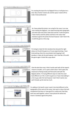
1. I’m creating the layout for my Digipack first as it will give me a
clear idea of what I need to do and the space I need to fill to
make it look professional
As I have picked the photo I am using for the cover I can now
start making the Digipack, I am experimenting with typography
and what style and colour looks best and fits in with the genre.
I have mainly used the yellow and that is the colour that
standouts against the photo the best however I don’t feel it fits
in with the genre or the song
I’m trying to make the font standout but also pick the right
colours to fit with the genre so I’m just experimenting. I have
tried putting a blue line around plain text hopping it will
standout, it does do this job however I don’t feel like it fits with
the genre again it looks like a pop album
I like the dark blue navy I think it works well with all the aspects
I have to consider, as it is quite a dark colour I feel it gives the
impression of being moody and that works well with the
Digipack photo. I’m trying different ways to make the cover
look different so it fits in with my genre so I have tried adding in
a line to go under the text however I don’t feel it works very
well it breaks up the text too much.
I’m adding in the band’s name I want it too look different to the
typography of the name of the song, I also want a colour that will
complement the blue so I have gone for a white and I feel they
work very well together, where I have placed the white text
means it standout against the photo.
2. I’ve chosen on just black for the colour of the disk side on the
Digipack this colour fits in with the genre, song and photos
however as at the moment it is slightly boring I might add a
photo to the disk
I was think for a while what I can add on the inside cover, I
wanted to add a photo of my model and not the ink photos
again as I feel if I place the photo there is will be too samey I
want something different, however I felt that just having a one
photo there might look random as I haven’t used a photo of the
model yet so I came up with the idea of adding lots of small
photos, this way the audience also gets to see more about the
artist.
I’m unsure whether to have the mini photos black and white or
in the original colour so I have used the same photo and
changed one to black and white and placed them next to each
other on the Digipack template so I can compare what they
look like and select the one that looks best. I have picked the
black and white on; it fits in with the rest of the Digipack and
doesn’t draw any attention away from anything.
When I first thought of adding mini photos in the Digipack I
wanted the photos to be all in line and horizontal and vertical
from each other, however the photo I want to use some are
landscape meaning I can’t have them all in line. However now
that I have seen uneven I prefer it, it fits in with the genre as its
alternative and a bit different.
3. I’m trying to find a font style and colour that will go with the rest
of the Digipack and the genre of my song. I have selected white
text with a navy line to fit in with the other text on the Digipack
however I’m not sure if I like it together I not sure if it fits with the
genre it looks like a pop genre
I am changing the name of my band from the original name of the
band from the actual bands name ‘london grammar’ to a new
name that I have created ‘anytime’. I’m also trying to improve my
digipack, before the disc was just blank I am now trying to make it
more creative
I am adding text to make the disc more visual as looking back at
my research text or an image on the disc is a big convention on
professional work so I feel it is very important to add in
When doing my digipack i missed out key pages, therefore making it
an album and not a digipack so i am adding more images. I have also
changes one side of the digipack that was made up of little photos
and now been replaced with some of the same images just edited in
a unique way, i feel this links the digipack together more so they
work well as a set and fits in better with my genre if alternative
4. when doing my research into digipack I noticed that a lot of them had
legal information about copyright issues and about the record label so
to follow conventions I have experimented with creating my own
niche record label called ‘levels records’ and have tried making a logo
for it. This fills up some gaps on the disc and makes it look less bare
Throughout my digipack process I have developed my idea a lot. I have constantly referred back to
research to find ways to improve my work and make it more realistic and I think this has worked
very well for me as the constant change I feel the work has got stronger and stronger.