The band created ancillary materials to promote their indie-pop music. They looked to other girl bands for inspiration on conveying their girly image through colorful logos and photos. After feedback, they simplified their advertisement to a close-up photo of the band pulling shapes with their large logo. For the CD cover, they similarly used a consistent photo from their music video on the front and back, with individual band photos inside and balloons for the track list.
1. How effective is the combination of your main product and ancillary texts?
When making our ancillary text we knew it had to stand out and catch our audience’s attention. The
most important part was the logo as it had to be recognisable so that everyone knows who the band
is. As our genre was indie-pop we wanted to try and show this throughout everything. We wanted to
create something which was girly that went with the image of the band and something you could
image seeing in real life. We looked at many CD covers and adverts for inspiration. To make it easier,
we looked at mainly pop girl bands as this was the image we wanted to create.
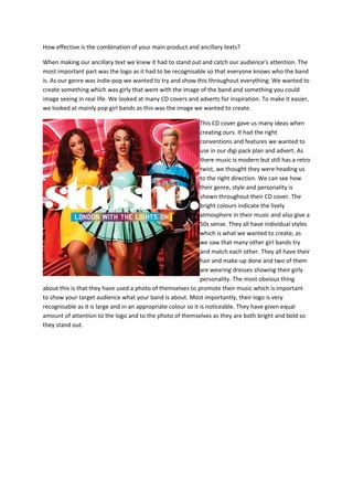
This CD cover gave us many ideas when
creating ours. It had the right
conventions and features we wanted to
use in our digi pack plan and advert. As
there music is modern but still has a retro
twist, we thought they were heading us
to the right direction. We can see how
their genre, style and personality is
shown throughout their CD cover. The
bright colours indicate the lively
atmosphere in their music and also give a
50s sense. They all have individual styles
which is what we wanted to create, as
we saw that many other girl bands try
and match each other. They all have their
hair and make-up done and two of them
are wearing dresses showing their girly
personality. The most obvious thing
about this is that they have used a photo of themselves to promote their music which is important
to show your target audience what your band is about. Most importantly, their logo is very
recognisable as it is large and in an appropriate colour so it is noticeable. They have given equal
amount of attention to the logo and to the photo of themselves as they are both bright and bold so
they stand out.
2. Rihanna’s CD cover was a great example to
look at when creating our digi pack. We can
see that she has not got her name on the
album cover, instead she has created her own
logo which anyone could recognise without
having her name of face shown as it has been
made in a way which goes well with her image.
Her logo has also been made large enough so
that it can be seen on the front cover.
Although her CD cover also just had her photo
on it, she has used unique ideas like having the
album name shown as a tattoo on her arm.
Her face is also shown as a way to almost give
u a clue on what her songs are about. Her
hand on her head, dark make-up and tongue
sticking out also give the audience a hint on
what messages her songs are trying to give.
3. We used a website called Picmonkey to create our fonts which allowed us to experiment with
different colours, styles, boldness and shadows. We then narrowed it down to 9 fonts which we liked
and went well with our band name “Sassy”. We first decided we wanted to have a continuous colour
scheme we would use for all our ancillary tasks. We choose the colours red, white and black as we
felt that red represented love and passion and white and black just make everything stand out so we
felt these colours would work well with our work. We choose font 2 as we thought it was girly and
old fashioned which is what we wanted. We felt that the logo would need to create an image for the
band as well as representing the personalities of the band. We thought this font gave the band a
stylish and funky image.
This was our first final outcome after experimenting with different photos, fonts, layout etc. We
booked out the studio to take some professional looking photos for our ancillary tasks. We choose to
4. have a black background as this would go with our colour scheme. We took a variety of group and
individual pictures. There were pictures of the girls pulling faces and posing to show their
personality. We decided to go with a close up image of the group as this gives the target audience
more detail of what the band like together. We put all the information around the photo so that
nothing was being covered. With the font again, we used red and white to make it stand out.
After receiving
change our idea
had many
feedback from our focus groups, we decided to
completely. We realised that our previous advert
problems with it and did not look realistic at all. The first
problem with it was that it was landscape and adverts in a magazine
are portrait so as we didn’t have time to take new photos, we still used the same photos
and used Photoshop to resize them so that they were portrait. The
font used was too basic and did not go with our band image so we
had to change it. The collage effect we used was making the image
unclear, and the whole point of using an image of the band was so
that the target audience could see what they looked like. So we started
again, and
did more research into CD covers and adverts and saw that most of them were
simple
and usually created the image of their album name. As our album name is “Pull
Shapes” we used an image of the band were
they
are literally pulling shapes. We couldn’t
change the background, but we did
however change our font so that it was
more
girly and a lot bigger so that everyone
could
see it. We put less information on the
advert as we thought the more simple
it
was the more professional it looked.
We also added an extra effect of
signatures at the bottom to
personalise it for the audience.
5.
6. For our final CD cover, we also changed this completely too. Our previous CD cover was unrealistic as
the plan was to make it open up like two doors however this was too complicated and didn’t work
very well when we tested it. We also wanted to use pictures of the people dancing in our main
video. However we forgot to take pictures from our final video so we ended up using pictures from
our rough cut so it was not consistent. We decided we wanted to make our advert and work
consistent, so we used the advert for the front cover and another group picture for the back cover.
For the track list, we used a photo of balloons that we took as this related well to the pull shapes
video as it was set at a party. Inside of the CD cover we used individual pictures of the band to show
the audience what the girls are like individually as well as together.
7. For our final CD cover, we also changed this completely too. Our previous CD cover was unrealistic as
the plan was to make it open up like two doors however this was too complicated and didn’t work
very well when we tested it. We also wanted to use pictures of the people dancing in our main
video. However we forgot to take pictures from our final video so we ended up using pictures from
our rough cut so it was not consistent. We decided we wanted to make our advert and work
consistent, so we used the advert for the front cover and another group picture for the back cover.
For the track list, we used a photo of balloons that we took as this related well to the pull shapes
video as it was set at a party. Inside of the CD cover we used individual pictures of the band to show
the audience what the girls are like individually as well as together.