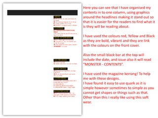
1. Here you can see that I have organised my
contents in to one column, using graphics
around the headlines making it stand out so
that it is easier for the readers to find what it
is they will be reading about.
I have used the colours red, Yellow and Black
as they are bold, vibrant and they are link
with the colours on the front cover.
Also the small black bar at the top will
include the date, and issue also it will read
“MONSTER - CONTENTS”.
I have used the magazine kerrang! To help
me with these designs.
I have found it easy to use quark as it is
simple however sometimes to simple as you
cannot get shapes or things such as that.
Other than this I really like using this soft
wear.
2. As you can see from this print screen I have
added the title “CONTENTS”.
Here I have added the main picture for my
contents which is giving an edgy look and a
cool atmosphere to the magazine.
I looked at using different pictures but out
of them all this was the best. I have tried to
get the colour scheme to fit in with the
colour that is displayed on the picture and it
has worked out very well.
I have added a advertisement “Get free
Apps…” which are used in many kerrang!
Magazines. So I thought it would be a good
idea to add my own, to making more eye
catching for my target audience.
3. Again I have used more advertisement in the
bottom right to allow the readers to become
more involved with the magazine itself.
Also I have added the Cover date and the
issue number in the black bar stretching
across the top I have added this as it makes
it seem more professional and I feel it looks
more like a magazine.
I have chosen not to change anything about
the colour scheme of the contents as I know
that the colours fit perfectly with the cover.
4. In this shot I have decided to change the
colour of the advertisement (bottom right) to
make it stand out more as the yellow and the
dark blue looked a little silly and the colours
clashed. I want it to attract the attention of
the reader so I have made it a lighter blue
highlighting the heart red and this colour
connotes love and passion.
And again to make the magazine look more
professional I have chosen to add in my own
Editors letter which is very bright and stands
out a lot.
5. Here I have chosen to include to smaller
pictures toward the bottom of the magazine
to add more quality in the magazine, one
them is of the unsigned artists who is holding
a guitar, and the other is in black and white
which is giving out a lot of attitude and
edginess to the magazine.
I am concerned however about the large
white gap in the middle there so I may in clue
some more photographs liking with the
magazine.
I have also changed the colour of the editor’s
letter as in the other print screen it was
clashing in with the writing in the black box
at the bottom I also have looked on some
kerrang magazines and they have used a
simple black font for the letter so that it is
easier for the fan to read.
6. In this print screen I have decided I will add
more photographs. This is again another
black and white photograph which is going
to be the album cover of Andy Brown
(Young man in the main image) it is in black
an white adding to that roughness. Also the
picture at the bottom is of the drummer
Luke from the unsigned band Merger, who
are the band that were interviewed for the
DPS.
I think that by adding more photos this will
allow the reader to take a look at who/what
it is they will be reading about.
At fist I wasn’t sure how to get a picture on
but when I found out I found it really easy
to work and to crop and fixe the pictures to
how I wanted them.
7. The final print screen has been taken to
show I have added numbers to my
photographs so that when the reader
comes to that number the picture will give
them hints to what the article, review etc.
is about which will make them more
interested in reading it depending on the
picture.
Everything here seems to fit in very well I
think and I find the colour scheme links in
well with the main image.
8. Although I felt proud of my contents page I handed in my
work and I was given some feed back which allowed me
to understand that it didn’t look very realistic or
professional. So I have made many changes to try my
best to create a better and more attractive magazine
contents page.
Also I was told some of the picture where more aimed
towards an indie magazine so I have taken some other
pictures which have made a big difference. I also used to
many pictures of the same person being the model on my
front cover so I have decided to take him out and replace
him with another picture which I think links with the rock
attitude.
9. I have happily decided that I would keep the
writing of my contents page the same and I
would also leave to top bar with the date,
issue and master head. Only because i like
the layout and I think that this will work well
as it has a very hard and rough look.
This picture here I have chosen of Bethany
Johnson, is quite friendly and inviting but
also has that edgy rough look about it as she
is sitting on a bricked floor. I have chosen it
for my content as it invited the reader but it
also continues to use my chosen mood.
10. Again I have made the decision to keep
this black and white picture only because
his facial expression really gives the
magazine rough look also his attitude show
that he doesn’t really care and the face he
has head phones in also creates that rock
atmosphere.
I feel I have made a great difference
already by changing it around and trying
out new things. The more time I have
spent using Quark the more I feel I can
handle and work with it.
11. Here is the complete Contents page as you
can see I have cut out the editors letter as it
let me down because it wasn’t very
professional. I decided to create a subscribe
instead which is again also something that
is used in the rock magazine Kerrang!
I have also cropped my own magazine in as
well to make it look more professional.
I have also used a close up image of David
McGovern (from the band Merger) to show
that a variety of shots have been used. In
these pictures I have also put the page
number, so if fans want to check out who
this weeks celebrity-look-a- like is they can
go straight to that page. Also if they want to
know about merger they don’t have to flick
though to find the right page.