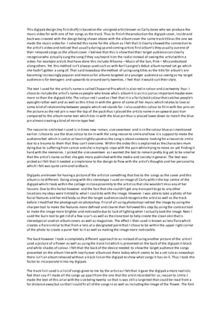
1. This digipak design (my firstdraft) is based on the unsigned artistknown as Carly Jones who we produce the
music video for with one of her songs as the track.Thus to finish theproduction the digipak cover, insideand
back was created with the design being shown above with the albumcover the same track titleas the one we
made the music video for. I selected this name for the album as I felt that it clearly showed the connection to
the artist’s video and noticed that usually duringup and comingartists firstalbum’s they usually useone of
their released songs as the albumcover. I believe that this is showthat their target audiencecan clearly
recognisewho actually sungthe songif they say heard iton the radio instead of seeingthe artistwithin a
video. For example artists thathave done this include:Rihanna –Music of the Sun, Pink – Missundaztood
alongothers. Yet this method isn’t always used such as with Avril Lavigne’s debut albumnamed Let go which
she hadn’t gotten a song of. That said nowadays themethod of usingsongtitles as the title for album’s are
becoming increasingly popular and moreso for albums targeted at a younger audienceso seeingas my target
audienceis for teenagers and upwards to around early twenties, I feel that itwould suittheir style.
The text I used for the artist’s nameis called Chaparral Pro which is also red in colour and sizetwenty four. I
chose to includethe artist’s nameso people who know who’s albumit is as itis justas importantmaybe even
more so than the digipak title.The colour red I used as I feel that it is a fairly bold colourthatcatches people’s
eyesight rather well and as well as this itties in with the genre of some of her music which relates to love or
some kind of relationship between people which red stands for. I also used this colour to fitin with the pins on
the picture as the red pin is near the top of the pack thus I placed the artists namein an upward posi tion
compared to the albumname text which ties in with the blue pin thus is placed lower down to match the blue
pin almostcreatinga kind of mirror type feel.
The reason to smiletext I used is in times new roman, sizeseventeen and is in the colour blueas I mentioned
earlier.I choseto use the blue colour to tie in with the song reason to smileand how itis suppostto make the
audiencefeel which is sad or at leastslightly upsetas the songis aboutsomeone lookingfor a reason to smile
due to a trauma to them that they can’t overcome. Within the video this is explained as thecharacters mum
dyingdue to sufferingfrom cancer and she is tryingto cope with the pain whiletrying to move on yet findingit
hard with the memories. I picked the sizeseventeen as I wanted the text to remain pretty big yet to be smaller
that the artist’s name so that she gets more published with the media and society in general. The text was
picked as I felt that it needed a simpletone to the design to flow with the artist’s thoughts and her personality
which I felt was quite calmand laidback.
Digipaks areknown for havinga pictureof the artistor something that ties to the songs as the cover and this
albumis no different. Going alongwith this stereotype I used an image of Carly withi n the top centre of the
digipak which I took within the college in closeproximity to the artistso that she wouldn’t miss any of her
lessons.Due to this factor however and the fact that she couldn’t get any transportto go to any other
locations my ideas were limited to what I could do with the image. However I was ableto take a photo of her
facial features and her mid body so that the target audiencecould recognisethe artistas well as the track
before I modified the photograph on photoshop. Firstof all usingphotoshop I edited the image by usingthe
sharpen tool to make the features more defined and clearer then followed this step by usingthe contrasttool
to make the image more brighter and noticeabledue to lack of lightingwhen I actually took the image. Next I
used the burn tool to get rid of a few scar’s as well as theclonetool to help create the clean skin thatis
stereotypical used on albumcovers as well as magazines. The effect I then used is known as lens flarewhich
creates a flaresimilar to that from a lens at a designated pointthat I chose to be within the upper right corner
of the photo to create a purer feel to it as well as makingthe image more noticeable.
The back however I took a completely different approach to as instead of usinganother picture of the artistI
used a picture of a flower as well as usingthe track listwhich is presented on the back of the digipak in black
and white shades of colour.I felt that the back of the device needed to showthe target audience the songs
presented on the album likewith nearly ever albumout there today which seems to be a set ruleas nowadays
there isn’t an albumreleased without a track liston the digipak to show what songs it has on it. Thus I took this
factor to incorporateitinto my digipak.
The track listI used is a listof songs given to me by the artistas I feltthat itgave the digipak a more realistic
feel than say if I made all the songs up apartfrom the one that the artistrecorded for us,reason to smile.I
made the text of this arial with the sizebeing twenty so that is was still a largetext that could be read from a
far distanceaway but so that I could fit all of the songs in as well as includingthe image of the flower. The font
2. I used in order to keep it clean and simpleas every text design that I used seemed to be either be too
professional or not enough such as a text that was old English yet so joined up that I couldn’tidentify some of
the song titles,nor could a group of people I asked on the matter either. Thus I felt the clean and simpletext
option would suitbetter as itallows peopleto view the track listand duringa shortquestionnairewhich I
conducted people only seem to view the back of digipaks when they firstpurchasethe albumand when they
want to find the song that they likebut not for anythingelse such as lookingatthe image on the back.
Due to my findings I didn’twant to spend too much time on the back yet more of the front as people
commented that they looked at the front of an albummuch more than they did with the back.Thus I took a
photo of a flower that I found within the village.The reason I took the image was becauseI felt that it tied with
the video of reason to smilewith the link to death as well as the title of the digipak which is the same name as
the video track. After takingthe photograph I began to edit itusingphotoshop, for instanceI used a blue hue
effect to the image to try and match itto the bluetext on the front however itdidn’t fit rightand neither did
red so instead I made it black and white. Thus it goes with the text as well as the background colour creatinga
kind of mellow feeling towards the digipak which represents the artist’s type of music which are quite slow
and as I mentioned before are mainly aboutfeelings and the way that people express them.
So that the photo fitted with the back of the digipak I used a flower texture for the white background to match
alongwith the image so that itdidn’t look out of place.I then bordered the photograph and text with an image
of jeans to again match the casual feelingthatI wanted the albumto create and express through the whole
digipak.However I do feel that it might be a step too far as it looks too different from the rest of the albumyet
I do likethe texture likefeel that it gives as it links with the target audience as studies I havelooked at show
that jeans are a top brand of wear for teens and upwards.
The middle of the digipak again I took a different idea for as I had to remember that half of the image was
going to be covered by a hole where the CD would be kept. That said I still wanted to includethe artistwithin
the middle of the digipak allowingitto flow as the audienceopened the pack up. Due to this factor I added
two images of Carly yet showingher more laid back and connected with the music by her expressions and the
emotion that I think people can feel when lookingat her facial features.The two pictures are presented
together yet slightly apartso thateach one can go on a different sidewith one being where the CD is placed
and the other being where the booklet would be left.
That said I placed the photos so that their eye view is lookingtowards the other image hopefully allowingthe
audienceto see the whole aspectof the digipak as itis known that we as humans recogniseimages by their
facial features and followthe way they are placed or the direction thatthey arelookingat. This is believed to
be why when lookingat a paintingof a photo of a person staringback atthe viewer they can sometimes get
intimidated.I feel that this is a good technique to use as itis subtleand doesn’t provide too much extra work
on top of the digipak design itself.
I didn’t decide to use any text on the insideas I feltthat it took attention away from the rest of the digipak and
as well as this I didn’t feel that text really suited it.For one I couldn’tpick any text that I felt suited the artistof
the songs even when usingquotes from the song titleas well as Carly.That said if I found the right text I ma
consider usingitwithin my final production pieceof the digipak.
Colours thatI used were picked in order to match the front of the albumcover as that was what people would
see when they opened the front cover so I tried to keep the background colour as close as I could,keeping it
different shades of brown whilealso usingthecolours brown and blueto border the images. This also matches
the text on the front cover which I feel creates that flowingeffect so that the digipak isn’ttoo different when
someone looks at itotherwise they may not know exactly what they are getting which some people, especially
my target audience,don’t like. Yet seeing as I clearly tied in the feeling throughout the digipak I think that
people will know what they are buyingwhen lookingatthe digipak both insideand out.