Download to read offline
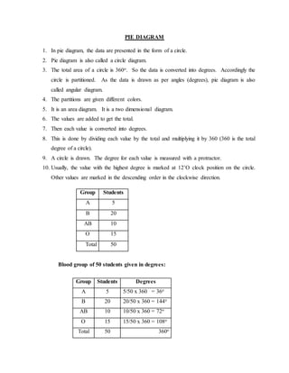
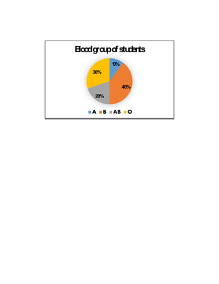

A pie diagram presents data in the form of a circle partitioned into slices corresponding to different categories. Each category's slice represents its percentage of the total by taking up the appropriate number of degrees out of the full circle's 360 degrees. For example, a pie diagram could show that of 50 students, 5 (10%) were group A, 20 (40%) were group B, 10 (20%) were group AB, and 15 (30%) were group O.


![Presenting-Experimental-Data-Grade-8 [Autosaved].pptx](https://cdn.slidesharecdn.com/ss_thumbnails/presenting-experimental-data-grade-8autosaved-240925105557-9775d0ae-thumbnail.jpg?width=640&height=640&fit=bounds)
![Presenting-Experimental-Data-Grade-8 [Autosaved].pptx](https://cdn.slidesharecdn.com/ss_thumbnails/presenting-experimental-data-grade-8autosaved-240925104859-008a237a-thumbnail.jpg?width=640&height=640&fit=bounds)