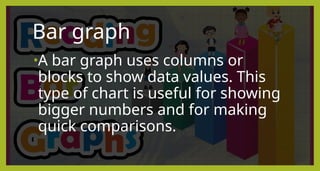
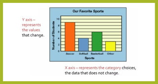
Bar graph
•A bargraph uses columns or
blocks to show data values. This
type of chart is useful for showing
bigger numbers and for making
quick comparisons.
10.
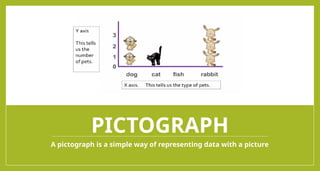
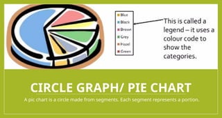
CIRCLE GRAPH/ PIECHART
A pic chart is a circle made from segments. Each segment represents a portion.
11.
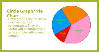
Circle Graph/ Pie
Chart
•Circle graphs do not show
exact values, but
percentages. They are
useful when comparing a
large sample with a small
sample.
12.
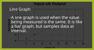
Line Graph
•A linegraph is used when the value
being measured is the same. It is like
a bar graph, but samples data at
interval.
13.
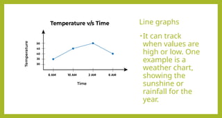
Line graphs
•It cantrack
when values are
high or low. One
example is a
weather chart,
showing the
sunshine or
rainfall for the
year.
14.
How to makebar
graph?
1) Collect your data. The
first thing you must do
is to collect all your
data.
15.
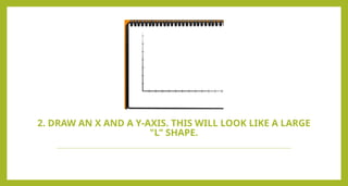
2. DRAW ANX AND A Y-AXIS. THIS WILL LOOK LIKE A LARGE
"L" SHAPE.
16.
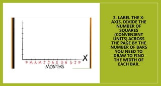
3. LABEL THEX-
AXIS. DIVIDE THE
NUMBER OF
SQUARES
(CONVENIENT
UNITS) ACROSS
THE PAGE BY THE
NUMBER OF BARS
YOU NEED TO
DRAW TO FIND
THE WIDTH OF
EACH BAR.
17.
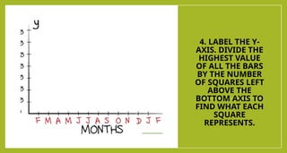
4. LABEL THEY-
AXIS. DIVIDE THE
HIGHEST VALUE
OF ALL THE BARS
BY THE NUMBER
OF SQUARES LEFT
ABOVE THE
BOTTOM AXIS TO
FIND WHAT EACH
SQUARE
REPRESENTS.
18.
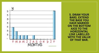
5. DRAW YOUR
BARS.EXTEND
THE BASE YOU
HAVE MARKED
ON THE BOTTOM
AXIS TO THE
HORIZONTAL
LINE LABELLED
WITH THE VALUE
OF THAT BAR.
19.
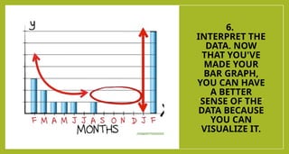
6.
INTERPRET THE
DATA. NOW
THATYOU'VE
MADE YOUR
BAR GRAPH,
YOU CAN HAVE
A BETTER
SENSE OF THE
DATA BECAUSE
YOU CAN
VISUALIZE IT.
20.
Performance Task
Divideyourselves into 4 groups.
Decide a list of possible survey questions to collect data on. (Ex. favorite
ice cream flavor, favorite pet, best T.V. show, favorite pizza toppings,
favorite toy, etc.
Choose one of the survey questions from the class list.
As a class choose up to three data collection categories. Brainstorm a list
of categories that match the survey question and that students can collect
data on. (Ex. chocolate, vanilla, strawberry, etc.) Choose up to three
categories.
• After the class has chosen three categories, determine which type of graph
they would like to collect and organize their data on.
23.
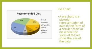
Pie Chart
• Apie chart is a
pictorial
representation of
data in the form of
a circular chart or
pie where the
slices of the pie
show the size of
the data.
24.
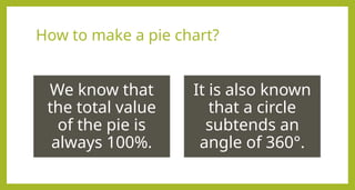
How to makea pie chart?
We know that
the total value
of the pie is
always 100%.
It is also known
that a circle
subtends an
angle of 360°.
25.
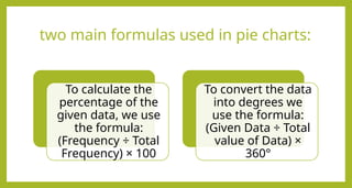
two main formulasused in pie charts:
To calculate the
percentage of the
given data, we use
the formula:
(Frequency ÷ Total
Frequency) × 100
To convert the data
into degrees we
use the formula:
(Given Data ÷ Total
value of Data) ×
360°
26.
Let us understandthe
above steps using an
example.
Observe the following pie chart
that represents the money
spent by Ana at the funfair. The
indicated color shows the
amount spent on each
category. The total value of the
data is 20 and the amount
spent on each category is
interpreted as follows:
• Ice Cream - 4
• Toffees - 4
• Popcorn - 2
• Rides - 10
27.
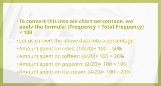
• To convertthis into pie chart percentage, we
apply the formula: (Frequency ÷ Total Frequency)
× 100
• Let us convert the above data into a percentage:
• Amount spent on rides: (10/20)× 100 = 50%
• Amount spent on toffees: (4/20)× 100 = 20%
• Amount spent on popcorn: (2/20)× 100 = 10%
• Amount spent on ice-cream: (4/20)× 100 = 20%
#2 Before we start our discussion, please pick up the pieces of paper under your chair then arrange your chairs silently. And please keep all the things unrelated to our subject. No unnecessary noise and raise your hands if you want to be called.
Who is absent today? Please look at your seatmate.
#3 What do you think has a better way of communication, now or 100 years ago?


![Presenting-Experimental-Data-Grade-8 [Autosaved].pptx](https://cdn.slidesharecdn.com/ss_thumbnails/presenting-experimental-data-grade-8autosaved-240925105557-9775d0ae-thumbnail.jpg?width=640&height=640&fit=bounds)
![Presenting-Experimental-Data-Grade-8 [Autosaved].pptx](https://cdn.slidesharecdn.com/ss_thumbnails/presenting-experimental-data-grade-8autosaved-240925104859-008a237a-thumbnail.jpg?width=640&height=640&fit=bounds)