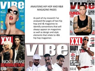
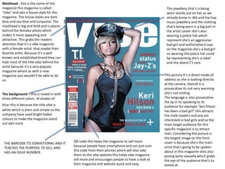
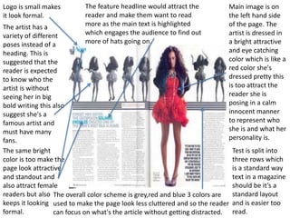
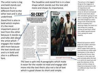
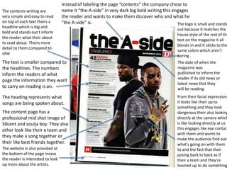
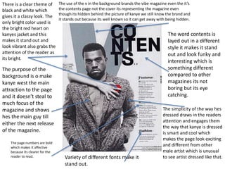
ANALYSING HIP HOP AND R&B 
MAGAZINE PAGES 
As part of my research I've 
analyzed the pages of two hip 
hop and r& magazines to 
identify conventions that will 
always appear on magazines 
as well as design and style 
elements that relate to r&b 
hip hop magazines
Masthead - this is the name of the 
magazine this magazine is called 
“vibe” and sets a house style for the 
magazine. The house styles are dark 
blue and sea blue and turquoise. The 
masthead is big and bold and is places 
behind the females photo which 
makes it more appealing and 
attractive. This grabs the readers 
attention that it’s a vibe magazine 
with a female artist that maybe their 
favorite artist. Because it’s a well 
known and established brand they can 
hide most of the title vibe behind the 
artist because it’s a very popular 
magazine where as with a new 
magazine you wouldn't be able to do 
so. 
The background – this is mixed in with 
three different colors of shades of 
blue this is because the title vibe is 
white which is plain and simple so the 
company have used bright faded 
colours to make the magazine stand 
out abit more 
THE BARCODE ITS CONVETIONAL AND IT 
TEACHES THE PURPOSE TO SELL AND 
HAS AN ISSUE NUMBER. 
QR code-this helps the magazine to sell more 
because people have smartphone and can just scan 
this code from their phones which will also take 
them to the vibe website this helps vibe magazine 
sell more and encourages people to have a look at 
their magazine and website quick and easy. 
The jewellery that’s is being 
worn stands out on her as we 
already know in r&b and hip hop 
music jewellery and the clothing 
that’s being worn is a big part in 
the artist career she's also 
wearing a police hat which 
represent she's an aggressive 
bad girl and authorative it says 
on the magazine she's a bad girl 
so wearing the police hat could 
be representing she's a rebel 
and she doesn't’t care. 
This picture It’s a direct mode of 
address as she is looking directly 
at the camera. Overall it is 
provocative its not very warming 
she's not smiling. 
The language is also provocative 
the ay in its speaking to its 
audience for example “keri hilson 
has been a bad girl” this attracts 
the male readers and any are 
interested in bad girls and so the 
main target audience for this 
specific magazine is to attract 
men. Considering the picture is 
the largest image on the front 
cover is because she's the main 
artist that’s going to be spoken 
about in this magazine shes also 
posing quite sexually which grabs 
the eye of the audience that’s its 
aimed at.
The title XXL is hidden 
behind the games 
picture this shows its a 
well known magazine its 
big and outstanding 
which is attracting to the 
customers and that 
makes them recognise 
the brand straight away. 
Slang language used to 
get the younger 
generations attention 
this makes them more 
engaged into the 
magazine. 
The name of the singer 
is big and stands out this 
represents who is on the 
front page. 
Barcode shows that its a 
product and it can be 
sold. 
The guy the game is 
making guns 
impersonations which 
gives us the 
impression that hes 
telling us hes a rebel 
and hes a dangerous 
guy. 
The white background 
is too make the rest of 
the text and pictures 
stand out more. 
Shirtless which makes 
him look outstanding 
and more dangerous. 
Tattoos on the game 
which is known one of 
the most common 
things in r&b. This 
makes him look thuggy 
and like a gangster 
represents that hes 
hard.
Logo is small makes 
it look formal. 
The artist has a 
variety of different 
poses instead of a 
heading. This is 
suggested that the 
reader is expected 
to know who the 
artist is without 
seeing her in big 
bold writing this also 
suggest she's a 
famous artist and 
must have many 
fans. 
The same bright 
color is too make the 
page look attractive 
and standout and 
also attract female 
readers but also 
keeps it looking 
formal. 
Main image is on 
the left hand side 
of the page. The 
artist is dressed in 
a bright attractive 
and eye catching 
color which is like a 
red color she's 
dressed pretty this 
is too attract the 
reader she is 
posing in a calm 
innocent manner 
to represent who 
she is and what her 
personality is. 
The feature headline would attract the 
reader and make them want to read 
more as the main text is highlighted 
which engages the audience to find out 
more of hats going on. 
Test is split into 
three rows which 
is a standard way 
text in a magazine 
should be it’s a 
standard layout 
and is easier too 
read. 
The overall color scheme is grey,red and blue 3 colors are 
used to make the page look less cluttered and so the reader 
can focus on what's the article without getting distracted.
The artist name is big 
and bold stands out 
because its in a 
different front to the 
other text and is also 
underlined. 
Stand first is also in 
bold which implies 
it’s the most 
important piece of 
text from the other 
because it stands out 
and talks abit about 
the artist which 
engages the reader 
abit more because 
the text stands out 
and is in bold and 
also in a different 
font. 
The headline and stand first is in a box 
shape which stands out the text abit 
more and shows its importance. 
The text is split into 4 paragraphs which make 
it easer for the reader to read and engage abit 
more into the text theirs also not a lot of text 
which is good shows its short and simple. 
The picture is the biggest 
thing on the magazine it 
stands out and shows a lot 
of importance and 
immediately the readers 
know its 50 cent and would 
want to read more about 
him and what's going on and 
who is standing with him. He 
also look dangerous and a 
thug on the street also the 
pieces of jewelry he's 
wearing makes him look rich 
and shows he's making 
money at least that’s what 
the readers would assume 
from seeing him wear 
jewelry. 
Rhetorical question which 
grabs the readers attention 
asking for their opinion 
which makes them want to 
read and discuss either with 
themselves or the other if 
he will be the future. Also 
the text is in the color red 
and normally when the text 
is in red its to stand out and 
grab the attention of the 
reader and also shows its 
importance because its also 
in a different color from the 
other text.
Instead of labeling the page “contents” the company chose to 
name it “the-A-side” in very dark big bold writing this engages 
the reader and wants to make them discover who and what he 
“the A-side” is. 
The logo is small and stands 
out because it matches the 
house style of the rest of the 
text on the magazine it all 
blends in and it sticks to the 
same colors which aren't 
boring . 
The date of when the 
magazine was 
published to inform the 
reader if its old news or 
latest news that they 
will be reading. 
The contents writing are 
very simple and easy to read 
on top of each text theirs a 
headline which is big and 
bold and stands out t inform 
the reader what their about 
to read about. Theirs more 
detail to them compared to 
vibe 
The text is smaller compared to 
the headlines. The numbers 
inform the readers of what 
page the information they want 
to carry on reading is on. 
The heading represents what 
songs are being spoken about. 
The content page has a 
professional mid shot image of 
50cent and soulja boy. They also 
other look like their a team and 
they make a song together or 
their like best friends together. 
The website is also provided at 
the bottom of the page incase 
the reader is interested to look 
up more about the artists. 
From their facial expressions 
it looks like their up to 
something and they look 
dangerous their also looking 
directly at the camera which 
is like looking directly at us 
this engages like eye contact 
with them and wants to 
make the audience find out 
what's going on with them 
to and the fact that their 
posing back to back as if 
their a team and they're 
teamed up to do something.
There is a clear theme of 
black and white which 
gives it a classy look. The 
only bright color used is 
the bright red heart on 
kanyes jacket and this 
makes it stand out and 
look vibrant also grabs the 
attention of the reader as 
its bright. 
The use of the v in the background brands the vibe magazine even the it’s 
the contents page not the cover its representing the magazine even 
though its hidden behind the picture of kanye we still know the brand and 
it stands out because its well known so it can get away with being hidden. 
The word contents is 
layed out in a different 
style it makes it stand 
out and look funky and 
interesting which is 
something different 
compared to other 
magazines its not 
boring but its eye 
catching. 
The purpose of the 
background is o make 
kanye west the main 
attraction to the page 
and it doesn’t steal to 
much focus of the 
magazine and shows 
hes the main guy till 
either the next release 
of the magazine. 
The simplicity of the way hes 
dressed draws in the readers 
attention and engages them 
the way that kanye is dressed 
is smart and cool which 
makes the page look exciting 
and different from other 
male artist which is unusual 
to see artist dressed like that. 
The page numbers are bold 
which makes it affective 
because its clearer for the 
reader to read. Variety of different fonts make it 
stand out.

Media vibe1 2

  • 1.
    ANALYSING HIP HOPAND R&B MAGAZINE PAGES As part of my research I've analyzed the pages of two hip hop and r& magazines to identify conventions that will always appear on magazines as well as design and style elements that relate to r&b hip hop magazines
  • 2.
    Masthead - thisis the name of the magazine this magazine is called “vibe” and sets a house style for the magazine. The house styles are dark blue and sea blue and turquoise. The masthead is big and bold and is places behind the females photo which makes it more appealing and attractive. This grabs the readers attention that it’s a vibe magazine with a female artist that maybe their favorite artist. Because it’s a well known and established brand they can hide most of the title vibe behind the artist because it’s a very popular magazine where as with a new magazine you wouldn't be able to do so. The background – this is mixed in with three different colors of shades of blue this is because the title vibe is white which is plain and simple so the company have used bright faded colours to make the magazine stand out abit more THE BARCODE ITS CONVETIONAL AND IT TEACHES THE PURPOSE TO SELL AND HAS AN ISSUE NUMBER. QR code-this helps the magazine to sell more because people have smartphone and can just scan this code from their phones which will also take them to the vibe website this helps vibe magazine sell more and encourages people to have a look at their magazine and website quick and easy. The jewellery that’s is being worn stands out on her as we already know in r&b and hip hop music jewellery and the clothing that’s being worn is a big part in the artist career she's also wearing a police hat which represent she's an aggressive bad girl and authorative it says on the magazine she's a bad girl so wearing the police hat could be representing she's a rebel and she doesn't’t care. This picture It’s a direct mode of address as she is looking directly at the camera. Overall it is provocative its not very warming she's not smiling. The language is also provocative the ay in its speaking to its audience for example “keri hilson has been a bad girl” this attracts the male readers and any are interested in bad girls and so the main target audience for this specific magazine is to attract men. Considering the picture is the largest image on the front cover is because she's the main artist that’s going to be spoken about in this magazine shes also posing quite sexually which grabs the eye of the audience that’s its aimed at.
  • 3.
    The title XXLis hidden behind the games picture this shows its a well known magazine its big and outstanding which is attracting to the customers and that makes them recognise the brand straight away. Slang language used to get the younger generations attention this makes them more engaged into the magazine. The name of the singer is big and stands out this represents who is on the front page. Barcode shows that its a product and it can be sold. The guy the game is making guns impersonations which gives us the impression that hes telling us hes a rebel and hes a dangerous guy. The white background is too make the rest of the text and pictures stand out more. Shirtless which makes him look outstanding and more dangerous. Tattoos on the game which is known one of the most common things in r&b. This makes him look thuggy and like a gangster represents that hes hard.
  • 4.
    Logo is smallmakes it look formal. The artist has a variety of different poses instead of a heading. This is suggested that the reader is expected to know who the artist is without seeing her in big bold writing this also suggest she's a famous artist and must have many fans. The same bright color is too make the page look attractive and standout and also attract female readers but also keeps it looking formal. Main image is on the left hand side of the page. The artist is dressed in a bright attractive and eye catching color which is like a red color she's dressed pretty this is too attract the reader she is posing in a calm innocent manner to represent who she is and what her personality is. The feature headline would attract the reader and make them want to read more as the main text is highlighted which engages the audience to find out more of hats going on. Test is split into three rows which is a standard way text in a magazine should be it’s a standard layout and is easier too read. The overall color scheme is grey,red and blue 3 colors are used to make the page look less cluttered and so the reader can focus on what's the article without getting distracted.
  • 5.
    The artist nameis big and bold stands out because its in a different front to the other text and is also underlined. Stand first is also in bold which implies it’s the most important piece of text from the other because it stands out and talks abit about the artist which engages the reader abit more because the text stands out and is in bold and also in a different font. The headline and stand first is in a box shape which stands out the text abit more and shows its importance. The text is split into 4 paragraphs which make it easer for the reader to read and engage abit more into the text theirs also not a lot of text which is good shows its short and simple. The picture is the biggest thing on the magazine it stands out and shows a lot of importance and immediately the readers know its 50 cent and would want to read more about him and what's going on and who is standing with him. He also look dangerous and a thug on the street also the pieces of jewelry he's wearing makes him look rich and shows he's making money at least that’s what the readers would assume from seeing him wear jewelry. Rhetorical question which grabs the readers attention asking for their opinion which makes them want to read and discuss either with themselves or the other if he will be the future. Also the text is in the color red and normally when the text is in red its to stand out and grab the attention of the reader and also shows its importance because its also in a different color from the other text.
  • 6.
    Instead of labelingthe page “contents” the company chose to name it “the-A-side” in very dark big bold writing this engages the reader and wants to make them discover who and what he “the A-side” is. The logo is small and stands out because it matches the house style of the rest of the text on the magazine it all blends in and it sticks to the same colors which aren't boring . The date of when the magazine was published to inform the reader if its old news or latest news that they will be reading. The contents writing are very simple and easy to read on top of each text theirs a headline which is big and bold and stands out t inform the reader what their about to read about. Theirs more detail to them compared to vibe The text is smaller compared to the headlines. The numbers inform the readers of what page the information they want to carry on reading is on. The heading represents what songs are being spoken about. The content page has a professional mid shot image of 50cent and soulja boy. They also other look like their a team and they make a song together or their like best friends together. The website is also provided at the bottom of the page incase the reader is interested to look up more about the artists. From their facial expressions it looks like their up to something and they look dangerous their also looking directly at the camera which is like looking directly at us this engages like eye contact with them and wants to make the audience find out what's going on with them to and the fact that their posing back to back as if their a team and they're teamed up to do something.
  • 7.
    There is aclear theme of black and white which gives it a classy look. The only bright color used is the bright red heart on kanyes jacket and this makes it stand out and look vibrant also grabs the attention of the reader as its bright. The use of the v in the background brands the vibe magazine even the it’s the contents page not the cover its representing the magazine even though its hidden behind the picture of kanye we still know the brand and it stands out because its well known so it can get away with being hidden. The word contents is layed out in a different style it makes it stand out and look funky and interesting which is something different compared to other magazines its not boring but its eye catching. The purpose of the background is o make kanye west the main attraction to the page and it doesn’t steal to much focus of the magazine and shows hes the main guy till either the next release of the magazine. The simplicity of the way hes dressed draws in the readers attention and engages them the way that kanye is dressed is smart and cool which makes the page look exciting and different from other male artist which is unusual to see artist dressed like that. The page numbers are bold which makes it affective because its clearer for the reader to read. Variety of different fonts make it stand out.