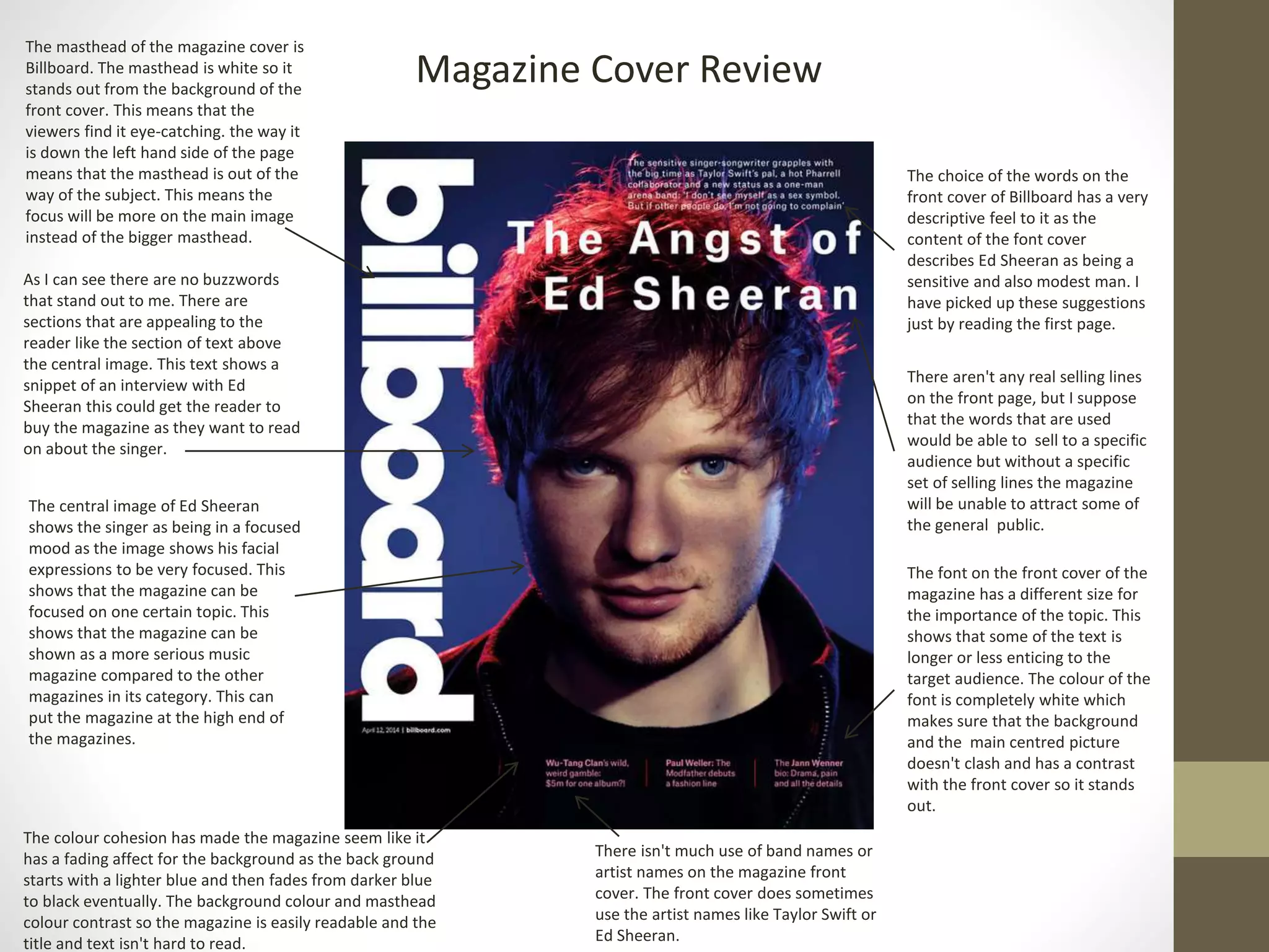
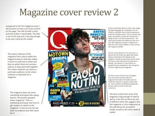
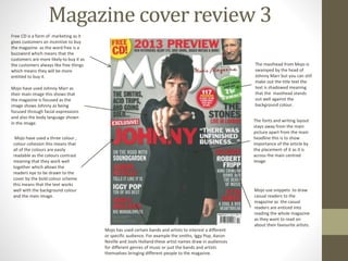
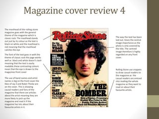
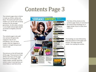
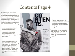
The document provides a review of several magazine covers and contents pages. Some key points made:
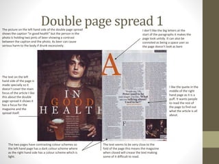
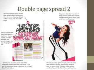
- Magazine mastheads are designed to stand out from the background in order to catch viewers' eyes. Central images are often used to focus attention on a main topic.
- Snippets of text and quotes are used to entice readers to learn more by reading the full articles. Mentions of popular artists can also draw in fans.
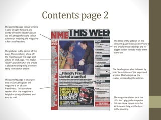
- Color schemes, font sizes, and layouts are intentional choices to ensure readability and guide the eye to important elements like headlines or images. Contrasting colors in particular help elements stand out.
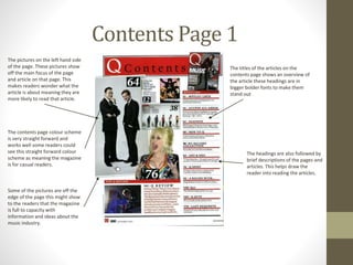
- Contents pages showcase article topics and brief descriptions to give readers a preview