The document discusses the design elements of a Kerrang magazine cover and articles. It analyzes the use of serif fonts, bold text, dark color schemes of red and black, and close-up celebrity photos to create an edgy, rock-oriented aesthetic that appeals to its target 16-25 male audience. Key goals included drawing readers in with attention-grabbing elements like the cover artist and pull quotes while maintaining a consistent house style and brand identity across the publication.
How to Make a Field invisible in Odoo 17Celine George
It is possible to hide or invisible some fields in odoo. Commonly using “invisible” attribute in the field definition to invisible the fields. This slide will show how to make a field invisible in odoo 17.
Macroeconomics- Movie Location
This will be used as part of your Personal Professional Portfolio once graded.
Objective:
Prepare a presentation or a paper using research, basic comparative analysis, data organization and application of economic information. You will make an informed assessment of an economic climate outside of the United States to accomplish an entertainment industry objective.
Operation “Blue Star” is the only event in the history of Independent India where the state went into war with its own people. Even after about 40 years it is not clear if it was culmination of states anger over people of the region, a political game of power or start of dictatorial chapter in the democratic setup.
The people of Punjab felt alienated from main stream due to denial of their just demands during a long democratic struggle since independence. As it happen all over the word, it led to militant struggle with great loss of lives of military, police and civilian personnel. Killing of Indira Gandhi and massacre of innocent Sikhs in Delhi and other India cities was also associated with this movement.
A Strategic Approach: GenAI in EducationPeter Windle
Artificial Intelligence (AI) technologies such as Generative AI, Image Generators and Large Language Models have had a dramatic impact on teaching, learning and assessment over the past 18 months. The most immediate threat AI posed was to Academic Integrity with Higher Education Institutes (HEIs) focusing their efforts on combating the use of GenAI in assessment. Guidelines were developed for staff and students, policies put in place too. Innovative educators have forged paths in the use of Generative AI for teaching, learning and assessments leading to pockets of transformation springing up across HEIs, often with little or no top-down guidance, support or direction.
This Gasta posits a strategic approach to integrating AI into HEIs to prepare staff, students and the curriculum for an evolving world and workplace. We will highlight the advantages of working with these technologies beyond the realm of teaching, learning and assessment by considering prompt engineering skills, industry impact, curriculum changes, and the need for staff upskilling. In contrast, not engaging strategically with Generative AI poses risks, including falling behind peers, missed opportunities and failing to ensure our graduates remain employable. The rapid evolution of AI technologies necessitates a proactive and strategic approach if we are to remain relevant.
Embracing GenAI - A Strategic ImperativePeter Windle
Artificial Intelligence (AI) technologies such as Generative AI, Image Generators and Large Language Models have had a dramatic impact on teaching, learning and assessment over the past 18 months. The most immediate threat AI posed was to Academic Integrity with Higher Education Institutes (HEIs) focusing their efforts on combating the use of GenAI in assessment. Guidelines were developed for staff and students, policies put in place too. Innovative educators have forged paths in the use of Generative AI for teaching, learning and assessments leading to pockets of transformation springing up across HEIs, often with little or no top-down guidance, support or direction.
This Gasta posits a strategic approach to integrating AI into HEIs to prepare staff, students and the curriculum for an evolving world and workplace. We will highlight the advantages of working with these technologies beyond the realm of teaching, learning and assessment by considering prompt engineering skills, industry impact, curriculum changes, and the need for staff upskilling. In contrast, not engaging strategically with Generative AI poses risks, including falling behind peers, missed opportunities and failing to ensure our graduates remain employable. The rapid evolution of AI technologies necessitates a proactive and strategic approach if we are to remain relevant.
Introduction to AI for Nonprofits with Tapp NetworkTechSoup
Dive into the world of AI! Experts Jon Hill and Tareq Monaur will guide you through AI's role in enhancing nonprofit websites and basic marketing strategies, making it easy to understand and apply.
Unit 8 - Information and Communication Technology (Paper I).pdfThiyagu K
This slides describes the basic concepts of ICT, basics of Email, Emerging Technology and Digital Initiatives in Education. This presentations aligns with the UGC Paper I syllabus.
Francesca Gottschalk - How can education support child empowerment.pptxEduSkills OECD
Francesca Gottschalk from the OECD’s Centre for Educational Research and Innovation presents at the Ask an Expert Webinar: How can education support child empowerment?
June 3, 2024 Anti-Semitism Letter Sent to MIT President Kornbluth and MIT Cor...Levi Shapiro
Letter from the Congress of the United States regarding Anti-Semitism sent June 3rd to MIT President Sally Kornbluth, MIT Corp Chair, Mark Gorenberg
Dear Dr. Kornbluth and Mr. Gorenberg,
The US House of Representatives is deeply concerned by ongoing and pervasive acts of antisemitic
harassment and intimidation at the Massachusetts Institute of Technology (MIT). Failing to act decisively to ensure a safe learning environment for all students would be a grave dereliction of your responsibilities as President of MIT and Chair of the MIT Corporation.
This Congress will not stand idly by and allow an environment hostile to Jewish students to persist. The House believes that your institution is in violation of Title VI of the Civil Rights Act, and the inability or
unwillingness to rectify this violation through action requires accountability.
Postsecondary education is a unique opportunity for students to learn and have their ideas and beliefs challenged. However, universities receiving hundreds of millions of federal funds annually have denied
students that opportunity and have been hijacked to become venues for the promotion of terrorism, antisemitic harassment and intimidation, unlawful encampments, and in some cases, assaults and riots.
The House of Representatives will not countenance the use of federal funds to indoctrinate students into hateful, antisemitic, anti-American supporters of terrorism. Investigations into campus antisemitism by the Committee on Education and the Workforce and the Committee on Ways and Means have been expanded into a Congress-wide probe across all relevant jurisdictions to address this national crisis. The undersigned Committees will conduct oversight into the use of federal funds at MIT and its learning environment under authorities granted to each Committee.
• The Committee on Education and the Workforce has been investigating your institution since December 7, 2023. The Committee has broad jurisdiction over postsecondary education, including its compliance with Title VI of the Civil Rights Act, campus safety concerns over disruptions to the learning environment, and the awarding of federal student aid under the Higher Education Act.
• The Committee on Oversight and Accountability is investigating the sources of funding and other support flowing to groups espousing pro-Hamas propaganda and engaged in antisemitic harassment and intimidation of students. The Committee on Oversight and Accountability is the principal oversight committee of the US House of Representatives and has broad authority to investigate “any matter” at “any time” under House Rule X.
• The Committee on Ways and Means has been investigating several universities since November 15, 2023, when the Committee held a hearing entitled From Ivory Towers to Dark Corners: Investigating the Nexus Between Antisemitism, Tax-Exempt Universities, and Terror Financing. The Committee followed the hearing with letters to those institutions on January 10, 202
Instructions for Submissions thorugh G- Classroom.pptxJheel Barad
This presentation provides a briefing on how to upload submissions and documents in Google Classroom. It was prepared as part of an orientation for new Sainik School in-service teacher trainees. As a training officer, my goal is to ensure that you are comfortable and proficient with this essential tool for managing assignments and fostering student engagement.
Welcome to TechSoup New Member Orientation and Q&A (May 2024).pdfTechSoup
In this webinar you will learn how your organization can access TechSoup's wide variety of product discount and donation programs. From hardware to software, we'll give you a tour of the tools available to help your nonprofit with productivity, collaboration, financial management, donor tracking, security, and more.
Synthetic Fiber Construction in lab .pptxPavel ( NSTU)
Synthetic fiber production is a fascinating and complex field that blends chemistry, engineering, and environmental science. By understanding these aspects, students can gain a comprehensive view of synthetic fiber production, its impact on society and the environment, and the potential for future innovations. Synthetic fibers play a crucial role in modern society, impacting various aspects of daily life, industry, and the environment. ynthetic fibers are integral to modern life, offering a range of benefits from cost-effectiveness and versatility to innovative applications and performance characteristics. While they pose environmental challenges, ongoing research and development aim to create more sustainable and eco-friendly alternatives. Understanding the importance of synthetic fibers helps in appreciating their role in the economy, industry, and daily life, while also emphasizing the need for sustainable practices and innovation.
Chapter 3 - Islamic Banking Products and Services.pptx
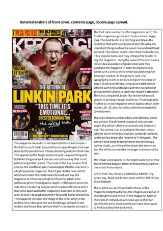
Detailed analysis of front
1. Detailed analysis of front cover, contents page, double page spread.
The font style used across the magazine is serif, this
fits the magazines genre as it creates a hard, angry
look. The bold text is eye catching and draws the
reader to that particular piece of text, this why the
important things such as the cover line and masthead
are bold. The editors made Linkin Park the boldest as
it is a popular name and may intrigue the reader to
buy the magazine. Using the name of the artist was a
clever idea as people who like linkin park may
purchase the magazine in order to discover new
bands with a similar style which would strengthen
Kerrang’s market. As the genre is rock, the
typography needs to be dark and give the sense of
anger. It achieves this by using quite a dark colour
scheme with reds and blacks with the exception of
yellow which is there to catch the reader’s attention.
They also using bold, block-like text which would
appeal to kerrang’s target audience. The typography
fits that as a rock magazine which appeals to an older
market, 16- 25 and the colour scheme orientates it
towards men.
The main colours used are dark and light red, white
and yellow. The different shades of red connote
anger, the white is there to contrast and balance it
out. The yellow is an exception to the dark colour
scheme and is there to emphasis certain bits of text,
so the yellow draws the readers to ‘linkin park’. The
white is also there to compliment the yellow as a
lighter shade, as in the yellow draws the attention
and the white conveys the message in a more subtle
way.
The image used appeal to the target audience as they
are extremely popular artists of that particular genre,
the artists featured are:
Linkin Park, You me at six, Metallica, Motion city,
Green day, Black veil brides, Josh and Oly, Biffy Clyro,
black Sabbath.
These artist are all influential for those of the
magazines target audience, the images used are all in
the rock genre and hence fit the magazine. Most of
the shots of individuals are close ups so they can
identify the artist more and hence make them want
to find out about the said artist.
The magazines layout is in-between cluttered and simple. I
think this is so it looks busy and hence appealing but not over
done to the point where it looks daunting and a bit child-like.
This appeals to the target audience as it is eye catching and
bold like the genre rock but also set out in a way that is not
patronising to the reader. The route of the eye is used, first
you see the masthead which would appeal to the user as it is
a highly popular magazine, then it goes to the cover artist
which will make the reader want to read and buy the
magazine as it features a highly influential artist in the
particular genre the magazine targets. It then goes across to
side story’s featuring popular artists such as Metallica which
may once again widen the magazines audience as they will
want to buy it to read about their favourite bands and artists.
The magazine includes the image of the cover artist in the
middle, this is because the eye tends to go straight to the
middle and hence they will see that first and want to read it.
2. As the left side is the most dominant side it has been taken advantage by including popular artists stories indie, this is
because the left this is the part that the reader will first glance at and it’s hence important to include the most
interesting stories.
The language used on the magazine is simple but also deep and fairly depressing, this was used to make the reader
sympathize with artist such as ‘this time its emotional’ and also ‘the naked truth’ which makes the reader want to read it
as they feel like the artist is being honest and they could get to know some person and private things. The mode of
address is mostly formal using proper English, this is conventional as the target audience are generally more mature and
don’t need slang and gossipy words to appeal them. The magazine is fairly depressing and achieves this with lines like
‘this time it’s emotional’ and ‘how the black album almost destroyed Metallica’.
The front cover relates to the genre rock because of the dark red background which represent anger and blood. The
mode of the address is a key convention for this magazine and affects if people buy it or not, the target audience will be
able to relate to stories such as green days album and will want to read stuff about the actual music, if the stories were
all gossipy about romance etc, the target audience may not read the magazine.
The font is mainly all Serif, this makes it appeal to the
target audience as it is more sophisticated, which
would appeal to the older target audience, it is also
bold which relates to the genre rock. The way the
images have a number on them, makes it easier for the
reader to read about their favourite artists and also
gives them the freedom to skip pages.
The yellow writing is once again featured on important
pieces of information, as it is an eye catching colour it
gets the reader’s attention and it means they can more
easily see the stories featured and the page numbers
of each story, the yellow also follows the colour
scheme set by the front cover. The white background
gives it a more formal, less busy look and hence
appeals to the target audience.
The Mise en scene are a pistol and a microphone, this
is because the microphone obviously relates to music
and the gun relates to the genre rock as it is
stereotypically hard and dangerous. The Images are
mostly close ups, this was used so the reader can more
noticeably tell the artist, and hence make them read
the page.
3. The font of the page is mainly serif once again, this is because curls wouldn’t really appeal to the target audience of the
magazine, they used the quote ‘we’re being the best MCR we can be’ in bold to draw the user attention at first glance,
the reason they want to do this is so the reader reads the quote and wants to find out more about the story and see in
what context is what said. They use big bl ocky writing which fits the rock genre. They also include a ‘world exclusive’ sign
which would appeal to the user as they think they will be reading something that hasn’t been said before. The main
story’s font is fairly small and there is a fair amount of this, this suits the target audience though as they are generally
older and don’t need large fonts and short paragraphs to hold their attention.
The layout is fairly clear and uncluttered, this is to appeal to the target audience. The left side of the magazine is mainly
made up of images, this is to catch the reader’s attention and then they want to read the particular story more. The
images almost work as a boarder to the main story, which could attract the reader to look at the story more. The route of
the eye was used, it starts by catching the reader’s attention on the dominant left side with the biggest picture, it then
takes it across to the large, bold quote which would capture the readers interest, it would then go back to the bottom left
and look at the 3 smaller pictures on the bottom until they eventually read the article.
The colour used are black and red which fit the genre rock, as the black connotes darkness and evil, and the red connotes
blood and danger. The text was white and red so it contrasts against the black and stands out, so the reader gets drawn
to the quote and can see it clearly. The kicker was red one again as a contras against the black background and white
writing and will then draw the reader’s attention to the story.
The images are large and dominate the page, this is so the reader sees who the artist is at first glance and will want to
read a story about that particular artist. The shot types are mainly close ups this was once again so the reader can easily
identify the artist and want to red on about them. The mise-en-scene were things such as a microphone, guitar and piano
this obviously fits as they are associated with music in general.
The language used is also proper and the story is well written, this is because the target audience will be able to
understand and appreciate this. The biggest quote was ‘we’re being the best MCR we can be’ which will be uplifting for
fans of the band to hear and will make them want to read the story.
4. The masthead is black bold font with a white background, the
white background is there to contrast against the black
writing and hence make it stand out. The writing is black
which connotes darkness and the writing has cracks in it
which looks like shattered glass and symbolises violence.
The main image is of a popular band/artist, this helps
broaden their market as people who like that band may buy
the magazine. The way they are standing also helps with their
brand identity as they are standing in an intimidating way,
with serious way which once again connotes violence. This
shows the brand identity is not high class and more middle
class. The image is also fairly close up which was used so
people will recognise the artist at first glance and will entice
them, helping with the band identity of being the rock genre
bands magazine.
The pull quote was written in red and is against a black
background as the colours contrast well the mode of address
is accessible and it helps the quote stand out, it also sticks
with the house style. The red writing suggests the person
who said the quote is quite an angry and violent person. The
name of the band who they quoted are written under the
quote in white and big letters, this so it stands out and draws
the reader in.
The smaller images along the bottom stick with the house style, close ups and with intimidating poses to fit with the
genre rock which is often perceived as violent. They have the name of the artist in white to contrast and stand out an
on running thing throughout the magazine.
The house style is once again the same, as it’s got dark colours
which add a gothic feel which would appeal to the fans of the
rock genre, it also uses red which once again shows violence,
something the target audience would relate to.
The image has a gothic style which helps with its brand
identity as it matches the gothic style put in place with the
house style, the artist is wearing all black which creates a
dark look, which is more masculine and hence appeals to
the male audience.
The font is Serif, big, bold which makes the brand identity
more masculine once again appealing to its male audience.
The big writing also gives it a fairly younger look appealing
to its teenage target audience.
The heading on the lower half of the page once again
appeals to its target audience as it talks about gigs and
information, things the younger audience would typically
attend, it also helps it keep up its brand identity of being
cool and relevant.
5. The main heading is written in white, bold capitals and is fitted right below the image of
the band. It contrasts against the black background with the black and white something
that happens thought out kerrang giving it a brand identity. This can be linked to the
rock, which is what the brand identity is trying to achieve, as it’s stereotypically loud,
angry and destructive. The white writing is in capitals which gives the impression of
shouting, something that happens throughout the magazine, obviously fitting the house
style and the shouting makes it seem loud helping them achieve their brand identity.
The image is of the bands main singer shirtless, sweaty and by the looks of it
screaming into the microphone which fits into the hard core brand identity, something
the target audience would enjoy.
The colour scheme was picked to fit with KERRANGS house style. The images also take
up the majority of the page, which is something that KERRANG do so this keeps with
their brand identity of being more music orientated.