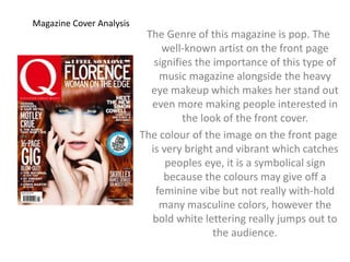
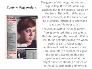
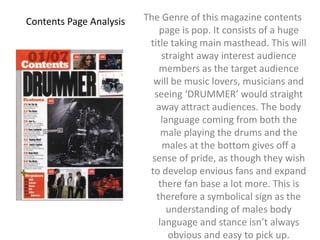
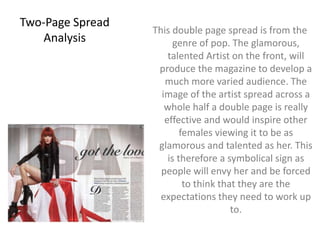
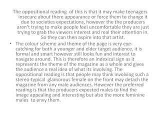
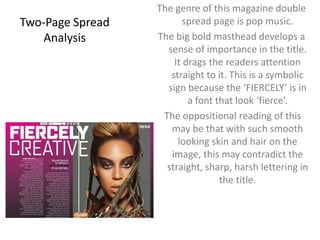
The document analyzes the cover and contents pages of several music magazines. It identifies various signs used on the pages, including symbolic signs like the use of feminine pink colors on one cover targeting female audiences. Indexical signs directly point to content, like large images of musicians indicating an emphasis on music. Iconic signs represent concepts through images, such as a magazine masthead being iconic of the brand. The analysis considers both oppositional and preferred readings of the signs.
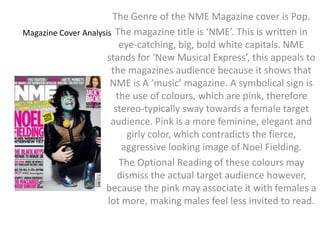
Introduction to AI for Nonprofits with Tapp NetworkTechSoup
Dive into the world of AI! Experts Jon Hill and Tareq Monaur will guide you through AI's role in enhancing nonprofit websites and basic marketing strategies, making it easy to understand and apply.
Operation “Blue Star” is the only event in the history of Independent India where the state went into war with its own people. Even after about 40 years it is not clear if it was culmination of states anger over people of the region, a political game of power or start of dictatorial chapter in the democratic setup.
The people of Punjab felt alienated from main stream due to denial of their just demands during a long democratic struggle since independence. As it happen all over the word, it led to militant struggle with great loss of lives of military, police and civilian personnel. Killing of Indira Gandhi and massacre of innocent Sikhs in Delhi and other India cities was also associated with this movement.
Macroeconomics- Movie Location
This will be used as part of your Personal Professional Portfolio once graded.
Objective:
Prepare a presentation or a paper using research, basic comparative analysis, data organization and application of economic information. You will make an informed assessment of an economic climate outside of the United States to accomplish an entertainment industry objective.
Model Attribute Check Company Auto PropertyCeline George
In Odoo, the multi-company feature allows you to manage multiple companies within a single Odoo database instance. Each company can have its own configurations while still sharing common resources such as products, customers, and suppliers.
Synthetic Fiber Construction in lab .pptxPavel ( NSTU)
Synthetic fiber production is a fascinating and complex field that blends chemistry, engineering, and environmental science. By understanding these aspects, students can gain a comprehensive view of synthetic fiber production, its impact on society and the environment, and the potential for future innovations. Synthetic fibers play a crucial role in modern society, impacting various aspects of daily life, industry, and the environment. ynthetic fibers are integral to modern life, offering a range of benefits from cost-effectiveness and versatility to innovative applications and performance characteristics. While they pose environmental challenges, ongoing research and development aim to create more sustainable and eco-friendly alternatives. Understanding the importance of synthetic fibers helps in appreciating their role in the economy, industry, and daily life, while also emphasizing the need for sustainable practices and innovation.
Welcome to TechSoup New Member Orientation and Q&A (May 2024).pdfTechSoup
In this webinar you will learn how your organization can access TechSoup's wide variety of product discount and donation programs. From hardware to software, we'll give you a tour of the tools available to help your nonprofit with productivity, collaboration, financial management, donor tracking, security, and more.
Read| The latest issue of The Challenger is here! We are thrilled to announce that our school paper has qualified for the NATIONAL SCHOOLS PRESS CONFERENCE (NSPC) 2024. Thank you for your unwavering support and trust. Dive into the stories that made us stand out!
2. The Genre of the NME Magazine cover is Pop.
The magazine title is ‘NME’. This is written in
eye-catching, big, bold white capitals. NME
stands for ‘New Musical Express’, this appeals to
the magazines audience because it shows that
NME is A ‘music’ magazine. A symbolical sign is
the use of colours, which are pink, therefore
stereo-typically sway towards a female target
audience. Pink is a more feminine, elegant and
Magazine Cover Analysis
girly color, which contradicts the fierce,
aggressive looking image of Noel Fielding.
The Optional Reading of these colours may
dismiss the actual target audience however,
because the pink may associate it with females a
lot more, making males feel less invited to read.
3. The preferred reading would be that they are just trying to
appeal to the female audience and grab the attention. As the
main image is quite masculine and violent that the pink produces
more of a connection with both the female and male audience.
The cover lines are written in a column, starting with the larger
text at the top of the column and then decreasing in sizes at the
lower area of the column. This is an indexical sign because they
are trying to develop a sense of importance of each subject.
This let’s the reader know what and who is involved in the
magazine but also emphasis the importance of each subject
or person featured. For example ‘Noel Fielding’ is in big and
bold letters forcing us to realize he is featured a lot more. The
central image is of Noel Fielding from the band ‘Loose
Trapestries’. From this is can see his dress sense is rather
eccentric therefore grabbing the readers interest even more.
The anchorage ‘NOEL FIELDING IN HIS WEIRDEST INTERVIEW
YET’ lets the audience know who is the central image for
anyone who may not know him.
4. The oppositional reading of the cover lines is that it may be too hard on
the eye, people don’t want to be uncomfortable with reading their
magazine, if people suffer with eyesight or are colour blind, they may
feel its difficult to read it. However the preferred reading is that they
made it BIG bright and bold, to create emphasis on certain areas and
subjects within the magazine.
The masthead is an iconic sign for the company, because the NME is a
well known magazine that people are familiar with. The NME is also
there masthead and their specific logo. So people will understand
and appreciate their logo. NME is a specific magazine based on
music, as it’s also a record company, so people will know they can go
to NME if they wish to hear latest gossip or information to do with
music.
The oppositional reading is of the masthead is that the font may be
slightly childish and not appeal to a slightly elder audience.
The preferred reading however is that they must appeal to a wide range
of audience and although it may not look like a classy font, it is still
smart, clear and understandable.
5. Magazine Cover Analysis
The Genre of this magazine is pop. The
well-known artist on the front page
signifies the importance of this type of
music magazine alongside the heavy
eye makeup which makes her stand out
even more making people interested in
the look of the front cover.
The colour of the image on the front page
is very bright and vibrant which catches
peoples eye, it is a symbolical sign
because the colours may give off a
feminine vibe but not really with-hold
many masculine colors, however the
bold white lettering really jumps out to
the audience.
6. Although the colours aren't stereo-typical boys
colours like blue or green, boys may still be very
much interested in the magazine because they
stereo-typically may find women on the front of a
magazine cover attractive and still enjoy reading
it or scanning it.
The Optional Reading of these colours will be that
people will assume that as there is a female artist
on the front it is aimed towards the female and
more feminine audience.
7. The masthead is an iconic sign for the company, because the ‘Q’
symbol for the magazine is worldwide known and people will
know clearly of the ‘Q’ magazine. It is specific to magazines.
The oppositional reading is that people although they may
recognize the symbol itself, may not know or understand the
meaning behind the one letter symbol is!
The preferred reading is though people may not know the
meaning behind it but they know it’s an easy to remember
symbol for a well-known magazine, therefore unless it’s fully
necessary for them to dig deep into the company, the only
way they need advertisement is for their label to be
completely on show and promoted around, so people
recognize the logo.
The preferred reading would be that the producers are trying to
make it appropriate for both genders and so have made the
female look really attractive on the front cover so males will
be interested but females will also envy her.
8. The cover lines are very elegant and look classy, producing more
of a sophisticated vibe which will again develop audience
numbers.
This is an indexical sign because it points out very specifically
that the whole magazine is aimed at the more feminine and
glamorous target audience.
The oppositional reading is that people may feel that the
language may be to advanced for what the magazine is. The
teen age is usually the common age for interest in music,
however this magazine, based on music is still rather formal
and sophisticated for the teen age range. However, the
preferred reading is that they wanted to make it formal and
posh so that people were impressed and that it didn’t seem
‘young, and chatty’ because that wouldn’t be professional of
them.
9. Contents Page Analysis
The genre of this magazine contents
page is Pop. It consists of an eye-catching
but tense image of Adele on
the front. This will straight away
develop readers, as the audience will
be especially intrigued to know and
read about famous artists.
The colours within the page ranges
from grey to red, these are colours
that stereo-typically I would call ‘uni-sex’
this is definitely a positive when
trying to gain a wider target
audience of both female and male.
This is therefore a symbolical sign is
the colours give us an idea and
opinion as to who and what the
target audience should be aimed at,
in this case, both male and female.
10. • The oppositional reading of these colours may be that
the page on a whole is quite dull looking, with blacks and
greys and only a little red, the colours still sway more
towards males stereo-typically, the picture of the boys at
the bottom of the page also looks a lot more of a boys
interest from the way they are positioned, they aren’t
trying to look appealing towards girls, meaning they are
trying to produce ‘males’ to be envious of them.
11. The typography within the contents page is rather plane and dull
again, but also is the same throughout the whole page.
There's no verticality, this is therefore an indexical sign
however because the’ average’ font is supposed to suggest
more of a masculine vibe meanwhile the bright red gives off
that feminine idea.
The oppositional reading would be the idea of such similar
fonts with no change, for the younger age group, they may get
bored easier, or expect something a little more adventurous.
However the preferred reading would possibly be the wise
choice of having such clear fonts, therefore making it so much
more understandable and easy to read.
12. The layout of the magazine on a whole is rather formal giving us
a sense that it should be aimed at an elder audience, however
this contradicts the colours used as they aren't very
sophisticated colours and wouldn’t really appeal to elder
audiences.
Within the layout, the centre image of Adele is an iconic sign as
her mood and persona she is giving off through her facial
expressions match the dullness and theme of the page as a
whole.
The oppositional reading of this would be that maybe her mood
within the image matching with the dull background and
theme may be seen as ‘boring’ leaving the readers
unimpressed and thinking its not ‘grabbing’ the readers
attention, however the preferred reading would argue that
and suggest that the theme and layout of the page is all in
sync and attracts a very wide audience for the fact alone that
it is understanding and clear enough to navigate around.
13. Contents Page Analysis The Genre of this magazine contents
page is pop. It consists of a huge
title taking main masthead. This will
straight away interest audience
members as the target audience
will be music lovers, musicians and
seeing ‘DRUMMER’ would straight
away attract audiences. The body
language coming from both the
male playing the drums and the
males at the bottom gives off a
sense of pride, as though they wish
to develop envious fans and expand
there fan base a lot more. This is
therefore a symbolical sign as the
understanding of males body
language and stance isn’t always
obvious and easy to pick up.
14. • The oppositional reading of this will then be that the
target audience of this page is aimed more towards boys
and their interest to be like the artists they see on the
page. However the article can still appeal to women and
their interest in the males appearance, they may be
intrigued to see weather the male is ‘attractive’, or not
only that but they themselves may also be interested in
‘drumming’ and may want to know more, this would be
the preferred reading.
15. The main image on the front of the page is an indexical sign
because it explains straight away from one glance at the page
that the magazine involves music. Therefore people will be
intrigued straight away. The oppositional reading of this would
be that it will detach other types of audiences just because of
such a huge image of drums on the front cover. Singers may
feel uninvited to view. However the preferred reading would
be that it is specified towards the music area, and a male sat
with a drum kit is suppose to encourage passion and people
to pick up an instrument and learn, its not suppose to detach
singers, but make them want to develop their skills.
The camera shots are quite professional but have been taken in
dark areas, this may decrease the readers because the camera
shots are mainly of males… this may intimidate women and
make them think they aren't as capable as males therefore
this is an iconic sign. The oppositional reading of this that
females may feel that the lack of females used as images may
intimidate females. However the preferred reading is the
producers trying to inspire other artists.
16. The ‘Exclusive’ written inside brackets Is an iconic sign
because it represents that the magazine, may be a
one off, or is important, this increases viewers as it
makes the magazine sound more important,
therefore it will be more appealing to the audience.
An oppositional reading of this may be that it’s giving
the reader false hope because it isn’t clearly stated
as to which part of the magazine is ‘exclusive’.
However the producers want to gain audience and
so will let the audience know its an exclusive
magazine as a whole.
17. Two-Page Spread
Analysis
This double page spread is from the
genre of pop. The glamorous,
talented Artist on the front, will
produce the magazine to develop a
much more varied audience. The
image of the artist spread across a
whole half a double page is really
effective and would inspire other
females viewing it to be as
glamorous and talented as her. This
is therefore a symbolical sign as
people will envy her and be forced
to think that they are the
expectations they need to work up
to.
18. The oppositional reading of this is that it may make teenagers
insecure about there appearance or force them to change it
due to societies expectations, however the the producers
aren’t trying to make people feel uncomfortable they are just
trying to grab the viewers interest and real their attention in.
So they can then aspire into that artist.
• The colour scheme and theme of the page is very eye-catching
for both a younger and elder target audience, it is
formal and smart however still looks fun and interest to
navigate around. This is therefore an indexical sign as it
represents the theme of the magazine as a whole and gives
the audience a real idea of what its involving. The
oppositional reading is that people may think involving such a
stereo-typical glamorous female on the front may detach the
magazine from any male audiences. However the preferred
reading is that the producers expected males to find the
image appealing and interesting but also the more feminine
males to envy them.
19. The overall typography used over the double page spread looks very
professional and sophisticated. The ‘got to love’ has been used
with a sort of elegant swerved font to show elegance and glamour.
This works and is a symbolical sign because it is a stereo-type and
opinion that the ‘soft curl’ of the ‘g’ is glamorous.
This oppositional reading of this is that the elegance in the font, may
not welcome males as much as females and so may detach the
page from its target audience of both male and female. However
the preferred reading is that it has been made to develop a more
professional theme matching vibe, it matches the classy body
language that ‘Florence and the machine’ gives off.
The ‘Exclusive’ written inside brackets Is an iconic sign because it
represents that the magazine, may be a one off, or is important, this
increases viewers as it makes the magazine sound more important,
therefore it will be more appealing to the audience.
An oppositional reading of this may be that it’s giving the reader false
hope because it isn’t clearly stated as to which part of the magazine
is ‘exclusive’. However the producers want to gain audience and so
will let the audience know its an exclusive magazine as a whole.
20. The genre of this magazine double
spread page is pop music.
The big bold masthead develops a
sense of importance in the title.
It drags the readers attention
straight to it. This is a symbolic
sign because the ‘FIERCELY’ is in
a font that look ‘fierce’.
The oppositional reading of this
may be that with such smooth
looking skin and hair on the
image, this may contradict the
straight, sharp, harsh lettering in
the title.
Two-Page Spread
Analysis
21. However the preferred reading may argue that
‘opposites attracts’ and so the sharp fonts, were used
to compliment such perfect skin and perfect hair. So
that people compared the sharp with the smooth.
The overall layout and theme of the double page spread
on a whole looks professional and the white font
contrasts well against the purple backdrop. The
gradient of purple, that goes from light to dark is an
indexical sign as it represents the idea that Beyonce
filling the whole of the left page of the double page
spread, is becoming more gloomy, dark and fierce, this
correlates to how she looks in the image.
22. The oppositional reading of this is that people may think the
sharp stop of background colour from grey to purple is
completely discarding the idea of her smooth skin and ‘silky’
looking hair. However the preferred reading maybe that the
severe change between both colours is used to add affect and
exaggerate the perfections Beyonce possesses.
The fierce look on Beyonce’s face is an iconic sign because it is a
reference to the subject of the magazine on a whole. The
fierce glance in her eyes give off an idea, we look at the face
and relate it to the ‘FIERCELY’ font. This is an oppositional
reading because it may distract the audience into them
thinking she is looking aggressive rather than fierce. However
the magazine have tried to provide passion and motivation to
progress, rather than a negative outlook on it.