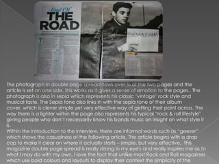
This magazine article uses a double page spread with a large sepia toned photograph taking up most of the pages. The photograph and its vintage style represents the musician's classic rock style. There is minimal use of color with black text on one side of the page. The informal language and inclusion of a lighter in the photograph help provide context about the musician's rock and roll lifestyle. Overall, the simple yet effective layout and design inspire the creator to consider simplicity in their own magazine spreads.