Contents Page
EvaluationsBy Bethany Barrows
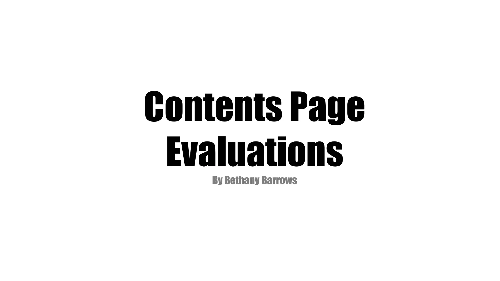
The masthead for this contents page is written really
differently from other magazines as it isn’t written in a
conventional straight line. It is on separate lines which
looks quirky and represents the mood of the magazine.
It is also written in bold block letters so it stands out
ands you can clearly see that it is a contents page.
This is only a single contents page which is different as
they are normally a double spread especially on a
popular and successful magazine like ‘vibe’. They
haven't included much writing which perhaps doesn’t
give the reader enough information but because they
are such a successful magazine, they don’t really need
much as they have already got a name and reputation
for themselves.
The colour scheme of this magazine is black and white
and grey which words really well, it could have looked
dull and boring but because of the dark shadows it
stands out and looks successful. He is wearing a grey
suit, so he looks quite lain and boring, but therefore his
face is the boldest thing on the contents age, and it is
important to show him more clearly than anything else.
The cover image of the famous rapper, Kanye West,
who is very iconic and has a large fan base so it was a
good idea to put him so large on the contents page to
attract his fans. It shows that he is the most important
thing in the magazine as he is very large and the text is
very small. His facial expression is very moody and
serious, which is what he is well known for and he
staring directly into the camera, and looking directly at
the reader so they can feel a closer connection to him.
In the background, there is a huge ‘V’, instead of writing
the actual word ‘Vibe’. This works well because it is still,
apparent what the magazine is, but Kanye West is still
the most important thing on the page. The ‘v’ fills up
the background nicely, in another shade of grey. So it
still sticks to the colour scheme but bring something
new to the page, to make it look more full.
There is only one column on the contents page, with all
the cover lines in. there is not much writing, because
they are already advertising their magazine well with a
large photo. The title of the column in ‘Features’ which
is a common one to have in a magazine. The clearly
write all the page numbers beside each text so the
readers know exactly where to find their favourite
stories. They have done as heading – e.g. DOLLARS TO
DONUTS’ then explained it in a few sentences which is
effective and something that I would like to follow in my
magazines. They also used alliteration to make it look
catchy and draw in readers.
There is also a slight bit of red on the contents page, a
heart on Kanye’s chest. The red is the brightest thing on
the entire page but is covered by a hand so the
attention isn’t taken away from Kanye’s face. The fact
that it is behind a hand, shows that perhaps Kanye West
is putting his heart on his sleeve and talking about his
life, which will make the reader want to find out more.
He is quite a private person, so inferring this is a great
thing for the magazine to do to attract fans.
There are two sections for the text – features and
fashion. This is a good idea as it divides up the page
nicely so people know what they are looking for. Also,
despite is being a music magazine they’re still
advertising fashion which isn’t a very common thing to
do therefore this magazine has an edge. Kanye is closely
linked with Fashion as well as music so they are
combining the two in their magazine, and promoting his
fashion line at the same time.
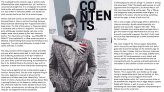
The mast head of this contents page is in really simple font, however,
it is placed inside a large red strip (a header) along the top of the page
to make it stand out more. The colour red corresponds to the colour
of the ‘Q’ logo so the use of this colour shows what magazine it is
from and links to the famous colour scheme of ‘Q.’ The issue number
is also put in the red header, in white font so it stands out and reader
can see that hey are clearly successful and the magazine have had 296
copies published. Moreover, there is also a footer which included the
magazine website, and the page numbers, so important institutional
information is easily assessable.
The colour scheme is predominantly red through out the contents page
(and front cover) however, there are a lot of dull brown and greens in
the photos which juxtapose the vibrant red. The background is pure
white, which makes it look very clean and neat and professional.
The contents page looks very busy because there are lots of images
filling it up. The images all vary is size, the largest image takes up half a
page so is clearly the most important. He isn’t looking directly at the
camera and there is no text to explain the image, however this creates
a sense of mystery to the reader, so they are intrigued and want to
find out more about the story. Liam Gallagher, is a music icon and is
very recognition so despite this not being conventional, they don’t
need any text to explain him. He as also on the Front cover so he has
already been introduced for those who didn’t know him. The front
cover is pictured in the right hand corner so people can also see the
connection between the main image, and the colour scheme.
The cover liens and structures in columns so they
look clear and neat. They are all written in black, with
a red line under their titles to keep to the red colour
scheme.
There is a page number, a title and a small paragraph
to explain what the page is about. This works well
because readers will be attracted by the title that
appeals most to them but then they can also learn
more about it underneath without being bored.
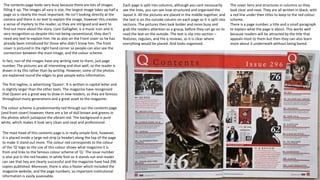
Each page is split into columns, although you cant necessarily
see the lines, you can see how structured and organised the
layout it. All the pictures are placed in the middle together, and
the text is on the outside column on each page so it is split into
sections. The pictures then look bolder and more busy and
grab the readers attention as a group, before they can go on to
read the text on the outside. The text is slip into section –
features, regulars, and the q reviews, so it is clear where
everything would be placed. And looks organised.
In fact, non of the images have any writing next to them, just page
number. The pictures are all interesting and shot well, so the reader is
drawn in by this rather than by writing. However, some of the photos
are explained round the edges to give people extra information.
The first tagline, is advertising ‘Queen’. It is written in capital letter and
is slightly larger than the other texts. The magazine have recognised
that Queen are a great way to draw in new readers, as they are famous
throughout many generations and a great asset to the magazine.
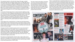
The masthead ‘contents’ is the most clear thing on the page, so people
clearly know what they are reading. However there is an image right next to
it of a band, d their picture is slightly overlapping the text to show that they
are way more interesting and important. Below the title, there is the name
of the magazine, and the date, which has no contribution to the layout of the
page, but is a necessary convention of it. Moreover, on the opposite page
there is also another masthead, saying ‘Q review’ in a red banner, this shows
clearly what the magazine is as it isn’t shown boldly anywhere else on the
page.
The first page of this is mainly pictures, as it looks busy and cluttered with a
variety of famous artists. They have put text on top of these images to explain
them and save on space. A lot of text can make the magazine sometimes seem
boring, and this is the opposite of what q want, so they have stuck mainly with
pictures to fill up the page.
The page on the left isn’t split into sections at all, it is just a miss-mash of
images surround a circle in the middle. There is no organisation to this,
however it still works a it supports the easy-going and quirky vibe of the artists
mentioned on the page. The right hand side however is very organised, it is
split into three columns to help organise the text. They have subheading
around the page to try and split up the large blocks of text even more – cover
story, features, regulars, and q review.
The articles are all organised well, and have a title, a page number, and an
explanation. The page numbers are colour coded to correspond to the section
they are in which it think is a really good idea so the reader wont get muddles
up and knows exactly where to look for what.
The colour scheme of this page is very bland,
and not very interesting. Hey have stuck to
the stereotypical red and white to keep to
their famous theme. However, the majority
of the colour from from the images, which is
perhaps why they used so many. The images
make it look more vibrant and colourful
instead of bland and empty.
There is a subscription box in the bottom right hand corner. It is
quite tucked away but still something that peoples eyes would be
drawn to as it is in a black box, with white writing. Subscriptions
are important to magazines so they know that some copies have
already been sold, and they get money in advance, therefore,
they have tried to make it stand out, without taking up to much
space. In this box they also have a picture of a previous magazine
to show that they have been successful with other issues, and
they want to advertise their success.
In the centre of the first page, there is a large circle with a lighthouse image
in it and the text, ‘2013 q magazines long range forecast, all aboard for hearty
larks.’ They have used a lexical field of words relating to sailors, to add a light
hearted sense of humour to the magazine and link with the main work
‘forecast’. A forecast is a prediction, used mainly in weather terms, therefore
they are implying that they are predicating what new music is going to be
popular in upcoming months, explaining why their magazine is worth the
read.
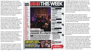
The ‘NME’ masthead stands out really well one this
contents page as although it is the same size as the
‘this week’ right next to it, it is still in its iconic bright
red so it catches peoples eyes and looks clearly.
Because NME is an initialisation that sounds like
‘enemy’ there is a black header behind it, to make it
stand out more and make it look mysterious. There is
also lots of other black throughout the contents page
for the same purpose.
Along the left hand side, there is a band
Index which NME always has in its contents
pages. There is a long list of the all the bands
that are going to be featured in the magazine.
The text is in red so it looks clear on the
white background, and matches the
masthead ‘NME’ so you can see the clear link
between them. Furthermore. There Is also
page numbers next t each line so readers can
look for their favourite artists and be able to
find them easily in the magazine.
There is only one main image on this
contents pages. Other contents pages tend to
have a lot of smaller images however this
only has one of the band ‘kasabian’ who are
clearly a big part of the magazine. This makes
a statement and as a result of the image
being larger, it is better quality and more
clear, however, I would prefer having lots of
images so there are los of tings to look at.
There are only 10 main articles listed on the right hand
side in the sections, however there is lots of detail in
them. They have a heading (e.g. Vampire weekend)
and an explanation, all in black, with the page number
in red next to it so it doesn’t bend in. There is also an
article underneath the main image, It looks almost like
a snippet of a newspaper as there is a large masthead
‘kasabian got romantic in church’ and the start of an
article. This draws in kasabian’s fans as you know there
is more information on them t come.
The articles are split into sections so they are clearly
divided. The sections are: news, radar, reviews, live!,
and features. They have more sections than other
magazine usually do, which makes the articles really
organised and easy to find. This way you know exactly
where to look for what you want to find. As well as
this, there is a ‘plus’ section at the bottom for extra
articles which there wasn’t enough room for but are
still significant.
There is a subscription box at the bottom in a
black box with yellow text. Yellow isn’t
features anywhere else on the magazine
therefore it draws your attention towards the
box without taking up too much room.
Subscriptions are important for magazine s
they can make more profit, so its important
that this box draws readers in.
The institutional info on this page is the ate
at the top ‘22 November 2008’ so it is clear
when the magazine is published. You could
also feature an email, and issue number, etc.
however this magazine hasn’t included them.
The Contents page is only a single one, which is
unconventional for the normal music magazine
contents, particularly NME. They have needed to put a
lot of information on one page rather than spread it
out more onto two, which is perhaps why they have
only had room for on image.

Contents page evaluations

  • 1.
  • 2.
    The masthead forthis contents page is written really differently from other magazines as it isn’t written in a conventional straight line. It is on separate lines which looks quirky and represents the mood of the magazine. It is also written in bold block letters so it stands out ands you can clearly see that it is a contents page. This is only a single contents page which is different as they are normally a double spread especially on a popular and successful magazine like ‘vibe’. They haven't included much writing which perhaps doesn’t give the reader enough information but because they are such a successful magazine, they don’t really need much as they have already got a name and reputation for themselves. The colour scheme of this magazine is black and white and grey which words really well, it could have looked dull and boring but because of the dark shadows it stands out and looks successful. He is wearing a grey suit, so he looks quite lain and boring, but therefore his face is the boldest thing on the contents age, and it is important to show him more clearly than anything else. The cover image of the famous rapper, Kanye West, who is very iconic and has a large fan base so it was a good idea to put him so large on the contents page to attract his fans. It shows that he is the most important thing in the magazine as he is very large and the text is very small. His facial expression is very moody and serious, which is what he is well known for and he staring directly into the camera, and looking directly at the reader so they can feel a closer connection to him. In the background, there is a huge ‘V’, instead of writing the actual word ‘Vibe’. This works well because it is still, apparent what the magazine is, but Kanye West is still the most important thing on the page. The ‘v’ fills up the background nicely, in another shade of grey. So it still sticks to the colour scheme but bring something new to the page, to make it look more full. There is only one column on the contents page, with all the cover lines in. there is not much writing, because they are already advertising their magazine well with a large photo. The title of the column in ‘Features’ which is a common one to have in a magazine. The clearly write all the page numbers beside each text so the readers know exactly where to find their favourite stories. They have done as heading – e.g. DOLLARS TO DONUTS’ then explained it in a few sentences which is effective and something that I would like to follow in my magazines. They also used alliteration to make it look catchy and draw in readers. There is also a slight bit of red on the contents page, a heart on Kanye’s chest. The red is the brightest thing on the entire page but is covered by a hand so the attention isn’t taken away from Kanye’s face. The fact that it is behind a hand, shows that perhaps Kanye West is putting his heart on his sleeve and talking about his life, which will make the reader want to find out more. He is quite a private person, so inferring this is a great thing for the magazine to do to attract fans. There are two sections for the text – features and fashion. This is a good idea as it divides up the page nicely so people know what they are looking for. Also, despite is being a music magazine they’re still advertising fashion which isn’t a very common thing to do therefore this magazine has an edge. Kanye is closely linked with Fashion as well as music so they are combining the two in their magazine, and promoting his fashion line at the same time.
  • 3.
    The mast headof this contents page is in really simple font, however, it is placed inside a large red strip (a header) along the top of the page to make it stand out more. The colour red corresponds to the colour of the ‘Q’ logo so the use of this colour shows what magazine it is from and links to the famous colour scheme of ‘Q.’ The issue number is also put in the red header, in white font so it stands out and reader can see that hey are clearly successful and the magazine have had 296 copies published. Moreover, there is also a footer which included the magazine website, and the page numbers, so important institutional information is easily assessable. The colour scheme is predominantly red through out the contents page (and front cover) however, there are a lot of dull brown and greens in the photos which juxtapose the vibrant red. The background is pure white, which makes it look very clean and neat and professional. The contents page looks very busy because there are lots of images filling it up. The images all vary is size, the largest image takes up half a page so is clearly the most important. He isn’t looking directly at the camera and there is no text to explain the image, however this creates a sense of mystery to the reader, so they are intrigued and want to find out more about the story. Liam Gallagher, is a music icon and is very recognition so despite this not being conventional, they don’t need any text to explain him. He as also on the Front cover so he has already been introduced for those who didn’t know him. The front cover is pictured in the right hand corner so people can also see the connection between the main image, and the colour scheme. The cover liens and structures in columns so they look clear and neat. They are all written in black, with a red line under their titles to keep to the red colour scheme. There is a page number, a title and a small paragraph to explain what the page is about. This works well because readers will be attracted by the title that appeals most to them but then they can also learn more about it underneath without being bored. Each page is split into columns, although you cant necessarily see the lines, you can see how structured and organised the layout it. All the pictures are placed in the middle together, and the text is on the outside column on each page so it is split into sections. The pictures then look bolder and more busy and grab the readers attention as a group, before they can go on to read the text on the outside. The text is slip into section – features, regulars, and the q reviews, so it is clear where everything would be placed. And looks organised. In fact, non of the images have any writing next to them, just page number. The pictures are all interesting and shot well, so the reader is drawn in by this rather than by writing. However, some of the photos are explained round the edges to give people extra information. The first tagline, is advertising ‘Queen’. It is written in capital letter and is slightly larger than the other texts. The magazine have recognised that Queen are a great way to draw in new readers, as they are famous throughout many generations and a great asset to the magazine.
  • 4.
    The masthead ‘contents’is the most clear thing on the page, so people clearly know what they are reading. However there is an image right next to it of a band, d their picture is slightly overlapping the text to show that they are way more interesting and important. Below the title, there is the name of the magazine, and the date, which has no contribution to the layout of the page, but is a necessary convention of it. Moreover, on the opposite page there is also another masthead, saying ‘Q review’ in a red banner, this shows clearly what the magazine is as it isn’t shown boldly anywhere else on the page. The first page of this is mainly pictures, as it looks busy and cluttered with a variety of famous artists. They have put text on top of these images to explain them and save on space. A lot of text can make the magazine sometimes seem boring, and this is the opposite of what q want, so they have stuck mainly with pictures to fill up the page. The page on the left isn’t split into sections at all, it is just a miss-mash of images surround a circle in the middle. There is no organisation to this, however it still works a it supports the easy-going and quirky vibe of the artists mentioned on the page. The right hand side however is very organised, it is split into three columns to help organise the text. They have subheading around the page to try and split up the large blocks of text even more – cover story, features, regulars, and q review. The articles are all organised well, and have a title, a page number, and an explanation. The page numbers are colour coded to correspond to the section they are in which it think is a really good idea so the reader wont get muddles up and knows exactly where to look for what. The colour scheme of this page is very bland, and not very interesting. Hey have stuck to the stereotypical red and white to keep to their famous theme. However, the majority of the colour from from the images, which is perhaps why they used so many. The images make it look more vibrant and colourful instead of bland and empty. There is a subscription box in the bottom right hand corner. It is quite tucked away but still something that peoples eyes would be drawn to as it is in a black box, with white writing. Subscriptions are important to magazines so they know that some copies have already been sold, and they get money in advance, therefore, they have tried to make it stand out, without taking up to much space. In this box they also have a picture of a previous magazine to show that they have been successful with other issues, and they want to advertise their success. In the centre of the first page, there is a large circle with a lighthouse image in it and the text, ‘2013 q magazines long range forecast, all aboard for hearty larks.’ They have used a lexical field of words relating to sailors, to add a light hearted sense of humour to the magazine and link with the main work ‘forecast’. A forecast is a prediction, used mainly in weather terms, therefore they are implying that they are predicating what new music is going to be popular in upcoming months, explaining why their magazine is worth the read.
  • 5.
    The ‘NME’ mastheadstands out really well one this contents page as although it is the same size as the ‘this week’ right next to it, it is still in its iconic bright red so it catches peoples eyes and looks clearly. Because NME is an initialisation that sounds like ‘enemy’ there is a black header behind it, to make it stand out more and make it look mysterious. There is also lots of other black throughout the contents page for the same purpose. Along the left hand side, there is a band Index which NME always has in its contents pages. There is a long list of the all the bands that are going to be featured in the magazine. The text is in red so it looks clear on the white background, and matches the masthead ‘NME’ so you can see the clear link between them. Furthermore. There Is also page numbers next t each line so readers can look for their favourite artists and be able to find them easily in the magazine. There is only one main image on this contents pages. Other contents pages tend to have a lot of smaller images however this only has one of the band ‘kasabian’ who are clearly a big part of the magazine. This makes a statement and as a result of the image being larger, it is better quality and more clear, however, I would prefer having lots of images so there are los of tings to look at. There are only 10 main articles listed on the right hand side in the sections, however there is lots of detail in them. They have a heading (e.g. Vampire weekend) and an explanation, all in black, with the page number in red next to it so it doesn’t bend in. There is also an article underneath the main image, It looks almost like a snippet of a newspaper as there is a large masthead ‘kasabian got romantic in church’ and the start of an article. This draws in kasabian’s fans as you know there is more information on them t come. The articles are split into sections so they are clearly divided. The sections are: news, radar, reviews, live!, and features. They have more sections than other magazine usually do, which makes the articles really organised and easy to find. This way you know exactly where to look for what you want to find. As well as this, there is a ‘plus’ section at the bottom for extra articles which there wasn’t enough room for but are still significant. There is a subscription box at the bottom in a black box with yellow text. Yellow isn’t features anywhere else on the magazine therefore it draws your attention towards the box without taking up too much room. Subscriptions are important for magazine s they can make more profit, so its important that this box draws readers in. The institutional info on this page is the ate at the top ‘22 November 2008’ so it is clear when the magazine is published. You could also feature an email, and issue number, etc. however this magazine hasn’t included them. The Contents page is only a single one, which is unconventional for the normal music magazine contents, particularly NME. They have needed to put a lot of information on one page rather than spread it out more onto two, which is perhaps why they have only had room for on image.