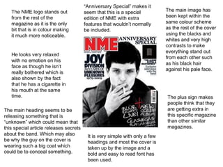
This document provides a detailed summary and analysis of a music magazine cover and contents page. Key details include:
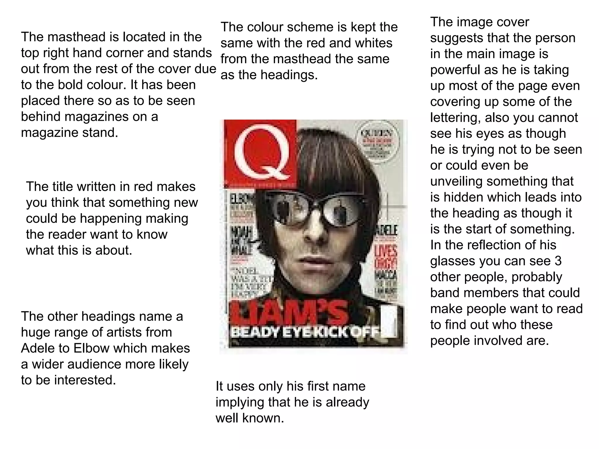
- The masthead is prominently displayed in bold color at the top right of the cover to stand out.
- The main cover image takes up most of the page, suggesting the person is powerful, and their reflection hints at other band members featured inside.
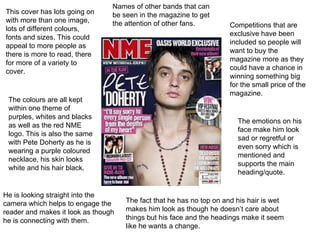
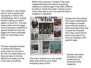
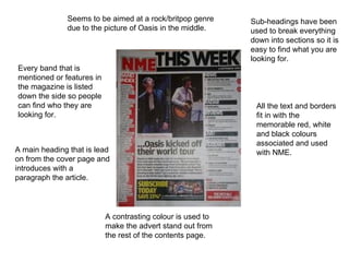
- The contents page lists articles through images and page numbers in a simple, easy to read layout. It highlights special features to entice readers.
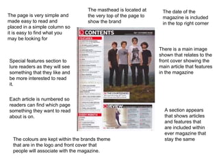
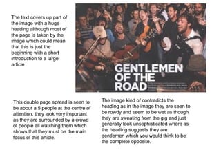
- A double page spread features a large group shot surrounded by people, contradicting the heading which calls them "gentlemen". This hints at a longer feature article.


![Presentation1[1]](https://cdn.slidesharecdn.com/ss_thumbnails/presentation11-110926162111-phpapp01-thumbnail.jpg?width=640&height=640&fit=bounds)


