The document analyzes the design elements and conventions used across magazine front covers, contents pages, and article spreads. Key elements include large bold fonts and colors to draw attention, prominent placement of headlines and images, and column-based layouts with emphasized quotes. Conventions include credits and dates, page numbers, mastheads and barcodes, and alignment of copy and cover lines. Imagery and word choices are meant to represent subjects as powerful, wealthy, aggressive, or mysterious to appeal to audiences.
This contents page from a music magazine uses conventions to engage readers. A central image of the band The Bronx/Mariachi El Bronx appeals to the target rock audience. Sections include feedback, news, and gig guides. Headings are highlighted in yellow boxes against a white background. A range of bands are featured to appeal to a large audience. The subscription advert follows conventions by being in the bottom right. The language, layout, and monochrome colors separate elements and make headlines stand out to inform and entertain readers.
Task Two - Detailed Analysis of Music Magazinelouisangus
This document analyzes the cover and interior pages of a music magazine targeted at teenage girls. It discusses the typography, layout, color, images, language, and conventions used. For the cover, it notes the use of serif and sans serif fonts, bold text to draw attention, and a pink/white color scheme appealing to girls. The layout follows conventions like the "route of the eye" and crowded text gives an informal feel. Images of celebrities like Justin Bieber attract the target audience. Interior pages also use fonts, colors, images, and conventions appropriately targeted to teenage girls.
This document analyzes readership statistics and design elements of two music magazines, Q and NME. It summarizes:
Q's main readers are of a higher socioeconomic class aged 34 on average. NME attracts younger readers, mostly male students around age 23.
Both magazines use red and white prominently in their mastheads and designs. Q centers images and articles while NME places the masthead and lead article on the left. Color schemes and layouts are designed to attract target audiences to specific music-focused content.
This document analyzes and summarizes several magazine covers and contents pages. For the BBC magazine analysis, it notes the masthead uses contrasting colors to attract readers. For the Top of the Pops analysis, it describes the Taylor Swift cover image inviting readers to learn about her style, and sub-images advertising fashion items. For the We Love Pop analysis, it highlights the neon colors and images promoting artists to entice readers.
The document analyzes different elements of an issue of the magazine NME, including the front cover, contents page, and a double page article spread about the artist Dizzee Rascal. Key connecting elements across these sections include a consistent color scheme of black, white and red; similar sans serif fonts; and the use of Dizzee Rascal as a featured artist on both the cover and in an interior article spread. Maintaining continuity of these visual and content-related elements helps reinforce the magazine's brand identity.
The document analyzes the layout and design conventions used in NME magazine. It discusses several key aspects of the magazine's front cover and inside pages including the masthead logo, center images, story titles, color schemes, and page elements like pull quotes and advertisements. Overall, the analysis finds that while NME follows many typical magazine conventions, it also employs some unique techniques to draw reader attention and highlight important stories and artists featured in each issue.
This magazine summary provides details about the target audience of Kerrang! Magazine based on visual elements and content on the front cover and contents page. Specifically:
- The front cover uses bright colors and images of rock bands, indicating its target of 15-25 year old rock music fans.
- Offers like free posters and a band member giveaway are aimed at attracting younger readers.
- The contents page has a simple layout and informal language and images that would appeal to and be understandable by its young adult audience.
- Both pages reference bands and topics of interest to rock music listeners in their late teens and early twenties through the images and stories featured.
The magazine targets men aged 17-30 from social class ABC1 interested in rock, indie, rap and hip-hop music. It typically features information on music festivals, tours, clubs and concerts. Sales are around 200,000 copies per week, and the website receives 5 million users monthly.
The document analyzes various elements of the cover and contents pages of a music magazine (NME) featuring Dizzee Rascal. Key elements discussed include the flashy red title on the cover that catches the eye, the main image of Dizzee Rascal drawing readers in, and pull quotes providing insights into the interviews. The contents page lists band indexes, images promoting tour information, and headings in bold and page numbers in red. Connecting elements throughout the magazine that make it cohesive and enticing include different fonts, theme colors like red, images of artists, and headlines promoting features.
The document provides an in-depth analysis of the cover of MOJO magazine issue 255. Some key points analyzed include the placement of the masthead at the top in bold and its 3D effect. The unique selling proposition is a free CD placed in the top corner in yellow. The center of visual interest is an image of David Bowie that overlays the masthead. Design elements like fonts, colors, images and placements follow conventions to effectively communicate information to the target audience.
The magazine cover features Dizzee Rascal as the main image and cover line. Various design elements are used to draw attention to key information, such as the title in red capital letters and a pull quote from Dizzee Rascal. Inside, the contents page lists the articles and bands featured, while the editorial previews an upcoming 16-page tour special section. Dizzee Rascal's interview spreads over two pages, with large quotes and images used to give a sense of what he discusses around topics like fame and his past.
The document provides an analysis of the layout, design elements, and conventions used in a Classic Rock magazine. It summarizes each page or spread, describing the masthead, images, headlines, pull quotes, and other common magazine design features. Overall, it finds that the magazine follows typical codes and conventions for layout, using visual hierarchies, color schemes, and design elements to effectively engage and guide readers through the content.
The front cover features a medium shot portrait of Mark Ronson, representing the genre of the magazine. The image attracts audiences by indicating the magazine's focus on rock and indie music. Information like the title and price are arranged prominently to catch readers' attention as they browse in shops. Representational signs include Ronson holding a broken trumpet, symbolic of his new musical style.
The document provides a review of several magazine covers and contents pages. Some key points made:
- Magazine mastheads are designed to stand out from the background in order to catch viewers' eyes. Central images are often used to focus attention on a main topic.
- Snippets of text and quotes are used to entice readers to learn more by reading the full articles. Mentions of popular artists can also draw in fans.
- Color schemes, font sizes, and layouts are intentional choices to ensure readability and guide the eye to important elements like headlines or images. Contrasting colors in particular help elements stand out.
- Contents pages showcase article topics and brief descriptions to give readers a preview
The document analyzes various elements of an issue of NME magazine. It summarizes that the magazine targets a male audience aged 13-25 from working class backgrounds. Elements like the bright red masthead and cover featuring rapper Dizzee Rascal signal this target demographic. The analysis also notes the magazine maintains consistency through its color scheme, fonts, and inclusion of the masthead on most pages to clearly establish its brand identity in each section.
The document summarizes the layout and design elements of a magazine cover and contents page. Key elements include:
- The masthead at the top of the cover in bold text to be noticeable. It suggests the magazine is about rock music.
- The main coverline next to the cover image to be one of the first things seen, using a quote and "incredible return" to excite readers.
- Interior images on the contents page linked to article listings to help readers find specific pages. Section headings also organize the content.
- The covermount and price suggest appealing to middle-class teenagers and young adults through free posters and music tracks.
The document provides an analysis of the design elements used in a magazine cover and contents pages, focusing on typography, color, images, layout, and language. For the magazine cover, serif fonts in bold are used to catch attention, and varying font sizes draw the eye to different areas. Blacks and reds set a moody tone. Celebrity images promote the magazine's genre. The formal layout contrasts the genre's rule-breaking attitude.
The contents pages continue the color scheme and reference cover images. Numbers clearly label sections to aid navigation. Columns organize information neatly. Band names in bold capitals further entice readers. Overall the design solidifies the magazine's brand identity as focused on dark emotions within the rock
This document analyzes the front cover and contents page of a magazine. The front cover image is a portrait of Mark Ronson representing the magazine's genre. Subheadings on the front cover provide information on what's inside. The contents page uses various fonts, photos of celebrities with quotes, and an advertisement to attract readers and highlight key articles. The layout, images, and language used aim to appeal to the magazine's target male audience.
This is my media presentation of an analysis of the music magazine NME. The analyisist is of the front cover, contents page, and a double page spread. I looked at the language and images used, also the layout of the pages and who the magazine is targetted at.
The document analyzes and compares the contents pages of three alternative music magazines: Kerrang!, Rock Sound, and Big Cheese. It finds that Kerrang! emphasizes a busy layout with tightly packed columns and images to maintain their bold house style, though this could be overwhelming for some readers. Rock Sound takes a simpler approach with fewer details, prioritizing large images and a controversial quote to attract readers. Big Cheese balances organization and vibrancy through divided sections and angled images. While all three represent the alternative music genre, they target different age demographics and have varying approaches to industry focus versus artist representation.
The double page spread features an article on the upcoming album of the band My Chemical Romance. The main image depicts the lead singer Gerard Way staring down which represents the emo attitude of their music. The layout maintains the magazine's house style with bold colors and cracked text. While Gerard is featured prominently, the other band members are also included to show they are equally important. The article provides an exclusive sneak peek of the unreleased album to make readers feel privileged.
The document summarizes the conventions and sales information of four magazines - Prime Living, Now, FourFourTwo, and Match. It describes the pictures, mastheads, teasers, colors, and target audiences of each magazine cover. Prime Living targets wealthy residents of Houston, selling 40,000 copies. Now targets females interested in celebrity gossip, selling 540,000 weekly. FourFourTwo focuses on soccer and sells 111,000 copies a week, making it the best-selling soccer magazine, outpacing Match by 5,000 copies.
- The target audience of Kerrang! magazine is rock music fans aged 18-34. It has a circulation of 24,207 and estimated readership of 378,000. The magazine includes stories and interviews on rock bands and uses graphic designs that appeal to rock fans.
- NME magazine has a readership of 369,000 people interested in a variety of music genres. The average reader is 24 years old and 52% work full time. The cover story is on singer Florence Welch and it advertises other band features to attract readers.
- Mixmag magazine has a circulation of 20,053 and targets young adults interested in dance music. 72% of its readers are male and they spend money socializing at
The magazine uses a red, white, and black color scheme throughout to look simple yet stand out. The bold red masthead draws immediate attention. The front cover features a medium close-up shot of Dizzee Rascal, breaking conventions. The informal, conversational language aims to engage a young, student target audience.
The document analyzes the front covers and contents pages of three music magazines - Kerrang, NME, and Q. It describes the color schemes, layouts, fonts, images, and other design elements used in each magazine. It notes how these visual components are intended to attract the target audiences, which include teenagers for Kerrang and NME, and older audiences for Q. Key details like band listings, article previews, and subscription information are also summarized.
This document analyzes the front cover and contents page of a magazine. The front cover features a portrait photo of Mark Ronson dressed in punk clothing to represent the genre of the magazine. Subheadings on the front cover provide information about what's inside. The contents page uses various fonts, photos of celebrities featured in the magazine with quotes, and features a large photo of The Clash to promote a free magazine about them. The language is aimed at an older audience and the color scheme is black, white, and color photos to make the page easy to read.
The contents page follows conventions with around 50% text and images. The images are of pop artists like George Shelly, Rita Ora, and Justin Bieber to attract the target audience. Words and images use slang like "fittest" and abbreviations to speak to readers informally. Sections include "On the Cover", "All About You", and "Celebs and Gossip". The layout, colors, and brand fonts/images maintain consistency to familiarize readers with each issue.
The document analyzes the front cover, contents page, and a double page spread (DPS) of a magazine.
The front cover uses bold colors and a single image of Katy Perry to draw attention. The contents page features a male model with a feminine touch of a red heart on his chest.
The DPS image of Nicki Minaj aims to intrigue readers with her direct gaze and ambiguous expression, enticing them to learn more in the article. Simple designs and limited elements are used throughout to avoid overwhelming readers.
The document analyzes the front cover, contents page, and a double page spread from a magazine.
The front cover analysis notes that the background color relates to the subject's clothing, the largest font is used for the artist's name to suggest they are the focus, and a long shot is used to show the whole body as the main subject.
The contents page analysis discusses the varied typography aimed at different readers, crowded but informative layout, categorization of sections, use of colors, images relating to articles, and informal language.
The double page spread analysis notes the bold font used for the headline word "fiercely", contrasting colors that stand out, a caption telling the topic, the large
The document analyzes magazine front covers and contents pages. It discusses conventions used across different magazines, including color schemes, placement of logos/images/text, and how elements appeal to target audiences. For example, it notes how pink is used to target teenage girls in pop magazines, while classical magazines use sophisticated fonts. It also provides examples of how specific magazine covers effectively communicate their genre through visual elements.
The document provides an analysis of the design elements of the front cover and opening contents page of a music magazine called 'Q'.
The cover uses bold red and white colors that contrast strongly and draw attention. It features an image of Dave Grohl in a field to create a comedic pun. Other elements like the price, barcode and coverlines are conventionally placed. The contents page continues the color scheme and features an image of Nick Cave to provide information on an article. It is laid out in columns and sections to organize the contents clearly.
Overall, the document analyzes how the design choices on the cover and opening page aim to attract the target audience of older music fans through bold colors, familiar artists, pun
The double-page spread features a large close-up image of rapper Kid Cudi taking up one full page. The dark background and neon smoke make him the main focal point. A quote from his interview is displayed on the left page in varying font sizes and styles. The spread uses his image and an informal writing style to represent him as a confident and rebellious artist who doesn't care what others think, appealing to its young male target audience.
The double-page spread features an interview with rapper Kid Cudi. A large close-up image of Kid Cudi dominates one page, displaying his confidence through direct eye contact and rude hand gestures. Neon smoke and a dark background make the image eye-catching. On the facing page, the informal interview text provides insight into Kid Cudi's accomplishments and lifestyle. Simple fonts and Kid Cudi's pose appeal to a young male audience.
This document provides an analysis of the front cover, contents page, and a double page spread from Billboard magazine.
The front covers follow a consistent house style with the logo and masthead placement. Photos are usually close-ups of well-known artists to appeal to readers. Fonts are sans serif to look modern.
The contents page is well-organized with charts on the left and features on the right. It uses various font sizes and styles to attract readers. Images of artists are grouped together.
The double page spread features an article on Rihanna with her quote in hot pink font. Photos break up the text across three columns. Sans serif font and a pink/black/white color
This document analyzes the front cover, contents page, and double page spread of various music magazines. For the front cover, it discusses design elements like the main image, masthead, banner, and footer which are used to attract readers interested in specific artists. On the contents page, it examines features like the band index, sections, and images with page numbers to help readers navigate. For the double page spread, it looks at the use of a large central image paired with accompanying text, consistent branding with colors, and previews or reviews of artists. Overall, the document discusses how magazine layout, images, and text are designed to effectively promote content to their target audiences.
The document provides information on magazine layout design. It discusses how bands featured in magazines are placed at the top or bottom of pages to be the first and last things seen. It also mentions how the magazine title is placed at the top left to catch the reader's eye as the human eye naturally looks there first. The lead singer is placed in the center to draw attention and the band members are holding instruments expressing their folk music genre.
The contents page uses stylish typography and bold fonts to appeal to younger audiences. A large image of a woman is used to grab attention and represent the magazine's ideology. Key information like articles and sections are highlighted through spacing, fonts, and positioning to easily direct the reader.
The document evaluates the writer's journalism for a music magazine they created. It provides a detailed analysis of the front cover, contents page, and double page spread, examining the representations of the artist and intended meanings and appeals to the target audience. Design elements, conventions, and the use of images and text are considered. The evaluation compares the preliminary and final versions, highlighting improvements in layout, photography, technology skills, and copy.
The document analyzes several magazine covers and contents pages. The covers use recognizable artist images and lists of featured bands to attract readers. Colorful mastheads and headers grab attention. Contents pages organize articles by genre and include band indexes, advertisements, and teasers to entice reading. Double page spreads balance images and text to review albums and preview upcoming music. House styles and layout conventions create cohesive, reader-friendly designs across the publications.
The document analyzes several magazine covers and contents pages. The covers use recognizable artist images and lists of featured bands to attract readers interested in those artists. Prominent mastheads, cover lines, and barcodes follow industry conventions. Contents pages organize articles by genre and include band indexes, advertisements, and editor notes to guide readers. Double page spreads balance articles and images while employing the magazines' color schemes and informal design.
The document analyzes the magazine cover and contents page design of various music magazines. It discusses design elements like the masthead, images, color schemes, fonts and layouts used and how they appeal to target audiences. For the magazine covers, it examines how the large central images of bands, use of high contrast colors and direct eye contact from the bands help grab readers' attention. The contents pages feature bold section headings, a band index and promotional ads to easily guide readers to articles of interest and encourage future purchases. Overall the document provides a detailed breakdown of the visual design strategies employed across different music magazine publications.
The document analyzes the magazine cover and contents page design of different music magazines. It discusses various design elements and how they are used to attract audiences. For the magazine cover, it examines the use of images, logos, fonts, layout, and color schemes. It notes how these elements are tailored for the target readership and genre of music featured. For the contents page, it discusses the organization of content sections, use of headings, images and advertisements. Across magazines, there is consistency in branding elements but also uniqueness in design to suit the publication's style of music coverage.
This document analyzes the design conventions used in a student-created R&B magazine.
The front cover uses a central image of an artist looking at the camera to engage the viewer. Stereotypical R&B elements like headphones, piercings and jewelry are included. Red, black and white colors are used consistently throughout to brand the magazine.
The contents page diverges from conventions by omitting "contents" and using a feature page format and image. Page numbers are in black with descriptions in red to draw the eye.
A double-page spread uses a large side profile image of an artist to invite readers into her perspective. Quotes from her discuss deeper lyrics and her desire to
This document provides a summary of key elements found in various music magazines' media packs and covers. It describes common design features across magazines like Rock Sound, Billboard, Q Magazine, including prominent artist images, plugs and puffs to attract readers, and consistent branding elements. Information on the target audiences and what readers can access in each magazine is also summarized. The document analyzes specific techniques used across magazine covers and spreads to engage and inform readers.
Task 3 music magazine analysis, Front cover and Contents pageseleanorwardmedia
The document discusses magazine cover design across multiple magazine covers. Key points made include:
- Main images should be recognizable celebrities to draw attention and reflect the genre of music covered
- Color schemes, fonts, and layouts are used consistently across covers to create a recognizable brand
- Subheadings, artist names, and teasers are included to inform readers of content and attract different audiences
- Popular artists, genres, and exclusive content are highlighted to increase sales and appeal to target demographics
The dominant central image takes up the full page, featuring artist Beyoncé wearing over-the-top makeup, hair and outfits to convey her as a very attention-seeking artist. The words "woman of the year" are emphasized in black text to highlight her impressive title and make the reader remember the article. The article uses traditional columns and features a bold, unique font for the title to stand out from the text and intrigue readers. The magazine's use of pink, purple and white suggests it targets a female audience, consistent with Beyoncé's style and genre of pop and R&B music.
The document analyzes magazines to understand how they engage readers. It finds that music magazines NME and Billboard are most popular, targeting teenagers and young adults. They use bright colors and bold text to attract younger audiences. The document then analyzes magazine covers and contents pages, finding they all feature famous artists to grab attention. Bright colors and set brand colors allow readers to recognize magazines. It plans to feature a street performer in its own magazine to tell their story.
The magazine cover uses bold colors and fonts to attract attention. The skyline features famous artists' names in white that stand out against the black background. The masthead is the largest red font that connotes awareness in a demanding tone. The main sell line below uses a specialized font and teases an exclusive opportunity to see the featured band of the issue. Overall the cover employs attention-grabbing design elements to appeal to its target audience of 16-24 year old females interested in new artists, concerts, and gossip.
Gender and Mental Health - Counselling and Family Therapy Applications and In...PsychoTech Services
A proprietary approach developed by bringing together the best of learning theories from Psychology, design principles from the world of visualization, and pedagogical methods from over a decade of training experience, that enables you to: Learn better, faster!
A Free 200-Page eBook ~ Brain and Mind Exercise.pptxOH TEIK BIN
(A Free eBook comprising 3 Sets of Presentation of a selection of Puzzles, Brain Teasers and Thinking Problems to exercise both the mind and the Right and Left Brain. To help keep the mind and brain fit and healthy. Good for both the young and old alike.
Answers are given for all the puzzles and problems.)
With Metta,
Bro. Oh Teik Bin 🙏🤓🤔🥰
Temple of Asclepius in Thrace. Excavation resultsKrassimira Luka
The temple and the sanctuary around were dedicated to Asklepios Zmidrenus. This name has been known since 1875 when an inscription dedicated to him was discovered in Rome. The inscription is dated in 227 AD and was left by soldiers originating from the city of Philippopolis (modern Plovdiv).
Philippine Edukasyong Pantahanan at Pangkabuhayan (EPP) CurriculumMJDuyan
(𝐓𝐋𝐄 𝟏𝟎𝟎) (𝐋𝐞𝐬𝐬𝐨𝐧 𝟏)-𝐏𝐫𝐞𝐥𝐢𝐦𝐬
𝐃𝐢𝐬𝐜𝐮𝐬𝐬 𝐭𝐡𝐞 𝐄𝐏𝐏 𝐂𝐮𝐫𝐫𝐢𝐜𝐮𝐥𝐮𝐦 𝐢𝐧 𝐭𝐡𝐞 𝐏𝐡𝐢𝐥𝐢𝐩𝐩𝐢𝐧𝐞𝐬:
- Understand the goals and objectives of the Edukasyong Pantahanan at Pangkabuhayan (EPP) curriculum, recognizing its importance in fostering practical life skills and values among students. Students will also be able to identify the key components and subjects covered, such as agriculture, home economics, industrial arts, and information and communication technology.
𝐄𝐱𝐩𝐥𝐚𝐢𝐧 𝐭𝐡𝐞 𝐍𝐚𝐭𝐮𝐫𝐞 𝐚𝐧𝐝 𝐒𝐜𝐨𝐩𝐞 𝐨𝐟 𝐚𝐧 𝐄𝐧𝐭𝐫𝐞𝐩𝐫𝐞𝐧𝐞𝐮𝐫:
-Define entrepreneurship, distinguishing it from general business activities by emphasizing its focus on innovation, risk-taking, and value creation. Students will describe the characteristics and traits of successful entrepreneurs, including their roles and responsibilities, and discuss the broader economic and social impacts of entrepreneurial activities on both local and global scales.
This document provides an overview of wound healing, its functions, stages, mechanisms, factors affecting it, and complications.
A wound is a break in the integrity of the skin or tissues, which may be associated with disruption of the structure and function.
Healing is the body’s response to injury in an attempt to restore normal structure and functions.
Healing can occur in two ways: Regeneration and Repair
There are 4 phases of wound healing: hemostasis, inflammation, proliferation, and remodeling. This document also describes the mechanism of wound healing. Factors that affect healing include infection, uncontrolled diabetes, poor nutrition, age, anemia, the presence of foreign bodies, etc.
Complications of wound healing like infection, hyperpigmentation of scar, contractures, and keloid formation.
This presentation was provided by Rebecca Benner, Ph.D., of the American Society of Anesthesiologists, for the second session of NISO's 2024 Training Series "DEIA in the Scholarly Landscape." Session Two: 'Expanding Pathways to Publishing Careers,' was held June 13, 2024.
Level 3 NCEA - NZ: A Nation In the Making 1872 - 1900 SML.pptHenry Hollis
The History of NZ 1870-1900.
Making of a Nation.
From the NZ Wars to Liberals,
Richard Seddon, George Grey,
Social Laboratory, New Zealand,
Confiscations, Kotahitanga, Kingitanga, Parliament, Suffrage, Repudiation, Economic Change, Agriculture, Gold Mining, Timber, Flax, Sheep, Dairying,
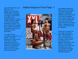
1. Radial Analysis of Front Page - 1 Large bold letters are used here over a red background, which has a ‘striking’ effect on the eye. This font has connotations of strength and dominance, which fits with the magazines genre of hip-hop as that is what the majority of hip-hop artists present themselves as being. This gives the preferred meaning to the audience that reading this magazine will help you develop a powerful personality. The colour red has connotations of power and passion. This helps enhance the meaning of the word ‘sexy’, and also presents the women as being sexually active to the audience as, what limited amount of clothes they have on, this is the colour which the clothes are. The preferred meaning of this front cover is that this is a high status and popular magazine; therefore the audience would want to read it over other competition. This is done by using a well-known and successful artist as the main focus on the page, being shown as being happy – suggesting that he is happy to be involved with the magazine. A long shot is used for the only image on the front page. This represents ‘Lil John’ as living a life of luxury, as in the shot he is portrayed to have woman surrounding him in a paradise environment. He is shown to be holding an expensive chain, which has connotations of money. This appeals to the target audience as this is what they would aspire to.
2. Radial Analysis of Front Page - 2 Thick, bold, white font over a blue background is used for the promotional word ‘free’. This makes the word stand-out, as it would interest the audience to buy the magazine. The layout has also put the word in the top left of the page, which is generally the first place looked at. Again, this is likely to entice the audience to purchase the magazine. A light blue and white colour scheme has been used throughout the layout of the page. These colours have connotations of peace and relaxation. This is comparable to the magazines main genre of music, as I would say the music is meant to have a ‘chill-out’ effect on the listener. The copy ‘must-hear’ is underlined. This increases the importance of the phrase, which puts pressure on the audience to purchase the magazines as they don’t want to miss out. This gives a forceful mode of address, as it is almost giving the reader an order; however it also appears to have the reader’s best interests at heart. The preferred meaning of the main image gives the impression that the artists music is mysterious, which is done through their facial expressions. This puts a ‘curious’ affect on the audience, making them want to listen to it.
3. Radial Analysis of Front Page - 3 The mode of address for this front cover is aggressive. This is created through the direct eye contact and clenched fists of the main feature on the page. The phrase ‘I am hip-hop’ which is on the top of Lil Wayne represents him as being the most talented artist in this genre of music at this present time. This represents the magazine as being up to date and as having the most appealing content which would appeal to its target audience. Also, Lil Wayne is a very popular and well-known person; therefore the image of him on the front page would help increase the magazines status. The personal pronoun ‘we’ll’ used here creates a friendly mode of address, giving off a sense of community. ‘ Big Poppa’ is coloured red, and is in large capital letters, making it stand-out. This is a well recognised name in the hip-hop industry, and therefore would interest the target audience as this would be what they want to read about. The chosen font and colour used puts more focus on ‘Big Poppa’s’ name from the rest of the copy, enhancing its visibility to the audience, as this would be a strong attraction to the reader. This image represents Lil Wayne as being tough and aggressive, as he has both fists clenched. This appeals to the target audience of the magazine as the genre of hip-hop often has content of violence in it, therefore this is the type of personality that they would be interested in.
4. Radial Analysis of Contents Page - 1 The use of the date and location indicates that the editor was there at the time of the concert. This creates a sense that the information produced is accurate and reliable, and also gives reference to how up-to-date the magazine is. There is a list with number reference showing what content is on each page in the magazine. This enables easy access to the information that you want to read about. By telling the reader that the offer expires on a certain date puts pressure on him/her as they now know that the offer is not available to them forever. The use of the word ‘only’ suggests that this is a deal which is not to be missed, as you are getting your moneys worth. It is clear that the artist is the main focus on the page. This is because he takes up a large space on the page. His head is also over the title of the page, showing that he is seen as an important aspect. The use of the word ‘lots’ and the big bold font used emphasises the amount of help that has been put in for Haiti. This copy creates a friendly mode of address, as it has connotations of generosity and rescue.
5. Radial Analysis of Contents Page - 2 The artist here is shown to be wearing a lot of jewellery. This represents the artist as being wealthy and successful. The colour red has connotations of danger and death. This gives off a violent mode of address to the reader. There is a page number at the bottom right of the page, which seems to be a convention followed for a contents page. A list of ‘features’ is placed on the left side of the page in a column form. This gives information on what the contents of each page in the magazine is. The magazine title has been placed in the top right of the page, in an identical but smaller version to the masthead which is on the front cover. A date of the magazines issue is underneath it. The artist is staring straight at the camera, whilst gritting his teeth and pressing his fists on his head. This represents the artist as being aggressive, and gives the preferred meaning that reading this magazine will put you in a serious mood.
6. Radial Analysis of Contents Page - 3 Again, information on the contents of the magazine is in a column form, running down the left side of the page. The page numbers are in a larger font and coloured red, making them stand out to the rest of the copy. Images have been included with page numbers in the top left corner of each one throughout the page. These images have reference to the contents of the stated page. The word ‘exclusive’ has connotations of being new, unique and interesting. This has been made to look like a stamp, and placed next to one of the ‘features’ in the column. This would attract the reader to that certain chunk of copy, as it has been labelled with a positive representation, whereas the rest hasn’t. The largest image on the page is in black and white. This represents the image as being original, which would signify to the reader that the man playing the drums is a legend. The addition sign has been used as a substitute for the word ‘plus’. This represents the magazine as being clever. A date has been put in the top left corner of the page, in thick large letters, above the masthead of the page. This is so it is clear to see what monthly issue this particular magazine is.
7. Radial Analysis of Double Spread - 1 The name of the band is in a large white font, and is the main feature of the bottom left half of the double spread. This makes it clear to read, and represents the band as being the main focus of the page. Columns have been used to manage all copy. A quote has been taken from the copy and made to be larger and bolder in order to be more visible to the reader. This may make the reader want to read the contents of the columns, as they could be curious in what made the artist say those words. Colourful graphic follows colour scheme of magazine, and may be seen as a ‘end of page’ sign. The image represents the people dressed in black as having authority, as they are staring at the camera and sitting around the table. Below them are people sitting cross-legged, dressed in white with blind folds on. They signify that the people dressed in black have power over them as they could be interpreted as obeying their orders. The letter ‘F’ has been emphasised here, as it is separated from the rest of the word in a square with a purple background behind it, and is larger than the rest of the copy which it follows on to. This is the first letter of the column.
8. Radial Analysis of Double Spread - 2 A large image of the band is the main feature of the first page in the double page spread. This image represents the band as being lazy, as they appear comfortable whilst laying on a bed. The copy is set out in columns next to the image of the band. The contents of this puff represents the band as being important and likeable. This is because the magazine has stated that itself ‘loves’ the band, and so as the readers have chosen to read this magazine, may be influenced by it. The name of the band is in a large and bold font with a blue background behind it, making it stand out from the rest of the copy. The opening letter has been made more visible to the reader. This is because it has been enlarged. A separate section with information on the artists in the image has been provided. This gives the reader a better idea of who they are looking at. A quote from the copy has been taken, put separate, and enlarged with a background behind it. This looks to be a convention of a double spread page.
9. Radial Analysis of Double Spread - 3 Columns have been used in the layout. Subheadings have been used in order to separate the copy. A quote has been taken from the copy and emphasised. This particular quote has been chosen as it has connotations of death, competition and violence, which would catch the attention of the reader. The colour red has also been used for it as this also has these connotations. There is one image on the page, and it is a dominant image of the artist in his own environment, and has been placed in the middle of the page. The rule of thirds has been used to make him the main focus.