RWD:
TARGET AUDIENCE: The target audience is mainly
aimed at teenagers/young people who are
familiar to the grime scene.
WHAT IS RWD(Rewind magazine)?:
It is British based magazine which features
news, interviews and charts on hip hop, RnB, UK
garage, music. RWD Magazine became a well
known name in UK underground urban music
circles in mid to late 2003. This coincided with the
rise of a new urban music genre, which later
became popularly referred to as Grime.
The magazine provided a platform for developing
unsigned artists to get their names and faces into
every popular underground music outlet.
ANALYIS :The masthead is situated along the top
of the magazine. The cover follows the typical
conventions of a magazine, however, the main
image over laps the title which breaks the
conventions just slightly. The simplicity of the
cover implies that it is targeted to a niche
audience. This is because the cover lines list
names of grime artists and only people who are
familiar with the genre will understand.
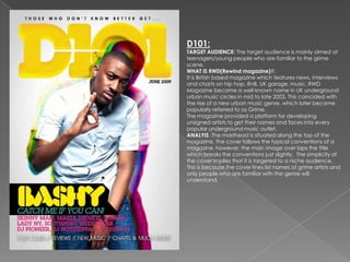
D101:
TARGET AUDIENCE: The target audience is mainly aimed at
teenagers/young people who are familiar to the grime
scene.
WHAT IS RWD(Rewind magazine)?:
It is British based magazine which features news, interviews
and charts on hip hop, RnB, UK garage, music. RWD
Magazine became a well known name in UK underground
urban music circles in mid to late 2003. This coincided with
the rise of a new urban music genre, which later became
popularly referred to as Grime.
The magazine provided a platform for developing
unsigned artists to get their names and faces into every
popular underground music outlet.
ANALYIS :The masthead is situated along the top of the
magazine. The cover follows the typical conventions of a
magazine, however, the main image over laps the title
which breaks the conventions just slightly. The simplicity of
the cover implies that it is targeted to a niche audience.
This is because the cover lines list names of grime artists and
only people who are familiar with the genre will
understand.
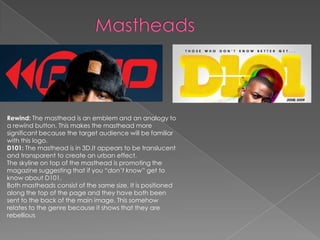
Rewind: The masthead is an emblem and an analogy to
a rewind button. This makes the masthead more
significant because the target audience will be familiar
with this logo.
D101: The masthead is in 3D.It appears to be translucent
and transparent to create an urban effect.
The skyline on top of the masthead is promoting the
magazine suggesting that if you “don’t know” get to
know about D101.
Both mastheads consist of the same size. It is positioned
along the top of the page and they have both been
sent to the back of the main image. This somehow
relates to the genre because it shows that they are
rebellious
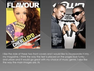
I like the style of these two front covers and I would like to incorporate it into
my magazine. I think the way the text is placed on the pages look funky
and urban and it would go great with my choice of music genre. I also like
the way the main images are. Its
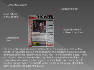
Contents research
                                                  Magazine logo

Short article
in the centre


                                                    Page divided in
                                                    different sections

 Subscription
 box


This contents page has many sections to it. This makes it easier for the
reader to navigate around the magazine. The magazine logo is situated
on this page so the reader would know that it is the contents page. There
is a blatant colour scheme of red and black. Its important to stick to a
colour theme in order for the page to look sophisticated . Majority of
contents pages has a mini article in the centre of the page. I think this
plays as a teaser to potential buyers.
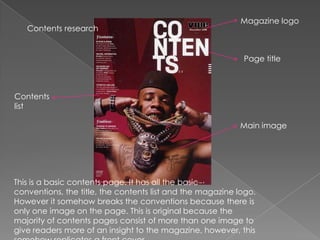
Magazine logo
   Contents research


                                                            Page title


Contents
list

                                                           Main image


This is a basic contents page. It has all the basic
conventions, the title, the contents list and the magazine logo.
However it somehow breaks the conventions because there is
only one image on the page. This is original because the
majority of contents pages consist of more than one image to
give readers more of an insight to the magazine, however, this
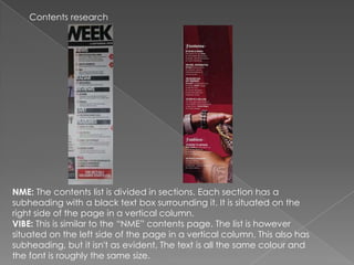
Contents research


NME: The contents list is divided in sections. Each section has a
subheading with a black text box surrounding it. It is situated on the
right side of the page in a vertical column.
VIBE: This is similar to the “NME” contents page. The list is however
situated on the left side of the page in a vertical column. This also has
subheading, but it isn't as evident. The text is all the same colour and
the font is roughly the same size.

Magazine cover research

  • 2.
    RWD: TARGET AUDIENCE: Thetarget audience is mainly aimed at teenagers/young people who are familiar to the grime scene. WHAT IS RWD(Rewind magazine)?: It is British based magazine which features news, interviews and charts on hip hop, RnB, UK garage, music. RWD Magazine became a well known name in UK underground urban music circles in mid to late 2003. This coincided with the rise of a new urban music genre, which later became popularly referred to as Grime. The magazine provided a platform for developing unsigned artists to get their names and faces into every popular underground music outlet. ANALYIS :The masthead is situated along the top of the magazine. The cover follows the typical conventions of a magazine, however, the main image over laps the title which breaks the conventions just slightly. The simplicity of the cover implies that it is targeted to a niche audience. This is because the cover lines list names of grime artists and only people who are familiar with the genre will understand.
  • 3.
    D101: TARGET AUDIENCE: Thetarget audience is mainly aimed at teenagers/young people who are familiar to the grime scene. WHAT IS RWD(Rewind magazine)?: It is British based magazine which features news, interviews and charts on hip hop, RnB, UK garage, music. RWD Magazine became a well known name in UK underground urban music circles in mid to late 2003. This coincided with the rise of a new urban music genre, which later became popularly referred to as Grime. The magazine provided a platform for developing unsigned artists to get their names and faces into every popular underground music outlet. ANALYIS :The masthead is situated along the top of the magazine. The cover follows the typical conventions of a magazine, however, the main image over laps the title which breaks the conventions just slightly. The simplicity of the cover implies that it is targeted to a niche audience. This is because the cover lines list names of grime artists and only people who are familiar with the genre will understand.
  • 4.
    Rewind: The mastheadis an emblem and an analogy to a rewind button. This makes the masthead more significant because the target audience will be familiar with this logo. D101: The masthead is in 3D.It appears to be translucent and transparent to create an urban effect. The skyline on top of the masthead is promoting the magazine suggesting that if you “don’t know” get to know about D101. Both mastheads consist of the same size. It is positioned along the top of the page and they have both been sent to the back of the main image. This somehow relates to the genre because it shows that they are rebellious
  • 5.
    I like thestyle of these two front covers and I would like to incorporate it into my magazine. I think the way the text is placed on the pages look funky and urban and it would go great with my choice of music genre. I also like the way the main images are. Its
  • 6.
    Contents research Magazine logo Short article in the centre Page divided in different sections Subscription box This contents page has many sections to it. This makes it easier for the reader to navigate around the magazine. The magazine logo is situated on this page so the reader would know that it is the contents page. There is a blatant colour scheme of red and black. Its important to stick to a colour theme in order for the page to look sophisticated . Majority of contents pages has a mini article in the centre of the page. I think this plays as a teaser to potential buyers.
  • 7.
    Magazine logo Contents research Page title Contents list Main image This is a basic contents page. It has all the basic conventions, the title, the contents list and the magazine logo. However it somehow breaks the conventions because there is only one image on the page. This is original because the majority of contents pages consist of more than one image to give readers more of an insight to the magazine, however, this
  • 8.
    Contents research NME: Thecontents list is divided in sections. Each section has a subheading with a black text box surrounding it. It is situated on the right side of the page in a vertical column. VIBE: This is similar to the “NME” contents page. The list is however situated on the left side of the page in a vertical column. This also has subheading, but it isn't as evident. The text is all the same colour and the font is roughly the same size.