Download to read offline
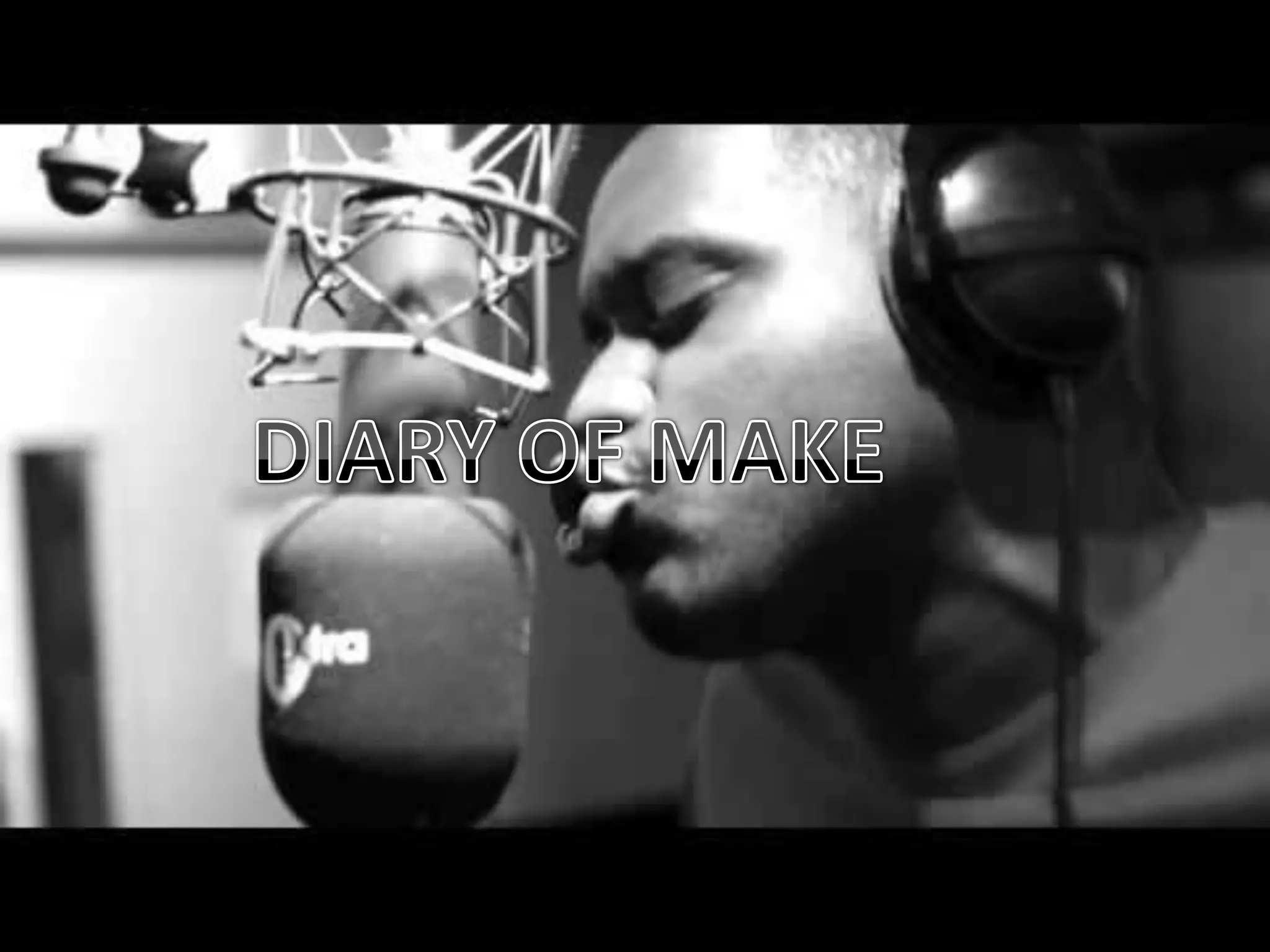
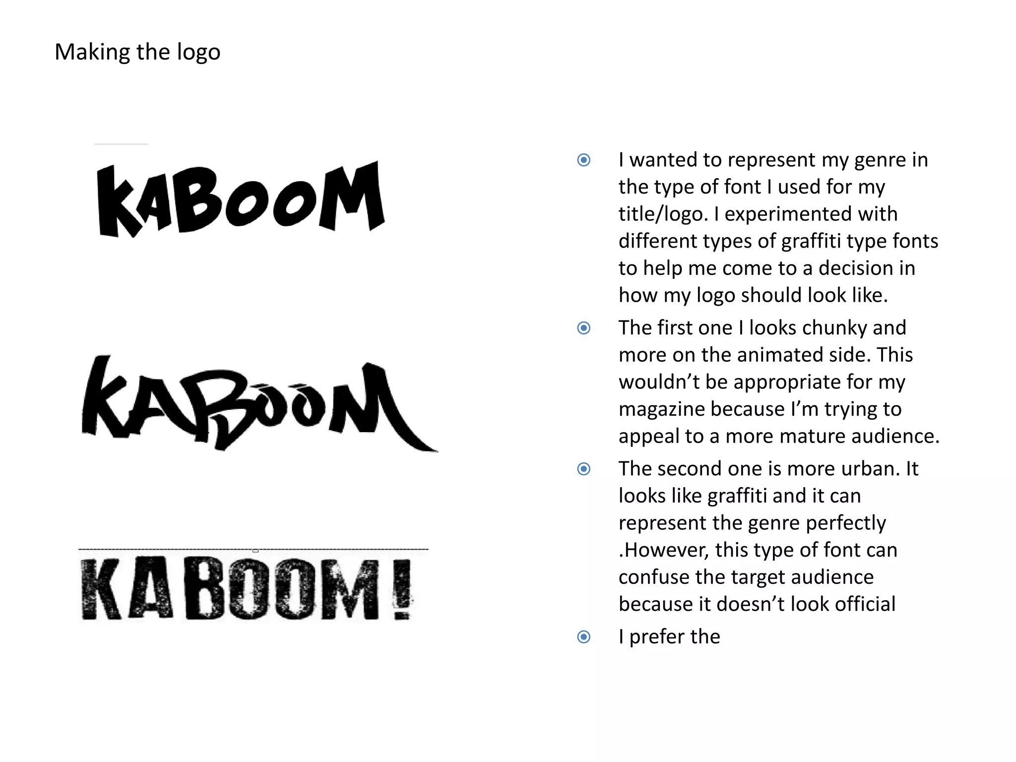
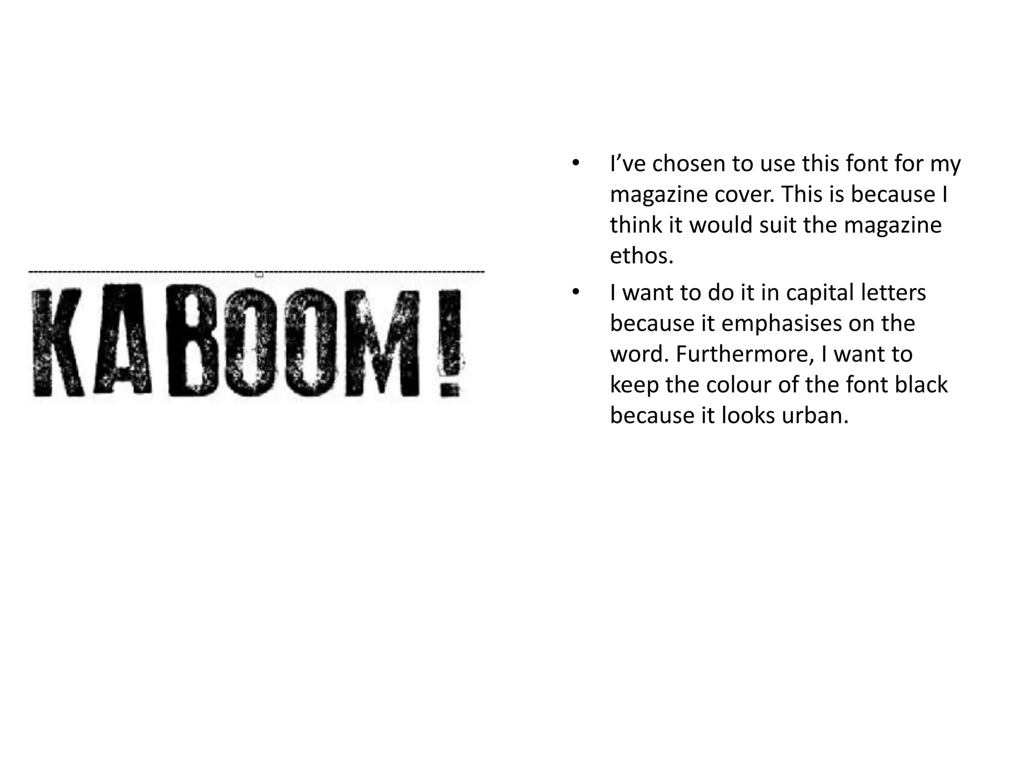
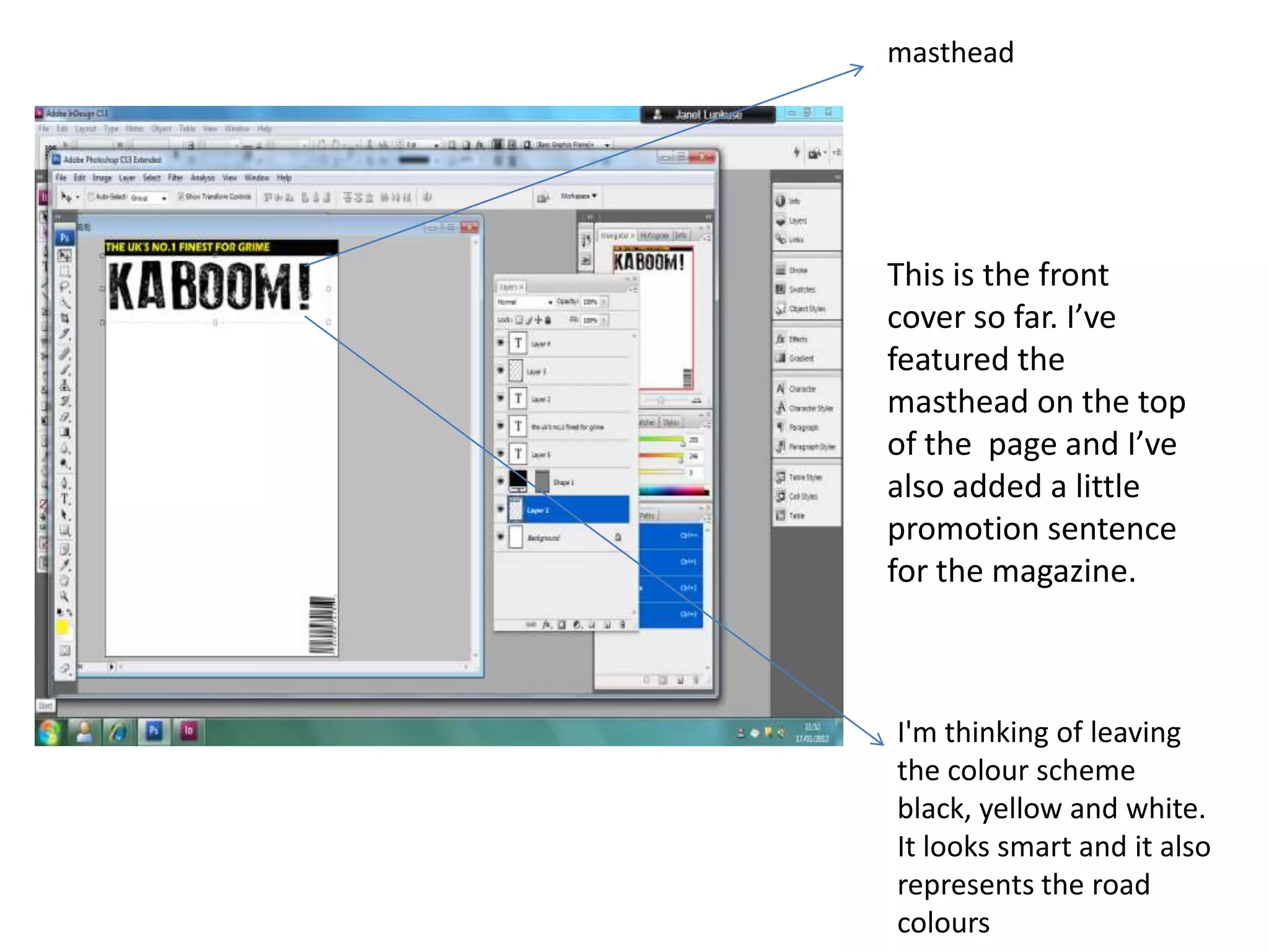

The document discusses designing a logo for a magazine. The author experiments with graffiti fonts but finds the first one too animated and the second too urban and confusing. The third font is selected as it suits the magazine's ethos. The logo is done in capital black letters on the magazine cover to look urban and emphasize the title. A promotion sentence is added below along with a black, yellow and white color scheme to look smart and represent road colors.


