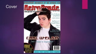
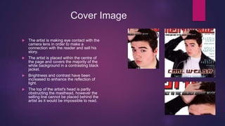
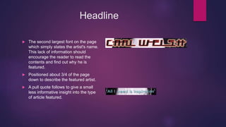
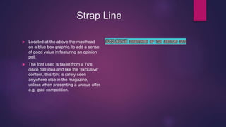
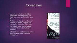
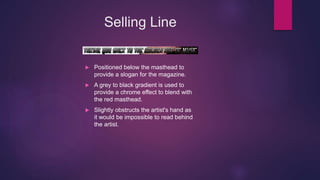
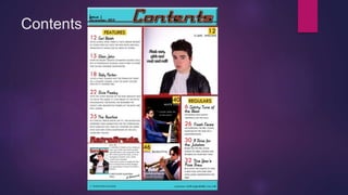
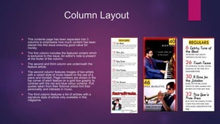
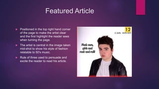
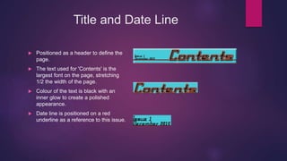
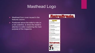
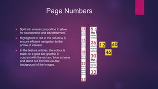
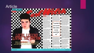
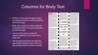
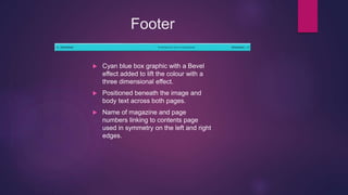
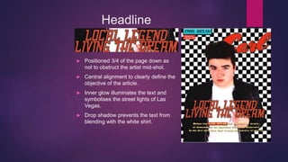
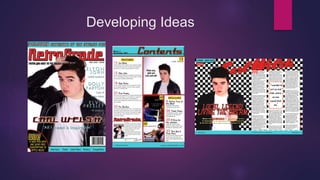
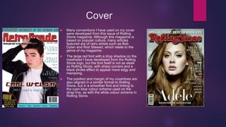
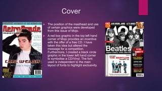
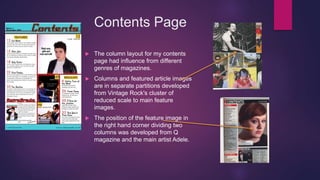
SlideShare a Scribd company logo
AS Media Studies
Evaluation
Q1. IN WHAT WAYS DOES YOUR MEDIA PRODUCT USE, DEVELOP OR
CHALLENGE FORMS AND CONVENTIONS OF REAL MEDIA
PRODUCTS?
Cover
Masthead
 The font size of the masthead is the largest
on the cover, filling about a 1/5th of the page
for the name to be clear to the reader.
 A stroke line and drop shadow is used to lift
the text from the white background.
 The font used is of a retro 50's style and
represents an American diner theme, linking
to the artists of the decade such as Elvis
Presley and Roy Orbison.
 Located at the top of the page to provide an
'umbrella' statement for the content covered.
 The centre of the text is slightly obstructed by
the artist's head to aid the appearance of the
cover image and highlight the importance of
the artist.
Cover Image
 The artist is making eye contact with the
camera lens in order to make a
connection with the reader and sell his
story.
 The artist is placed within the centre of
the page and covers the majority of the
white background in a contrasting black
jacket.
 Brightness and contrast have been
increased to enhance the reflection of
light.
 The top of the artist's head is partly
obstructing the masthead, however the
selling line cannot be placed behind the
artist as it would be impossible to read.
Headline
 The second largest font on the page
which simply states the artist's name.
This lack of information should
encourage the reader to read the
contents and find out why he is
featured.
 Positioned about 3/4 of the page
down to describe the featured artist.
 A pull quote follows to give a small
less informative insight into the type
of article featured.
Strap Line
 Located at the above the masthead
on a blue box graphic, to add a sense
of good value in featuring an opinion
poll.
 The font used is taken from a 70's
disco ball idea and like the 'exclusive'
content, this font is rarely seen
anywhere else in the magazine,
unless when presenting a unique offer
e.g. ipad competition.
Coverlines
 Aligned to the right margin with a
small space from the edge of the
page, to ensure no information is cut
off.
 Positioned on the right hand side of
the artist, to prevent covering the
main selling statement of the cover.
 Last names are in Italic to provide
contrast and make the text more
appealing.
 A drop shadow has been used so the
text is easier to read on a white
background.
Selling Line
 Positioned below the masthead to
provide a slogan for the magazine.
 A grey to black gradient is used to
provide a chrome effect to blend with
the red masthead.
 Slightly obstructs the artist's hand as
it would be impossible to read behind
the artist.
Contents
Column Layout
 This contents page has been separated into 3
columns to emphasise how much content has been
placed into this issue ensuring good value for
money.
 The first column includes the featured content which
is exclusive to this issue. An editor's note is present
at the footer of the column.
 The second and third column are underneath the
feature article.
 The second column features images of two artists
with a varied style of music based on the use of a
piano and trumpet. Page numbers are shown in the
top corner of each feature on a gold box graphic to
contrast with the red and blue colour scheme. Pull
quotes taken from their fictional article hint their
personality and interests in music.
 The third column features a list of articles with a
signature style of article only available in this
magazine.
Featured Article
 Positioned in the top right hand corner
of the page to make the artist clear
and the first highlight the reader sees
when turning the page.
 The artist is central in the image taken
mid-shot to show his style of fashion
relatable to 50's music.
 Rule of three used to persuade and
excite the reader to read his article.
Title and Date Line
 Positioned as a header to define the
page.
 The text used for 'Contents' is the
largest font on the page, stretching
1/2 the width of the page.
 Colour of the text is black with an
inner glow to create a polished
appearance.
 Date line is positioned on a red
underline as a reference to this issue.
Masthead Logo
 Masthead from cover reused in the
features column.
 Positioned above the editor's note on
a red underline, to direct the reader's
attention to editor explaining the main
purpose of the magazine.
Page Numbers
 Split into uneven proportion to allow
for sponsorship and advertisement.
 Highlighted in red in the columns to
ensure efficient navigation to the
article of interest.
 In the feature articles, the colour is
black on a gold box graphic to
contrast with the red and blue scheme
and stand out from the neutral
background of the images.
Article
Columns for Body Text
 Printed on the second page to allow
the featured artist to cover the entirety
of the first page.
 Body text is split over three columns
to divide the text into equal proportion
across the page.
 Use of a drop cap to guide the
reader's attention to the start of the
body text.
 The background shows through the
boundaries between each column to
add a lively black and white contrast.
Footer
 Cyan blue box graphic with a Bevel
effect added to lift the colour with a
three dimensional effect.
 Positioned beneath the image and
body text across both pages.
 Name of magazine and page
numbers linking to contents page
used in symmetry on the left and right
edges.
Headline
 Positioned 3/4 of the page down as
not to obstruct the artist mid-shot.
 Central alignment to clearly define the
objective of the article.
 Inner glow illuminates the text and
symbolises the street lights of Las
Vegas.
 Drop shadow prevents the text from
blending with the white shirt.
Lead In
 Positioned beneath the headline as a
brief statement about the purpose of
the article before the reader's eye is
drawn to the drop cap on the second
page.
 Red box graphic behind the artist's
name highlights their importance and
high status.
Pull Quote
 Placed in the centre of the second
column to add detail.
 White rectangle box graphic with a
red stroke borders the quote. Small
circle graphics with a strong outer
glow are used.
Photoshoot Image
 Covers approx. 4/5ths of the first
page within the centre to emphasise
the appearance of the artist.
 Studio image taken mid shot to
portray the artist as a style icon as
well as a musician.
 Checkerboard background relates to
the 50's diner theme.
 In a unique font, the artist's name is
splashed across the gutter and
columns as an umbrella statement for
the article.
Index Tab and Caption
 Positioned near the top left corner of
the first page as a reference to the
article.
 The colour scheme and bevel effect
relate to the footer to balanc the use
of colours in the article.
 Caption gives a brief statement to
describe the studio image. Alliteration
is used to make the statement catchy
and memorable.
Byline
 Positioned vertically from the third
column to credit the writer of the
article.
 A contrasting red colour with a black
stroke effect ensures the text does not
blend into the background.
Developing Ideas
Cover
 Many conventions I have used on my cover
were developed from this issue of Rolling
Stone magazine. Although this magazine is
based on popular culture, many articles
featured are of retro artists such as Bob
Dylan and Rod Stewart, which relate to the
genre of my magazine.
 The large red font with a drop shadow on the
masthead I have developed from the Rolling
Stone logo, but the font itself is not as sleek
as Rolling Stone, with sharp corners and a
black stroke effect to appear more edgy and
menacing.
 The position and margin of my coverlines are
also aligned in a similar format to Rolling
Stone, but in a smoother font and linking to
the cyan blue colour scheme used on the
strap line, as with the white colour scheme in
Rolling Stone.
Cover
 The position of the masthead and use
of certain graphics were developed
from this issue of Mojo.
 A red box graphic in the top left hand
corner of Mojo provides an incentive
with the offer of a free CD. I have
taken this idea but altered the
message for a competition.
Furthermore, I created a black circle
graphic in the lower left hand corner
to symbolise a CD/Vinyl. The font
used is independent to the main
layout of fonts to highlight exclusivity.
Contents Page
 The column layout for my contents
page had influence from different
genres of magazines.
 Columns and featured article images
are in separate partitions developed
from Vintage Rock's cluster of
reduced scale to main feature
images.
 The position of the feature image in
the right hand corner dividing two
columns was developed from Q
magazine and the main artist Adele.
Article
 Elements of the body text columns and
the caption have been developed from
this issue of Q magazine featuring Ed
Sheeran.
 A pull quote insert is used in the centre
of the middle column as opposed to the
insert placed between the two columns
in Q.
 I've used the position of the headline
and lead in below the artist in Q and
restructured the font and colour scheme
for my genre. These fonts have a
vintage appearance compared to the
sleek text in Q.
 A red box graphic is placed behind the
artist's name in the lead in to suggest
authority.
Challenging Ideas - Cover
 I have used a footer to describe the
type of content the reader will expect
see in this issue.
 A black circular graphic with a red
stroke effect and competition details
stands out with an unrelatable colour
scheme of gold and black. This
directs the reader's eye to the
statement 'Win' and encourage the
reader to see how to apply.
Challenging Ideas - Contents Page
 I have created a red neon light effect
on the dividing lines of the columns.
This illuminates the images which
surround to create an 80's ambience
and symbolise the variety of genres
featured.
Challenging Ideas - Article
 The artist's name is splashed across
the two pages in the largest font size
on the page. This statement
enhances the artist's celebrity status
to encourage the reader to see why
the magazine is promoting him.
 The byline is positioned vertically
against the third column to separate
the writer's credit from the body text.

More Related Content

What's hot

Front cover analysis
Front cover analysisFront cover analysis
Front cover analysisKieran Raza
 
Task 2- magazine cover, contents & double page spread
Task 2- magazine cover, contents & double page spreadTask 2- magazine cover, contents & double page spread
Task 2- magazine cover, contents & double page spread
asmediab15
 
Contents page analysis
Contents page analysisContents page analysis
Contents page analysis
kaitlynstephensonmedia
 
Magazine Construction
Magazine ConstructionMagazine Construction
Magazine ConstructionTMoorwood
 
Magazine Cover Layout Research & Analysis
Magazine Cover Layout Research & AnalysisMagazine Cover Layout Research & Analysis
Magazine Cover Layout Research & AnalysisAmy0895
 
Task 4- Magazine Analysis
Task 4- Magazine AnalysisTask 4- Magazine Analysis
Task 4- Magazine Analysis2011karisha
 
Textual analysis
Textual analysisTextual analysis
Textual analysis
amelia rennison
 
Q
QQ
Evaluation 1- In what ways does your media product use, develop or challenge ...
Evaluation 1- In what ways does your media product use, develop or challenge ...Evaluation 1- In what ways does your media product use, develop or challenge ...
Evaluation 1- In what ways does your media product use, develop or challenge ...
Daisy Birchall
 
NME analysis
NME analysisNME analysis
NME analysis
beckyt95
 
Contents page analysis
Contents page analysisContents page analysis
Contents page analysisDavid Stout
 
As media-evaluation1 (1)
As media-evaluation1 (1)As media-evaluation1 (1)
As media-evaluation1 (1)
Van Harren Burgos
 
Magazine Textual Analysis
Magazine Textual AnalysisMagazine Textual Analysis
Magazine Textual AnalysisJwbread
 
Textual analysis
Textual analysisTextual analysis
Textual analysisJwbread
 
Music Magazines - Research
Music Magazines - ResearchMusic Magazines - Research
Music Magazines - ResearchVanessa S
 

What's hot (18)

Front cover analysis
Front cover analysisFront cover analysis
Front cover analysis
 
Task 2- magazine cover, contents & double page spread
Task 2- magazine cover, contents & double page spreadTask 2- magazine cover, contents & double page spread
Task 2- magazine cover, contents & double page spread
 
Contents page analysis
Contents page analysisContents page analysis
Contents page analysis
 
Magazine Construction
Magazine ConstructionMagazine Construction
Magazine Construction
 
Magazine Cover Layout Research & Analysis
Magazine Cover Layout Research & AnalysisMagazine Cover Layout Research & Analysis
Magazine Cover Layout Research & Analysis
 
Task 4- Magazine Analysis
Task 4- Magazine AnalysisTask 4- Magazine Analysis
Task 4- Magazine Analysis
 
Textual analysis
Textual analysisTextual analysis
Textual analysis
 
Q
QQ
Q
 
Evaluation 1- In what ways does your media product use, develop or challenge ...
Evaluation 1- In what ways does your media product use, develop or challenge ...Evaluation 1- In what ways does your media product use, develop or challenge ...
Evaluation 1- In what ways does your media product use, develop or challenge ...
 
NME analysis
NME analysisNME analysis
NME analysis
 
Contents page analysis
Contents page analysisContents page analysis
Contents page analysis
 
House style
House styleHouse style
House style
 
As media-evaluation1 (1)
As media-evaluation1 (1)As media-evaluation1 (1)
As media-evaluation1 (1)
 
Magazine Textual Analysis
Magazine Textual AnalysisMagazine Textual Analysis
Magazine Textual Analysis
 
Textual analysis
Textual analysisTextual analysis
Textual analysis
 
Music Magazines - Research
Music Magazines - ResearchMusic Magazines - Research
Music Magazines - Research
 
Question 1
Question 1Question 1
Question 1
 
Question 1
Question 1Question 1
Question 1
 

Viewers also liked

Evaluation question 1
Evaluation question 1Evaluation question 1
Evaluation question 1
Harry Mock
 
Evaluation question 3
Evaluation question 3Evaluation question 3
Evaluation question 3
Harry Mock
 
Evaluation question 2
Evaluation question 2Evaluation question 2
Evaluation question 2
Harry Mock
 
Question 7
Question 7Question 7
Question 7
trisushi
 
Question 6
Question 6Question 6
Question 6
trisushi
 
Question 5
Question 5Question 5
Question 5
trisushi
 
Conclsion
ConclsionConclsion
Conclsion
Connor Hennessy
 
Media evaluation q4x
Media evaluation q4xMedia evaluation q4x
Media evaluation q4x
Van Harren Burgos
 
Media evaluation q3x
Media evaluation q3xMedia evaluation q3x
Media evaluation q3x
Van Harren Burgos
 
Media evaluation q2x
Media evaluation q2xMedia evaluation q2x
Media evaluation q2x
Van Harren Burgos
 
Media evalution q5
Media evalution q5Media evalution q5
Media evalution q5
Van Harren Burgos
 
Media evaluation q1x
Media evaluation q1xMedia evaluation q1x
Media evaluation q1x
Van Harren Burgos
 
Media evaluation q6
Media evaluation  q6Media evaluation  q6
Media evaluation q6
Van Harren Burgos
 
Final media presentation PDF
Final media presentation PDFFinal media presentation PDF
Final media presentation PDFoksanatorhan
 
A2 Media Studies Evaluation Question 2
A2 Media Studies Evaluation Question 2A2 Media Studies Evaluation Question 2
A2 Media Studies Evaluation Question 2
Christopher Slemensek
 
Conclusion q7
Conclusion q7Conclusion q7
Conclusion q7
Connor Hennessy
 
GCSE Media Studies Magazine Production
GCSE Media Studies Magazine ProductionGCSE Media Studies Magazine Production
GCSE Media Studies Magazine Production
Mrs Downie
 

Viewers also liked (20)

Evaluation question 1
Evaluation question 1Evaluation question 1
Evaluation question 1
 
Evaluation question 3
Evaluation question 3Evaluation question 3
Evaluation question 3
 
Evaluation question 2
Evaluation question 2Evaluation question 2
Evaluation question 2
 
Question 7
Question 7Question 7
Question 7
 
Question 6
Question 6Question 6
Question 6
 
Question 5
Question 5Question 5
Question 5
 
Conclsion
ConclsionConclsion
Conclsion
 
Media evaluation q4x
Media evaluation q4xMedia evaluation q4x
Media evaluation q4x
 
Media evaluation q3x
Media evaluation q3xMedia evaluation q3x
Media evaluation q3x
 
Media evaluation q2x
Media evaluation q2xMedia evaluation q2x
Media evaluation q2x
 
Media evalution q5
Media evalution q5Media evalution q5
Media evalution q5
 
Media evaluation q1x
Media evaluation q1xMedia evaluation q1x
Media evaluation q1x
 
Question 6
Question 6Question 6
Question 6
 
Media evaluation q6
Media evaluation  q6Media evaluation  q6
Media evaluation q6
 
Final media presentation PDF
Final media presentation PDFFinal media presentation PDF
Final media presentation PDF
 
A2 Media Studies Evaluation Question 2
A2 Media Studies Evaluation Question 2A2 Media Studies Evaluation Question 2
A2 Media Studies Evaluation Question 2
 
Conclusion q7
Conclusion q7Conclusion q7
Conclusion q7
 
GCSE Media Studies Magazine Production
GCSE Media Studies Magazine ProductionGCSE Media Studies Magazine Production
GCSE Media Studies Magazine Production
 
Q2
Q2Q2
Q2
 
Q3
Q3Q3
Q3
 

Similar to AS Media Studies Evaluation Question 1

Tasks 1, 2 & 3 music magazine covers powerpoint
Tasks 1, 2 & 3 music magazine covers powerpointTasks 1, 2 & 3 music magazine covers powerpoint
Tasks 1, 2 & 3 music magazine covers powerpointlindseyberrill
 
Contents Page Analysis
Contents Page AnalysisContents Page Analysis
Contents Page AnalysisAnikayasmiin
 
Magazine research info
Magazine research infoMagazine research info
Magazine research info
tomhogan123
 
Magazine coursework 2/11
Magazine coursework 2/11Magazine coursework 2/11
Magazine coursework 2/11
cian2199
 
Double page analysis q
Double page analysis qDouble page analysis q
Double page analysis qLaurenCooney97
 
Magazine Contents Page Analysis
Magazine Contents Page AnalysisMagazine Contents Page Analysis
Magazine Contents Page Analysis
jordanjenkins98
 
Magazine contents page analysis
Magazine contents page analysisMagazine contents page analysis
Magazine contents page analysis
jordanjenkins98
 
Deconstruction practice
Deconstruction practiceDeconstruction practice
Deconstruction practice
robynneve
 
Music Magazine Contents Page Analysis
Music Magazine Contents Page AnalysisMusic Magazine Contents Page Analysis
Music Magazine Contents Page AnalysisPieter Jollans
 
Analyses of contents pages
Analyses of contents pagesAnalyses of contents pages
Analyses of contents pages
kaitlynstephensonmedia
 
Textual analysis q magazine contents page
Textual analysis q magazine contents pageTextual analysis q magazine contents page
Textual analysis q magazine contents page
ambercrickmore
 
Doublepage 110303030414-phpapp02
Doublepage 110303030414-phpapp02Doublepage 110303030414-phpapp02
Doublepage 110303030414-phpapp02Longmark12
 
Music Magazine Analysis
Music Magazine AnalysisMusic Magazine Analysis
Music Magazine AnalysisGemma
 
media mag anal isis
media mag anal isis media mag anal isis
media mag anal isis
milesorec
 
Content page analysis
Content page analysisContent page analysis
Content page analysisumay27
 

Similar to AS Media Studies Evaluation Question 1 (20)

Tasks 1, 2 & 3 music magazine covers powerpoint
Tasks 1, 2 & 3 music magazine covers powerpointTasks 1, 2 & 3 music magazine covers powerpoint
Tasks 1, 2 & 3 music magazine covers powerpoint
 
Contents page analysis
Contents page analysisContents page analysis
Contents page analysis
 
Contents page analysis
Contents page analysisContents page analysis
Contents page analysis
 
Contents page analysis
Contents page analysisContents page analysis
Contents page analysis
 
Contents Page Analysis
Contents Page AnalysisContents Page Analysis
Contents Page Analysis
 
Magazine research info
Magazine research infoMagazine research info
Magazine research info
 
Magazine coursework 2/11
Magazine coursework 2/11Magazine coursework 2/11
Magazine coursework 2/11
 
Double page analysis q
Double page analysis qDouble page analysis q
Double page analysis q
 
Magazine Contents Page Analysis
Magazine Contents Page AnalysisMagazine Contents Page Analysis
Magazine Contents Page Analysis
 
Magazine contents page analysis
Magazine contents page analysisMagazine contents page analysis
Magazine contents page analysis
 
Deconstruction practice
Deconstruction practiceDeconstruction practice
Deconstruction practice
 
Music Magazine Contents Page Analysis
Music Magazine Contents Page AnalysisMusic Magazine Contents Page Analysis
Music Magazine Contents Page Analysis
 
Analyses of contents pages
Analyses of contents pagesAnalyses of contents pages
Analyses of contents pages
 
Textual analysis q magazine contents page
Textual analysis q magazine contents pageTextual analysis q magazine contents page
Textual analysis q magazine contents page
 
Dizzee rascal
Dizzee rascalDizzee rascal
Dizzee rascal
 
Magazine Analysis
Magazine AnalysisMagazine Analysis
Magazine Analysis
 
Doublepage 110303030414-phpapp02
Doublepage 110303030414-phpapp02Doublepage 110303030414-phpapp02
Doublepage 110303030414-phpapp02
 
Music Magazine Analysis
Music Magazine AnalysisMusic Magazine Analysis
Music Magazine Analysis
 
media mag anal isis
media mag anal isis media mag anal isis
media mag anal isis
 
Content page analysis
Content page analysisContent page analysis
Content page analysis
 

Recently uploaded

Supporting (UKRI) OA monographs at Salford.pptx
Supporting (UKRI) OA monographs at Salford.pptxSupporting (UKRI) OA monographs at Salford.pptx
Supporting (UKRI) OA monographs at Salford.pptx
Jisc
 
Language Across the Curriculm LAC B.Ed.
Language Across the  Curriculm LAC B.Ed.Language Across the  Curriculm LAC B.Ed.
Language Across the Curriculm LAC B.Ed.
Atul Kumar Singh
 
Model Attribute Check Company Auto Property
Model Attribute  Check Company Auto PropertyModel Attribute  Check Company Auto Property
Model Attribute Check Company Auto Property
Celine George
 
Instructions for Submissions thorugh G- Classroom.pptx
Instructions for Submissions thorugh G- Classroom.pptxInstructions for Submissions thorugh G- Classroom.pptx
Instructions for Submissions thorugh G- Classroom.pptx
Jheel Barad
 
Overview on Edible Vaccine: Pros & Cons with Mechanism
Overview on Edible Vaccine: Pros & Cons with MechanismOverview on Edible Vaccine: Pros & Cons with Mechanism
Overview on Edible Vaccine: Pros & Cons with Mechanism
DeeptiGupta154
 
The approach at University of Liverpool.pptx
The approach at University of Liverpool.pptxThe approach at University of Liverpool.pptx
The approach at University of Liverpool.pptx
Jisc
 
ESC Beyond Borders _From EU to You_ InfoPack general.pdf
ESC Beyond Borders _From EU to You_ InfoPack general.pdfESC Beyond Borders _From EU to You_ InfoPack general.pdf
ESC Beyond Borders _From EU to You_ InfoPack general.pdf
Fundacja Rozwoju Społeczeństwa Przedsiębiorczego
 
The French Revolution Class 9 Study Material pdf free download
The French Revolution Class 9 Study Material pdf free downloadThe French Revolution Class 9 Study Material pdf free download
The French Revolution Class 9 Study Material pdf free download
Vivekanand Anglo Vedic Academy
 
CLASS 11 CBSE B.St Project AIDS TO TRADE - INSURANCE
CLASS 11 CBSE B.St Project AIDS TO TRADE - INSURANCECLASS 11 CBSE B.St Project AIDS TO TRADE - INSURANCE
CLASS 11 CBSE B.St Project AIDS TO TRADE - INSURANCE
BhavyaRajput3
 
GIÁO ÁN DẠY THÊM (KẾ HOẠCH BÀI BUỔI 2) - TIẾNG ANH 8 GLOBAL SUCCESS (2 CỘT) N...
GIÁO ÁN DẠY THÊM (KẾ HOẠCH BÀI BUỔI 2) - TIẾNG ANH 8 GLOBAL SUCCESS (2 CỘT) N...GIÁO ÁN DẠY THÊM (KẾ HOẠCH BÀI BUỔI 2) - TIẾNG ANH 8 GLOBAL SUCCESS (2 CỘT) N...
GIÁO ÁN DẠY THÊM (KẾ HOẠCH BÀI BUỔI 2) - TIẾNG ANH 8 GLOBAL SUCCESS (2 CỘT) N...
Nguyen Thanh Tu Collection
 
Thesis Statement for students diagnonsed withADHD.ppt
Thesis Statement for students diagnonsed withADHD.pptThesis Statement for students diagnonsed withADHD.ppt
Thesis Statement for students diagnonsed withADHD.ppt
EverAndrsGuerraGuerr
 
The Challenger.pdf DNHS Official Publication
The Challenger.pdf DNHS Official PublicationThe Challenger.pdf DNHS Official Publication
The Challenger.pdf DNHS Official Publication
Delapenabediema
 
Basic phrases for greeting and assisting costumers
Basic phrases for greeting and assisting costumersBasic phrases for greeting and assisting costumers
Basic phrases for greeting and assisting costumers
PedroFerreira53928
 
Synthetic Fiber Construction in lab .pptx
Synthetic Fiber Construction in lab .pptxSynthetic Fiber Construction in lab .pptx
Synthetic Fiber Construction in lab .pptx
Pavel ( NSTU)
 
Introduction to Quality Improvement Essentials
Introduction to Quality Improvement EssentialsIntroduction to Quality Improvement Essentials
Introduction to Quality Improvement Essentials
Excellence Foundation for South Sudan
 
Welcome to TechSoup New Member Orientation and Q&A (May 2024).pdf
Welcome to TechSoup   New Member Orientation and Q&A (May 2024).pdfWelcome to TechSoup   New Member Orientation and Q&A (May 2024).pdf
Welcome to TechSoup New Member Orientation and Q&A (May 2024).pdf
TechSoup
 
How to Split Bills in the Odoo 17 POS Module
How to Split Bills in the Odoo 17 POS ModuleHow to Split Bills in the Odoo 17 POS Module
How to Split Bills in the Odoo 17 POS Module
Celine George
 
How to Break the cycle of negative Thoughts
How to Break the cycle of negative ThoughtsHow to Break the cycle of negative Thoughts
How to Break the cycle of negative Thoughts
Col Mukteshwar Prasad
 
Polish students' mobility in the Czech Republic
Polish students' mobility in the Czech RepublicPolish students' mobility in the Czech Republic
Polish students' mobility in the Czech Republic
Anna Sz.
 
The geography of Taylor Swift - some ideas
The geography of Taylor Swift - some ideasThe geography of Taylor Swift - some ideas
The geography of Taylor Swift - some ideas
GeoBlogs
 

Recently uploaded (20)

Supporting (UKRI) OA monographs at Salford.pptx
Supporting (UKRI) OA monographs at Salford.pptxSupporting (UKRI) OA monographs at Salford.pptx
Supporting (UKRI) OA monographs at Salford.pptx
 
Language Across the Curriculm LAC B.Ed.
Language Across the  Curriculm LAC B.Ed.Language Across the  Curriculm LAC B.Ed.
Language Across the Curriculm LAC B.Ed.
 
Model Attribute Check Company Auto Property
Model Attribute  Check Company Auto PropertyModel Attribute  Check Company Auto Property
Model Attribute Check Company Auto Property
 
Instructions for Submissions thorugh G- Classroom.pptx
Instructions for Submissions thorugh G- Classroom.pptxInstructions for Submissions thorugh G- Classroom.pptx
Instructions for Submissions thorugh G- Classroom.pptx
 
Overview on Edible Vaccine: Pros & Cons with Mechanism
Overview on Edible Vaccine: Pros & Cons with MechanismOverview on Edible Vaccine: Pros & Cons with Mechanism
Overview on Edible Vaccine: Pros & Cons with Mechanism
 
The approach at University of Liverpool.pptx
The approach at University of Liverpool.pptxThe approach at University of Liverpool.pptx
The approach at University of Liverpool.pptx
 
ESC Beyond Borders _From EU to You_ InfoPack general.pdf
ESC Beyond Borders _From EU to You_ InfoPack general.pdfESC Beyond Borders _From EU to You_ InfoPack general.pdf
ESC Beyond Borders _From EU to You_ InfoPack general.pdf
 
The French Revolution Class 9 Study Material pdf free download
The French Revolution Class 9 Study Material pdf free downloadThe French Revolution Class 9 Study Material pdf free download
The French Revolution Class 9 Study Material pdf free download
 
CLASS 11 CBSE B.St Project AIDS TO TRADE - INSURANCE
CLASS 11 CBSE B.St Project AIDS TO TRADE - INSURANCECLASS 11 CBSE B.St Project AIDS TO TRADE - INSURANCE
CLASS 11 CBSE B.St Project AIDS TO TRADE - INSURANCE
 
GIÁO ÁN DẠY THÊM (KẾ HOẠCH BÀI BUỔI 2) - TIẾNG ANH 8 GLOBAL SUCCESS (2 CỘT) N...
GIÁO ÁN DẠY THÊM (KẾ HOẠCH BÀI BUỔI 2) - TIẾNG ANH 8 GLOBAL SUCCESS (2 CỘT) N...GIÁO ÁN DẠY THÊM (KẾ HOẠCH BÀI BUỔI 2) - TIẾNG ANH 8 GLOBAL SUCCESS (2 CỘT) N...
GIÁO ÁN DẠY THÊM (KẾ HOẠCH BÀI BUỔI 2) - TIẾNG ANH 8 GLOBAL SUCCESS (2 CỘT) N...
 
Thesis Statement for students diagnonsed withADHD.ppt
Thesis Statement for students diagnonsed withADHD.pptThesis Statement for students diagnonsed withADHD.ppt
Thesis Statement for students diagnonsed withADHD.ppt
 
The Challenger.pdf DNHS Official Publication
The Challenger.pdf DNHS Official PublicationThe Challenger.pdf DNHS Official Publication
The Challenger.pdf DNHS Official Publication
 
Basic phrases for greeting and assisting costumers
Basic phrases for greeting and assisting costumersBasic phrases for greeting and assisting costumers
Basic phrases for greeting and assisting costumers
 
Synthetic Fiber Construction in lab .pptx
Synthetic Fiber Construction in lab .pptxSynthetic Fiber Construction in lab .pptx
Synthetic Fiber Construction in lab .pptx
 
Introduction to Quality Improvement Essentials
Introduction to Quality Improvement EssentialsIntroduction to Quality Improvement Essentials
Introduction to Quality Improvement Essentials
 
Welcome to TechSoup New Member Orientation and Q&A (May 2024).pdf
Welcome to TechSoup   New Member Orientation and Q&A (May 2024).pdfWelcome to TechSoup   New Member Orientation and Q&A (May 2024).pdf
Welcome to TechSoup New Member Orientation and Q&A (May 2024).pdf
 
How to Split Bills in the Odoo 17 POS Module
How to Split Bills in the Odoo 17 POS ModuleHow to Split Bills in the Odoo 17 POS Module
How to Split Bills in the Odoo 17 POS Module
 
How to Break the cycle of negative Thoughts
How to Break the cycle of negative ThoughtsHow to Break the cycle of negative Thoughts
How to Break the cycle of negative Thoughts
 
Polish students' mobility in the Czech Republic
Polish students' mobility in the Czech RepublicPolish students' mobility in the Czech Republic
Polish students' mobility in the Czech Republic
 
The geography of Taylor Swift - some ideas
The geography of Taylor Swift - some ideasThe geography of Taylor Swift - some ideas
The geography of Taylor Swift - some ideas
 

AS Media Studies Evaluation Question 1

  • 1. AS Media Studies Evaluation Q1. IN WHAT WAYS DOES YOUR MEDIA PRODUCT USE, DEVELOP OR CHALLENGE FORMS AND CONVENTIONS OF REAL MEDIA PRODUCTS?
  • 3. Masthead  The font size of the masthead is the largest on the cover, filling about a 1/5th of the page for the name to be clear to the reader.  A stroke line and drop shadow is used to lift the text from the white background.  The font used is of a retro 50's style and represents an American diner theme, linking to the artists of the decade such as Elvis Presley and Roy Orbison.  Located at the top of the page to provide an 'umbrella' statement for the content covered.  The centre of the text is slightly obstructed by the artist's head to aid the appearance of the cover image and highlight the importance of the artist.
  • 4. Cover Image  The artist is making eye contact with the camera lens in order to make a connection with the reader and sell his story.  The artist is placed within the centre of the page and covers the majority of the white background in a contrasting black jacket.  Brightness and contrast have been increased to enhance the reflection of light.  The top of the artist's head is partly obstructing the masthead, however the selling line cannot be placed behind the artist as it would be impossible to read.
  • 5. Headline  The second largest font on the page which simply states the artist's name. This lack of information should encourage the reader to read the contents and find out why he is featured.  Positioned about 3/4 of the page down to describe the featured artist.  A pull quote follows to give a small less informative insight into the type of article featured.
  • 6. Strap Line  Located at the above the masthead on a blue box graphic, to add a sense of good value in featuring an opinion poll.  The font used is taken from a 70's disco ball idea and like the 'exclusive' content, this font is rarely seen anywhere else in the magazine, unless when presenting a unique offer e.g. ipad competition.
  • 7. Coverlines  Aligned to the right margin with a small space from the edge of the page, to ensure no information is cut off.  Positioned on the right hand side of the artist, to prevent covering the main selling statement of the cover.  Last names are in Italic to provide contrast and make the text more appealing.  A drop shadow has been used so the text is easier to read on a white background.
  • 8. Selling Line  Positioned below the masthead to provide a slogan for the magazine.  A grey to black gradient is used to provide a chrome effect to blend with the red masthead.  Slightly obstructs the artist's hand as it would be impossible to read behind the artist.
  • 10. Column Layout  This contents page has been separated into 3 columns to emphasise how much content has been placed into this issue ensuring good value for money.  The first column includes the featured content which is exclusive to this issue. An editor's note is present at the footer of the column.  The second and third column are underneath the feature article.  The second column features images of two artists with a varied style of music based on the use of a piano and trumpet. Page numbers are shown in the top corner of each feature on a gold box graphic to contrast with the red and blue colour scheme. Pull quotes taken from their fictional article hint their personality and interests in music.  The third column features a list of articles with a signature style of article only available in this magazine.
  • 11. Featured Article  Positioned in the top right hand corner of the page to make the artist clear and the first highlight the reader sees when turning the page.  The artist is central in the image taken mid-shot to show his style of fashion relatable to 50's music.  Rule of three used to persuade and excite the reader to read his article.
  • 12. Title and Date Line  Positioned as a header to define the page.  The text used for 'Contents' is the largest font on the page, stretching 1/2 the width of the page.  Colour of the text is black with an inner glow to create a polished appearance.  Date line is positioned on a red underline as a reference to this issue.
  • 13. Masthead Logo  Masthead from cover reused in the features column.  Positioned above the editor's note on a red underline, to direct the reader's attention to editor explaining the main purpose of the magazine.
  • 14. Page Numbers  Split into uneven proportion to allow for sponsorship and advertisement.  Highlighted in red in the columns to ensure efficient navigation to the article of interest.  In the feature articles, the colour is black on a gold box graphic to contrast with the red and blue scheme and stand out from the neutral background of the images.
  • 16. Columns for Body Text  Printed on the second page to allow the featured artist to cover the entirety of the first page.  Body text is split over three columns to divide the text into equal proportion across the page.  Use of a drop cap to guide the reader's attention to the start of the body text.  The background shows through the boundaries between each column to add a lively black and white contrast.
  • 17. Footer  Cyan blue box graphic with a Bevel effect added to lift the colour with a three dimensional effect.  Positioned beneath the image and body text across both pages.  Name of magazine and page numbers linking to contents page used in symmetry on the left and right edges.
  • 18. Headline  Positioned 3/4 of the page down as not to obstruct the artist mid-shot.  Central alignment to clearly define the objective of the article.  Inner glow illuminates the text and symbolises the street lights of Las Vegas.  Drop shadow prevents the text from blending with the white shirt.
  • 19. Lead In  Positioned beneath the headline as a brief statement about the purpose of the article before the reader's eye is drawn to the drop cap on the second page.  Red box graphic behind the artist's name highlights their importance and high status.
  • 20. Pull Quote  Placed in the centre of the second column to add detail.  White rectangle box graphic with a red stroke borders the quote. Small circle graphics with a strong outer glow are used.
  • 21. Photoshoot Image  Covers approx. 4/5ths of the first page within the centre to emphasise the appearance of the artist.  Studio image taken mid shot to portray the artist as a style icon as well as a musician.  Checkerboard background relates to the 50's diner theme.  In a unique font, the artist's name is splashed across the gutter and columns as an umbrella statement for the article.
  • 22. Index Tab and Caption  Positioned near the top left corner of the first page as a reference to the article.  The colour scheme and bevel effect relate to the footer to balanc the use of colours in the article.  Caption gives a brief statement to describe the studio image. Alliteration is used to make the statement catchy and memorable.
  • 23. Byline  Positioned vertically from the third column to credit the writer of the article.  A contrasting red colour with a black stroke effect ensures the text does not blend into the background.
  • 25. Cover  Many conventions I have used on my cover were developed from this issue of Rolling Stone magazine. Although this magazine is based on popular culture, many articles featured are of retro artists such as Bob Dylan and Rod Stewart, which relate to the genre of my magazine.  The large red font with a drop shadow on the masthead I have developed from the Rolling Stone logo, but the font itself is not as sleek as Rolling Stone, with sharp corners and a black stroke effect to appear more edgy and menacing.  The position and margin of my coverlines are also aligned in a similar format to Rolling Stone, but in a smoother font and linking to the cyan blue colour scheme used on the strap line, as with the white colour scheme in Rolling Stone.
  • 26. Cover  The position of the masthead and use of certain graphics were developed from this issue of Mojo.  A red box graphic in the top left hand corner of Mojo provides an incentive with the offer of a free CD. I have taken this idea but altered the message for a competition. Furthermore, I created a black circle graphic in the lower left hand corner to symbolise a CD/Vinyl. The font used is independent to the main layout of fonts to highlight exclusivity.
  • 27. Contents Page  The column layout for my contents page had influence from different genres of magazines.  Columns and featured article images are in separate partitions developed from Vintage Rock's cluster of reduced scale to main feature images.  The position of the feature image in the right hand corner dividing two columns was developed from Q magazine and the main artist Adele.
  • 28. Article  Elements of the body text columns and the caption have been developed from this issue of Q magazine featuring Ed Sheeran.  A pull quote insert is used in the centre of the middle column as opposed to the insert placed between the two columns in Q.  I've used the position of the headline and lead in below the artist in Q and restructured the font and colour scheme for my genre. These fonts have a vintage appearance compared to the sleek text in Q.  A red box graphic is placed behind the artist's name in the lead in to suggest authority.
  • 29. Challenging Ideas - Cover  I have used a footer to describe the type of content the reader will expect see in this issue.  A black circular graphic with a red stroke effect and competition details stands out with an unrelatable colour scheme of gold and black. This directs the reader's eye to the statement 'Win' and encourage the reader to see how to apply.
  • 30. Challenging Ideas - Contents Page  I have created a red neon light effect on the dividing lines of the columns. This illuminates the images which surround to create an 80's ambience and symbolise the variety of genres featured.
  • 31. Challenging Ideas - Article  The artist's name is splashed across the two pages in the largest font size on the page. This statement enhances the artist's celebrity status to encourage the reader to see why the magazine is promoting him.  The byline is positioned vertically against the third column to separate the writer's credit from the body text.