Download to read offline

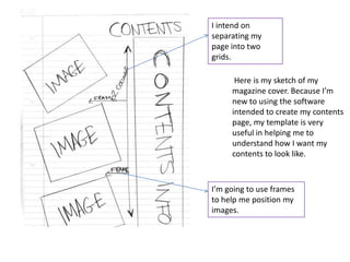
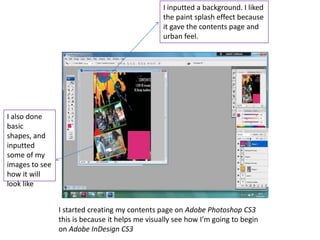
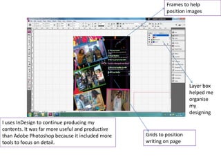
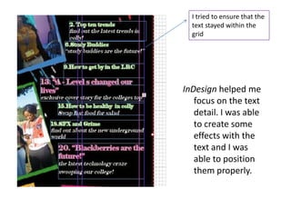

This document describes the process of designing a magazine cover and contents page. The author created draft sketches and templates in Photoshop to plan layouts before building the actual pages in InDesign. InDesign proved more useful than Photoshop for the task as it included tools tailored to organizing text and images across a page. Frames, grids, and layers helped the author strategically position all elements, and test cover designs were refined through techniques like blurring images and experimenting with fonts and backgrounds.


