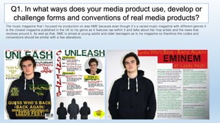
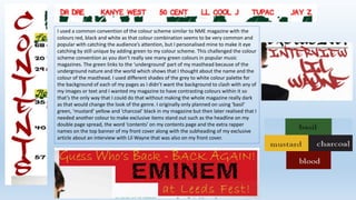
VIP High Class Call Girls Bikaner Anushka 8250192130 Independent Escort Servi...
Question 1
1. Q1. In what ways does your media product use, develop or
challenge forms and conventions of real media products?
The music magazine that I focused my production on was NME because even though it’s a varied music magazine with different genres it
is the closest magazine published in the UK to my genre as it features rap within it and talks about hip-hop artists and the news that
revolves around it. As well as that, NME is aimed at young adults and older teenagers as is my magazine so therefore the codes and
conventions should be similar with a few alterations.
2. Since I was looking into NME magazine and taking inspiration from it, I
decided to challenge the masthead convention as NME magazine has the
masthead in the top left corner of the front page so I decided to place my
masthead over the whole top row of my front cover, covering the whole
width of it rather than keeping it to the side. However I decided to use the
common convention of having the masthead in capital letters like most
magazines do as this clearly shows the magazines name and is eye catching
to the reader since it’s bigger and bolder than everything else on the page.
As well as that, the font style of the masthead is unique to the magazine
and is only used for the masthead on the front cover of my magazine and
the contents page along with the number of the pages within the magazine
and the name of the artist in my double page spread interview headline. It
is a common convention to keep the font style different for the masthead to
everything else in the magazine as it allows the reader to remember the
magazine just by the font style of the writing of the masthead. However I
decided to use this on the masthead and the page numbers so that there
was a link between the whole magazine and so all the pages linked back to
the front cover and the masthead showing it’s from the same magazine.
I also used the convention of having three words for my masthead
of ‘UNLEASH THE UNDERGROUND’ just like NME is ‘NEW MUSICAL
EXPRESS’ however I challenged it as I didn’t shorten it, I just made
the ‘THE UNDERGROUND’ smaller than ‘UNLEASH’ so that the
reader could know the magazine simply by ‘Unleash’. My
masthead also links to the content of my magazine and the genre
of it as it’s about rap and when I think of rap I imagine
underground rap battles like the one in the movie ‘8 Mile’ and the
fact that there aren’t as many rap magazines that just focus on rap
in the UK the word ‘unleash’ is perfect as it suggests a new door
and something new to the reader, which will excite them and make
them want to look more into it.
3. I used a common convention of the colour scheme similar to NME magazine with the
colours red, black and white as that colour combination seems to be very common and
popular with catching the audience’s attention, but I personalised mine to make it eye
catching by still unique by adding green to my colour scheme. This challenged the colour
scheme convention as you don’t really see many green colours in popular music
magazines. The green links to the ‘underground’ part of my masthead because of the
underground nature and the world which shows that I thought about the name and the
colour of the masthead. I used different shades of the grey to white colour palette for
the background of each of my pages as I didn’t want the background to clash with any of
my images or text and I wanted my magazine to have contrasting colours within it so
that’s the only way that I could do that without making the whole magazine really dark
as that would change the look of the genre. I originally only planned on using ‘basil’
green, ‘mustard’ yellow and ‘charcoal’ black in my magazine but then later realised that I
needed another colour to make exclusive items stand out such as the headline on my
double page spread, the word ‘contents’ on my contents page and the extra rapper
names on the top banner of my front cover along with the subheading of my exclusive
article about an interview with Lil Wayne that was also on my front cover.
4. During my production I only used studio photos as that is the common convention in most
music magazines with celebrities and also it’s used in NME magazine and therefore I
decided to use it in a similar way. As well as that I decided to follow the convention that
NME follows of only using one photo for my front cover so that it’s the main focus of my
magazine and this specific issue, whereas other magazines have sub-images on the front
cover showing different articles. For the front cover I photographed my model looking
directly at the camera and keep a straight face to connect with the reader and create a
tense atmosphere because rappers tend to look a little intimidating in photos. I also used
a medium shot of my model for my front cover to show off the dark clothing that he is
wearing which challenges the usual conventions of the mise-en-scene of the models in
music magazines as they usually wear bright clothes, however this isn’t the case for my
magazine or NME magazine as the models have either black or white clothing on the
issues that I have found. I also decided to use a similar photo for my double page spread
as my front cover as my model is supposed to be Eminem. The only difference between
the image on my front cover and double page spread is the angle of the head because on
the front cover he looks more intimidating whereas on my double page spread he looks
more casual and relaxed. This is to show that the article is more relaxed and he’s used to
interviews. As for the small image on my contents page my model is looking directly at the
reader with a smirk on his face and his hands next to his face, for this I wanted my model
to recreate a photo of an existing rapper just to show that this is a rap magazine.
5. Another convention that I have used that most music magazines use is
the use of a puff word or phrase to promote an item by giving out
freebies and using competitions. This is a common convention used
throughout magazines to interest the reader into buying the magazine
and making them think that they’re getting more than they actually are
for the price that they’re paying. I have used this on my front cover to
attract my readers into looking through the magazine and for them to
buy it and I have included the freebies that I believe my readers would
be interested in and appeal to them more. I have also made the puff
word ‘free’ a bigger font size and bolder to the rest of the words in this
to make it stand out more and so it’s eye catching and it’s what the
reader would see first. As well as that I have included a puff word on the
bottom right corner of my contents page as a surprise to my reader so
that they keep coming back for more. However for this I decided to use a
competition instead of a freebie to attract the reader to find out more.
Most music magazines only either have a freebie or a competition within
the content so I decided to develop this convention by adding both of
them in. As for the competition I have put the words in a bright yellow
arrow pointing towards the other pages in the magazine, this is the first
thing that the reader would notice on the contents page as it’s a brighter
yellow than everything else and the arrow pointing further in makes the
reader more eager to look further into the magazine and read on.
6. In the production of my contents page, I have decided to use the convention of separating different articles into different sections and subheadings
such as ‘Features’, ‘Reviews’ and ‘What’s happening’. I decided to use this convention because it makes the contents page look more organized and
that’s what I found that the people who took part in my survey wanted so I did it to please them. As well as that, this way you can find the page
numbers of the special top articles that are recommended and featured. I have also used the convention of adding page numbers next to the article so
that the reader can easily skip to it if that is what they want to look at and under the subheadings of the article I have included a brief concise summary
of what the article is about, this follows the usual convention of a contents page and is very similar to NME’s contents page. The headings of each
section also use the same conventions as NME’s magazine as I’ve also included a contrasting colour box under the heading, for example NME’s section
headings are on a black background box with white writing on top whereas mine is a green font colour on top of a yellow box, making them stand out.