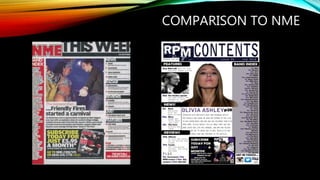
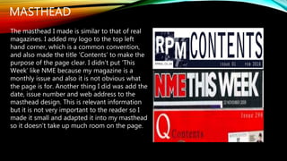
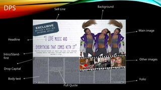
QUESTION 1
In what way does your media product use, develop or challenge forms and
conventions of real media products?
AN OVERVIEW OF FRONT COVER
I think my magazine front cover is reflective of published music magazines such as NME, The
Face and Q etc. but there are also conventions I have challenged in order to create a unique
magazine that will be easy to differentiate for the reader when it is on the shelf, that is the aim.
The main image, layout (regarding the ‘Z ‘layout), masthead, barcode and strip are conventions
that are similar on most magazines so when creating my magazine I followed these
conventions. However, other factors are subjective, e.g. the positioning of cover lines, the
amount of content on the page, the design, colour scheme and so on.
Although it is debatable that most indie magazines use the colours red and black primarily, I
believe that these colours are not completely reflective of the indie genre. ‘Indie’ represents
artists and bands belonging to an independent record label and this does not promote any
one genre of music, therefore I believe any colour can be used to symbolise the variety of
people the music may appeal to. This is why I used the colour scheme of purple, black, white,
navy and grey.
FRONT COVER
Main image
Masthead
Cover Lines
Cover Lines
Main Cover Line
Colour Scheme
Barcode-
Date
Web address
PriceStrip
Puff/Sell line
COMPARISON TO NME
MAIN IMAGE
For my front cover I used an image which denotes my model wearing a white and
purple ski jacket, with her hair up and holding a vinyl as a prop. The shot is a medium
– close up and the mise – en scene connotes her facial expression as being
mysterious as her lips are slightly parted and her eyebrows slightly raised. She is
looking straight into the camera which will make the audience feel like she is
connecting directly with them.
This image is inspired by NME and The Face music magazines as their covers are
similar in the sense that the image is positioned similarly on the page. Also the
clothing is varied on different magazine issues, depending on the artist; some NME
covers are bright and some are dull and this has an impact on the model’s make up
and clothing.
I wanted to create a fresh, new vibe with my magazine so I used bright colours and a
retro ski jacket with purple as the main colour to connote independence. NME issues
have different aims, although the niche audience may be the same, different issues
appeal to different individual’s, which is what I am aiming for in my magazine.
MASTHEAD
I showed the process of making my masthead in
Photoshop on my blog. I decided to name my
magazine RPM after the term ‘revolutions per
minute’ regarding playing a vinyl. Initially I was
going to use a font from the website ‘DaFont.com’
but decided to create my own one instead. The
distorted effect, along with the shattered glass
design makes the masthead unique. I used a
navy/white/black colour on the masthead and also
incorporated the issue number and date along
with it. The size and position of it on the
page is similar to other famous mastheads, most similar to that of NME. Also most
magazines place the issue number, date and price with the masthead because that will
make it clear to the reader, but I have only put the price in the barcode. I positioned the
masthead in the top left hand corner of the page because that is where the reader will look
first, this is a common convention of magazines.
COVER LINES
My front cover only featured a few cover lines. I only used a
few because the page looked busy enough already, with the
smoky background and large image. This is not too dissimilar
from real media products but this does vary depending on
what magazine you are considering. For example, Q
magazine below has many cover lines which looks good
because of the plain background and also this is a common
feature of a rock magazine. However the alternate magazine,
The Face has very few cover lines because of the eccentric
image.
HOW I CHALLENGED CONVENTIONS
In my opinion I followed most of the conventions of a typical magazine front cover.
However, there are a few features I did not use because I didn’t find them vital to use
to make my magazine look aesthetically pleasing. For example, I didn’t create a
skyline. I decided not to because I had a strip at the bottom and a puff in the top
corner, so a skyline may have made the page too crowded. I tried to make the page
creative and effective which is why I preferred to keep it more simplistic and not full of
content.
Something else I did not do, was add another smaller image to the front cover. Most
magazines have a small image on the front cover to give an insight of what is
included in the magazine, however I did not consider this a vital factor because I see
the contents page as an opportunity to display more pictures, putting more on the
front cover may make it look messy.
AN OVERVIEW OF CONTENTS PAGE
When creating my front cover, I was inspired by
the contents page of NME; because of the
overwhelming success of the magazine I
thought the layout was great so I adapted some
features and developed them for my own
magazine. I did use the idea of a ‘Band Index’
because I thought it was a professional way to
present all the artists that are featured in the
magazine.
I followed most conventions of a real media
product by using subheadings, a few images, an
advertisement, title/masthead and a summary
of the main article below the main image. The
one convention of an indie magazine I did not
follow throughout my magazine, was the colour
scheme.
CONTENTS PAGE
Main Image
Other Image
Logo
Masthead
Subheadings
Issue number
Web address
Date
Logo
Social media info
Page number
Advertisement
Extra info
Summary of
main article
Page numbers
for navigation
Band Index
COMPARISON TO NME
MAIN IMAGE AND ANCHOR TEXT
The main image I used is a close – up of my model and below I have featured her
name, page number and a summary of the article. This is similar to that of NME and I
found this an important feature because it gives the reader an opportunity to read a
little more about what they were exposed to on the front cover and make a decision if
they want to read the main article.
The image is positioned on the top half of the page and subheadings are positioned
around it. This layout for my contents page is good because it shows the importance
of information; it prioritises the text in order of relevance e.g. the main image is large
so the reader will look there first and then maybe to the subheading ‘Features’,
‘News!’ etc because there is another image and the text is larger than that of the
‘Band Index’. This is also a similar convention used by NME.
MASTHEAD
The masthead I made is similar to that of real
magazines. I added my logo to the top left
hand corner, which is a common convention,
and also made the title ‘Contents’ to make the
purpose of the page clear. I didn’t put ‘This
Week’ like NME because my magazine is a
monthly issue and also it is not obvious what
the page is for. Another thing I did was add the
date, issue number and web address to the
masthead design. This is relevant information
but it is not very important to the reader so I
made it small and adapted it into my masthead
so it doesn’t take up much room on the page.
ADVERTISEMENT
I decided to add an advertisement to my contents
page because I thought it would make it look more
realistic and professional and because it is a very
popular convention. Also I saw it as an opportunity
to add another image to the page, and a normal
convention of a contents page is that there is an
image of the front cover on it. I followed the colour
scheme of purple, black and white and I think the
combination made it look interesting and stand out
on the page. This is similar to the ad on NME
contents page and I think it resembles that of a real
media product.
AN OVERVIEW OF DOUBLE PAGE SPREAD
Overall, my double page spread is not inspired by any one magazine which is why I
cannot compare it as much as the front cover or contents page. I have researched
music magazine DPS’ and have acknowledged certain features that are commonly
used e.g. a headline, intro to article, body text, images, folio etc. I have used all of
these features but not in a way that I have seen any magazine do. This is because
every article is different, including; the artist, the location of the photo shoot, the
writer of the article/the voice, the subject of the article etc.
I have tried to continue the fresh and creative vibe for my DPS and I think I have
succeeded in creating something unique and intriguing.
DPS
Headline
Folio
Other images
Intro/Stand-
first
Main image
Sell Line
Drop Capital
Body text
Pull Quote
Background
HEADLINE/TEXT
Body text – with drop
capital at the beginning,
a few columns
separated distinctly
Intro – a brief description of
the article, featured
before/above the body text
begins
Headline – a pull quote
from the article is used as
the headline, bold
writing/colour which
creates contrast with
background
Most magazines also have the interviewer and interviewee text in different
colours. Also a pull quote will feature in the middle of a block of text to
separate it and also be a different colour to stand out.
In what way does your media product use, develop or challenge
forms and conventions of real media products?
After carefully analysing the similarities and differences between my music
magazine and real, published magazines, I think my magazine does resemble a
real media product.
I have outlined and demonstrated how I have followed and challenged
conventions of magazines and I believe I follow most conventions; from the front
cover, contents page and double page spread. My magazine promotes fluency as
the house style is continued throughout. The theme is consistent and the colour
scheme is followed throughout the magazine which makes it aesthetically
pleasing for the reader to look at, the logo is featured on each page and I have
achieved my initial plan to make it look unique.
Rebecca Weight

Evaluation question 1

  • 1.
    QUESTION 1 In whatway does your media product use, develop or challenge forms and conventions of real media products?
  • 2.
    AN OVERVIEW OFFRONT COVER I think my magazine front cover is reflective of published music magazines such as NME, The Face and Q etc. but there are also conventions I have challenged in order to create a unique magazine that will be easy to differentiate for the reader when it is on the shelf, that is the aim. The main image, layout (regarding the ‘Z ‘layout), masthead, barcode and strip are conventions that are similar on most magazines so when creating my magazine I followed these conventions. However, other factors are subjective, e.g. the positioning of cover lines, the amount of content on the page, the design, colour scheme and so on. Although it is debatable that most indie magazines use the colours red and black primarily, I believe that these colours are not completely reflective of the indie genre. ‘Indie’ represents artists and bands belonging to an independent record label and this does not promote any one genre of music, therefore I believe any colour can be used to symbolise the variety of people the music may appeal to. This is why I used the colour scheme of purple, black, white, navy and grey.
  • 3.
    FRONT COVER Main image Masthead CoverLines Cover Lines Main Cover Line Colour Scheme Barcode- Date Web address PriceStrip Puff/Sell line
  • 4.
  • 5.
    MAIN IMAGE For myfront cover I used an image which denotes my model wearing a white and purple ski jacket, with her hair up and holding a vinyl as a prop. The shot is a medium – close up and the mise – en scene connotes her facial expression as being mysterious as her lips are slightly parted and her eyebrows slightly raised. She is looking straight into the camera which will make the audience feel like she is connecting directly with them. This image is inspired by NME and The Face music magazines as their covers are similar in the sense that the image is positioned similarly on the page. Also the clothing is varied on different magazine issues, depending on the artist; some NME covers are bright and some are dull and this has an impact on the model’s make up and clothing. I wanted to create a fresh, new vibe with my magazine so I used bright colours and a retro ski jacket with purple as the main colour to connote independence. NME issues have different aims, although the niche audience may be the same, different issues appeal to different individual’s, which is what I am aiming for in my magazine.
  • 6.
    MASTHEAD I showed theprocess of making my masthead in Photoshop on my blog. I decided to name my magazine RPM after the term ‘revolutions per minute’ regarding playing a vinyl. Initially I was going to use a font from the website ‘DaFont.com’ but decided to create my own one instead. The distorted effect, along with the shattered glass design makes the masthead unique. I used a navy/white/black colour on the masthead and also incorporated the issue number and date along with it. The size and position of it on the page is similar to other famous mastheads, most similar to that of NME. Also most magazines place the issue number, date and price with the masthead because that will make it clear to the reader, but I have only put the price in the barcode. I positioned the masthead in the top left hand corner of the page because that is where the reader will look first, this is a common convention of magazines.
  • 7.
    COVER LINES My frontcover only featured a few cover lines. I only used a few because the page looked busy enough already, with the smoky background and large image. This is not too dissimilar from real media products but this does vary depending on what magazine you are considering. For example, Q magazine below has many cover lines which looks good because of the plain background and also this is a common feature of a rock magazine. However the alternate magazine, The Face has very few cover lines because of the eccentric image.
  • 8.
    HOW I CHALLENGEDCONVENTIONS In my opinion I followed most of the conventions of a typical magazine front cover. However, there are a few features I did not use because I didn’t find them vital to use to make my magazine look aesthetically pleasing. For example, I didn’t create a skyline. I decided not to because I had a strip at the bottom and a puff in the top corner, so a skyline may have made the page too crowded. I tried to make the page creative and effective which is why I preferred to keep it more simplistic and not full of content. Something else I did not do, was add another smaller image to the front cover. Most magazines have a small image on the front cover to give an insight of what is included in the magazine, however I did not consider this a vital factor because I see the contents page as an opportunity to display more pictures, putting more on the front cover may make it look messy.
  • 9.
    AN OVERVIEW OFCONTENTS PAGE When creating my front cover, I was inspired by the contents page of NME; because of the overwhelming success of the magazine I thought the layout was great so I adapted some features and developed them for my own magazine. I did use the idea of a ‘Band Index’ because I thought it was a professional way to present all the artists that are featured in the magazine. I followed most conventions of a real media product by using subheadings, a few images, an advertisement, title/masthead and a summary of the main article below the main image. The one convention of an indie magazine I did not follow throughout my magazine, was the colour scheme.
  • 10.
    CONTENTS PAGE Main Image OtherImage Logo Masthead Subheadings Issue number Web address Date Logo Social media info Page number Advertisement Extra info Summary of main article Page numbers for navigation Band Index
  • 11.
  • 12.
    MAIN IMAGE ANDANCHOR TEXT The main image I used is a close – up of my model and below I have featured her name, page number and a summary of the article. This is similar to that of NME and I found this an important feature because it gives the reader an opportunity to read a little more about what they were exposed to on the front cover and make a decision if they want to read the main article. The image is positioned on the top half of the page and subheadings are positioned around it. This layout for my contents page is good because it shows the importance of information; it prioritises the text in order of relevance e.g. the main image is large so the reader will look there first and then maybe to the subheading ‘Features’, ‘News!’ etc because there is another image and the text is larger than that of the ‘Band Index’. This is also a similar convention used by NME.
  • 13.
    MASTHEAD The masthead Imade is similar to that of real magazines. I added my logo to the top left hand corner, which is a common convention, and also made the title ‘Contents’ to make the purpose of the page clear. I didn’t put ‘This Week’ like NME because my magazine is a monthly issue and also it is not obvious what the page is for. Another thing I did was add the date, issue number and web address to the masthead design. This is relevant information but it is not very important to the reader so I made it small and adapted it into my masthead so it doesn’t take up much room on the page.
  • 14.
    ADVERTISEMENT I decided toadd an advertisement to my contents page because I thought it would make it look more realistic and professional and because it is a very popular convention. Also I saw it as an opportunity to add another image to the page, and a normal convention of a contents page is that there is an image of the front cover on it. I followed the colour scheme of purple, black and white and I think the combination made it look interesting and stand out on the page. This is similar to the ad on NME contents page and I think it resembles that of a real media product.
  • 15.
    AN OVERVIEW OFDOUBLE PAGE SPREAD Overall, my double page spread is not inspired by any one magazine which is why I cannot compare it as much as the front cover or contents page. I have researched music magazine DPS’ and have acknowledged certain features that are commonly used e.g. a headline, intro to article, body text, images, folio etc. I have used all of these features but not in a way that I have seen any magazine do. This is because every article is different, including; the artist, the location of the photo shoot, the writer of the article/the voice, the subject of the article etc. I have tried to continue the fresh and creative vibe for my DPS and I think I have succeeded in creating something unique and intriguing.
  • 16.
    DPS Headline Folio Other images Intro/Stand- first Main image SellLine Drop Capital Body text Pull Quote Background
  • 17.
    HEADLINE/TEXT Body text –with drop capital at the beginning, a few columns separated distinctly Intro – a brief description of the article, featured before/above the body text begins Headline – a pull quote from the article is used as the headline, bold writing/colour which creates contrast with background Most magazines also have the interviewer and interviewee text in different colours. Also a pull quote will feature in the middle of a block of text to separate it and also be a different colour to stand out.
  • 18.
    In what waydoes your media product use, develop or challenge forms and conventions of real media products? After carefully analysing the similarities and differences between my music magazine and real, published magazines, I think my magazine does resemble a real media product. I have outlined and demonstrated how I have followed and challenged conventions of magazines and I believe I follow most conventions; from the front cover, contents page and double page spread. My magazine promotes fluency as the house style is continued throughout. The theme is consistent and the colour scheme is followed throughout the magazine which makes it aesthetically pleasing for the reader to look at, the logo is featured on each page and I have achieved my initial plan to make it look unique. Rebecca Weight