The document analyzes the contents pages of different music magazines to understand their structure and layout. It finds that magazines generally include the magazine logo and heading, issue date and number, section headings, article names and short summaries, images, and consistent layouts across issues. The contents pages are designed to be visually appealing and easy to read while highlighting key articles and sections to attract readers.
This is Tom's answer to question 1 of the evaluation for our music magazine. The question is, "In what way does your media product use, develop or challenge codes and conventions of real media products?".
This is Tom's answer to question 1 of the evaluation for our music magazine. The question is, "In what way does your media product use, develop or challenge codes and conventions of real media products?".
Ethnobotany and Ethnopharmacology:
Ethnobotany in herbal drug evaluation,
Impact of Ethnobotany in traditional medicine,
New development in herbals,
Bio-prospecting tools for drug discovery,
Role of Ethnopharmacology in drug evaluation,
Reverse Pharmacology.
Unit 8 - Information and Communication Technology (Paper I).pdfThiyagu K
This slides describes the basic concepts of ICT, basics of Email, Emerging Technology and Digital Initiatives in Education. This presentations aligns with the UGC Paper I syllabus.
How to Split Bills in the Odoo 17 POS ModuleCeline George
Bills have a main role in point of sale procedure. It will help to track sales, handling payments and giving receipts to customers. Bill splitting also has an important role in POS. For example, If some friends come together for dinner and if they want to divide the bill then it is possible by POS bill splitting. This slide will show how to split bills in odoo 17 POS.
We all have good and bad thoughts from time to time and situation to situation. We are bombarded daily with spiraling thoughts(both negative and positive) creating all-consuming feel , making us difficult to manage with associated suffering. Good thoughts are like our Mob Signal (Positive thought) amidst noise(negative thought) in the atmosphere. Negative thoughts like noise outweigh positive thoughts. These thoughts often create unwanted confusion, trouble, stress and frustration in our mind as well as chaos in our physical world. Negative thoughts are also known as “distorted thinking”.
The Indian economy is classified into different sectors to simplify the analysis and understanding of economic activities. For Class 10, it's essential to grasp the sectors of the Indian economy, understand their characteristics, and recognize their importance. This guide will provide detailed notes on the Sectors of the Indian Economy Class 10, using specific long-tail keywords to enhance comprehension.
For more information, visit-www.vavaclasses.com
How to Create Map Views in the Odoo 17 ERPCeline George
The map views are useful for providing a geographical representation of data. They allow users to visualize and analyze the data in a more intuitive manner.
Students, digital devices and success - Andreas Schleicher - 27 May 2024..pptxEduSkills OECD
Andreas Schleicher presents at the OECD webinar ‘Digital devices in schools: detrimental distraction or secret to success?’ on 27 May 2024. The presentation was based on findings from PISA 2022 results and the webinar helped launch the PISA in Focus ‘Managing screen time: How to protect and equip students against distraction’ https://www.oecd-ilibrary.org/education/managing-screen-time_7c225af4-en and the OECD Education Policy Perspective ‘Students, digital devices and success’ can be found here - https://oe.cd/il/5yV
The Art Pastor's Guide to Sabbath | Steve ThomasonSteve Thomason
What is the purpose of the Sabbath Law in the Torah. It is interesting to compare how the context of the law shifts from Exodus to Deuteronomy. Who gets to rest, and why?
Instructions for Submissions thorugh G- Classroom.pptxJheel Barad
This presentation provides a briefing on how to upload submissions and documents in Google Classroom. It was prepared as part of an orientation for new Sainik School in-service teacher trainees. As a training officer, my goal is to ensure that you are comfortable and proficient with this essential tool for managing assignments and fostering student engagement.
2024.06.01 Introducing a competency framework for languag learning materials ...Sandy Millin
http://sandymillin.wordpress.com/iateflwebinar2024
Published classroom materials form the basis of syllabuses, drive teacher professional development, and have a potentially huge influence on learners, teachers and education systems. All teachers also create their own materials, whether a few sentences on a blackboard, a highly-structured fully-realised online course, or anything in between. Despite this, the knowledge and skills needed to create effective language learning materials are rarely part of teacher training, and are mostly learnt by trial and error.
Knowledge and skills frameworks, generally called competency frameworks, for ELT teachers, trainers and managers have existed for a few years now. However, until I created one for my MA dissertation, there wasn’t one drawing together what we need to know and do to be able to effectively produce language learning materials.
This webinar will introduce you to my framework, highlighting the key competencies I identified from my research. It will also show how anybody involved in language teaching (any language, not just English!), teacher training, managing schools or developing language learning materials can benefit from using the framework.
2024.06.01 Introducing a competency framework for languag learning materials ...
Contents page analysis
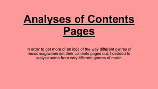
1. Analyses of Contents
Pages
I have been faced with the task of creating a
contents page before, however never one from a
music magazine. In order to get more of an idea
of the way different genres of music magazines
set their contents pages out, I decided to analyse
some from very different genres of music.
2. Logo Heading
Page number on image
Dateline
Page number
Section heading Issue number
Images
Numbers
Synopsis
The logo is unique to the magazine brand
and so incorporating it into the contents
page reminds the reader of the magazine
as the logo is recognisable.
Article name
The section heading gives an insight as to
what the following information will be about.
In this case, it is telling us that the features
of the magazine are displayed below.
The images are either in the
columns or in lines themselves.
This gives the page structure.
The page numbers are in a neat
line down the side of the page.
Gives the reader an idea of what
the text will be about, it is usually
an artist’s name.
The synopsis is a chunk of text which is
essentially the article condensed into a
few sentences. This allows the reader to
skim over the topic and decide if they
are interested in reading it.
The heading usually contains the
name of the magazine (in this
case it includes the logo) and is at
the top of the page.
The issue number sets the magazine aside from
all of the other magazines produced by the
company. It gives the magazine an identity and
ensures that readers don’t feel as though
they’re buying the same thing each time. It also
proves that the magazine are trustworthy once
they reach a certain number of issues because
it shows that people have continued to buy
them.
The page number on the image ensures
that the reader understands what there is
to offer inside the magazine. The image
attracts the eye and the page number
directs the reader to the article linked to
the image.
The page number informs the
reader of what page of the
magazine they are currently on.
The dateline is similar to the issue
number, it sets the magazine at a
point in time.
3. Heading
Images
Structure
The contents page is
structured using columns
which makes it easier to
read. This also is more
aesthetically pleasing and
so the contents page looks
good.
The heading is the name of the
magazine. It links the contents
page to the front cover and is in
large font. This catches the
readers attention and is in the
same font as the headline on the
front cover which allows the
reader to recognise the brand.
Most of the images are in
perfect squares and have
been presented in two
perfect columns.
Sub-sections
The sub sections are headlined in
bold and they are all set in a text
box which keeps them together
making It easier for the reader to
navigate around the page. The
page numbers are in a perfect line
which keeps the page looking
neat.
Special article
The special article is in a separate
text box with a dotted border. This
forces it to stand out against the
other articles. The image has been
photo shopped to stand alone and
the synopsis is shaped around her
head. The section heading is the
artist’s name and is in bold letters,
with her surname being larger
than her forename which suggests
that this is the most recognisable
name to the audience.
This advert is blue and black with a little
red. This makes it stand out against the
contents page itself and therefore the
reader will be attracted to the column
broadcasting the shows/.
Advert
Colour scheme
The colour scheme is predominantly
maroon red and white writing. This is a
classic pairing of colours which will
attract an older, cultured, classic adult
with an appreciation for the classical
music this magazine is displaying.
Main image
The model in this image is very polished and seems to be
of high class due to her perfectly placed, curled hair and
her classic makeup with a simple black shawl.
4. Heading
The heading is in the same
font as is used on every
Kerrang magazine. This gives
a sense of familiarity for the
regular readers and makes the
magazine recognisable.
Date line
The date line is directly beneath
the heading and contains the date
of the issue and the issue
number. This gives the magazine
individuality and sets it in time.
Note from editor
Whilst this is not a feature of
every magazine, it is featured
in more relaxed,
conversational magazines to
allow the reader to connect
with those producing the
magazine. This helps the
magazine to have regular
readers. It is displayed in a
separate column to the other
contents. This allows it to
stand out and makes the
page easier to read.
Sub section
The use of a separate section
holding the actual contents makes
the page easier to read and more
aesthetically pleasing.
Features
Features of the magazine are
displayed as images to give the
reader an insight as to what the
magazine contains.
Main image
The main image is of Marilyn Manson
whom is pictured in a dirty setting with a
simple red sofa. The artist is shown to be
holding some sort of cards, possibly tarot
cards which gives the contents page a
spooky feel to it. The dark eye makeup and
dark nail varnish will appeal to the readers
that enjoy such things, as with the slicked
back hair. It is a very gothic look.
Section headings
The section headings are in a vibrant
yellow colour which is the same as that of
the heading and the sub heading. It has
been placed on a black background which
together force the writing to stand out and
catch the reader’s attention.
Article name and synopsis
The article names are in a bold
black font to catch the reader’s
eye. The synopsis is in a smaller
font to provide the reader with
some information on the more
interesting articles.
Layout
The magazine has
been presented in
columns to make it
easier to read and to
ensure that the
magazine follows the
traditional layout of a
magazine.
This is another of
Kerrang’s contents
pages which shows
that the layout of the
magazine is the same
in each issue.