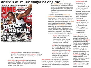
Analysis of music magazine one NME The mast head- Is in a formal large 
bold, font in red going across the front 
cover. This identity's the magazine and 
brings attraction. The colours that are 
used are dependable throughout the 
front cover. 
Cover lines- Stick with the context and 
conventions of the magazine keeping with 
the theme of the colour scheme which is red 
,white. Also the cover lines ‘kasbian’ are all 
indie bands the cover lines relate to the genre 
of the magazine which is indie . They also 
show who the target audience are unisex-aged 
16-30 because only young people are 
interested in these type of bands who are 
current, this is because of the Type language 
used, bold, bright colours used to attract 
consumers also the topics of the magazine. 
Main image- Is a medium 
close up crouched of the 
artist who is Dizzee Rascal . 
The artist relates to the genre 
his representing indie/rap. 
This will be attracting readers 
as big fans of the artist are 
likely to read the magazine 
this creates a USP of the 
magazine and will be the 
main reason people will buy 
it. Also in the image the 
background is of graffiti and 
the gold chain and outfit 
Dizzie is wearing are all know 
images of rap and are 
associated with it this shows 
the genre. Which the target 
auidence will quickly point 
out and recognise 
Footer- at the bottom of the 
page looks simple and 
sophisticated, simply naming 
the artists which are yet to 
featured in the magazine. 
Barcode/price- legal 
obligation on all 
magazines the price 
£2.20 shows the are 16- 
25 as its affordable for 
young adults to 
purchase. This magazine 
targets a niche market 
of music enthusiasts 
which like the genre 
indie/hiphop 
Skyline- Is used to 
attract readers to the 
magazine it provides 
a specific one time 
offer “16 page 
autumn tour special’ 
which only this 
magazine has . 
Puff-A puff provides the purpose 
of a freebie/ special offer this is 
the pavement reunion. This will 
be on the main things the target 
audience will look and persuade 
them to buy the magazine as 
they feel like they're getting 
something out of it. 
Denotation Is Dizzie is seen wearing printed jeans, 
jewellery ,printed trainers this connotation is the hip 
hop image associated with most artists, you wouldn’t 
see a rapper in a suit. 
Main cover line- This stays with the main image 
showing the name of the artist and a quote from 
him which the language is very casual using the 
slang term “man” is reaching out to the younger 
target audience. 
House style- The colour scheme used is red which 
relates to the blood and violence in hip-hop, white 
relates to being fresh as the magazine is new and 
Dizzie is a fresh, new artist .
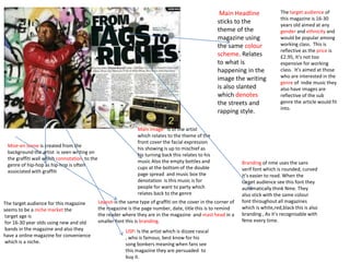
Mise-en scene is created from the 
background the artist is seen writing on 
the graffiti wall which connotation to the 
genre of hip-hop as hip-hop is often 
associated with graffiti 
Main image- is of the artist 
which relates to the theme of the 
front cover the facial expression 
his showing is up to mischief as 
his turning back this relates to his 
music Also the empty bottles and 
cups at the bottom of the double 
page spread and music box the 
denotation is this music is for 
people for want to party which 
relates back to the genre 
Main Headline 
sticks to the 
theme of the 
magazine using 
the same colour 
scheme. Relates 
to what is 
happening in the 
image the writing 
is also slanted 
which denotes 
the streets and 
rapping style. 
Layout-is the same type of graffiti on the cover in the corner of 
the magazine is the page number, date, title this is to remind 
the reader where they are in the magazine and mast head in a 
smaller font this is branding. 
The target audience of 
this magazine is 16-30 
years old aimed at any 
gender and ethnicity and 
would be popular among 
working class. This is 
reflective as the price is 
£2.95, It’s not too 
expensive for working 
class. It’s aimed at those 
who are interested in the 
genre of indie music they 
also have images are 
reflective of the sub 
genre the article would fit 
into. 
Branding of nme uses the sans 
serif font which is rounded, curved 
it’s easier to read. When the 
target audience see this font they 
automatically think Nme. They 
also stick with the same colour 
font throughout all magazines 
which is white,red,black this is also 
branding , As it’s recognisable with 
Nme every time. 
USP- Is the artist which is dizzee rascal 
, who is famous, best know for his 
song bonkers meaning when fans see 
this magazine they are persuaded to 
buy it. 
The target audience for this magazine 
seems to be a niche market the 
target age is 
for 16-30 year olds using new and old 
bands in the magazine and also they 
have a online magazine for convenience 
which is a niche.
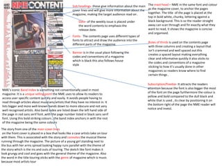
The mast head – NME in the same font and colour 
as the magazine cover, to anchor the pages 
together. The title of the page is placed at the 
top in bold white, chunky, lettering against a 
black background. This is so the reader straight 
away can scan through and fin exactly what they 
want to read, it shows the magazine is concise 
and organised. 
Rules of thirds is used on the contents page 
with three columns and creating a layout that 
isn’t crammed and well spaced out this 
creates a spaced layout making everything 
clear and informative quickly it also sticks to 
the codes and conventions of a magazine 
sticking to how it’s usually done in other 
magazines so readers know where to find 
certain things . 
Sub headings- these give information about the main 
cover lines and will give more information about the 
magazine, making the target audience read on . 
Date- of the weekly issue is placed under 
the word contents to emphasis the 
release date. 
Fonts- The contents page uses different types of 
fonts to attract and draw the audience into the 
different parts of the magazine. 
NME’s iconic Band Index is something not conventionally used in most 
magazine. It is a unique selling point the NME uses to allow its readers to 
access user specific content quickly and easily. It avoids people having to 
read through articles about musicians/artists that they have no interest in. It 
lists bigger and more well-known bands down to more obscure and not very 
well recognised artists. Also band index are listed down the left hand side of 
the page in red sans serif font ,with the page number listed in black sans serif 
font. Using this bold striking colours , the band index anchors in with the rest 
of the magazine being the same colours 
The story from one of the main cover lines 
on the front cover is placed in a box that looks like a case artists take on tour 
with them. This is associated with the story and connotes the musical theme 
running through the magazine. The picture of a young girl standing next to 
the bus with her arms spread looking happy runs parallel with the theme of 
the story which is the ins and outs of touring. The sketch like font makes it 
look grungy and cool and goes with the general theme of the magazine. Also 
the word in the title touring sticks with the genre of magazine which is music 
because most artists tour 
Subscription/freebie- It attracts the readers 
attention because the font is also bigger the most 
of the font on the page furthermore the colour is 
yellow and bold compared to the dull black and 
white that is used , its clear by positioning it on 
the bottom right of the page the NME reader will 
notice and invest. 
Banner is in the usual place following the 
codes and conventions of a magazine 
which is black this also follows house 
style

Nme

  • 1.
    Analysis of musicmagazine one NME The mast head- Is in a formal large bold, font in red going across the front cover. This identity's the magazine and brings attraction. The colours that are used are dependable throughout the front cover. Cover lines- Stick with the context and conventions of the magazine keeping with the theme of the colour scheme which is red ,white. Also the cover lines ‘kasbian’ are all indie bands the cover lines relate to the genre of the magazine which is indie . They also show who the target audience are unisex-aged 16-30 because only young people are interested in these type of bands who are current, this is because of the Type language used, bold, bright colours used to attract consumers also the topics of the magazine. Main image- Is a medium close up crouched of the artist who is Dizzee Rascal . The artist relates to the genre his representing indie/rap. This will be attracting readers as big fans of the artist are likely to read the magazine this creates a USP of the magazine and will be the main reason people will buy it. Also in the image the background is of graffiti and the gold chain and outfit Dizzie is wearing are all know images of rap and are associated with it this shows the genre. Which the target auidence will quickly point out and recognise Footer- at the bottom of the page looks simple and sophisticated, simply naming the artists which are yet to featured in the magazine. Barcode/price- legal obligation on all magazines the price £2.20 shows the are 16- 25 as its affordable for young adults to purchase. This magazine targets a niche market of music enthusiasts which like the genre indie/hiphop Skyline- Is used to attract readers to the magazine it provides a specific one time offer “16 page autumn tour special’ which only this magazine has . Puff-A puff provides the purpose of a freebie/ special offer this is the pavement reunion. This will be on the main things the target audience will look and persuade them to buy the magazine as they feel like they're getting something out of it. Denotation Is Dizzie is seen wearing printed jeans, jewellery ,printed trainers this connotation is the hip hop image associated with most artists, you wouldn’t see a rapper in a suit. Main cover line- This stays with the main image showing the name of the artist and a quote from him which the language is very casual using the slang term “man” is reaching out to the younger target audience. House style- The colour scheme used is red which relates to the blood and violence in hip-hop, white relates to being fresh as the magazine is new and Dizzie is a fresh, new artist .
  • 2.
    Mise-en scene iscreated from the background the artist is seen writing on the graffiti wall which connotation to the genre of hip-hop as hip-hop is often associated with graffiti Main image- is of the artist which relates to the theme of the front cover the facial expression his showing is up to mischief as his turning back this relates to his music Also the empty bottles and cups at the bottom of the double page spread and music box the denotation is this music is for people for want to party which relates back to the genre Main Headline sticks to the theme of the magazine using the same colour scheme. Relates to what is happening in the image the writing is also slanted which denotes the streets and rapping style. Layout-is the same type of graffiti on the cover in the corner of the magazine is the page number, date, title this is to remind the reader where they are in the magazine and mast head in a smaller font this is branding. The target audience of this magazine is 16-30 years old aimed at any gender and ethnicity and would be popular among working class. This is reflective as the price is £2.95, It’s not too expensive for working class. It’s aimed at those who are interested in the genre of indie music they also have images are reflective of the sub genre the article would fit into. Branding of nme uses the sans serif font which is rounded, curved it’s easier to read. When the target audience see this font they automatically think Nme. They also stick with the same colour font throughout all magazines which is white,red,black this is also branding , As it’s recognisable with Nme every time. USP- Is the artist which is dizzee rascal , who is famous, best know for his song bonkers meaning when fans see this magazine they are persuaded to buy it. The target audience for this magazine seems to be a niche market the target age is for 16-30 year olds using new and old bands in the magazine and also they have a online magazine for convenience which is a niche.
  • 3.
    The mast head– NME in the same font and colour as the magazine cover, to anchor the pages together. The title of the page is placed at the top in bold white, chunky, lettering against a black background. This is so the reader straight away can scan through and fin exactly what they want to read, it shows the magazine is concise and organised. Rules of thirds is used on the contents page with three columns and creating a layout that isn’t crammed and well spaced out this creates a spaced layout making everything clear and informative quickly it also sticks to the codes and conventions of a magazine sticking to how it’s usually done in other magazines so readers know where to find certain things . Sub headings- these give information about the main cover lines and will give more information about the magazine, making the target audience read on . Date- of the weekly issue is placed under the word contents to emphasis the release date. Fonts- The contents page uses different types of fonts to attract and draw the audience into the different parts of the magazine. NME’s iconic Band Index is something not conventionally used in most magazine. It is a unique selling point the NME uses to allow its readers to access user specific content quickly and easily. It avoids people having to read through articles about musicians/artists that they have no interest in. It lists bigger and more well-known bands down to more obscure and not very well recognised artists. Also band index are listed down the left hand side of the page in red sans serif font ,with the page number listed in black sans serif font. Using this bold striking colours , the band index anchors in with the rest of the magazine being the same colours The story from one of the main cover lines on the front cover is placed in a box that looks like a case artists take on tour with them. This is associated with the story and connotes the musical theme running through the magazine. The picture of a young girl standing next to the bus with her arms spread looking happy runs parallel with the theme of the story which is the ins and outs of touring. The sketch like font makes it look grungy and cool and goes with the general theme of the magazine. Also the word in the title touring sticks with the genre of magazine which is music because most artists tour Subscription/freebie- It attracts the readers attention because the font is also bigger the most of the font on the page furthermore the colour is yellow and bold compared to the dull black and white that is used , its clear by positioning it on the bottom right of the page the NME reader will notice and invest. Banner is in the usual place following the codes and conventions of a magazine which is black this also follows house style