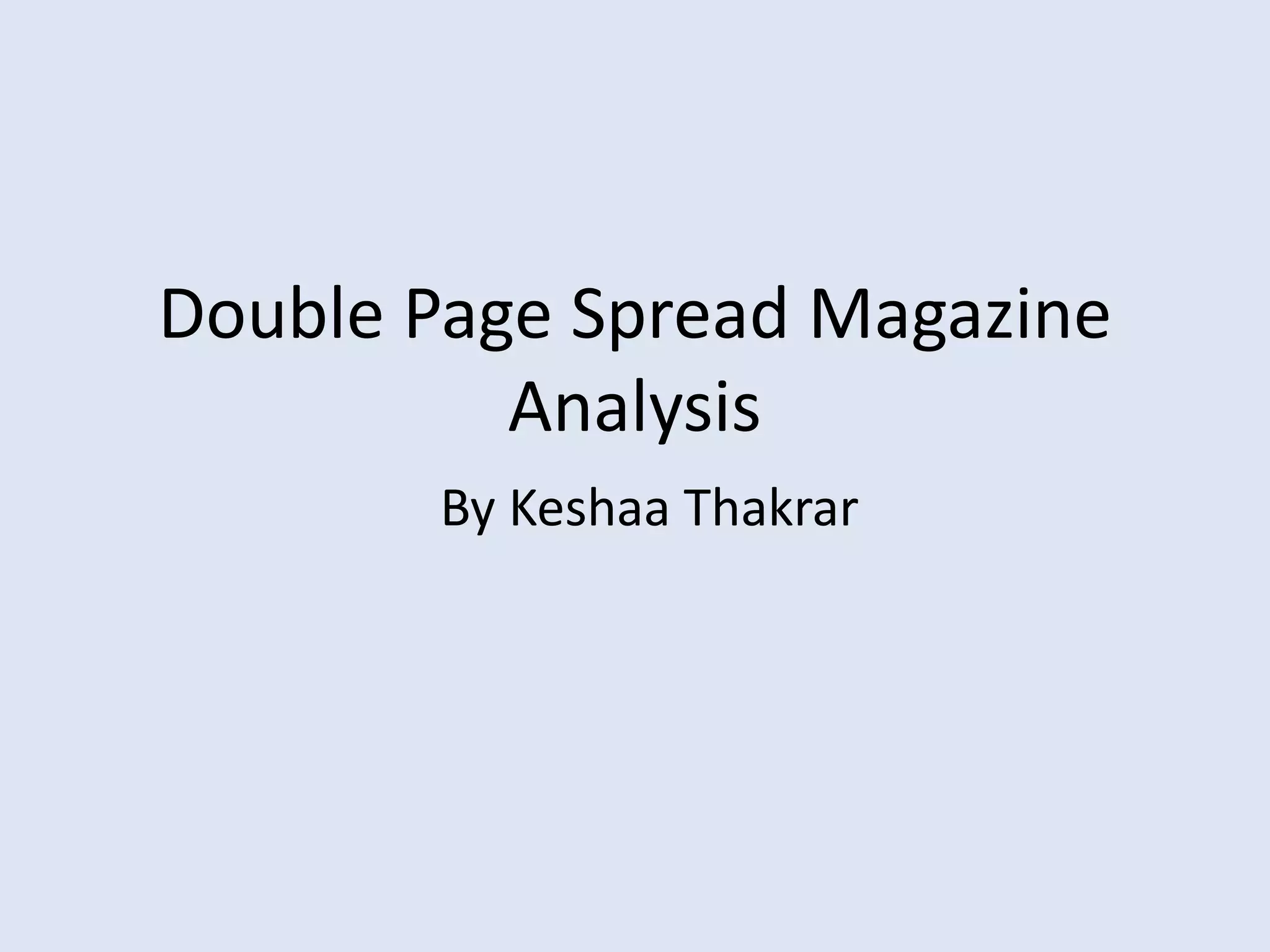
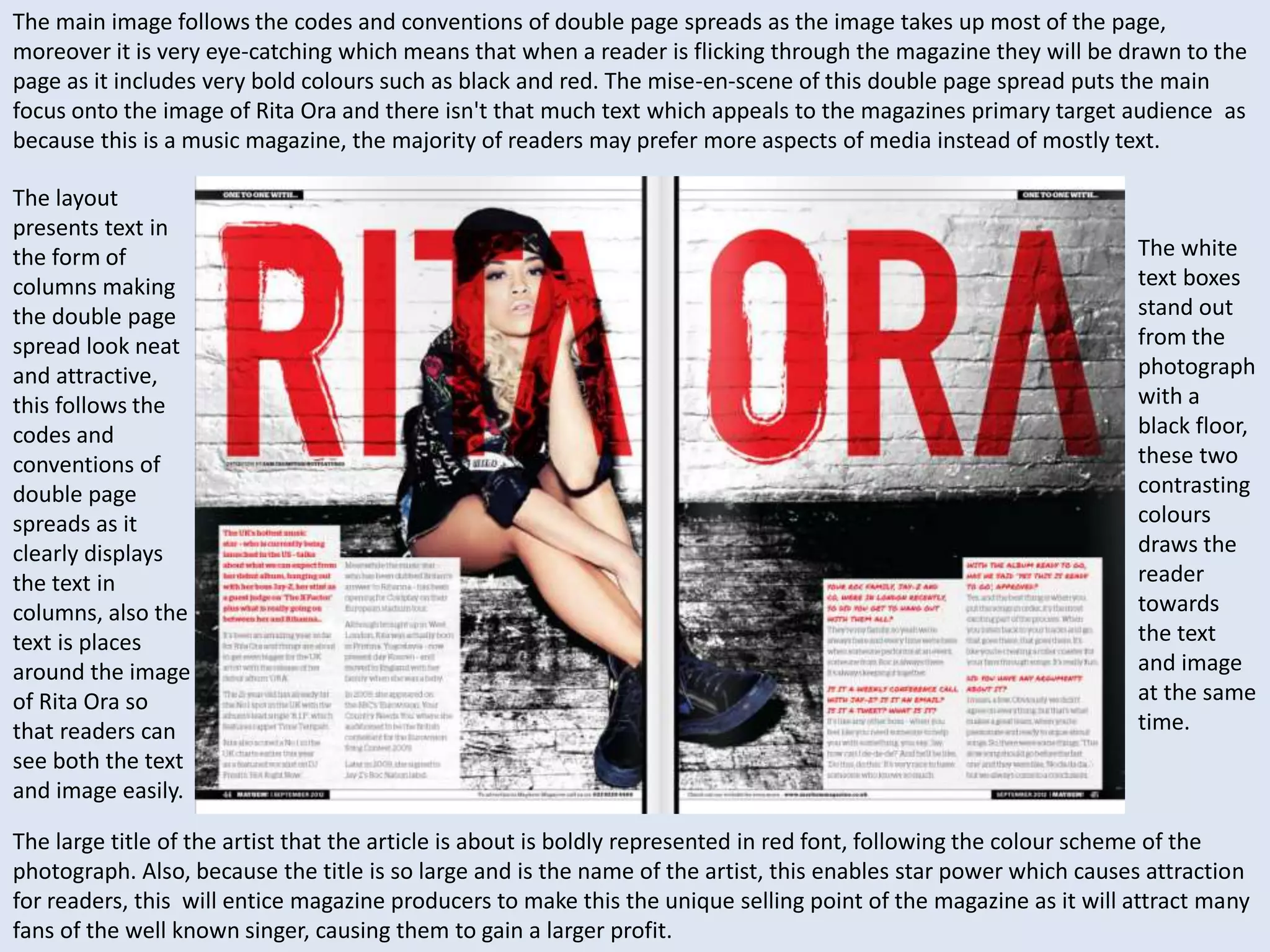
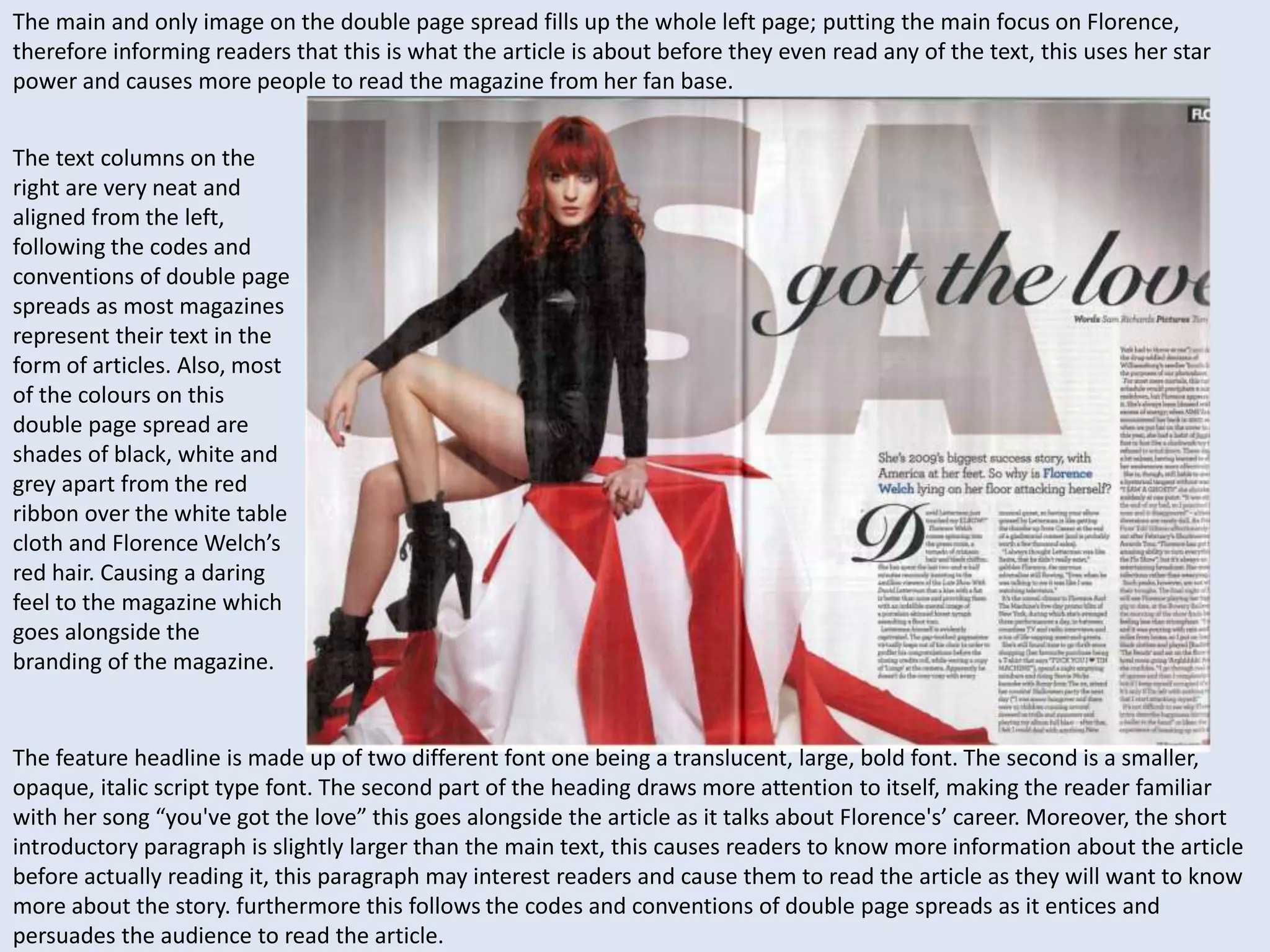
Double Page Spread Magazine 
Analysis 
By Keshaa Thakrar
The main image follows the codes and conventions of double page spreads as the image takes up most of the page, 
moreover it is very eye-catching which means that when a reader is flicking through the magazine they will be drawn to the 
page as it includes very bold colours such as black and red. The mise-en-scene of this double page spread puts the main 
focus onto the image of Rita Ora and there isn't that much text which appeals to the magazines primary target audience as 
because this is a music magazine, the majority of readers may prefer more aspects of media instead of mostly text. 
The layout 
presents text in 
the form of 
columns making 
the double page 
spread look neat 
and attractive, 
this follows the 
codes and 
conventions of 
double page 
spreads as it 
clearly displays 
the text in 
columns, also the 
text is places 
around the image 
of Rita Ora so 
that readers can 
see both the text 
and image easily. 
The white 
text boxes 
stand out 
from the 
photograph 
with a 
black floor, 
these two 
contrasting 
colours 
draws the 
reader 
towards 
the text 
and image 
at the same 
time. 
The large title of the artist that the article is about is boldly represented in red font, following the colour scheme of the 
photograph. Also, because the title is so large and is the name of the artist, this enables star power which causes attraction 
for readers, this will entice magazine producers to make this the unique selling point of the magazine as it will attract many 
fans of the well known singer, causing them to gain a larger profit.
The main and only image on the double page spread fills up the whole left page; putting the main focus on Florence, 
therefore informing readers that this is what the article is about before they even read any of the text, this uses her star 
power and causes more people to read the magazine from her fan base. 
The text columns on the 
right are very neat and 
aligned from the left, 
following the codes and 
conventions of double page 
spreads as most magazines 
represent their text in the 
form of articles. Also, most 
of the colours on this 
double page spread are 
shades of black, white and 
grey apart from the red 
ribbon over the white table 
cloth and Florence Welch’s 
red hair. Causing a daring 
feel to the magazine which 
goes alongside the 
branding of the magazine. 
The feature headline is made up of two different font one being a translucent, large, bold font. The second is a smaller, 
opaque, italic script type font. The second part of the heading draws more attention to itself, making the reader familiar 
with her song “you've got the love” this goes alongside the article as it talks about Florence's’ career. Moreover, the short 
introductory paragraph is slightly larger than the main text, this causes readers to know more information about the article 
before actually reading it, this paragraph may interest readers and cause them to read the article as they will want to know 
more about the story. furthermore this follows the codes and conventions of double page spreads as it entices and 
persuades the audience to read the article.
The main image takes up the entirety of the left page on this double page spread, along side the large translucent red ‘J’ on 
the right hand page behind the main text, the ‘J’ links to the picture of Jay-Z, informing readers that the article is about him. 
Moreover as the ‘J’ is red it follows the same colour scheme of the photograph with the red tones and text in the picture. 
The text is presented in 
a two column format, 
following the codes and 
conventions of double 
page spreads, having 
the text in column form 
sets it aside from the 
picture as it is very neat 
and simple, adding 
further impact to the 
main image which is 
quite complex with its 
differing colours and 
tones. Therefore when 
readers are flicking 
through the magazine 
they will be drawn to 
the main image and 
will instantly recognise 
what the article is 
about. 
On top of the picture there is a short introductory paragraph with a quote from the article, this will cause readers to be 
more interested in reading the whole article as they will want to know what the quote is referring to. moreover, as this 
short paragraph is red, it stands out from Jay-Z’s black shirt making it very visible and eye catching to the reader. This short 
paragraph follows the codes and conventions of double page spreads as they are used to advertise their unique selling point 
of the magazine to the reader, this article uses star power to gain readers.

Double page spread analysis

  • 1.
    Double Page SpreadMagazine Analysis By Keshaa Thakrar
  • 2.
    The main imagefollows the codes and conventions of double page spreads as the image takes up most of the page, moreover it is very eye-catching which means that when a reader is flicking through the magazine they will be drawn to the page as it includes very bold colours such as black and red. The mise-en-scene of this double page spread puts the main focus onto the image of Rita Ora and there isn't that much text which appeals to the magazines primary target audience as because this is a music magazine, the majority of readers may prefer more aspects of media instead of mostly text. The layout presents text in the form of columns making the double page spread look neat and attractive, this follows the codes and conventions of double page spreads as it clearly displays the text in columns, also the text is places around the image of Rita Ora so that readers can see both the text and image easily. The white text boxes stand out from the photograph with a black floor, these two contrasting colours draws the reader towards the text and image at the same time. The large title of the artist that the article is about is boldly represented in red font, following the colour scheme of the photograph. Also, because the title is so large and is the name of the artist, this enables star power which causes attraction for readers, this will entice magazine producers to make this the unique selling point of the magazine as it will attract many fans of the well known singer, causing them to gain a larger profit.
  • 3.
    The main andonly image on the double page spread fills up the whole left page; putting the main focus on Florence, therefore informing readers that this is what the article is about before they even read any of the text, this uses her star power and causes more people to read the magazine from her fan base. The text columns on the right are very neat and aligned from the left, following the codes and conventions of double page spreads as most magazines represent their text in the form of articles. Also, most of the colours on this double page spread are shades of black, white and grey apart from the red ribbon over the white table cloth and Florence Welch’s red hair. Causing a daring feel to the magazine which goes alongside the branding of the magazine. The feature headline is made up of two different font one being a translucent, large, bold font. The second is a smaller, opaque, italic script type font. The second part of the heading draws more attention to itself, making the reader familiar with her song “you've got the love” this goes alongside the article as it talks about Florence's’ career. Moreover, the short introductory paragraph is slightly larger than the main text, this causes readers to know more information about the article before actually reading it, this paragraph may interest readers and cause them to read the article as they will want to know more about the story. furthermore this follows the codes and conventions of double page spreads as it entices and persuades the audience to read the article.
  • 4.
    The main imagetakes up the entirety of the left page on this double page spread, along side the large translucent red ‘J’ on the right hand page behind the main text, the ‘J’ links to the picture of Jay-Z, informing readers that the article is about him. Moreover as the ‘J’ is red it follows the same colour scheme of the photograph with the red tones and text in the picture. The text is presented in a two column format, following the codes and conventions of double page spreads, having the text in column form sets it aside from the picture as it is very neat and simple, adding further impact to the main image which is quite complex with its differing colours and tones. Therefore when readers are flicking through the magazine they will be drawn to the main image and will instantly recognise what the article is about. On top of the picture there is a short introductory paragraph with a quote from the article, this will cause readers to be more interested in reading the whole article as they will want to know what the quote is referring to. moreover, as this short paragraph is red, it stands out from Jay-Z’s black shirt making it very visible and eye catching to the reader. This short paragraph follows the codes and conventions of double page spreads as they are used to advertise their unique selling point of the magazine to the reader, this article uses star power to gain readers.